How to Create Satisfying Motion Design: Principles, Techniques & AI Tools (2026)
Satisfying motion design comes down to four qualities — smooth easing, precise timing, seamless loops, and visual resolution. This guide covers the principles, techniques, and AI tools to create motion design that holds attention.

Tooba Siddiqui
May 15, 2026 • Updated May 18, 2026
16 mins Read
Satisfying motion design comes down to four core qualities — smooth easing, precise timing, seamless loops, and visual resolution. When all four are present, viewers watch longer, engage more, and share instinctively.
Most motion design guides teach you which software to use. This one teaches you why some motion feels fluid and some feels mechanical — and how to close that gap whether you are working in After Effects or generating with AI tools. The principles that make motion design satisfying are the same regardless of the tool. The tool determines how you apply them. For a foundation on what motion design is as a discipline, see what is motion graphics. For the tools used to produce it, see best tools for motion design.
What Makes Motion Design Feel Satisfying?
Satisfying motion is not a stylistic preference — it is a perceptual response. The human brain is wired to process motion in terms of physical expectation. Objects in the real world accelerate, decelerate, anticipate, follow through. When animated motion mirrors those physical properties, the brain processes it as natural and rewarding. When it does not — when motion starts and stops at constant speed, when elements land without settling, when the loop cuts back with a visible jump — the brain registers something off, even when the viewer cannot name what it is.
Four qualities define satisfying motion design:
- Easing — motion that accelerates and decelerates naturally rather than moving at constant speed
- Timing — movement that lands where the eye expects it, in rhythm with the content's internal beat
- Loop integrity — animation that cycles without visible seams, creating the sense of continuous, resolved motion
- Visual resolution — compositions that arrive somewhere rather than simply moving, giving the viewer a sense of completion
Every principle in this guide — anticipation, follow-through, color transitions, typographic rhythm — is an extension of one or more of these four qualities. Master the four and the specific techniques become applications rather than rules to memorise.
For the foundational design principles that underpin all visual communication, see principles of design.
Master Easing — The Foundation of Smooth Motion
Easing is the single most impactful quality in motion design. Two animations using identical elements and identical durations produce completely different results depending on whether easing is applied.
What easing means: instead of moving from point A to point B at constant velocity, the element accelerates at the start (ease in), decelerates at the end (ease out), or does both (ease in-out). Each variant creates a different perceptual effect:
- Ease in — slow start, fast end. Creates momentum and energy. The element arrives with force.
- Ease out — fast start, slow end. Creates elegance and softness. The element settles into place.
- Ease in-out — slow-fast-slow. The most satisfying of the three for most motion design applications. Mimics natural physical motion most closely.
- Linear — constant speed. Looks mechanical in almost every context. Avoid it as a default.
Why linear motion never looks right: nothing in the physical world moves at constant velocity. A door does not swing at the same speed from open to closed. A ball does not travel at the same speed from throw to landing. When animated motion does, the brain registers the absence of physics — not as "technically incorrect" but as "something feels off."
Applying easing without traditional software: describe motion as if describing a physical object. A shape that "floats gently into frame and settles softly" is an ease in-out. A word that "snaps in and decelerates to a stop" is an ease in. The description contains the easing instruction. For AI motion design tools, this language translates directly into prompt writing — describe the physical quality of the motion, not just its direction.
Prompting for easing in ImagineArt: use language that describes physical properties — "smooth deceleration," "fluid organic motion," "natural settling movement," "soft ease into position." Avoid mechanical descriptors when smoothness is the goal. See AI video prompts for a full guide to motion prompt construction.
Get Timing Right
Timing is the skill most motion designers underestimate and most viewers unconsciously feel. Two designers using identical assets produce completely different results based on timing alone — the same animation at the wrong speed becomes either rushed or laboured.
Duration as a design decision: timing is not a technical setting, it is a creative one. Every motion design piece has an internal tempo — the rhythm at which it moves through information. Individual animation durations should serve that tempo, not contradict it.
Practical reference points:
- UI micro-animations: under 300ms — fast enough to feel responsive, slow enough to be perceived
- Social media transitions: 400–600ms — the sweet spot between punchy and considered
- Cinematic reveals: 800ms–2 seconds — enough time for the viewer to appreciate what is happening
- Logo animations: 1–3 seconds — brand identity moments deserve room to breathe
Motion and audio sync: the most reliable path to satisfying timing is music. Motion that lands on a beat feels intentional. Motion that misses a beat by even a few frames feels imprecise. When producing motion design alongside audio — whether a full score or a simple sound effect — map your animation events to specific moments in the audio before setting durations.
Developing timing instinct without software: play a piece of music. Tap your finger when you want an element to arrive. Map your animation beats to those taps. This exercise — done without any software open — builds timing intuition faster than hours of timeline adjustment.
For camera movement principles that apply directly to timing and motion rhythm, see camera movements and AI camera movement prompts.
Design for the Loop
The loop is motion design's most satisfying format. The brain rewards resolution — the moment when a sequence completes and begins again seamlessly triggers a small but real sense of satisfaction on each cycle. It is why satisfying loops spread organically on social media, why they are used as loading screens, and why they outperform linear animations as background motion.
What makes a loop seamless: the last frame must connect to the first frame without a visible jump in position, scale, color, or motion state. Any discontinuity — even a single frame — breaks the loop and breaks the satisfaction with it.
Three loop types that consistently satisfy:
Morphing loops — shapes transforming continuously into new forms, each transformation flowing naturally into the next. The viewer never sees a start or end point — only continuous transformation. Particularly effective with organic shapes and fluid motion.
Rotation loops — elements completing a full 360° cycle. The simplest loop to make seamless because the physics of rotation guarantee the end state matches the start state. Satisfying when the rotation speed uses ease in-out rather than constant velocity.
Reveal-and-reset loops — content builds from nothing to a complete state, then resets smoothly to repeat. The build creates anticipation, the complete state provides resolution, the reset is fast enough to feel like breathing rather than rewinding. Common in data visualisation and kinetic typography.
Prompting for loops in ImagineArt: use explicit loop language — "seamless loop," "continuously cycling animation," "infinite repeat," "loop-ready motion." Specify that the end state should match the start state. Review the output specifically for the transition between the last and first frames before publishing.
For related rhythmic motion references and inspiration, see stop motion ideas and AI dancing prompts.
Use Anticipation and Follow-Through
Anticipation and follow-through are two of Disney's original 12 principles of animation — and the two most directly applicable to motion graphic design, where character animation is absent but physical believability still determines whether motion feels alive or mechanical.
Anticipation: a small preparatory movement in the opposite direction before the main action. Before a shape expands, it briefly compresses. Before text rises into frame, it dips slightly downward. Before a reveal occurs, the preceding element leans toward what is coming.
Anticipation does two things: it prepares the viewer's eye for what is about to happen, and it makes the main action feel earned rather than arbitrary. Motion without anticipation feels sudden even when it is timed correctly. Motion with anticipation feels intentional.
Follow-through and overlapping action: not all elements stop at precisely the same moment. When a group of elements arrives at a resting position, trailing elements continue slightly past the stopping point before settling back — like a flag continuing to wave after the wind stops. This overlapping timing creates the sense of physical momentum and weight that distinguishes motion design that feels alive from motion design that feels assembled.
In practice: stagger your stopping points. The primary element arrives first. Secondary elements trail by 50–100ms. The last element to stop is the smallest or lightest in visual weight. This sequence takes seconds to implement and transforms the feel of any multi-element animation.
For how these principles interact with compositional balance and visual grouping, see gestalt design principles and balance principle of design.
Color and Composition in Motion
Motion design is not just about how things move — it is about how color and composition behave across time. A jarring color transition breaks the satisfaction of a piece even when the motion itself is technically correct.
Color transitions that feel satisfying:
- Analogous palette shifts — moving between colors adjacent on the color wheel. The transitions are perceptually smooth because the colors share hue characteristics. The viewer perceives continuity even as the color changes.
- Gradient morphing — smooth interpolation between two hues across the duration of a clip. Works particularly well as background motion because it creates a sense of time passing without distracting from foreground elements.
- Value transitions within a single hue — moving from light to dark or dark to light within the same color family. Creates a sense of depth and atmosphere without introducing color complexity.
Compositional balance in motion: a composition that is balanced in its first and last frames can be deeply imbalanced mid-motion. Elements moving across the frame shift the visual weight distribution with them. Design for balance at every key moment — especially at the point of maximum displacement, when elements are furthest from their resting positions.
Negative space and motion: motion needs room to breathe. A crowded composition with constant movement in every region creates visual exhaustion rather than visual satisfaction. Stillness in part of the frame makes motion in another part more impactful. The contrast between moving and static regions directs the viewer's eye and creates emphasis. The same layout design principles that govern static composition — hierarchy, spacing, visual flow — apply directly to motion design, with time added as a dimension that affects how those principles are perceived..
For color treatment in video production, see color grading vs color correction. For contrast, see contrast principle of design
Kinetic Typography — Making Text Feel Satisfying
Kinetic typography — animated text — is the most shared format in motion design. The combination of language and motion activates two cognitive channels simultaneously: the viewer reads and watches at the same time. When the two are in sync, the result is compelling. When they fight each other, the result is confusion.
What separates satisfying kinetic typography from generic text animation:
Rhythm between word timing and the underlying beat. Each word or phrase should arrive at a specific moment in the audio — not approximately on the beat, but precisely on it. This level of timing precision is what distinguishes kinetic typography that feels crafted from kinetic typography that feels assembled.
Font weight that survives motion speed. Thin, elegant typefaces that look refined on a static canvas become illegible when in motion, particularly at social media display sizes. Use the boldest available weight. The motion will soften the visual weight — you need to start heavier than feels right on the canvas.
One typographic element moving at a time. When multiple words animate simultaneously, the eye does not know where to look. Stagger arrivals. Let each word settle before the next moves. The viewer should always have a clear reading target.
Stillness as emphasis. The most powerful moment in kinetic typography is often when everything stops. A single word held static while music plays beneath it carries more weight than a sequence of animated words. Use stillness deliberately — the contrast between motion and stillness is where emotional emphasis lives.
For crafting prompts that produce strong typographic motion output, see AI film prompts guide.
How to Create Satisfying Motion Design with ImagineArt
ImagineArt produces motion design-style animated content from text prompts — and the four qualities that define satisfying motion design (easing, timing, loop integrity, visual resolution) can be directed through prompt language without traditional software skills.
Step 1: Define the feeling before the form
Before opening any tool, answer one question: what should the viewer feel when this motion plays? The answer becomes the anchor for every subsequent decision — the color palette, the tempo, the loop type, the typographic weight. Motion design that starts from a feeling produces more coherent output than motion design that starts from a style reference.
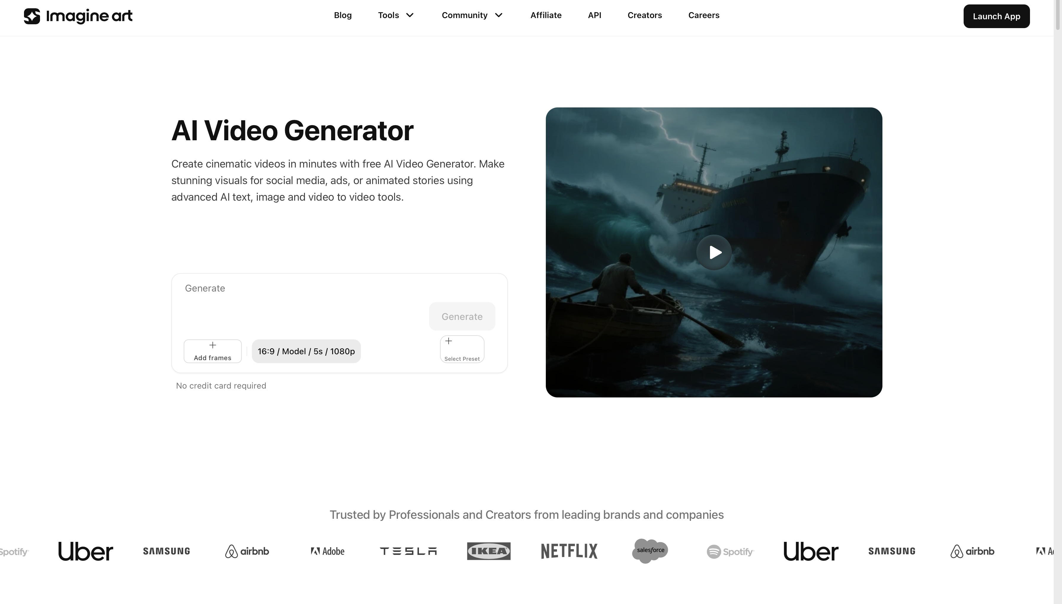
Step 2: Open ImagineArt AI Video Generator
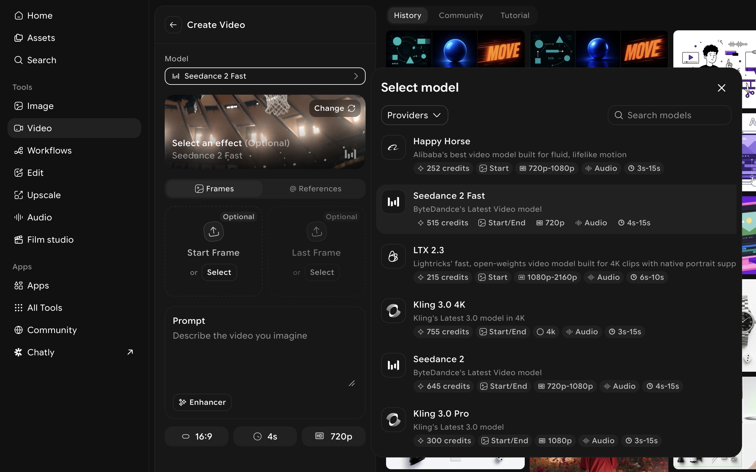
Go to ImagineArt AI Video Generator, select the AI video model, and set the format to match your intended platform — 9:16 for TikTok and Reels, 16:9 for YouTube and desktop, 1:1 for Instagram feed.
Step 3: Write a prompt built around the four qualities
Describe easing, timing character, loop intent, and visual resolution explicitly in your prompt. Generic motion prompts produce generic output. Specific physical descriptions produce specific motion:
Satisfying geometric loop: "Smooth morphing geometric shapes, ease-in-out transitions, seamless loop, soft colour palette shifting gradually from deep navy to teal, minimal composition with generous negative space, satisfying and meditative"
Kinetic typography: "Bold white text arriving one word at a time in rhythm with a slow beat, each word settling softly into place before the next appears, dark background, clean and satisfying motion, 9:16 format"
Brand reveal: "Logo mark emerging from a soft gradient background, slow ease-in build with gentle follow-through settle, warm colour palette, resolves to a clean still frame, premium and considered aesthetic"
Step 4: Use Motion Control for purposeful directed motion
For motion design built around a specific static asset — a product image, a brand mark, an illustration — Motion Control adds directed, controlled motion to it. Upload your asset, apply a motion reference, and generate animated output where the movement is intentional rather than AI-interpreted. For a full guide to animating assets with directed motion, see motion transfer guide.
Step 5: Review against the four qualities
Before moving to editing, review each generated output against the four qualities:
- Does the motion ease? Or does it move at constant speed?
- Does timing feel rhythmically correct?
- If it is a loop — does the last frame connect to the first without a jump?
- Does the composition resolve somewhere, or does it just stop?
If any quality is missing, adjust the relevant prompt language and regenerate. One specific change per iteration produces more useful refinement than rewriting the whole prompt.
Step 6: Assemble and refine in AI Video Editor
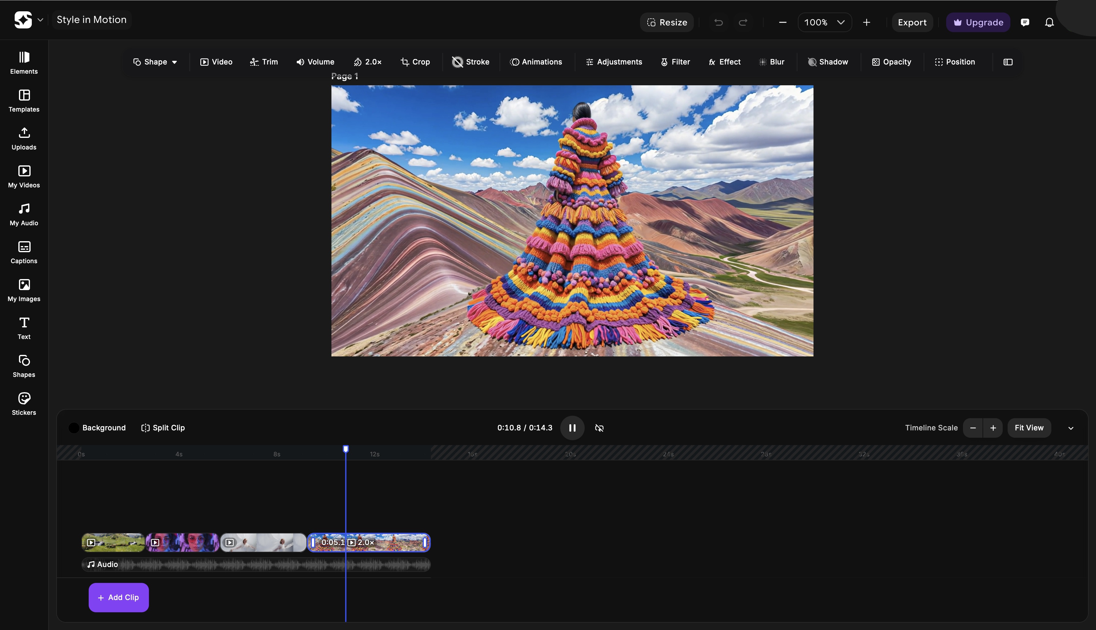
Bring your clips into ImagineArt AI Video Editor to trim, sequence, sync audio, and add any text overlays. This is where the pacing of a multi-clip piece is set — where individual satisfying moments are arranged into a satisfying whole.
Step 7: Export in the correct format
Export at the platform-correct specification. Satisfying motion design displayed at the wrong aspect ratio loses both visual quality and compositional integrity.
For cinematic production techniques that elevate motion design output quality, see how to make cinematic video.
Satisfying Motion Design for Social Media
The platform determines what satisfying means in context. The principles are universal — the application is platform-specific.
TikTok and Instagram Reels
Both platforms autoplay and loop video content automatically. This makes loop integrity more important here than on any other surface — a loop that cuts back visibly will play incorrectly on every repeat.
The first frame is also a hook. Satisfying motion on TikTok does not build slowly — it hooks in the first second. The satisfaction comes from surprise and resolution together: something unexpected happens, and then it resolves cleanly.
Audio sync is measurably more impactful on TikTok and Reels than on any other platform. Motion that lands on a trending audio beat performs at a fundamentally different level from motion that ignores the audio. Build timing around the track, not the other way around.
For platform-specific production guidance, see best AI video generator for TikTok and best AI video generator for Instagram Reels.
YouTube and Long-Form
In long-form video, satisfying motion design lives in the transitions and chapter moments — not as the primary content but as the visual punctuation that gives the piece structure and momentum. A chapter opening with a satisfying motion graphic resets the viewer's attention. A title card with well-timed kinetic typography frames what is coming.
The standard in long-form is restraint: one or two moments of motion design per chapter, executed precisely, rather than continuous motion throughout. The contrast between moving and static content is what makes the motion moments land.
For long-form YouTube production tools and workflow, see best AI video generators for YouTube.
Common Mistakes That Make Motion Design Feel Unsatisfying
-
Linear motion as a default. The most common mistake at every level. Constant velocity from A to B never looks right — nothing physical moves that way. Every animation should have an ease curve. If you are generating with AI, describe the physical quality of the motion explicitly rather than leaving it to default interpretation.
-
Overanimating. When every element moves simultaneously, nothing stands out and everything exhausts. Stagger animations. Let some elements be still. Stillness is not absence of design — it is a design choice that makes moving elements more impactful.
-
No resolution point. Motion that moves without arriving anywhere leaves the viewer unsatisfied. Every motion sequence needs a destination — a frame where everything has settled and the composition is complete. The viewer should feel the piece has concluded, not just stopped.
-
Ignoring audio. Motion without sound consideration misses half the satisfaction equation. Even ambient background sound changes how motion is perceived. Motion that lands on audio events — beats, transitions, spoken words — feels designed. Motion that ignores audio feels accidental.
-
Inconsistent timing logic across elements. When different elements in the same piece follow different timing rules — different ease types, different durations, different rhythmic relationships — the piece feels incoherent even when each individual element looks fine in isolation. Establish a timing system at the start and apply it consistently.
-
Abrupt endings without settle. A motion graphic that cuts off before the last element has come to rest feels unfinished. The tail of a motion — the final 200–400ms where everything settles — is as important as the main motion. Do not cut it.
Ready to Create Motion Design with ImagineArt?
Satisfying motion design is not a function of tool complexity or production budget — it is a function of how precisely the four core qualities are applied. Get the easing right and the motion feels physical. Get the timing right and it feels rhythmic. Build for the loop and it feels resolved. Design toward a visual destination and the viewer feels satisfied.
These principles apply whether you are working in After Effects, Blender, or generating with AI. The tool is the medium. The principles are the craft.
ImagineArt makes those principles accessible without the software learning curve — motion design that eases, times, loops, and resolves, generated from a prompt and refined in minutes.
Frequently Asked Questions
Satisfying motion design has four core qualities: smooth easing that mimics natural physical motion, precise timing that feels rhythmically correct, seamless loop integrity for repeating animations, and visual resolution where the composition arrives somewhere rather than simply stopping. When all four are present, the brain processes the motion as natural and rewarding.
Easing is the variation of motion speed across the duration of an animation — slow start and fast end (ease in), fast start and slow end (ease out), or slow-fast-slow (ease in-out). Easing makes motion feel physical and organic rather than mechanical. Linear motion — constant speed from A to B — almost always looks robotic because nothing in the physical world moves that way.
A seamless loop requires the last frame of the animation to connect directly to the first frame without any visible jump in position, scale, color, or motion state. Morphing loops, rotation loops, and reveal-and-reset loops are the three most reliable loop formats. When prompting AI motion tools, use explicit language: 'seamless loop,' 'continuously cycling,' 'loop-ready.'
Easing, timing, anticipation, follow-through, visual hierarchy across time, and loop integrity. These principles apply regardless of the tool being used — they are perceptual qualities rooted in how the human brain processes motion, not software features.
Kinetic typography is animated text — words, phrases, or sentences that move in sync with audio or an internal visual rhythm. It is the most shared format in motion design because it activates reading and watching simultaneously. Satisfying kinetic typography arrives one element at a time, in precise rhythm with the audio, using bold type weights that remain legible in motion.
Map your animation events to specific moments in the audio before setting durations. Identify the beats, transitions, and key moments in the track and assign an animation arrival or transition to each. Motion that lands exactly on a beat feels designed. Motion that misses by even a few frames feels imprecise. Build timing from the audio outward, not the animation inward.
Tooba Siddiqui
Tooba Siddiqui is a content marketer with a strong focus on AI trends and product innovation. She explores generative AI with a keen eye. At ImagineArt, she develops marketing content that translates cutting-edge innovation into engaging, search-driven narratives for the right audience.