
Tooba Siddiqui
April 8, 2026 • Updated June 5, 2026
13 mins Read
Every design decision — where to place a headline, how much space to leave around an image, which colour to make a button — is either principled or arbitrary. Principles of design are the foundational guidelines that govern how visual elements are arranged to communicate effectively.
These graphic design rules are not constraints — they are frameworks for decision-making that have been developed, tested, and refined through a century of practice and cognitive science. Understanding them is what separates design that works from design that only looks good in the designer's imagination.
What Are Graphic Design Principles?
The rules of graphic design form the framework necessary for arranging visual elements and creating visually appealing compositions. They describe how visual composition works: what creates hierarchy, what communicates relationships, what directs the eye, what signals quality or confusion or trust.
Design principles are distinct from design elements. Elements are the ‘what’: colour, typeface, shape, line, texture, space. These visual guidelines are the 'how'’: how those elements are arranged in relation to each other to produce communication. A design element placed without principle is just an object on a surface. A design element placed with principle is communication.
Where These Visual Design Principles Come From
The formal study of these visual design principles emerged from two converging disciplines in the early 20th century. The Bauhaus school (1919–1933) formalised the principles of visual composition: how line, shape, colour, and space interact. Gestalt psychology (Wertheimer, Köhler, Koffka) described the perceptual principles through which the human visual system organises information — proximity, similarity, continuity, closure, figure-ground.
Together, these traditions established the vocabulary that contemporary graphic design still uses. The names have been refined, the applications have expanded, and digital media has added new contexts. However, the fundamental design principles are the same because human visual perception has not changed.
Why Graphic Design Principles Matter
For Professional Designers
Design principles provide a vocabulary for design decisions. When a composition is not working, a designer with command of principles can diagnose the problem specifically. The hierarchy is unclear because the size contrast between levels is insufficient; the layout feels unstable because the visual weight is concentrated in one corner without counterbalance; the text is hard to read because the leading is too tight. Diagnosis enables targeted correction.
For Marketers and Brand Managers
Most marketing and brand content is made by people without formal design training. Understanding the core principles provides the framework to make or brief good creative work without needing to know how to use design software. It also provides the direction to evaluate work produced by others, explain why a layout is not working, or suggest specific improvements.
For AI Image Generation
AI image generators produce better outputs when prompted with design principle language. 'Make something clean and modern' produces generic outputs. 'Left-aligned hierarchy, bold size contrast between headline and body, generous white space, rule-of-thirds composition' produces directed, purposeful outputs. Knowledge of graphic design principles is the primary determinant of AI image generation quality.
The most reliably powerful skill in AI-assisted design is the ability to translate a visual intention into structured design-principle language. The designer who can brief an AI model the way they would brief a junior designer — with specific structural and compositional direction — gets dramatically better results than the designer who relies on aesthetic descriptions alone.
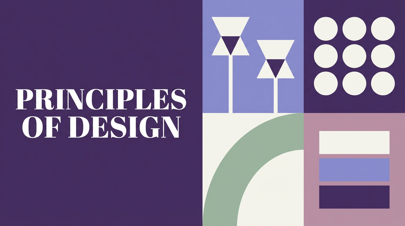
The Core Graphic Design Principles
Here’s a breakdown of the most important principles of design:
Visual Hierarchy
Before any other principle can function, visual hierarchy has to be established. Hierarchy is the principle that controls the order in which a viewer processes information. It answers the question: what should they see first, second, and third?
A large headline reads before a small caption, always. But weight, colour, contrast, and position all contribute too. A small element in high contrast can outrank a large element in low contrast. Placement at the top of a composition typically signals priority, though this can be overridden by strong visual weight elsewhere.
In weak hierarchy, every element is treated as equally important. The viewer has no clear entry point and the composition feels cluttered or confusing. Strong hierarchy guides the eye with intention.
Alignment
Alignment in design is the positioning of visual elements so they share a visual connection — to a grid, a page edge, or each other. It creates order, guides the eye, and communicates professionalism. The four types: left alignment (most readable for text), right alignment (creates tension and elegance), centre alignment (formal and symmetrical, best for short text), and edge/object alignment (elements aligned to each other rather than the page). Misalignment reads as careless even to viewers who cannot articulate why.
When images, headlines, captions, and interface elements are aligned to the same invisible structure, the layout reads as intentional and resolved. When they are not, the composition feels random regardless of how strong the individual elements are.
This is especially relevant when building layouts using an AI workflow where multiple generated assets need to come together into a coherent composition.
Read full article: Alignment in Graphic Design
 Left-aligned magazine design layout
Contrast
The contrast principle of design is responsible for almost everything that catches your eye. Contrast is the juxtaposition of opposing visual elements to create emphasis, hierarchy, and visual interest. It operates through colour (light/dark, warm/cool), size (large/small), weight (bold/light), shape (geometric/organic), texture (smooth/rough), and space (dense/open). Contrast is also a functional accessibility requirement: the WCAG standard requires minimum 4.5:1 contrast ratios for normal text.
Without contrast, a composition is flat. Everything competes on the same visual level and nothing wins. Contrast is what creates focal points, establishes hierarchy, and gives a layout its energy.
 Minimalist product shot showcasing the contrast design principle through strong light and shadow.
Read full article: Contrast in Graphic Design
Balance
Balance principle of design governs the distribution of visual weight across a composition so it feels stable and complete. The three types: symmetrical balance (mirror-image, formal and traditional), asymmetrical balance (different elements of equivalent visual weight — the dominant mode in contemporary design), and radial balance (elements arranged around a central point). Visual weight is determined by size, value, colour saturation, complexity, isolation, and position.
 An editorial portrait demonstrating the balance principle of design through asymmetrical composition
Read full article: Balance Principle of Design
Proximity
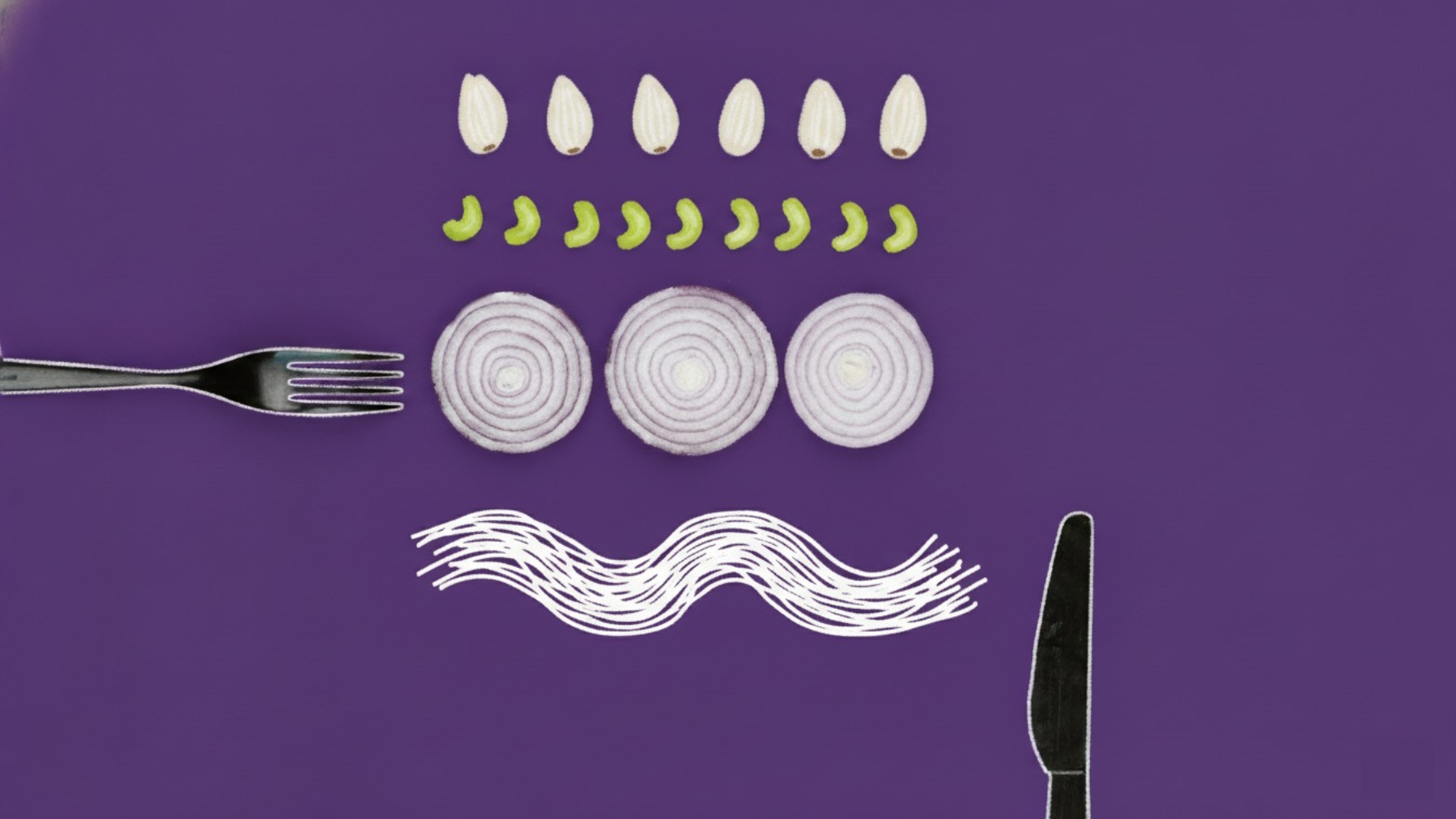
Proximity in design uses physical closeness to communicate relationships: elements near each other are perceived as related, elements apart are perceived as separate. It is the fastest and most fundamental grouping mechanism in visual design. The rule: more space between unrelated elements than between related ones.
Proximity reduces cognitive load by communicating relationships before the viewer reads any content. This matters enormously in interface design, editorial layout, and information design. When related information is grouped, the viewer does not have to work to identify the relationships. The layout communicates structure without requiring the viewer to read every word.
 Recipe app UI card showcasing proximity principles of design
Read full article: Proximity in Graphic Design
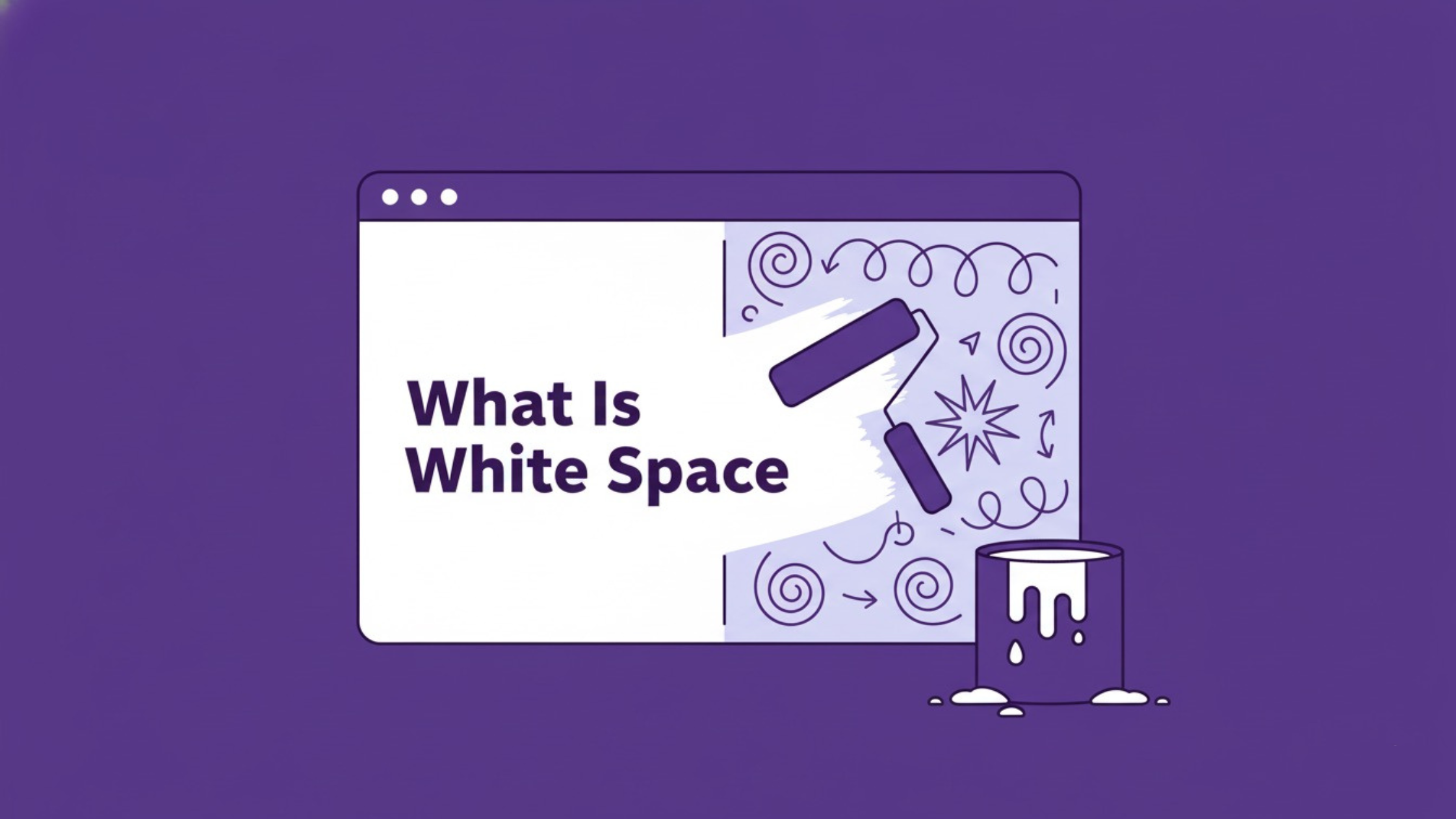
White Space
White space — also called negative space — is the empty area between and around design elements. It is not absence of design; it is an active design element. White space in design improves readability, directs attention through isolation, reduces cognitive load, and creates the visual rhythm that makes complex layouts navigable. The instinct to fill every space is the most consistent obstacle to good design.
Compositions with generous white space feel premium, calm, and confident. This is why luxury brands consistently use more white space than mass-market brands. The space itself is communicating brand positioning.
When prompting for product photography, packaging design, or editorial layouts using an AI image editor, instructing the model to leave significant empty space around the subject consistently produces more polished, professional results than filling the frame.
 Product shot featuring intentional white space, demonstrating the design principle of negative space
Read full article: White Space in Design
Repetition and Consistency
Repetition of visual elements — colours, typefaces, spacing intervals, graphic motifs — creates unity and brand recognition. Repetition is how a one-page design becomes a consistent two-page spread, how a logo becomes a brand identity system, how a website becomes a coherent product rather than a collection of pages. Consistency is the systematic application of repetition: the same decisions, made the same way, across every touchpoint.
This is the principle most directly connected to brand design. A brand is largely a system of repetitions. The same typeface, the same colour palette, the same compositional style applied consistently across all touchpoints until the combination becomes recognisable without a logo.
For teams producing high volumes of visual content, an AI video generator or an AI video editor can maintain repetition across formats by applying consistent style parameters, prompts, and visual treatments at scale. The challenge shifts from execution to establishing the right design system parameters before generation begins.
Gestalt Principles
The Gestalt principles describe how the human visual system organises individual elements into meaningful wholes. They explain why some compositions feel intuitive and others confusing, why some logos are instantly readable and others ambiguous. They are the perceptual science underlying visual design. These principles of design include proximity, similarity, continuity, closure, figure-ground, prägnanz, symmetry, connectedness, common region, focal point, and common fate.
Read full article: Gestalt Design Principles
The Rule of Thirds
The rule of thirds divides a composition into a 3×3 grid using two horizontal and two vertical lines. Placing key elements at the four intersection points produces dynamic, engaging compositions because off-centre placement creates visual tension that keeps the eye moving through the frame. It is the foundational compositional principle in photography, cinematography, and layout design — not a rule to always follow, but a reliable default to understand before departing from it.
Read full article: Rule of Thirds in Design
The Golden Ratio
The golden ratio (approximately 1:1.618, denoted φ) describes a proportional relationship that appears throughout nature and has been used in design and architecture for centuries. Its practical design applications include logo proportioning (sizing elements in φ ratios to each other), typographic scale (multiplying successive type sizes by 1.618), and layout division (the 62/38 golden ratio split for primary/secondary areas). The Fibonacci sequence — whose ratios converge on φ — produces the golden spiral, a compositional framework for placing focal points.
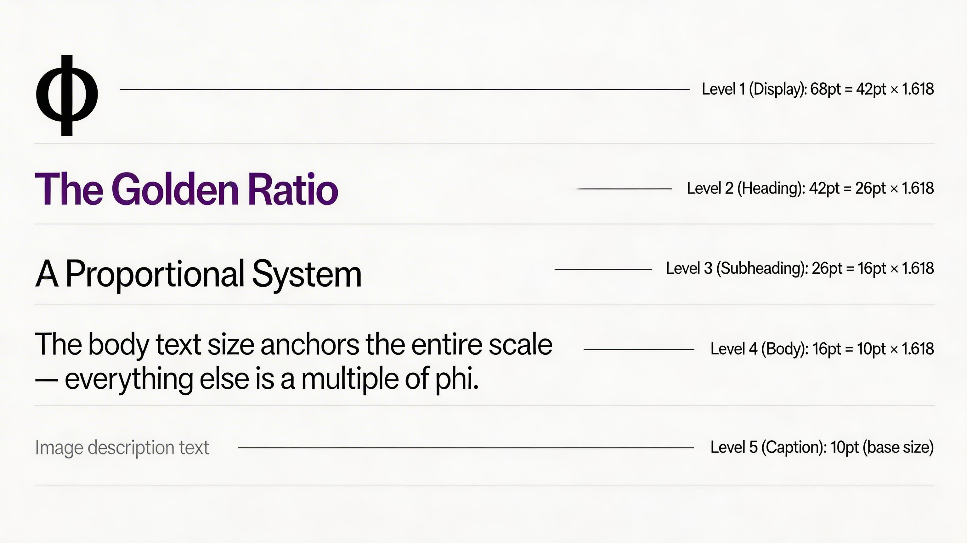 Sample typographic scale for the golden ratio
Read full article: The Golden Ratio in Design
Grid Systems
Grid systems are the most concrete expression of layout design principles in professional work — they give every element a structural address on the page so nothing feels arbitrarily placed. The 12-column grid (used in most web and print design) provides maximum compositional flexibility within a consistent structure. Baseline grids create consistent vertical rhythm in typographic layouts. Modular grids support complex multi-content-type layouts. Grids ensure that elements aligned to the same framework are aligned to each other by extension — creating order without individual alignment decisions.
For a full guide to grid construction, column systems, and layout design principles across print and digital formats, see our layout design principles guide.
Typography as a Design Principle
Typography is simultaneously a design element (typefaces, letterforms, type size) and a design principle (how type is set to communicate hierarchy, voice, and legibility). The core typographic design principles: sufficient size contrast between hierarchy levels (minimum 1.5× between adjacent levels), adequate leading (minimum 1.4× the font size), appropriate letter-spacing (different for headlines vs body text), and font pairing that creates clear role differentiation through structural contrast (serif headline vs sans-serif body, for example).
Colour Theory as a Design Principle
Colour is both an element (specific hues, saturations, values) and a principle (how colour relationships are organised to serve communication). The core colour design principles: colour contrast (sufficient value contrast for legibility and hierarchy), colour harmony (analogous, complementary, and triadic schemes that feel visually cohesive), and colour psychology (the associations different hues carry across cultures and contexts). Colour is the fastest design signal — it communicates before any other element is processed.
How Graphic Design Principles Work Together
No principle operates in isolation. Every successful design demonstrates several simultaneously. A well-designed call-to-action button applies: contrast (colour and size contrast from surrounding elements), proximity (close to the content that justifies clicking it), isolation/white space (clear space around it that emphasises its importance), focal point from the Gestalt principles (it is the most visually distinct element in its area), and hierarchy (it is at the correct level of visual priority for its role).
A worked example of a product landing page:
- Visual hierarchy establishes the reading order: hero image → headline → benefit description → CTA → features → social proof → secondary CTA.
- Alignment creates structural order (left-aligned text throughout, elements aligned to a 12-column grid).
- Contrast differentiates the primary CTA from all other elements through colour and isolation.
- Proximity groups the headline and sub-headline tightly, the feature items with their icons tightly, the social proof testimonials in a defined region.
- White space gives the primary CTA clear space around it, gives the hero section breathing room, creates clear section breaks between content zones. For how white space and restraint combine into a full design philosophy, see how to design with minimalism.
- Balance distributes visual weight between the hero imagery and the text content below.
- Gestalt's common region groups each feature card within its card boundary. Gestalt's focal point makes the primary CTA — the most visually distinct element — the first point of attention after the hero.
Every element, every space, every contrast decision is serving the hierarchy. The hierarchy is serving the communication goal. This is what principled design looks like.
Using Visual Design Principles in AI Image Generation
Understanding principles of graphic design transforms AI graphic generation from unpredictable to reliable. The difference between vague prompting ('make something modern and clean') and principled prompting ('left-aligned hierarchy, bold size contrast between headline and body, generous white space, rule-of-thirds composition, high value contrast') is the difference between generic outputs and directed, purposeful design work.
Model Recommendations by Principle
- Ideogram v3: typography, alignment, layout structure, logo work, any prompt where text accuracy within the image is important.
- Nano Banana Pro: photorealistic composition, colour theory in product photography, visual hierarchy through lighting and focal point.
- Seedream: artistic composition, painterly balance, editorial aesthetic.
- Flux 2: design style movements, illustration, colour theory in artistic contexts.
A Principled Prompt Example
Basic prompt · Model: Nano Banana Pro
"Minimal brand identity overview. Show logo (wordmark with geometric mark), three brand colours as swatches with hex codes, and one application example (a business card). All elements aligned to a clean grid. Consistent visual hierarchy throughout. White background."
 Generated by ImagineArt AI Image Generator
Advanced prompt · Model: Nano Banana Pro
"Product campaign hero image applying multiple graphic design principles. Rule of thirds composition: main product at the lower-left thirds intersection, generous negative space upper-right (white space principle). Visual hierarchy through lighting: the product is the brightest element in the frame, commanding primary attention (focal point principle). Colour contrast: warm product against a cool neutral background (contrast principle). Balance: the product mass balanced by a small botanical element at the upper-right thirds point (asymmetric balance principle). The composition demonstrates: hierarchy, contrast, balance, white space, and rule-of-thirds simultaneously. Soft natural side lighting. Premium lifestyle aesthetic."
Recommended read: AI Tools for Designers
Ready to Create Stunning Graphic Design with ImagineArt?
You do not need to be a trained designer to apply graphic design principles. You need to understand what they are, why they work, and how to direct creative work — manual or AI-assisted — using principle-based language.
For enterprise teams using AI-generated brand content at scale: the principle that determines output quality is the quality of the brief. Principle-based prompting — specifying alignment, hierarchy, contrast, balance, white space, and compositional framework — produces dramatically more usable outputs than aesthetic description alone.
Recommended read: Graphic Design Tips for Non-Designers & Beginners
Frequently Asked Questions
While different design traditions define these differently, the most widely referenced seven are: visual hierarchy, alignment, contrast, balance, proximity, white space (negative space), and repetition/consistency. These form the core compositional toolkit for professional graphic design across all media.
Visual hierarchy, because it determines whether the design communicates its intended message in the intended order. Without clear hierarchy, all other principles serve a composition that has no communication priority. Every other principle ultimately serves the hierarchy.
Design elements are the components of a design — colour, typography, shape, line, texture, space. Design principles are the guidelines for how those elements are arranged — alignment, contrast, balance, proximity, hierarchy, white space. Elements are the what; principles are the how.
AI image generators respond to design principle language with significantly more reliability and precision than aesthetic descriptions. Specifying alignment (left-aligned), contrast (bold size contrast between headline and body), composition (rule-of-thirds), and space (generous white space, isolated subject) produces directed, purposeful outputs. Design principles are the vocabulary through which creative direction is translated into AI prompt language.
Yes — the principles of hierarchy, contrast, balance, composition, and visual rhythm all apply to video and motion design, with the additional dimension of time. Visual hierarchy in video is established through movement (the moving element commands attention), timing (what appears when determines reading order), and the compositional principles of each frame.
Tooba Siddiqui
Tooba Siddiqui is a content marketer with a strong focus on AI trends and product innovation. She explores generative AI with a keen eye. At ImagineArt, she develops marketing content that translates cutting-edge innovation into engaging, search-driven narratives for the right audience.