
Tooba Siddiqui
April 3, 2026 • Updated April 8, 2026
8 mins Read
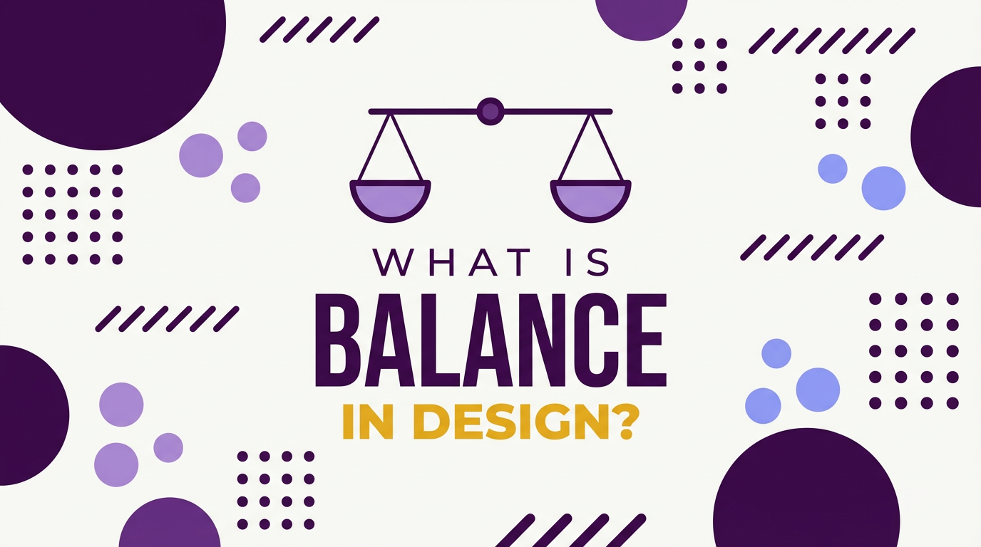
Balance is what makes a design feel settled. An unbalanced layout creates subconscious unease, something feels wrong even if the viewer cannot articulate why.
Unlike alignment in design, which is structural, balance is perceptual. It is about how heavy different elements feel to the eye — a quality called visual weight. A large pale shape and a small dark shape can balance each other because their visual weights are equivalent, even though their sizes are not. Understanding visual weight is the key to understanding balance in graphic design.
What is Balance Principle of Design?
Visual Weight — The Foundation of Balance
Visual weight is the perceived heaviness of a design element, determining how much attention it demands from the eye. Larger elements feel heavier. Darker elements feel heavier. More complex or detailed elements feel heavier. Isolated elements feel heavier than elements surrounded by similar elements. An element at the centre of a composition feels lighter than the same element positioned near an edge.
Balance principle of design doesn’t have rigid rules. They are tendencies that designers use to predict how a composition will feel before they test it. The practical test for visual weight is simple: stand back from a composition, squint until it blurs, and observe where your eye is drawn. The areas your eye gravitates to are the heaviest.
Read full article: Principles of Design
Why Balance Matters
Balance in graphic design creates a sense of visual completion. A balanced layout invites the viewer to rest their eye on the content rather than being pushed toward the heavy side. Imbalance, used deliberately, creates tension and energy that can be a powerful design tool. Imbalance used accidentally is just a mistake.
Also read: Graphic Design Tips for Beginners & Non-Designers
Types of Balance in Graphic Design
There balance principle of design is further divided into three major types:
Symmetrical Balance in Graphic Design
Symmetrical balance places elements in mirror-image positions on either side of a central axis. Both halves of the composition carry equal visual weight because they are equal. The result feels formal, stable, and authoritative. It communicates permanence, tradition, and reliability.
Symmetrical balance is used in institutional identity (universities, government bodies, financial institutions), formal print design (invitations, certificates, formal publications), and many logo mark designs. The Adidas trefoil and the Target target are symmetrically balanced marks.
The risk of symmetrical balance is that it can feel static or predictable. When used in the right context, that predictability is exactly the right signal.
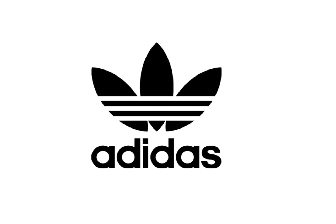 Adidas's logo is a fine example of symmetrical balance in design
Asymmetrical Balance in Graphic Design
Asymmetrical balance distributes different elements of equivalent visual weight across a composition. One large pale element balanced by one small dark element. A dense block of text balanced by a large expanse of white space. A complex illustration balanced by a simple bold headline.
Asymmetrical balance is the dominant compositional mode in contemporary graphic design. Editorial layouts, digital product design, brand campaigns, and most modern packaging use asymmetric balance. It allows for visual interest and hierarchy while maintaining compositional stability.
The challenge of asymmetric balance is that it requires active judgment about visual weight. You cannot mechanically place elements as you can with symmetry. It develops with practice and is significantly accelerated by studying strong examples.
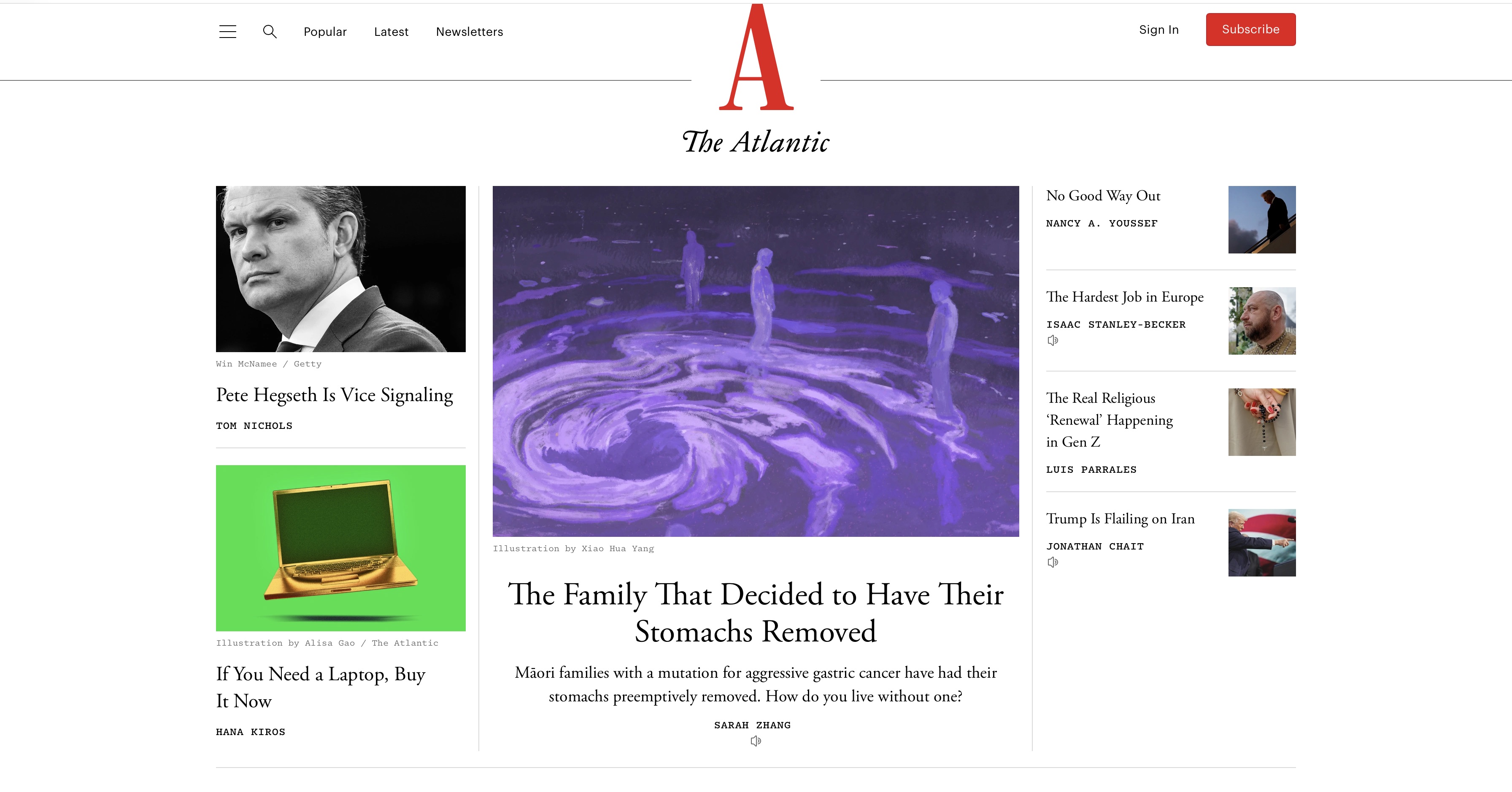 The Atlantic’s editorial layout showing compositional stability through asymmetric balance
Radial Balance in Graphic Design
Radial balance arranges elements around a central point. It creates a sense of completeness and cyclical continuity. Radial balance is common in logo design (badge and emblem formats), mandala-inspired illustration, and product design where a central focal point needs to radiate authority outward.
![]() Starbucks logo illustrating radial balance, with the central mermaid figure
Starbucks logo illustrating radial balance, with the central mermaid figure
Symmetrical balance communicates stability, authority, and tradition. Asymmetrical balance communicates dynamism, modernity, and confidence. The choice between them is not purely aesthetic — it is a brand communication decision.
Balance vs Symmetry — The Critical Distinction
Balance and symmetry are not the same thing, and conflating them is one of the most common errors in design thinking. Symmetry is a structural condition: both halves of the composition are mirror images of each other. Balance is a perceptual condition: the visual weight of the composition feels distributed without tipping to one side.
An asymmetric composition can be perfectly balanced. An asymmetric editorial spread with a large image on the left balanced by a dense column of text on the right is balanced. Even though it is not symmetrical, but the visual weights are equivalent. Symmetry is one way to achieve balance. It is not the only way, and for contemporary design, it is frequently not the best way.
How Visual Weight Works in Practice
The variables that affect visual weight are:
Size: larger elements feel heavier. A 200px element weighs more than a 50px element in the same composition.
Value (darkness): darker elements feel heavier than lighter elements. Black weighs more than grey, which weighs more than white.
Colour: saturated colours feel heavier than desaturated ones. Warm colours (red, orange) generally feel heavier than cool colours (blue, green) at equivalent saturation.
Complexity and texture: detailed elements feel heavier than simple ones. A photograph weighs more than a flat colour block of the same size.
Isolation: a single element surrounded by empty space has more visual weight than the same element surrounded by similar elements.
Position: elements near the edges of a composition tend to feel lighter than elements near the centre (which acts as a gravitational anchor).
The Squint Test
The most reliable practical technique for assessing balance is the squint test: step back from the composition, partially close your eyes until the design blurs, and observe where your eye is drawn. The area that draws your eye is the heaviest. If it is where the most important content is, the balance is serving the hierarchy. If it is pulling attention away from the most important content, the balance needs adjustment.
Balance in Different Design Contexts
Here are a few examples of balance in graphic design:
Balance in Logo Design
Logo marks must be optically balanced, not just mathematically balanced. Typefaces with geometric construction can appear optically heavier on one side even when their mathematical measurements are equal. Logo designers adjust individual letterforms, spacing, and element sizing to achieve optical balance. Or you can use AI logo generators and apply these optical corrections automatically, making it particularly useful for generating balanced logo marks and emblem formats.
Also read: Top AI Logo Makers
Balance in Web and UI Layout
Web layouts use asymmetric balance constantly: a sidebar balanced against a wider content area; a large hero image balanced by stacked content blocks below; a navigation bar balanced by a CTA button on the opposite side. The 12-column grid system makes asymmetric balance systematic — layouts in 4/8, 5/7, or 3/9 column splits are all asymmetric by definition and achieve balance through content weight rather than structural symmetry.
Balance in Poster and Print Design
Print posters frequently use asymmetric balance to create energy and movement. A large photographic element occupying 60% of the poster balanced against typographic information occupying 40% is asymmetric in structure but balanced in visual weight. The photographic element is large but relatively simple in tone; the typographic element is small but dense with information. The weights offset.
Pro tip: Use the AI Graphic Generator to produce print-ready poster compositions with asymmetric balance built into the generation, rather than corrected in post.
Also read: Best AI Tools for Poster Design
How to Prompt Balance in AI-Generated Design
Balance can be directed through compositional language in prompts while using AI image generators. The key is to specify both the structural arrangement (where elements are placed) and the visual weight distribution (what those elements look like in terms of size, value, and complexity).
Prompt Language for Balance
- 'Symmetrically balanced composition with equal visual weight on both sides'
- 'Asymmetric layout: large image left balanced by dense text right'
- 'Radial composition: elements arranged around a central focal point'
- 'Visual balance through contrast: small dark element offsetting large pale element'
- 'Dynamic asymmetric balance: off-centre subject with generous white space counterweight'
Best models: Ideogram v3 for structured symmetrical layouts; Nano Banana Pro or Seedream for photographic asymmetric compositions; Flux 2 for dynamic asymmetric editorial design.
Basic prompt · Model: Nano Banana Pro
"Symmetrically balanced brand identity poster. Logo centred on a white background. Identical information blocks mirrored on left and right below the logo. Equal visual weight on both sides. Formal and authoritative."
![]() Generated by ImagineArt AI Image Generator
Generated by ImagineArt AI Image Generator
Advanced prompt · Model: Nano Banana Pro
"Asymmetrically balanced magazine cover. Left two-thirds: full-bleed close-up editorial portrait, dark and complex. Right one-third: pure white space with minimal typography — magazine title at top, cover lines in an ultra-light sans-serif stacked vertically. The visual weight of the dense, dark portrait on the left is counterbalanced by the authoritative typographic content in the white space on the right. The composition is unequal in structure but visually balanced. Portrait format."
Recommended read: Best AI Tools for Designers
Ready to Design Stunning Graphics with ImagineArt?
The designer who understands visual weight can look at any composition, identify where the tension is, and make a specific change that resolves it. That skill is what separates layouts that feel professionally resolved from those that almost work.
Test symmetrical, asymmetrical, and radial arrangements against the same brief and compare what each communicates. With tools like ImagineArt Workflows brand can design campaigns and editorial content with compositional logic and visual weight decisions carry through every asset automatically.
Balance is learnable. The fastest way to accelerate that learning is to generate, evaluate, and adjust — deliberately and repeatedly.
Frequently Asked Questions
Symmetrical balance (both halves mirror each other), asymmetrical balance (different elements of equivalent visual weight), and radial balance (elements arranged around a central point).
Symmetry is a structural condition, both sides are mirror images. Balance is a perceptual condition in which the visual weight feels evenly distributed. An asymmetric composition can be perfectly balanced. Symmetry is one way to achieve balance, but not the only way.
The balance principle of design creates a sense of visual stability and completion. An unbalanced design creates subconscious unease that detracts from communication. Well-executed asymmetric balance creates visual energy and hierarchy while maintaining that sense of stability.
Visual weight is how heavy or attention-demanding an element feels to the eye. It is affected by size (larger = heavier), value (darker = heavier), colour saturation, complexity, isolation, and position in the composition.
Tooba Siddiqui
Tooba Siddiqui is a content marketer with a strong focus on AI trends and product innovation. She explores generative AI with a keen eye. At ImagineArt, she develops marketing content that translates cutting-edge innovation into engaging, search-driven narratives for the right audience.