
Tooba Siddiqui
April 3, 2026 • Updated April 9, 2026
8 mins Read
Nothing draws the eye like difference. Contrast principle of design creates visual tension, establishes hierarchy, and directs attention. Without contrast, everything in a composition competes equally — and when everything competes, nothing wins. The viewer's eye has nowhere to go. The message is lost.
Contrast in design can be achieved through colour, size, weight, shape, texture, space, or direction. It is simultaneously the simplest principle of design to understand and one of the most powerful to master.
What Is Contrast Principle of Design?
Contrast in graphic design is a difference made deliberate. Two elements in contrast are perceptibly different in at least one visual quality: one is large and one is small, one is dark and one is light, one is bold and one is thin. That difference creates a meangingful relationship. The larger element is more important; the darker element is more serious; the bolder element demands attention first.
Read full article: Principles of Design
Why Contrast in Design Matters
Contrast principle of design helps designers create visual hierarchy. It produces an ordered sequence in which a viewer perceives the elements of a composition. Without contrast in design, there is no hierarchy. A page where everything is the same size, weight, and colour has no visual priority.
Contrast is also a functional requirement, not just an aesthetic one. The WCAG 2.1 accessibility standard requires a minimum 4.5:1 contrast ratio between body text and its background for normal vision, and 7:1 for small text. Low contrast fails users with visual impairments — and it fails everyone in low-light or bright conditions.*
Types of Contrast in Graphic Design
The contrast principle of design can be further divided into six main types:
1. Colour Contrast
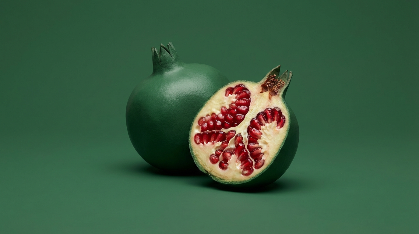
Colour contrast is the most immediately impactful contrast type. It operates on two axes: light/dark (value contrast) and warm/cool (temperature contrast). Complementary colours create the strongest chromatic contrast. Black on white provides maximum value contrast.
Colour contrast is both aesthetic and functional. High-value contrast improves legibility across all content types. Low-value contrast (grey text on white, for example) reduces readability and fails accessibility standards. When choosing a colour palette for any design, test the contrast ratios before committing.
![]() In Cocla Cola logo, the red script set against white background creates high visual impact
In Cocla Cola logo, the red script set against white background creates high visual impact
2. Size Contrast
Size contrast is the foundation of typographic hierarchy. A headline that is significantly larger than the body text creates an immediate reading priority as the eye goes to the largest element first. Size contrast also applies to imagery: a large image on a page dominates a small one even if both are equally well-composed.
The effective size contrast ratio for typographic hierarchy is typically a minimum of 1.5:1 between hierarchy levels. A 16px body text paired with an 18px headline produces negligible contrast. A 16px body paired with a 32px headline produces clear, unambiguous hierarchy.
3. Weight Contrast
Weight contrast is the typographic designer's primary tool. A bold headline against light body text creates hierarchy without requiring a size difference. Weight contrast is particularly effective in minimal layouts where size variation would be too dramatic. A single typeface family at multiple weights can create a complete visual hierarchy through weight alone.
4. Shape Contrast
Geometric against organic. Angular against curved. Rectangular against circular. Shape contrast in design creates visual tension and personality. A single circular element in a grid of rectangles draws the eye immediately. Shape contrast communicates character: geometric shapes feel structured and rational; organic shapes feel natural and expressive.
5. Texture Contrast
Smooth against rough. Flat against detailed. Matte against glossy. Texture contrast is used heavily in packaging design, editorial photography, and mixed-media illustration. A smooth typography treatment on a rough handmade paper background creates contrast that communicates craftsmanship and authenticity. Digital texture contrast, like a flat icon against a detailed photographic background, creates visual hierarchy through complexity difference.
6. Space Contrast
Dense against open. Active against restful. Space contrast connects directly to the principle of white space: areas of visual density contrasted with areas of visual emptiness create rhythm, direct the eye, and give the viewer's attention somewhere to rest before returning to the content. A composition without space contrast is visually exhausting.
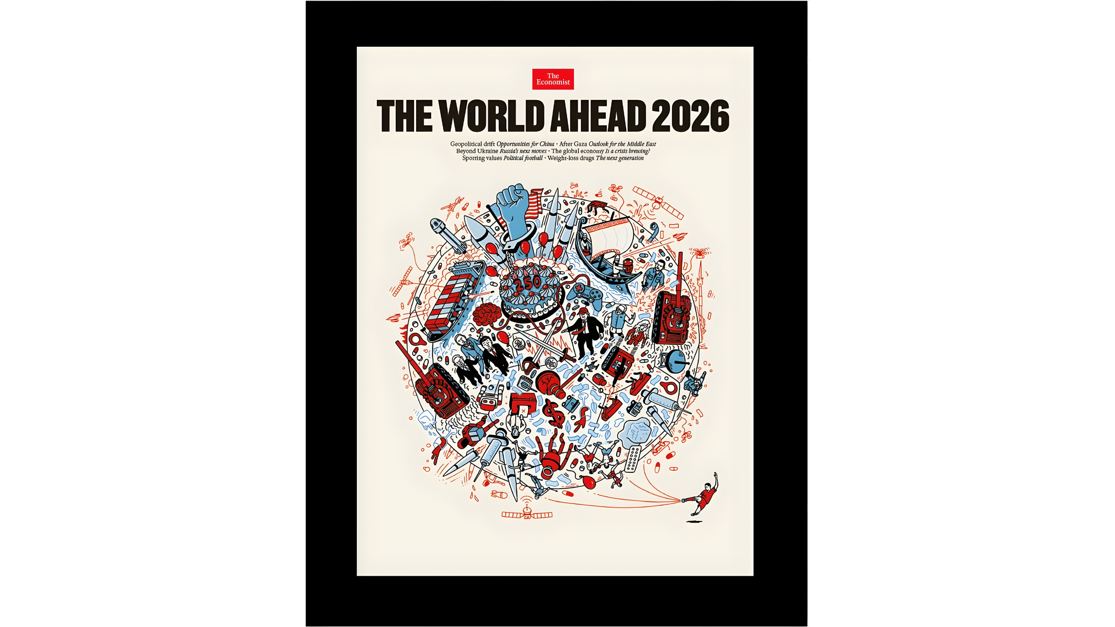 The Economist magazine cover demonstrates space contrast with bold central visual surrounded by negative space and minimal text
Also read: Graphic Design Tips for Beginners & Non-Designers
Contrast in Graphic Design and Typography
A typographic system typically uses three or four levels of contrast to create hierarchy: headline (largest, heaviest, or most distinctive), subheading (medium scale, medium weight), body text (smallest, lightest reading weight), and supporting text like captions, labels, footnotes (smallest, often in a lighter colour).
The most common mistake in typographic hierarchy is insufficient contrast between levels. When the headline is only slightly larger than the subheading, and the subheading only slightly larger than the body text, the hierarchy becomes ambiguous. Each level must be perceptibly different from the one below it.
Serif vs Sans-Serif as a Contrast Strategy
Pairing a serif typeface with a sans-serif typeface creates contrast through structural difference. The serif's finishing strokes against the sans-serif's geometric clarity creates visual interest and clear role differentiation, typically headline in one, body in the other. This is one of the most reliable font pairing strategies precisely because the structural contrast is always readable.
WCAG Colour Contrast Standards
The Web Content Accessibility Guidelines (WCAG) define minimum colour contrast ratios for text on digital surfaces. WCAG 2.1 Level AA requires 4.5:1 for normal text (under 18pt or 14pt bold) and 3:1 for large text. Level AAA requires 7:1 for normal text. These are not design preferences but legal requirements for publicly accessible digital content in many jurisdictions.
Tools for checking contrast ratios: WebAIM Contrast Checker, Figma's accessibility plugins, ImagineArt AI image editor for post-generation adjustments. Always check before publishing.
Why High Contrast Is Inclusive Design
High contrast design does not just serve users with visual impairments. It serves everyone reading on a bright outdoor screen, everyone reading in a low-light environment, everyone reading quickly, and everyone reading from a distance. High contrast is good design for all audiences since accessibility and aesthetics are not in conflict.
Contrast Principle of Design in Real-World Contexts
Poster Design
Posters live or die on contrast. A poster at street level has approximately 1–2 seconds to communicate before a pedestrian passes. Maximum contrast — large headline against high-contrast background, simplified colour palette, clear figure-ground relationship — is not optional. The poster that sacrifices contrast for aesthetic delicacy fails its function. Apply the constrast in design with AI Poster Maker and generate poster compositions with strong figure-ground relationships, bold typographic weight contrast, and high-value colour pairings.
Also read: Best AI Tools for Poster Design
Logo Design
Effective logos work in a single colour because their visual power comes from shape contrast, not colour. A logo that loses its identity in monochrome has insufficient shape contrast to survive the reduction. Test every logo design in black and white before approving the colour version. With AI logo generator, you can apply shape and value contrast by default in logo and mark generation, making it a reliable starting point for contrast testing across monochrome and colour versions.
Also read: Top AI Logo Makers
Social Media
Social media feeds are high-density visual environments. A post that lacks sufficient contrast with the surrounding content — in colour, size, or visual weight — disappears. The highest-performing social media graphics consistently use strong value contrast (dark on light or light on dark) and minimal colour palettes. Try AI Graphic Generator to produce social media graphics with strong built-in value contrast, optimised for feed visibility across both light and dark backgrounds.
How to Prompt Contrast in AI-Generated Design
Contrast must be specified in prompts when using AI image generator. Models do not automatically produce high-contrast work unless directed to. The default tendency is toward balanced, moderate compositions, which is the opposite of what contrast requires.
Prompt Language for Contrast
- 'High contrast black and white'
- 'Bold typographic contrast: oversized headline against minimal body text'
- 'Complementary colour palette: deep navy against vivid coral'
- 'Maximum value contrast: light subject against dark background'
- 'Strong tonal contrast: dark foreground, bright background'
- 'Size contrast: large dominant image, small secondary element'
Best models: Nano Banana Pro or Seedream for photographic/colour contrast. Ideogram v3 for typographic contrast and layouts.
Basic prompt · Model: Nano Banana Pro
"High contrast product photography. Single product centred on a pure black background. Strong directional side lighting creating dramatic shadow. Product surface materials clearly visible. No other elements. Maximum tonal contrast between product highlights and black background."
Advanced prompt · Model: Ideogram v3
"A bold typographic poster for a contemporary art exhibition. Maximum contrast throughout. Background: near-black charcoal. Headline: exhibition name in an ultra-heavy grotesque typeface, reversed white, filling 60% of the poster height. Supporting details — artist name, dates, venue — in a ultra-light weight of the same typeface family in a pale grey. A single horizontal rule in vivid electric blue separates the headline from the supporting text. The contrast is absolute: maximum weight versus minimum weight, maximum and minimum value, with a single chromatic accent. No images. No gradients. A3 portrait format."
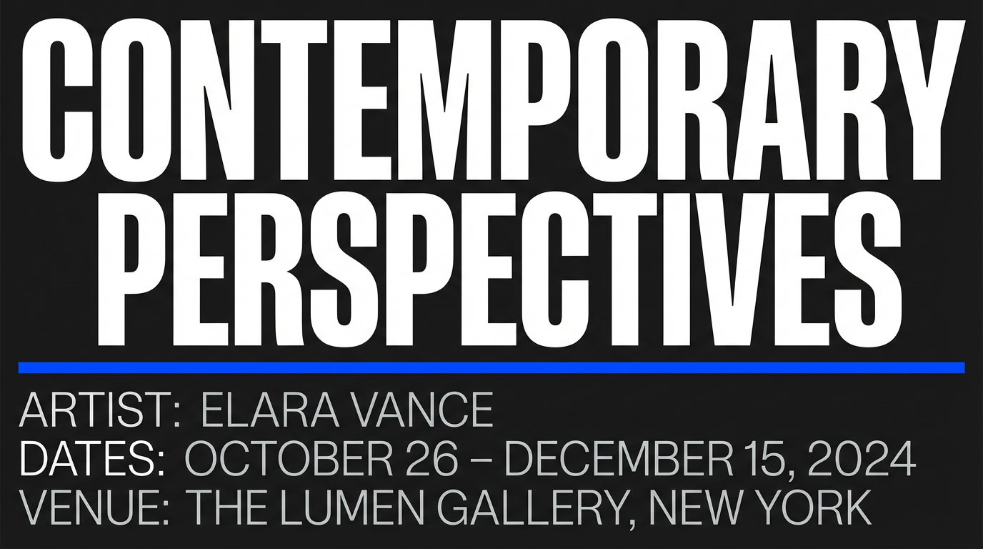 Generated by ImagineArt AI Image Generator
Also read: Best AI Tools for Designers
Ready to Design Stunning Graphics with ImagineArt?
Every hierarchy decision, every legibility choice, every moment where a viewer's eye goes exactly where you intended it to go: contrast made that happen. The designer who understands contrast does not rely on instinct to create emphasis. They make specific, deliberate choices, and the composition responds.
Contrast is learnable, testable, and immediately visible in the output. Tools like ImagineArt Workflows helps you try out different contrast logic, apply it consistently, adjust until the hierarchy is unambiguous.
Tooba Siddiqui
Tooba Siddiqui is a content marketer with a strong focus on AI trends and product innovation. She explores generative AI with a keen eye. At ImagineArt, she develops marketing content that translates cutting-edge innovation into engaging, search-driven narratives for the right audience.