
Tooba Siddiqui
April 3, 2026 • Updated April 8, 2026
13 mins Read
Every non-designer's instinct is to fill the gap. More messages, more features, more content, because empty space feels like wasted space. That instinct is wrong.
White space is not absence. It is design.
- Apple built a trillion-dollar brand on it.
- Muji made it a philosophy.
- Aesop made it a packaging strategy.
The same empty space that signals luxury in one context signals incompleteness in another.
This difference separates design that communicates from design that just occupies space.
This guide covers everything: what white space is, why it works, what it means, and how to apply it using AI.
What is White Space in Design?
Also known as negative space, white space in design is any area that contains no visual element: no text, no image, no shape, no rule. White space is not nothing. It is a design element that shapes the perception of every element around it. Change the white space in a composition and you change the composition.
Read full article: Principles of Design
Types of White Space
Macro vs Micro White Space
Macro white space in graphic design is the large-scale empty area. The margins around the page, the space between major layout sections, or the open area in a photograph above a single subject. It is the breathing room of the overall composition.
Micro white space is the small-scale space between individual elements. The letter-spacing between characters, line-height between lines of text, the padding inside a button, or the gap between a label and its form field. Micro white space is typography's domain, but it exists in every component of a design.
Both matter equally. A layout with generous macro white space but insufficient micro white space, such as tight leading, cramped letter-spacing, feels inconsistent and creates reading difficulties even as the overall page breathes.
Active vs Passive White Space
Passive white space in design is background space that gives the eye rest. The unused area around a centred composition or the margins of a page. It exists primarily to prevent density.
Active white space is deliberately shaped to create meaning. The FedEx logo uses active white space: the negative space between the E and the X creates an arrow that communicates speed and direction. The WWF panda logo uses active white space: the white areas between the black marks complete the panda's face through closure. Active white space does design work beyond simply existing.
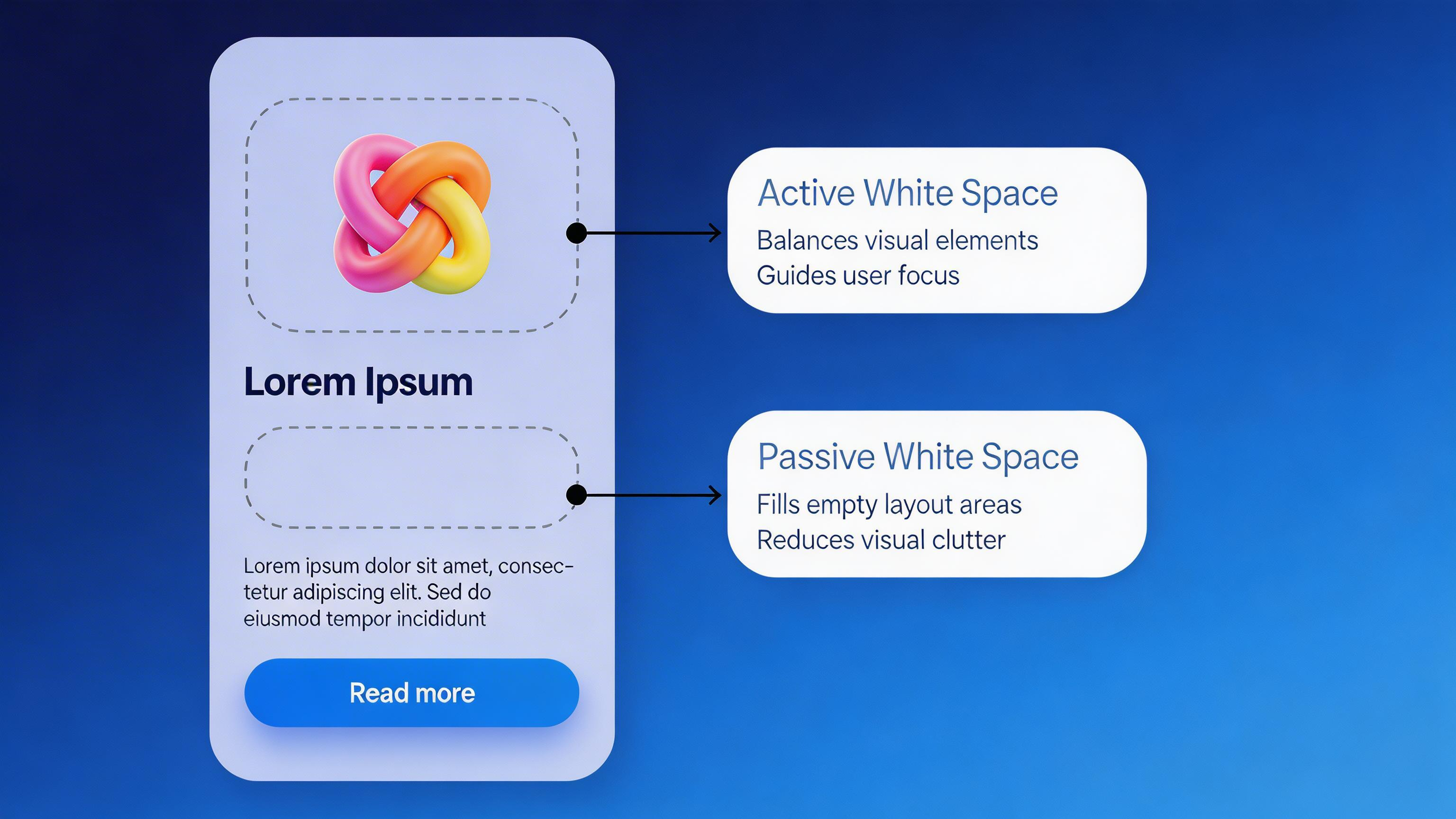 Active and passive white space in UI design
White Space is Not Always White
This deserves explicit emphasis because it is a frequent point of confusion. White space is a concept, not a colour. A dark background with areas free of content is white space. A textured canvas with clear zones around a subject is white space. Some designers prefer the term 'negative space' precisely to avoid the colour implication. The term refers to the absence of designed elements, not to a specific colour.
Understanding Where White Space in Design Fits
White space doesn't live in one place, it runs through every layer of design. Understanding where white space operates and what decisions it represents in each context is what turns the principle into practice.
Typography
Letter-spacing (tracking) is the space between characters. Insufficient tracking creates cramped, hard-to-read text. Line-height (leading) is the vertical space between lines. Standard body text requires at minimum 1.4–1.5× the font size. Paragraph spacing is the gap between paragraphs, distinct from line-height. Together, these micro white spaces determines whether body copy is readable or punishing.
The minimum recommended line-height for body text is 1.4× the font size. At 16px body text, line-height should be no less than 22–24px. Designs with 1.0× line-height consistently produce lower reading comprehension and higher fatigue scores.
Layout
Page margins are white space. The gutters between columns are white space. The space between a headline and the body text below it is white space. Section breaks should be visibly larger than within-section spacing. This is proximity made visible, and it is one of the most reliable hierarchy tools in layout design.
Photography and Illustration
In photography, the area around and behind the subject is white space. Portraits shot against a plain background use white space to focus attention on the subject. Wide landscape shots with a vast sky above a small subject use white space to communicate scale, solitude, or aspiration. In illustration, areas of the composition deliberately left empty are white space. These are informed design decisions, not omissions.
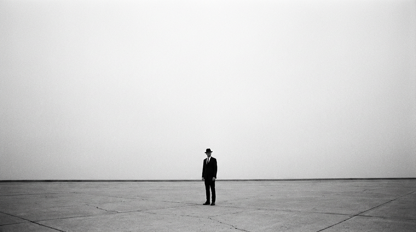 The abundant white space brings all the focus to the main subject
Product Packaging
A label that occupies 30% of a bottle surface, leaving 70% of the glass visible, communicates luxury through restraint. Labels with dense text, multiple logos, and competing graphic elements communicate differently. Their density signals either complexity (ingredients, regulatory information) or value-based positioning. Both are correct; neither is accidental.
Digital UI
In UI design, white space takes the form of padding (space inside a component), margin (space outside a component), and negative space in the overall layout. The 8px grid system used by most professional UI teams codifies white space decisions into a consistent scale: 8, 16, 24, 32, 40, 48 pixels. Every spacing decision is a multiple of 8, creating consistent visual rhythm across an entire product.
Also read: Graphic Design Tips for Beginners & Non-Designers
Why is White Space Important in Design: 7 Reasons
White Space Improves Readability
Typography research consistently demonstrates that line-height, letter-spacing, and paragraph spacing directly affect reading speed, comprehension, and retention. The mechanism is simple: adequate vertical space between lines prevents the eye from accidentally jumping to an adjacent line during the natural saccadic movement of reading.
White Space Directs Attention
An element isolated in white space commands the viewer's complete attention. Isolation is one of the most powerful mechanisms for creating visual emphasis. The background is not incidental rather a mechanism that focuses attention on the product. A CTA button buried in visual density competes with everything around it. White space around the CTA is part of its visual power.
White Space Reduces Cognitive Load
Cognitive load is the mental effort required to process a given piece of information. Interfaces with clear white space, well-defined component boundaries, and generous spacing feel easier to use before a single interaction has occurred. In marketing, reduced cognitive load directly affects conversion: a landing page that is easy to process is more likely to be read, and content that is read is more likely to convert.
White Space Communicates Premium Positioning
White space is expensive in print: more paper, fewer products per page. It implies that brand can afford not to maximise every square centimetre. In digital design, the constraint is less physical but the signal persists: a brand that doesn't need to fill every pixel to justify its presence communicates confidence.
A useful test: look at the packaging of the premium and budget versions of any product category. The most consistent visual difference will be white space. Premium has more of it. Always.
White Space Increases Conversion
The relationship between white space and conversion rate on landing pages is one of the most consistently documented findings in UX research. This aligns with principles 2 and 3: an isolated CTA commands attention and reduces the cognitive cost of the decision. CXL Institute landing page research and multiple published A/B testing datasets consistently show that landing pages with more white space around CTAs outperform visually dense alternatives.
White Space Creates Visual Rhythm
A layout with consistent spacing intervals, tight within sections, generous between sections, has rhythm. White space is the interval in visual rhythm. The reader's eye flows through at a predictable pace, encountering content in a structured sequence. A layout where spacing is inconsistent has no rhythm. The experience of reading is less efficient and less pleasant.
White Space Creates Elegance by Subtraction
The most difficult design decision is not what to add but what to remove. White space requires confidence — the confidence to let the design work with fewer elements rather than more. White space is the residue of good editing. It is what remains when everything unnecessary has been removed.
What White Space Represents
White space in graphic design does not carry a single fixed meaning. The same spatial generosity communicates different things depending on category, audience, and context.
Luxury and Premium Positioning
The most consistent and cross-cultural meaning of white space is luxury. The brands that occupy the premium tier of any category almost universally use more white space in design. Apple's product pages. Aesop's packaging. Hermès' windows. Bottega Veneta's advertising.
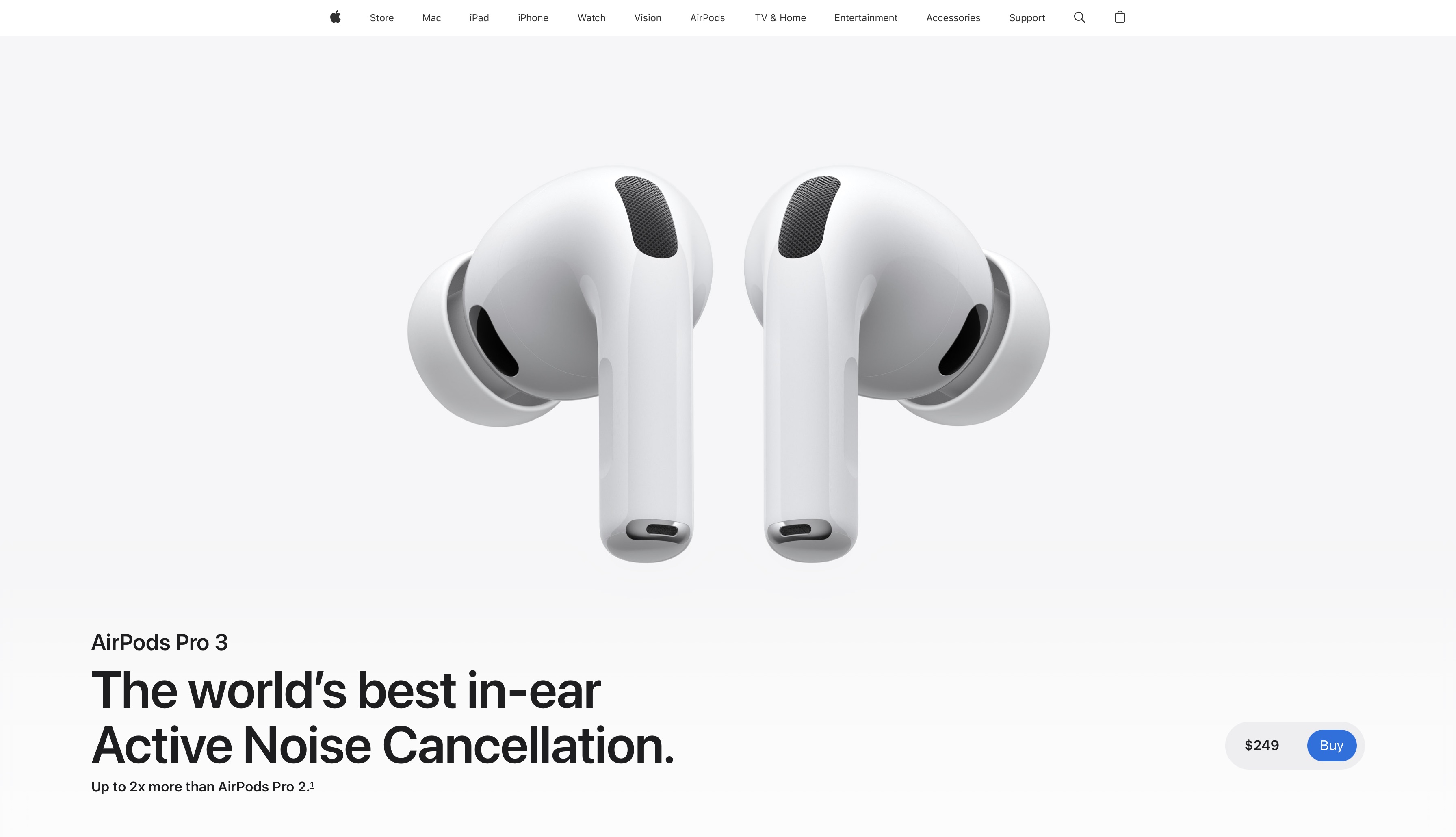 Apple uses white space in design to position their products as premium
Confidence
Beyond luxury, white space represents confidence. A brand that fills every available space is communicating that it cannot trust a single element to carry sufficient weight alone. A brand that chooses restraint communicates the opposite.
Sophistication
Restraint is a mark of sophistication in every domain. In graphic design, the ability to communicate with fewer elements is the mark of a mature creative sensibility. The Economist. The New Yorker. Any respected long-form publication. All use significant white space with adequate margins, generous leading, clear section breaks. All are associated with intelligence and quality.
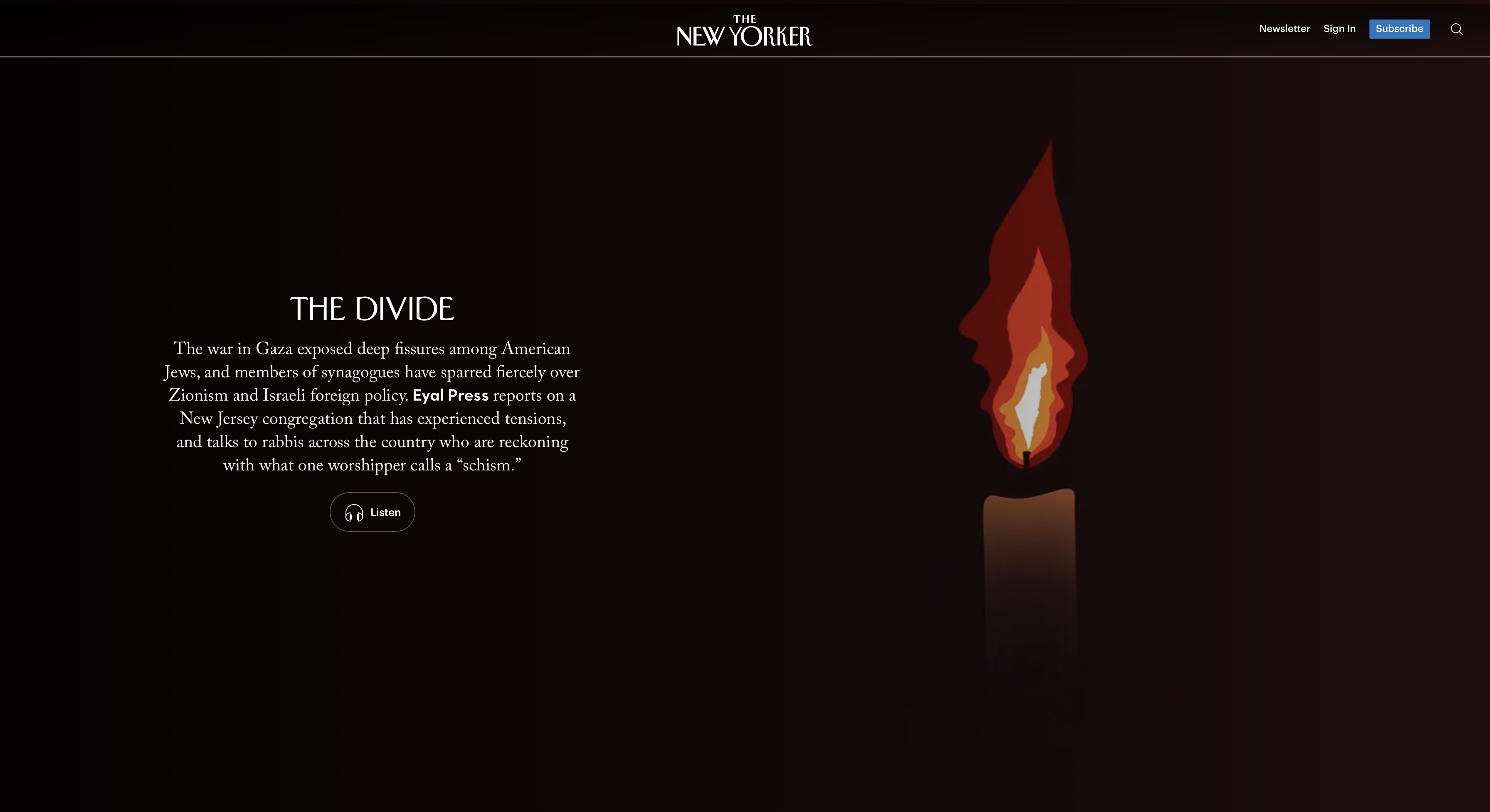 Minimalist layout with white space in design guiding the eye, The New Yorker
Clarity and Intelligence
In information design and data visualisation, white space represents clarity. Edward Tufte's 'data-ink ratio' formalised this principle: the proportion of a visualisation's ink devoted to data rather than decoration should be maximised. Every non-data element should either serve the data or be removed. What remains after that editing process is white space.
Calm and Control
Wellness, healthcare, meditation, and mental health brands use white space to communicate safety, serenity, and control. Visually open compositions create a space to breathe, a sense of calm, an environment that feels safe and controlled. This is why clinic interiors, pharmaceutical packaging, and wellness brand design consistently use clean, spacious visual language.
When White Space Represents the Wrong Thing
White space can misfire. An e-commerce page with insufficient product imagery and generous white space around sparse product information does not look premium. A service page that uses white space to avoid providing concrete information reads as evasive. A portfolio with widely spaced work samples reads as thin.
The critical distinction: white space communicates positive qualities when the content it frames is genuinely strong: a single powerful image, a clear message, a bold typographic statement. When the content is weak, white space amplifies the weakness rather than communicating confidence. White space is not a substitute for substance. It is a framing for substance that already exists.
Misconceptions about White Space in Graphic Design
'It's Wasted Space'
This is the most persistent misconception, and the one designers spend the most time countering. Apple, Aesop, Muji, Hermès, and the majority of luxury brands globally have built their visual identities on white space. The space is not wasted, it is doing the work of communicating restraint, confidence, quality, and premium positioning.
'You Can Only Use It in Premium or Luxury Design'
White space improves readability and conversion in every category. Landing pages with generous white space around CTAs consistently outperform dense alternatives. Editorial layouts with appropriate leading and margins are simply easier to read than cramped ones. White space is a functional requirement for clear communication.
'More Content = More Value'
The instinct to fill space with content assumes that more information equals more value. In most communication contexts, the reverse is true. A message that requires less space and less noise to communicate is not less valuable rather more confident. White space is the visual signal that the designer has the confidence to communicate with fewer elements.
Applying White Space in AI-Generated Design
AI image generators default toward visual density and fill the frame with elements, detail, and visual activity. Generating designs with deliberate, structured white space requires explicit prompting. Once generated, you can refine spatial balance using the AI image editor.
Prompt Language for White Space
- 'Generous white margins: subject isolated in the centre'
- 'Minimal elements, maximum negative space'
- 'Premium packaging aesthetic: label occupying lower 30% of bottle, glass visible above'
- 'Luxury brand style: single element centred in large white space'
- 'White space as a primary design element: do not fill the composition'
- 'Plenty of breathing room between elements'
- 'Editorial white space: generous margins, clear section breaks'
Best models: Ideogram v3 for layout-based white space; Nano Banana Pro for photographic negative space; Seedream for product photography with deliberate background space.
Luxury Positioning — Fragrance Campaign
Basic Prompt · Model: Nano Banana Pro
"Luxury fragrance campaign image. Single perfume bottle in the lower-left third of frame. The remaining two-thirds of the image is clean, out-of-focus background. Dim ambient light. No other objects. The white space communicates luxury, restraint, and premium positioning."
 Generated by ImagineArt AI Image Generator
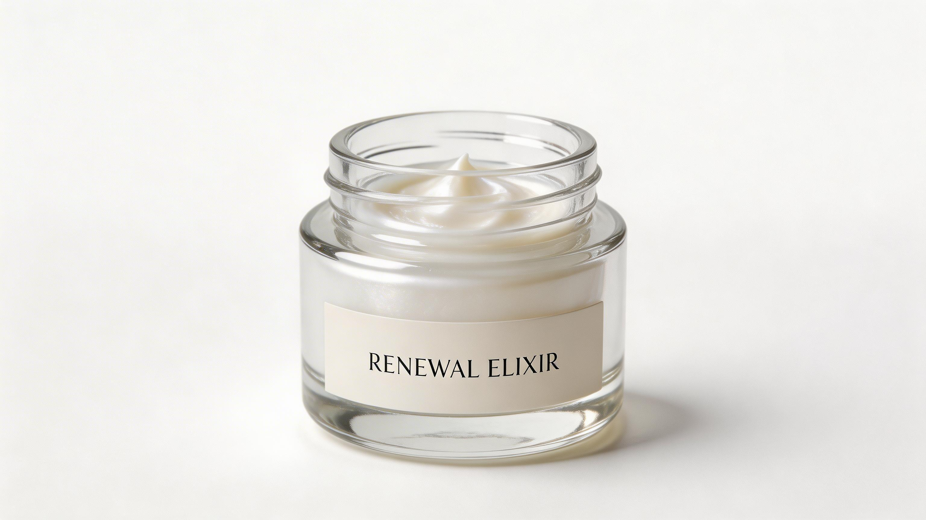
Premium Packaging — Skincare
Basic Prompt · Model: Seedream
"Premium skincare product photography. Single amber glass bottle on a pure white marble surface. The bottle occupies the lower-left third of the frame. The upper two-thirds of the frame is open white space. Minimal, deliberate, luxury aesthetic. No props except a single dried botanical stem beside the bottle."
 Generated by ImagineArt AI Image Generator
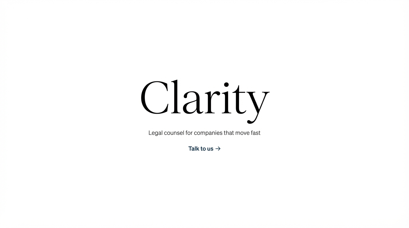
Typographic Confidence — Professional Services Hero
Advanced Prompt · Model: Nano Banana Pro
"Minimal professional services brand homepage hero. The hero section is 80% white space. Centred at the visual midpoint: a single word in large, light-weight extended serif — 'Clarity'. Below it (20px gap): a single sentence in a small light sans-serif: 'Legal counsel for companies that move fast'. Below (32px gap): a text link 'Talk to us →' in the brand colour — no button. No imagery. No background texture. No decoration. The white space is the design statement: this firm is confident enough to let a single word and sentence carry the entire hero section. Deep confidence through extreme restraint."
 Generated by ImagineArt AI Image Generator
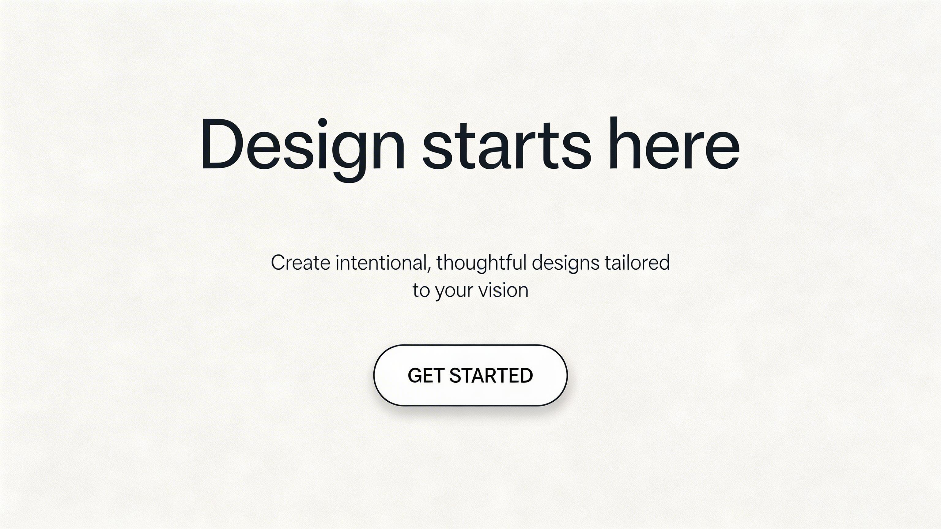
Conversion-Focused Landing Page
Advanced Prompt · Model: Seedream 5.0 Lite
Landing page hero section design. Single headline centred in the upper third of the section: 'Design starts here' in a medium-weight extended sans-serif at large size. Below the headline (32px gap): a one-sentence description in a light weight, smaller size, also centred. Below the description (48px gap): a single CTA button, centred. Generous white space above the headline and on both sides of all elements — the content area occupies no more than 50% of the section width. The white space isolation of the CTA is the conversion mechanism. Clean, aspirational, conversion-focused layout.”
 Generated by ImagineArt AI Image Generator
Minimal Annual Report Cover
Advanced Prompt · Model: Ideogram v3
"Minimalist annual report cover design. White background. A single abstract geometric mark — a thin circle, approximately 6cm diameter — centred at 40% from the top. Below the mark (24px gap): the company name in a light-weight sans-serif, centred, small size. Below the name (8px gap): the year in the same typeface, same weight, same size. No other elements. No colour except the black type. The white space surrounding these three elements is the dominant visual element of the cover — approximately 80% of the surface. The design communicates confidence through restraint."
Recommended read: Best AI Tools for Designers
Design Stunning Creatives with ImagineArt
The fastest way to develop an instinct for white space is to generate deliberately — to prompt for restraint and see what emerges when you remove rather than add.
For teams, the challenge is consistency: maintaining the same spatial standards across every designer, every format, and every campaign. ImagineArt Workflows lets teams build white-space-led design pipelines that run the same spacing logic across every output automatically. For organisations operating at larger scale, ImagineArt Enterprise provides the infrastructure to enforce visual standards, including white space, as a system-wide default rather than a per-project decision.
Frequently Asked Questions
White space is the empty area between and around design elements. Any area of a composition that contains no text, image, shape, or graphic. It does not have to be literally white. It is called negative space as an alternative term precisely because it does not require a white colour.
White space improves readability, directs attention, reduces cognitive load, communicates quality positioning, increases conversion on CTAs, creates visual rhythm, and signals editorial confidence. It is a functional design element that does specific, measurable work in every composition.
White space represents different things depending on context: luxury and premium positioning (the scarcity signal), confidence (not needing to fill every space), sophistication (restraint as a mark of maturity), clarity and intelligence (simplification as expertise), and calm or control (particularly in wellness and healthcare contexts).
Yes. White space communicates positive qualities when the content it frames is strong. When the content is weak, white space amplifies the weakness. An empty-feeling page with sparse product information can be perceived as incomplete. White space requires strong content to frame.
There is no universal answer. The test is whether the most important element commands sufficient attention, and whether spacing between groups clearly signals their relationships. In typography: minimum 1.4× line-height for body text, minimum 16px between body text and the next element. In layout: section breaks should be visibly larger than within-section spacing.
Tooba Siddiqui
Tooba Siddiqui is a content marketer with a strong focus on AI trends and product innovation. She explores generative AI with a keen eye. At ImagineArt, she develops marketing content that translates cutting-edge innovation into engaging, search-driven narratives for the right audience.