
Tooba Siddiqui
April 8, 2026 • Updated May 20, 2026
10 mins Read
Layout is where all principles of design converge. Alignment, contrast, balance, proximity, white space, grid, hierarchy — every principle of design applies simultaneously when you are composing a layout. A layout design is not a collection of individual decisions made in sequence. It is a system of relationships, and every decision affects every other.
This article builds the complete framework: the seven core layout design principles, how grid systems work, how visual hierarchy operates, and how to make layout design effectively using both traditional design practice and AI image generation tools.
What Is Layout Design
Layout design is the intentional arrangement of visual elements within a defined area to achieve a specific communication goal. A good layout design is the architecture of visual communication. It determines what the viewer sees first, second, and third; how long they spend on each element; and whether the overall impression is of clarity or chaos.
Layout design applies at every scale: a single business card, a double-page magazine spread, a website homepage, an app screen, a billboard. The layout design principles are the same regardless of medium, but the constraints and priorities differ.
Read full article: Principles of Design
The Core Layout Design Principles
There are seven core layout design principles:
1. Visual Hierarchy
Visual hierarchy is the ordered sequence in which a viewer perceives the elements of a layout — what they see first, second, third. It is one of the most fundamental layout design principles because it determines whether the composition communicates its intended message in the intended order.
Hierarchy is created through contrast: size contrast (larger = more important), weight contrast (bolder = more important), colour contrast (higher saturation = more important), position (higher in the composition generally = more important), and isolation (more white space around = more important). Every well-structured layout design has an unambiguous answer to the question 'what is the most important element here?'
2. Grid Systems
A grid is the invisible architectural framework that governs the placement of every element in a layout. Grids ensure consistency since elements aligned to a grid are aligned to each other by extension. The most widely used grid in professional design is the 12-column grid, because 12 is divisible by 2, 3, 4, and 6, providing maximum compositional flexibility within a consistent structural framework.
Professional layout designs don’t use grids to create rigid, predictable compositions. Instead, grids provide a stable foundation, making any dynamic departures from the structure more impactful. A grid-breaking element is only striking because the grid is established.
3. Alignment
Alignment is the structural ordering of elements in relation to each other and to the grid. Every element in a professional layout is aligned to something: a column edge, a grid line, another element's edge, a centre axis. Alignment is invisible when correct and immediately apparent when wrong.
See the full article: Alignment in Graphic Design
4. Proximity and Grouping
Related elements are placed in close proximity; unrelated elements are separated by larger gaps. The spatial relationship between elements communicates their logical relationship before the viewer reads any content.
See the full article: Proximity in Graphic Design
5. White Space
White space, the empty areas between and around elements, is an active layout design element, not an absence of design. It creates visual rest, establishes hierarchy through isolation, improves readability, and communicates premium positioning.
See the full article: What is White Space in Graphic Design
6. Balance
The distribution of visual weight across the layout. Balance does not require symmetry. An asymmetrically balanced layout distributes different elements of equivalent visual weight and is the dominant mode in contemporary design.
See the full article: Balance in Graphic Design
7. Contrast
The creation of emphasis and hierarchy through visual difference: size contrast, colour contrast, weight contrast. Without contrast, everything in a layout competes equally and nothing communicates priority.
See the full article: Contrast in Graphic Design
Grid Systems in Depth
Column Grids
The column grid divides the horizontal space into equal-width columns separated by gutters. The 12-column grid is the professional standard because it supports 2-column (6+6), 3-column (4+4+4), 4-column (3+3+3+3), and unequal (8+4, 5+7, 9+3) layouts within the same framework. Columns do not need to be used individually; a large image can span multiple columns, creating visual scale within the grid structure.
Baseline Grids
The baseline grid divides the vertical space into equal horizontal increments, typically matching the line-height of the body text. All text in the layout sits on this grid, creating consistent vertical rhythm across the entire composition. Baseline grids are more visible in their effects than in their application. A layout with consistent baseline alignment simply feels more ordered than one without.
Modular Grids
A modular grid combines column and row divisions to create a matrix of equal-sized modules. This is the most complex grid type and the most flexible, allowing elements to span any number of modules in any direction. Magazine layouts and complex information design frequently use modular grids to manage the placement of many different content types simultaneously.
When to Break the Grid
Grid-breaking elements work because the grid is established. An image that extends beyond the column boundaries, a headline that bleeds to the edge of the page. Without the grid, there is no rule to break and therefore no visual impact in the breaking. Grid breaks are emphasis tools. They should be rare, intentional, and never accidental.
Visual Hierarchy in Layout Design — The Reading Patterns
The F-Pattern
Eye-tracking research consistently shows that readers of Western-language text scan layouts in an F-shaped pattern. They read horizontally across the top, drop down and read horizontally again (shorter than the first sweep), then scan vertically down the left edge. F-pattern reading explains why primary content should be in the upper-left area of a layout, and why left-aligned text is easier to scan than centred or right-aligned text.
The Z-Pattern
For layouts with less text density, the eye follows a Z-pattern: across the top, diagonally down to the lower-left, then across the bottom. It is common in advertising and landing pages. It creates natural positions for the logo (upper-left), a supporting message (upper-right), the primary visual (diagonal middle), and the CTA (lower-right). Z-pattern layout is the dominant structure in conversion-focused layout designs.
Designing for Scanning vs Reading
Not all layout designs are intended to be read. Much of it is intended to be scanned; the viewer extracts enough information to decide whether to read more. Layouts intended for scanning should have stronger visual hierarchy (larger size contrast between levels), more white space (easier to scan), and more prominent visual anchors (images, headlines, data callouts) that allow the eye to quickly extract the key message.
Also read: Graphic Design Tips for Beginners & Non-Designers
Layout Designs for Different Contexts
Print Layout
Print layout operates under physical constraints: the page has fixed dimensions, content cannot reflow, and the output is governed by print production specifications (bleed, safe zone, CMYK colour space, minimum type size for legibility). Margins in print are generous because the page edge is a physical boundary. Content in the safe zone is guaranteed to print correctly; content in the bleed zone is cropped.
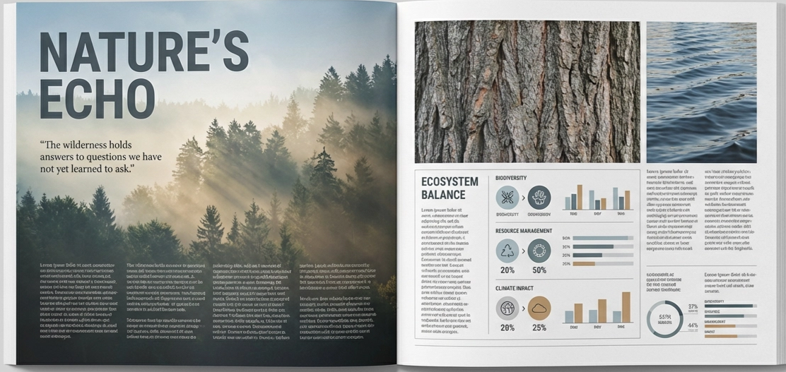 Sample print layout design generated by ImagineArt AI Image Generator
Web and UI Layout
Web layouts are responsive. They must function across screen widths from 320px (small mobile) to 2560px+ (large desktop). The 8px grid system is the professional standard: all spacing, sizing, and positioning decisions are multiples of 8, creating consistent visual rhythm across an entire product. Breakpoints (the screen widths at which the layout reconfigures) must be defined and designed for explicitly.
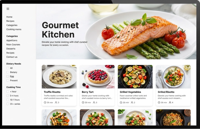 Sample web layout design generated by ImagineArt AI Image Generator
Social Media Layout
Each platform has specific format requirements that create layout constraints: Instagram feed (1:1 or 4:5), Instagram Stories (9:16), TikTok (9:16), LinkedIn (1.91:1 or 1:1), YouTube thumbnails (16:9). Layouts must be designed within these constraints, and text must be legible at mobile viewing distances. The most common social media layout failure: text that is readable on desktop but too small to read in a feed.
Also read: Social Media Image Size Guide
Building a Layout from Scratch — A Practical Process
- Define the communication goal. What must the viewer take away from this layout? What action should they take? What feeling should they leave with?
- Establish the grid. Choose a column structure appropriate for the content complexity and the format constraints. Apply it consistently.
- Place the primary element. The most important elements like the headline, hero image, and primary CTA should be positioned first, at the strongest compositional position (typically the upper-left or a rule-of-thirds intersection point).
- Build the hierarchy. Add supporting elements in descending order of importance, using size, weight, and colour contrast to reinforce their hierarchical position.
- Apply proximity and grouping. Group related elements tightly; separate unrelated elements with generous space.
- Audit white space. Check that the most important element has sufficient isolation to command attention. Check that section breaks are larger than within-section spacing. Check that micro white space in typography (leading, tracking, paragraph spacing) is adequate.
- Test at distance. Step back from the composition. Which element draws the eye first? Is it the most important element? If not, the hierarchy needs adjustment.
Layout Design with AI — How to Brief Effectively
An AI image generator can produce layout concepts, but they require specific structural language in the prompt. Aesthetic language alone such as 'clean and professional’ does not produce structured grid-based layouts. Structural language does.
Basic prompt · Model: Ideogram v3
"Editorial magazine layout concept. Two-column grid. Left column: full-height portrait photograph. Right column: headline at top in bold serif, body text below in two sub-columns, pull quote highlighted in the brand colour across the full column width at the midpoint. Consistent baseline alignment throughout. Clean, authoritative editorial aesthetic."
Advanced prompt · Model: Ideogram v3
"Landing page hero section layout. Z-pattern composition. Upper-left: company logo in minimal sans-serif. Upper-right: navigation links — Home, Product, Pricing, About. Centre-diagonal: primary headline in large bold extended sans-serif, 2 lines, left-aligned. Below the headline (24px gap): a one-sentence description in medium-weight sans-serif, same left alignment. Below description (40px gap): two CTA buttons — primary button (filled, brand colour) and secondary button (outline, neutral). Lower section: three feature highlights in a three-column grid, each with an icon, feature name, and one-line description. Generous white space. Clean 12-column grid. Blue-purple brand palette on white background."
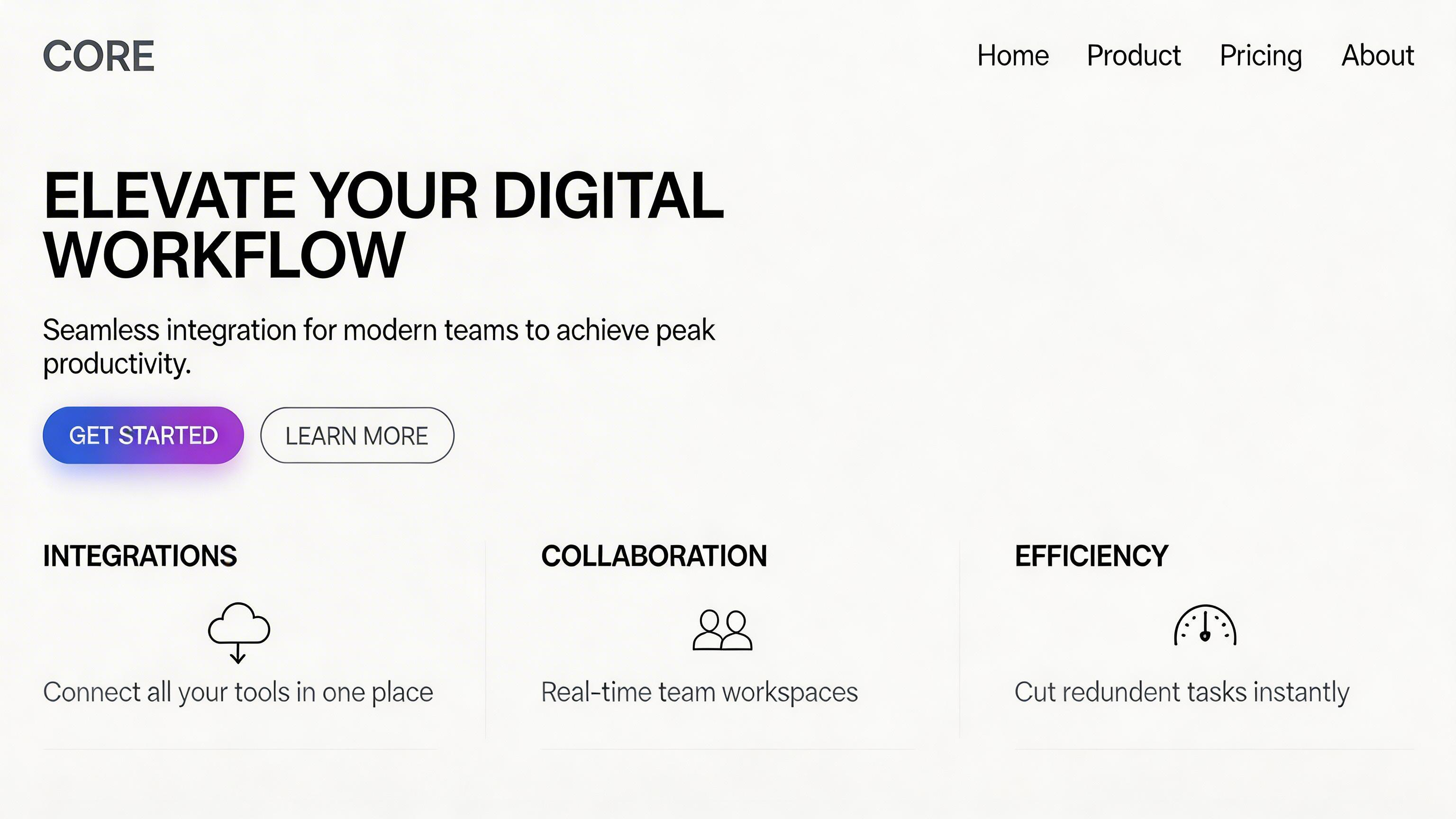 Generated by ImagineArt AI Image Generator
Also read: Best AI Tools for Designers
Ready to Create Stunning Graphic Design with ImagineArt?
Mastering layout design means understanding how all the principles interact to create cohesive, compelling compositions. With tools like ImagineArt Workflows, designers can now apply these principles at scale. AI-assisted workflows help generate structured layouts, maintain grid consistency, enforce visual hierarchy, and explore variations rapidly — all while reducing repetitive tasks. By combining traditional design knowledge with AI-powered assistance, you can create layouts that are both strategically sound and visually striking.
Frequently Asked Questions
The seven core layout design principles are: visual hierarchy (creating a clear perception order), grid systems (the invisible structural framework), alignment (ordering elements structurally), proximity and grouping (using space to communicate relationships), white space (using empty areas actively), balance (distributing visual weight), and contrast (creating emphasis through difference).
Visual hierarchy is the ordered sequence in which a viewer perceives elements in a composition — what they see first, second, third. It is created through contrast: size, weight, colour, position, and isolation. A layout with clear visual hierarchy immediately answers the question 'what is the most important element here?'
Grids ensure consistent alignment across a composition by providing a shared framework that all elements relate to. Elements aligned to the same grid are aligned to each other by extension, creating visual order without requiring individual alignment decisions for every element pair. Grids also allow dynamic compositions — elements spanning multiple columns, intentional grid breaks for emphasis — that are only possible when the underlying structure is established.
Visual hierarchy, because it determines whether the layout communicates its intended message in the intended order. Without hierarchy, all other layout principles serve a composition that has no clear purpose. Every other principle — contrast, alignment, white space, balance — ultimately serves the hierarchy.
Tooba Siddiqui
Tooba Siddiqui is a content marketer with a strong focus on AI trends and product innovation. She explores generative AI with a keen eye. At ImagineArt, she develops marketing content that translates cutting-edge innovation into engaging, search-driven narratives for the right audience.