
Tooba Siddiqui
April 8, 2026 • Updated April 8, 2026
9 mins Read
The golden ratio has been described as the universe's built-in proportioning system. It is often referred to as the mathematical fingerprint of natural beauty and the secret behind every great work of art. It has also been described as an overrated historical myth that designers apply retroactively to justify decisions already made on intuition.
Both descriptions contain truth. The golden ratio — approximately 1:1.618, denoted by the Greek letter φ (phi) — does appear consistently in nature. It also produces proportional relationships that the human eye perceives as harmonious and has been used deliberately by designers and architects for centuries.
What Is the Golden Ratio
The golden ratio describes a specific proportional relationship between two quantities. If you divide a line into two parts — a longer part (A) and a shorter part (B) — such that the ratio of the whole line to the longer part equals the ratio of the longer part to the shorter part, you have the golden ratio. That ratio is approximately 1.618:1, or φ:1.
Expressed differently: if the shorter part is 1 unit, the longer part is 1.618 units, and the whole is 2.618 units. These three lengths are in the golden ratio to each other. Phi (φ), which is the golden ratio symbol, is an irrational number and cannot be expressed as a simple fraction, and its decimal expansion never terminates or repeats. Like π, it appears throughout mathematics and nature in ways that continue to surprise.
Read full article: Principles of Design
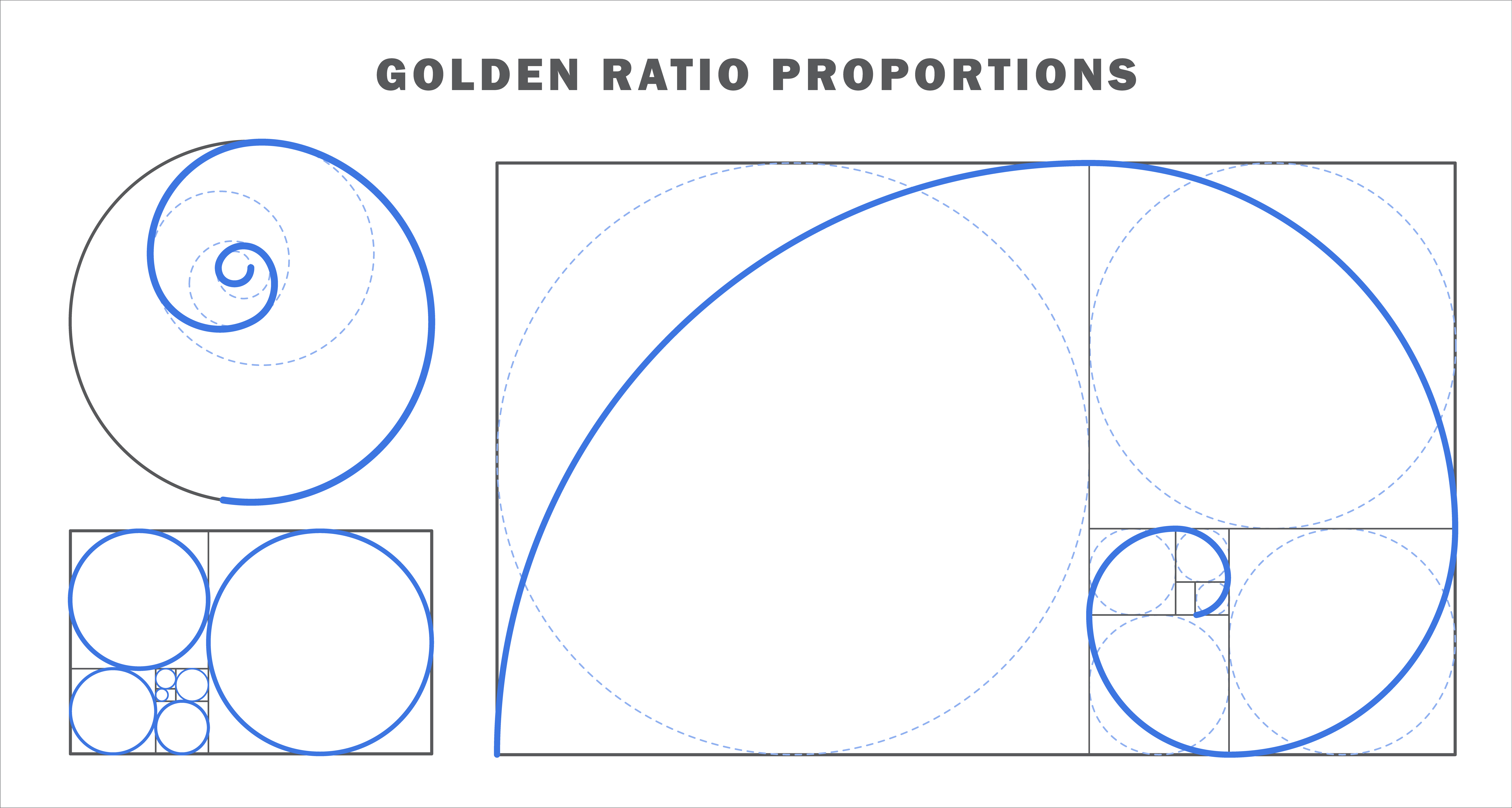 The Golden Ratio Proportions
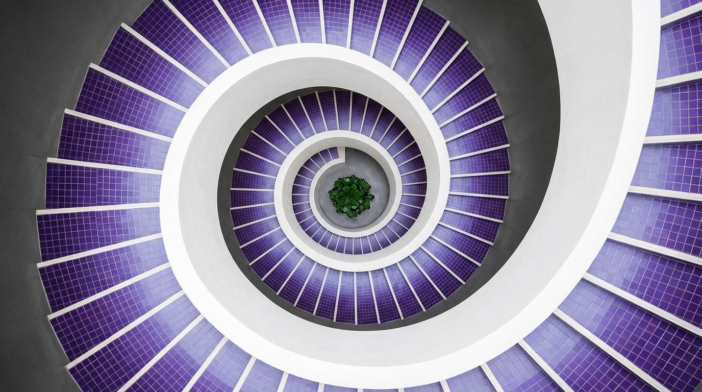
The Golden Spiral and Golden Rectangle
A golden rectangle has sides in the proportion 1:φ (1:1.618). If you remove a square from a golden rectangle, the remaining rectangle is also a golden rectangle having the same proportion but smaller in size. Repeat this process infinitely, and you produce a sequence of nested golden rectangles. Draw a quarter-circle arc within each square, and you produce the golden spiral. It is the iconic logarithmic spiral associated with nautilus shells, galaxy arms, and romanesco broccoli.
The golden spiral and rectangle are the most practically useful design tools derived from the golden ratio. They provide a compositional framework and a proportion system that can be applied directly to layout, logo design, and typographic scale.
Where It Appears in Nature
The Fibonacci sequence (1, 1, 2, 3, 5, 8, 13, 21...), in which each number is the sum of the two before it, converges on the golden ratio. As the numbers in the sequence grow, the ratio between consecutive numbers approaches φ. This is why Fibonacci proportions appear wherever growth is governed by simple recursive rules: the spiral of a sunflower's seeds, the branching of trees, the arrangement of leaves on a stem.
This natural appearance is the source of the golden ratio's mystique. Whether it is a fundamental property of growth or simply a mathematical coincidence that has been observed in selective examples is a debate beyond the scope of design practice. What matters for designers is that the golden ratio proportions are consistently perceived as harmonious.
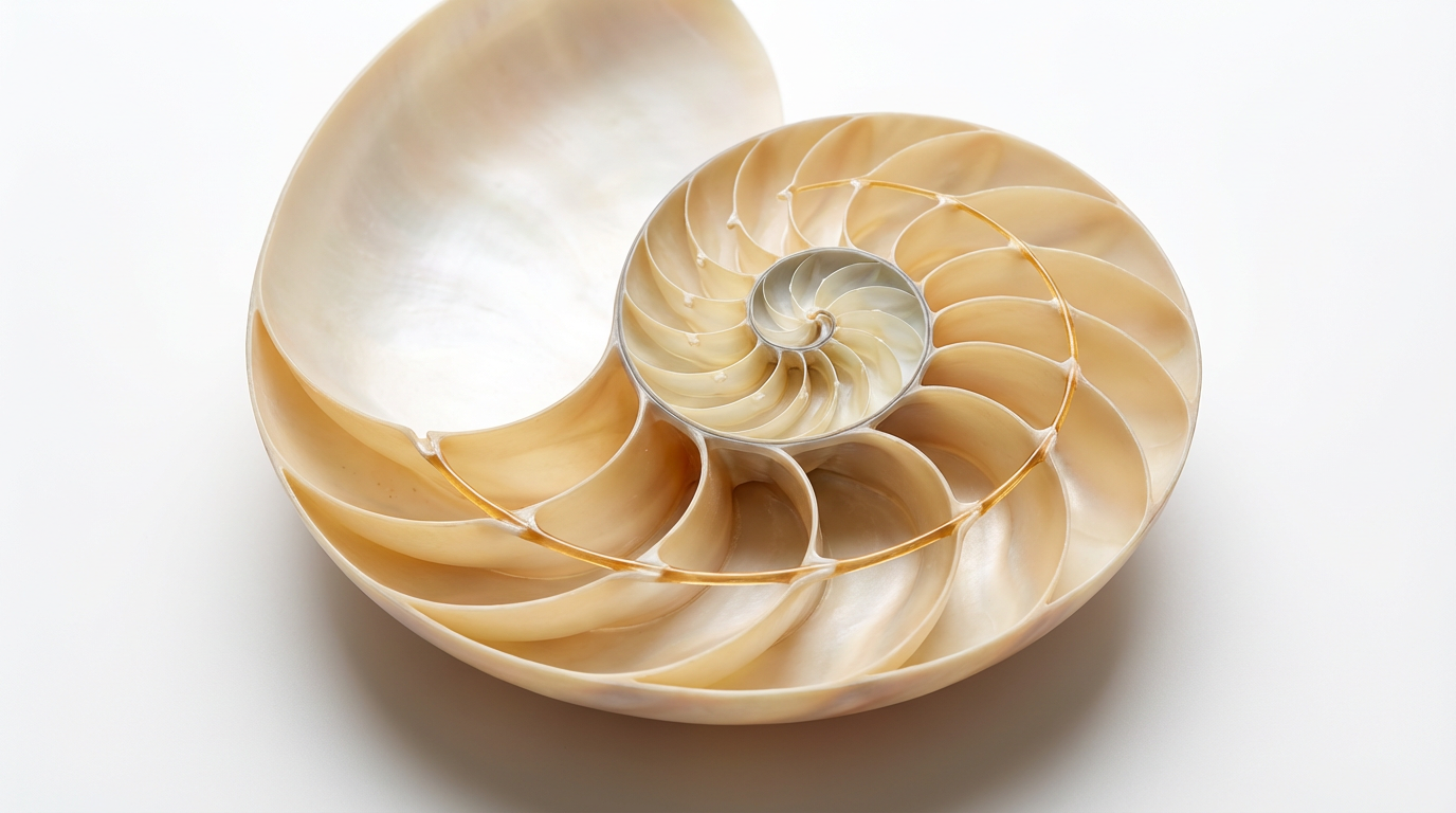 Spiral pattern of a seashell illustrating the golden ratio
The Golden Ratio vs the Rule of Thirds
Both the golden ratio and the rule of thirds are compositional frameworks that produce harmonious, dynamic results. They differ in their mathematical basis and their practical applications:
Rule of thirds: divides the composition into three equal parts (1:1:1 ratio). It is fast to apply visually, widely used, taught as the default compositional framework. It produces dynamic results reliably.
The golden ratio: divides the composition at the φ point (approximately 1:1.618). It is more mathematically precise, more complex to apply, and used more often for proportion decisions than for compositional placement. The golden ratio produces harmonious results with slightly more mathematical elegance.
In practice, most designers use the rule of thirds for compositional decisions (where to place elements in a frame) and the golden ratio for proportion decisions (what size should this element be relative to that one). The two are compatible and often used together.
How to Use the Golden Ratio in Design
Logo Design and Proportioning
The golden ratio is used in logo design to determine the proportional relationship between elements. The size of the icon relative to the wordmark, the width of the letterforms relative to the height, or the spacing between the mark and the text.
Some of the iconic golden ratio examples include Apple's logo, Twitter's original bird mark, and the National Geographic yellow rectangle. All these are proportioned using golden ratio relationships. The technique: overlay a golden rectangle or golden spiral on the logo composition and adjust elements until they align with the proportional framework. This ensures that relationships between elements are mathematically harmonious rather than arbitrary.
The practical process: determine the desired overall size of the logo mark. Divide by 1.618 to find the subordinate dimension. Divide again for the next level. Apply these dimensions to the spacing, sizing, and positioning of elements within the mark.
Typography and Type Scale
The golden ratio produces a typographic scale by multiplying successive type sizes by φ (1.618). Starting with a base body text size, multiply by 1.618 to find the subheading size, multiply again for the headline size.
Example with 10px base: 10px body → 16px (×1.618) subheading → 26px (×1.618) heading → 42px (×1.618) display. These sizes are in golden ratio to each other and are perceived as harmoniously related rather than arbitrarily chosen.
This approach produces a type scale with more visual drama between levels than equal-interval scales. The progression is exponential rather than linear. It produces a headline that is significantly larger than the subheading, creating clear hierarchy with minimal ambiguity about which level of content is which.
Layout and Composition
Dividing a layout at the golden ratio creates a content area and a sidebar (or a primary column and a secondary column) in the proportion 1:1.618. The content area is approximately 62% of the width; the sidebar is approximately 38%.
The 62/38 split is more dynamic than a 50/50 split (which reads as divided) and more comfortable than a 70/30 split (which can read as marginal). This split appears in many editorial and web layouts. The golden ratio split produces a dominant area that is clearly primary and a subordinate area that is clearly secondary, without the secondary feeling negligible.
Also read: Graphic Design Tips for Beginners & Non-Designers
The Golden Spiral as a Compositional Tool
Overlay the golden spiral on a photograph or layout. Place the most important element of the composition at the eye of the spiral (the innermost point of the curl). Secondary elements follow the arc of the spiral outward. It creates a compositional path that the eye follows naturally from most to least important.
The technique is more complex than the rule of thirds and less reliably accessible without compositional tools. However, it produces compositions with a more organic, flowing quality when applied well. It is the preferred compositional framework for portrait photographers and fine art photographers who want more than reliable dynamism.
Is the Golden Ratio Overrated?
The honest answer is: it depends on what you are claiming. The golden ratio reliably produces harmonious proportions in design contexts. This is not contested. What is contested is the mythological claim that it is the secret formula behind all great art, that it appears universally in nature, and that any composition aligned to it will be perceived as beautiful.
The retroactive application of the golden ratio is a selection bias problem rather than a principle of design. Finding it in famous artworks by adjusting the overlay until the proportions fit doesn’t change the fact that composition would have been great with out without the golden ratio.
For designers, the useful truth is: golden ratio proportions are more harmonious than arbitrary ones. Using φ as a proportioning tool helps produce more consistent relationships between elements than intuitive sizing decisions.
How to Prompt Golden Ratio in AI Design
While using the AI image generators, make sure your prompt explicity describes the composition using the golden ratio for accurate results.
Basic prompt · Model: Ideogram v3
"Logo mark design using golden ratio proportions. The mark is a wordmark with a geometric icon to the left. The icon dimensions and the spacing between icon and text are in golden ratio proportions — icon height equals the cap height of the wordmark, icon width is icon height ÷ 1.618. Clean, precise, harmonious proportions throughout."
 Generated by ImagineArt AI Image Generator
Advanced prompt · Model: Nano Banana Pro
"Editorial portrait photograph composed using the golden spiral. The subject's eye is placed at the innermost point of the spiral — the upper-right thirds intersection area. The spiral curves through the composition from the eye across the shoulder and downward into the lower-left of the frame. The subject occupies the right portion of the frame, with the golden spiral's open space at the left creating room for the subject's gaze. Warm natural window light from the left. The composition feels organic and harmonious rather than mechanically geometrical."
Also read: Best AI Tools for Designers
Ready to Create Stunning Graphic Design with ImagineArt?
The golden ratio in design is a practical tool for creating harmony, balance, and visually appealing proportions. You can apply φ-based proportioning consistently across multi-format and multi-style AI-generated assets using ImagineArt Workflows, ensuring every design decision is harmoniously aligned and visually compelling.
Start leveraging the golden ratio, combine it with other compositional tools, and apply it to create dynamic elements using the golden spiral for organic flow. Achieving visually balanced, professional designs has never been easier.
Frequently Asked Questions
The golden ratio is a proportional relationship of approximately 1:1.618 (denoted φ) where the ratio of the whole to the larger part equals the ratio of the larger part to the smaller part. In design, it is used to create harmonious proportional relationships between elements in logos, layouts, typography, and composition.
Practical applications include: logo proportioning (sizing elements in φ ratios to each other), typographic scale (multiplying successive type sizes by 1.618), layout division (splitting a layout approximately 62/38 for primary/secondary areas), and compositional placement (using the golden spiral to position the primary focal point).
The rule of thirds divides a composition into three equal parts (1:1:1) and is used primarily for compositional placement. The golden ratio divides at a 1:1.618 proportion and is used primarily for sizing relationships between elements. The rule of thirds is faster and more widely used; the golden ratio produces more mathematically precise harmony. Both are compatible and often used together.
The Fibonacci sequence — whose ratios converge on φ — does appear in natural growth patterns including sunflower seed spirals, nautilus shell proportions, and leaf arrangements on stems. Whether φ itself is a fundamental constant of natural beauty or a mathematical coincidence observed in selectively chosen examples is a philosophical debate. Its practical design utility is independent of its metaphysical status.
Tooba Siddiqui
Tooba Siddiqui is a content marketer with a strong focus on AI trends and product innovation. She explores generative AI with a keen eye. At ImagineArt, she develops marketing content that translates cutting-edge innovation into engaging, search-driven narratives for the right audience.