
Saba Sohail
November 6, 2025 • Updated November 20, 2025
4 mins Read
Graphic Design Tips for Stunning Visuals and Ads
Designing an invitation? creating a LinkedIn post? Making a job advertisement? Don’t know how to pair fonts and use the canvas? Up your brand and social design game with 17 super practical graphic design tips.
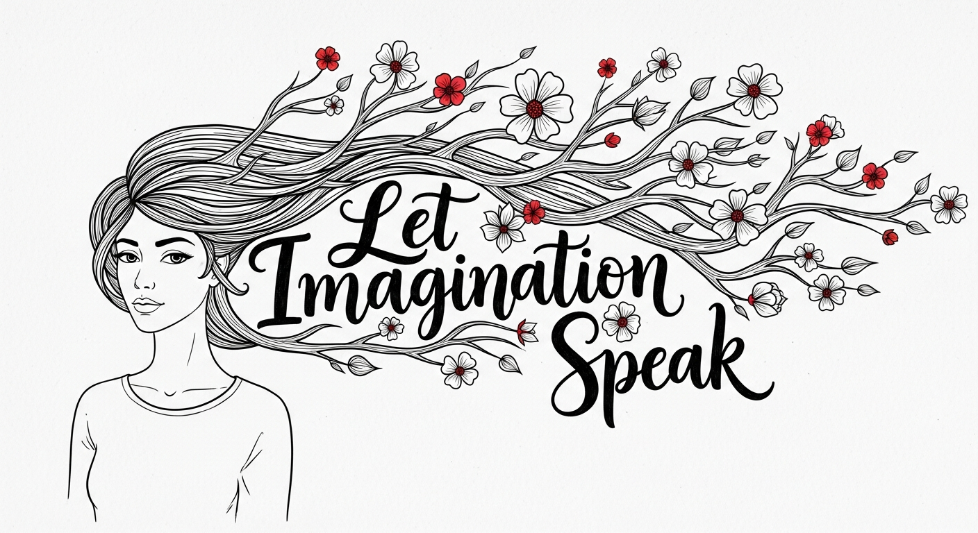
1. Start with a Clear Visual Hierarchy
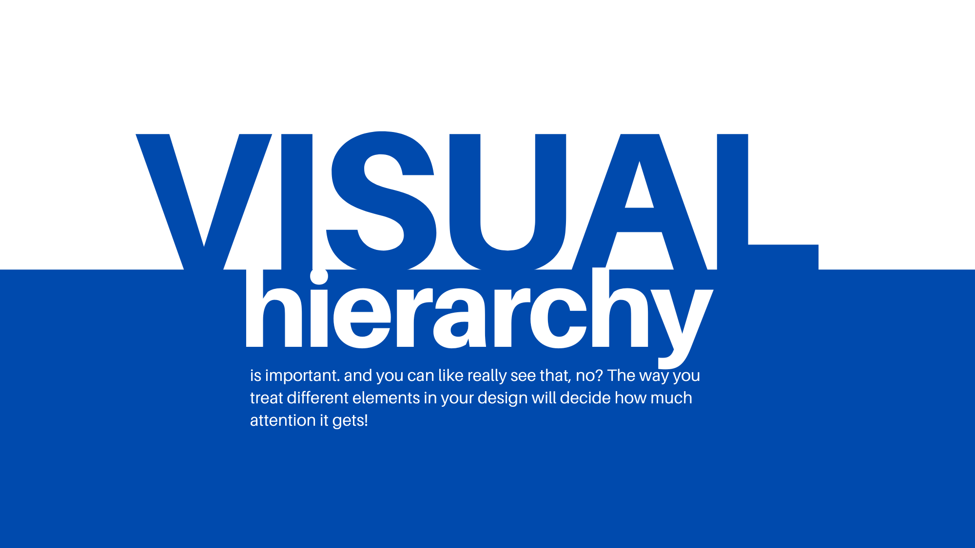
Visual hierarchy means organizing your elements so your design viewers, audience and even managers instantly know what to look at first.
 Graph Design Tip 1
Use size, color, and contrast to guide attention: your headline should stand out, followed by supporting text and visuals. This visual hierarchy will keep your message clear and your layout easy to follow.
2. Use Consistent Colors and the Right Color Palettes
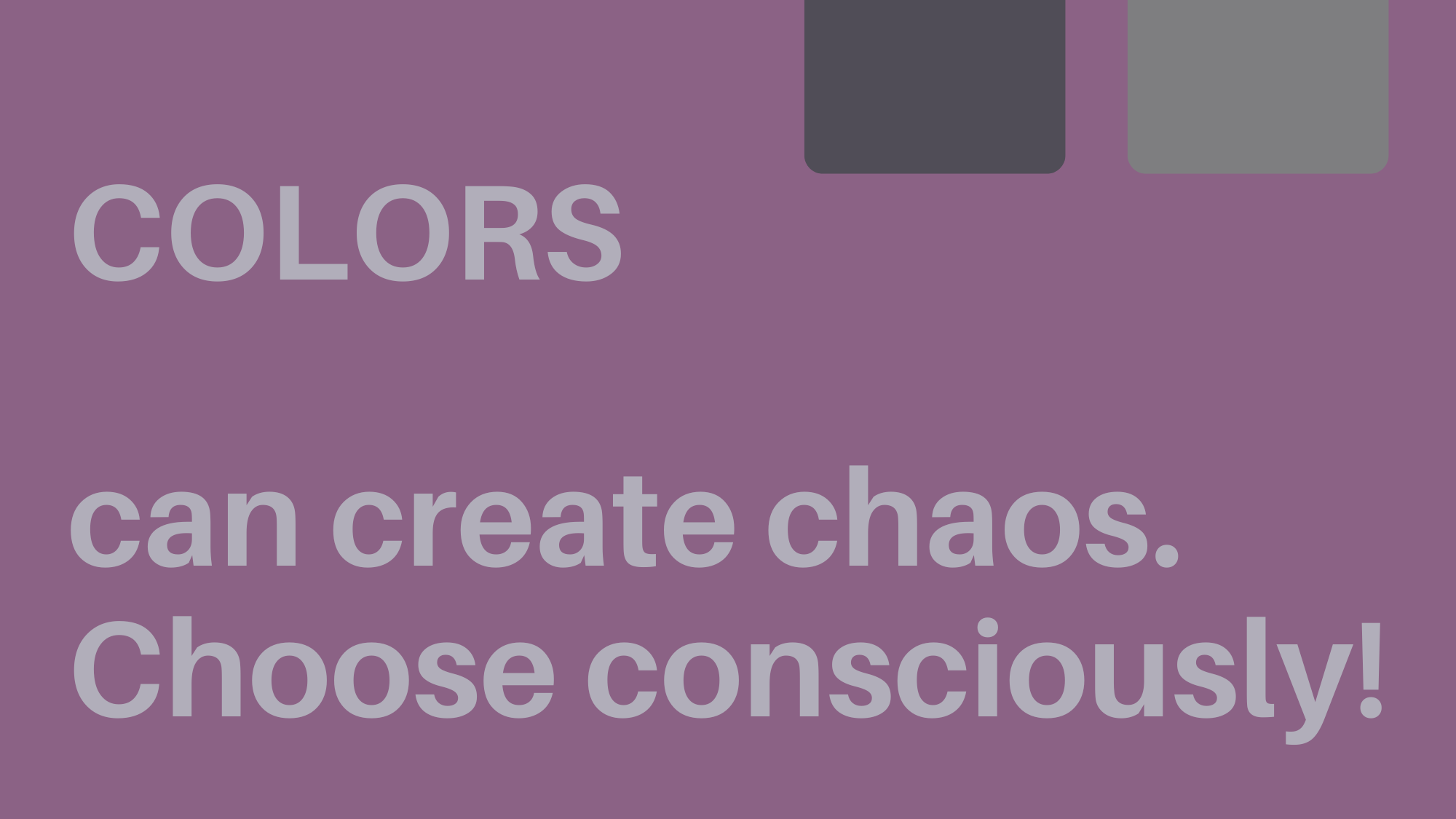
Colors affect how people feel about your design. Stick to a limited color palette (usually 2–4 colors) that matches your brand personality. For example, blue for trust, red for energy, green for growth and environment. You can use AI apps like ImagineArt AI image colorizer to explore color schemes.
 Graphic Design Tip 2
3. Use White Space to Avoid Clutter
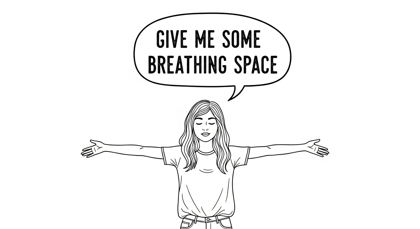
White space, that designers also call negative space is the empty area around your text and images. It gives your design breathing room and keeps it from feeling cramped. A clean layout with enough spacing makes your content look elegant and easier to read.
 Graphic Design Tip 3
4. Use the Same Design Elements on Every Page
Consistency builds brand recognition. Stick to the same colors, fonts, icons, and layout patterns across all your materials. When your audience sees cohesive visuals everywhere, it strengthens your professional identity.
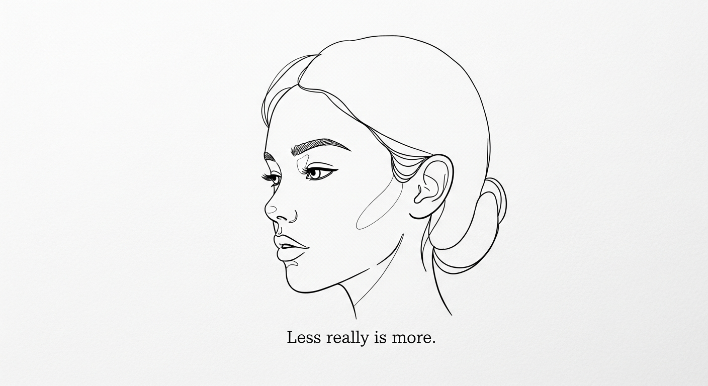
5. Keep Designs Simple and Focused
Avoid cramming too many visuals, fonts, or ideas into one design. Simplicity helps your audience absorb your message instantly. Remember: less is more. One strong idea always beats five competing ones.
6. Use High-Quality Visuals (Stock or AI-Generated)
Blurry or low-quality images make even great layouts look amateurish. Always use high-resolution visuals that match your brand style.
 Saba_Sohail_red_white_and_black_doodle_of_a_woman_her_hair_in_the_hair_formin_c5a7dead-56a9-43d9-815a-0a2f7fc9b044.png
💡 Tip: With ImagineArt, you can instantly generate or edit high-quality images for any project. From social graphics to branded visuals to doodles and line using simple prompts. AI image generators save time, maintain consistency, and open you to endless creative possibilities without relying on stock photos.
Recommended Read: How much does AI image generation cost?
7. Limit Effects and Filters for Professionalism
While filters and effects can enhance a design, overusing them often creates visual noise. Stick to subtle adjustments like gentle shadows or soft gradients that enhance rather than distract. This gives your design a refined, timeless feel.
 Graphic Design Tip 7
8. Make Sure Designs Are Mobile-Friendly
This is one of the most popular and needed graphic design tips for beginners. Most people view designs on their phones, so readability matters. Check that text isn’t too small, images aren’t cropped awkwardly, and important details remain clear on smaller screens. Designing mobile-first ensures your visuals look great everywhere.
9. Test and Tweak Based on Audience Response
Design isn’t one-and-done; it’s an ongoing process. Observe which visuals perform best on your social channels or ads, and refine accordingly. Feedback and analytics help you evolve your design style effectively.
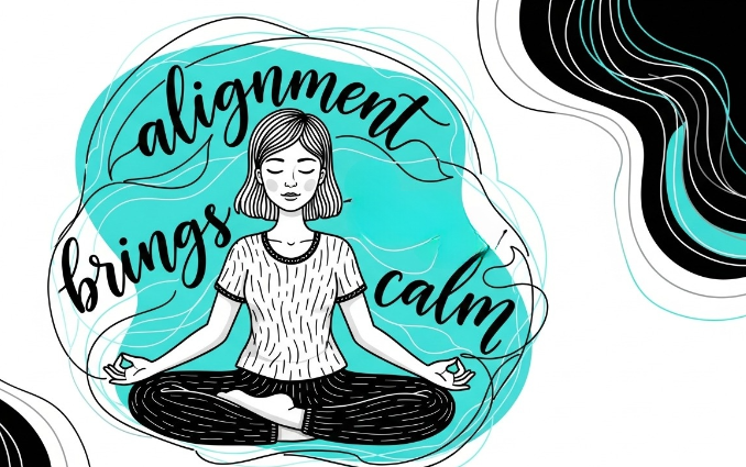
10. Align Text and Images for Balance
Balanced alignment creates order, which naturally makes your design look more professional. Alignment means that every element is connected and intentional. So as a graphic design tip, use grids and guides to line things up properly. They’ll help you put text blocks, icons, and photos in place.
 Graphic Design Tip 10
11. Check Great Design for Inspiration
Study the work of designers and brands you admire. Notice how they use color, typography, and composition to guide the eye. Inspiration sparks creativity. It’s not about copying, but understanding what makes a design effective.
 Graphic Design Tip 11
12. Choose Fonts Wisely — Font Family and Pairing
Fonts have personalities too! Serif fonts (like Times New Roman) feel classic, sans-serif fonts (like Helvetica) feel modern. Limit yourself to 2 complementary fonts, one for headlines and one for body text to keep designs harmonious and easy to read.
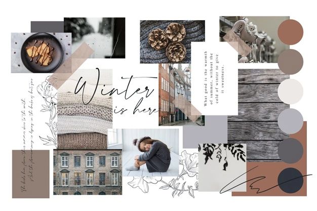
13. Create Moodboards
A moodboard is a visual collage of ideas, colors, photos, and textures that represent your design direction. It helps you stay focused and maintain a consistent look throughout your project. Moodboards are especially helpful when collaborating with teams or clients.
 Graphic Design Tip 13
14. No Naked Images
Never drop an image onto a layout without context. Pair it with text, shapes, or borders that integrate it naturally. Naked images can look unpolished; even a simple frame or color overlay can make them feel more intentional.
15. Keep a Diary of Inspiration
Save designs, colors, and layouts that catch your eye. Screenshots, links, or Pinterest boards work great. Over time, you’ll build your own library of ideas to draw from whenever you’re stuck creatively.
16. Make Variations
Don’t settle on your first version. Create multiple variations of your design. Try different color schemes, fonts, or image placements. Comparing them side-by-side helps you see what feels most balanced and effective.
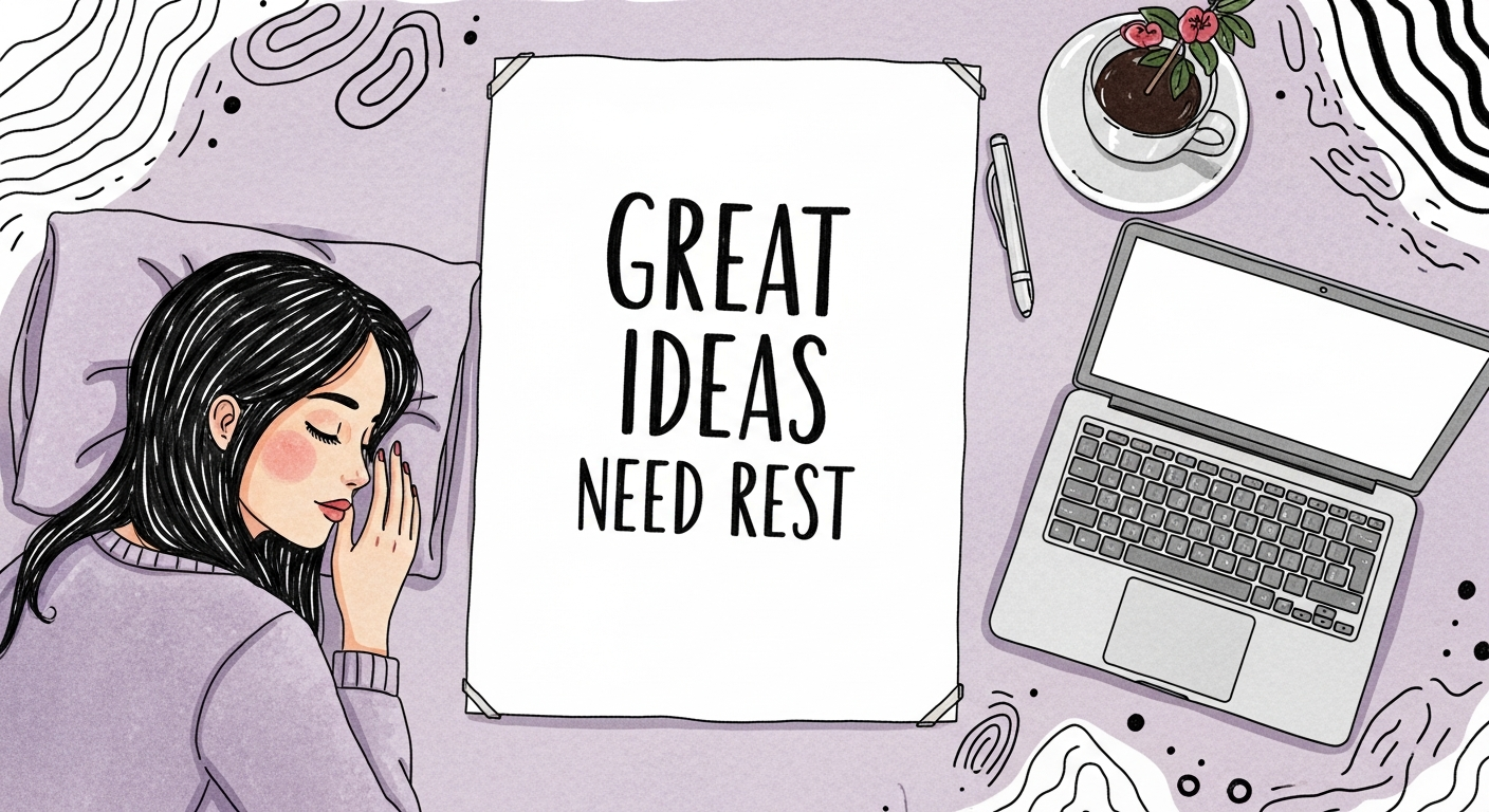
17. Take Breaks
After working on a design for too long, your eyes get used to the layout and miss small mistakes. Step away for a bit; when you return, you’ll spot inconsistencies and fresh improvement ideas instantly.
Graphic Design Tip 17
Recommended Read
AI Tools for Enterprises | AI Tools for Graphic Designers
Saba Sohail
Saba Sohail is a Generative Engine Optimization and SaaS marketing specialist working in automation, product research and user acquisition. She strongly focuses on AI-powered speed, scale and structure for B2C and B2B teams. At ImagineArt, she develops use cases of AI Creative Suite for creative agencies and product marketing teams.