
Tooba Siddiqui
April 3, 2026 • Updated April 8, 2026
8 mins Read
The human brain does not wait to read content before deciding what belongs together. The moment it perceives a composition, it begins grouping elements by physical closeness. Proximity is the brain's first and fastest tool for making sense of visual information.
The principle of proximity is direct: elements placed near each other are perceived as related. Elements placed apart are perceived as separate. This is how the human visual system operates. The Gestalt principle of proximity was established by cognitive psychologists in the early 20th century and validated consistently since.
What Is Proximity in Graphic Design
Proximity is one of the core Gestalt principles of perception. The Gestalt psychologists, Max Wertheimer, Wolfgang Köhler, and Kurt Koffka, observed that humans perceive groups and patterns before they perceive individual elements. The proximity design principle states that objects near each other are perceived as a group regardless of their differences in shape, size, or colour.
This matters enormously for design because it means layout communicates meaning before content does. A caption placed directly below an image communicates its relationship to that image before the viewer reads a word. A button placed beside a form field communicates that they are connected before the viewer understands either element's function.
Read full article: Principles of Design
Why Proximity in Graphic Design Matters
Proximity is the simplest principle with the most immediate cognitive impact. When related elements are grouped by proximity, the viewer does not need to consciously work out which elements belong together. The grouping is immediately apparent. This frees cognitive resources for the actual content rather than the structural parsing of the layout.
Proximity also communicates relationships that typography and colour cannot. Two elements with no visual similarity become related when placed in close proximity. Two elements with identical visual treatment become separate when given generous space between them.
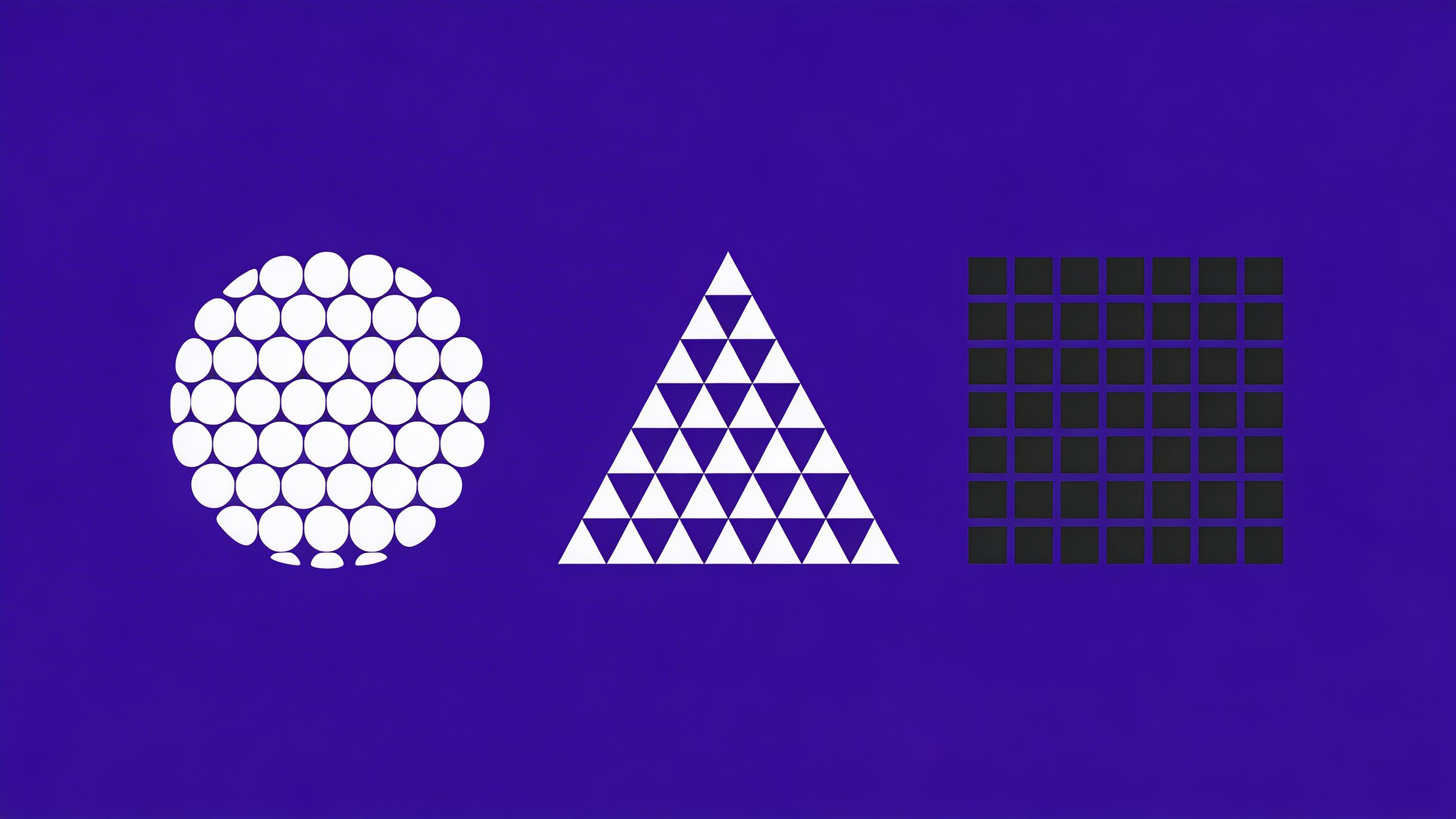
The rule for Gestalt principle of proximity: more space between unrelated elements than between related elements. The amount of space is a signal about the strength of the relationship. The closer the elements, the stronger the implied relationship.
 Whitespace creates two clear groups using the principle of proximity, even with varied shapes within each group.
White Space and Proximity in Graphic Design
White space and proximity design principle work together to create groupings and separations simultaneously. Proximity is the reduction of space between related elements. White space is the increase of space between unrelated elements.
The most common proximity failure is treating all spacing equally. It includes applying the same amount of space between every element in a layout regardless of the relationships between them. Equal spacing creates a composition where every element appears equally related to everything else. The result is visual noise: the viewer must read every element to understand its relationship to the others rather than perceiving those relationships through the layout.
The solution is spatial hierarchy: tight spacing within groups, generous spacing between groups. The amount of space is the signal.
Alignment and Proximity in Graphic Design
Proximity design principle complements the principle of alignment. Together, they produce professional and organised layouts. Proximity groups elements by closeness; alignment orders those groups into a coherent visual structure.
A group of elements that are in close proximity but not aligned looks accidental like the elements happened to end up near each other. A group that is both proximate and aligned looks designed, featuring intentional placements and deliberate organisation. Use proximity to establish what belongs together, then use principle of alignment to make that grouping feel intentional.
Proximity Design Principle in Practice — 6 Design Contexts
Typography
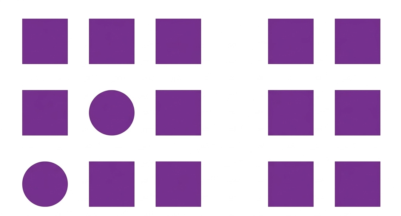
The most fundamental application of proximity is editorial design. A caption placed immediately below an image (4–8px gap) communicates that it describes that image. A caption placed 30px below the image and 25px above the next element is ambiguous as it could relate to either. Always place captions in tight proximity to the element they describe.
 Editorial layout demonstrating the principle of proximity in typography, with related text blocks grouped clearly for visual hierarchy.
Form Design
In form design, proximity is critical for usability. A label must be in tight proximity to its input field It should be close enough that there is no ambiguity about which label belongs to which field. WCAG success criteria 1.3.1 (Info and Relationships) requires that instructions and associated controls are programmatically or visually connected. Proximity is the visual mechanism.
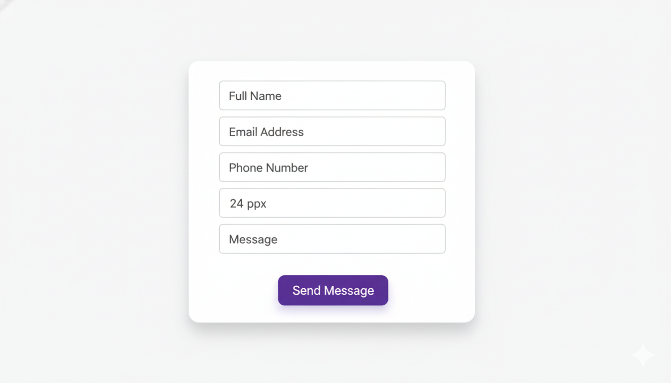 Sample form design illustrating the principle of proximity, with related fields grouped together for clarity and ease of use.
Navigation Design
Navigation groupings communicate through proximity. Primary navigation items close together form one group; a 'Contact' item separated by a larger gap becomes distinct. In mobile navigation, related function clusters are grouped tightly. The spatial logic of navigation is proximity logic.
Card Components
The card is the most universal UI pattern precisely because it externalises proximity. Elements within a card such as title, description, image, and CTA are visually grouped by the card's boundary, making their relationship unambiguous. The card solves the proximity problem structurally rather than relying on spatial calibration between individual elements.
Logo and Tagline
The proximity between a logo mark and its tagline communicates the strength of their relationship. A tagline in tight proximity to the mark feels integrated and appears to be a part of the identity system. A tagline with generous space feels like a secondary thought. Most brand guidelines specify exact minimum and maximum distances between the logo mark and tagline because this spacing communicates brand confidence.
Pro tip: Use AI Logo Generator to generate logo mark and tagline combinations with proximity-calibrated spacing built into the output.
 Sample logo design demonstrating the principle of proximity, with related elements grouped closely.
Product Packaging
Packaging information hierarchy depends entirely on proximity groupings. The brand name and product name are closely related (tight proximity). The product descriptor is less related (moderate gap). Legal information and nutritional data are least related (maximum separation). The proximity structure tells the viewer what to read first, second, and third, without any typographic size difference required.
Pro tip: Use AI Graphic Generator to produce structured label layouts with grouping logic applied — brand name, product name, descriptor, and legal text at appropriate spatial distances from each other.
Also read: Graphic Design Tips for Beginners & Non-Designers
When Proximity in Graphic Design Fails
Equal Spacing Throughout
The most common proximity error is applying the same spacing between every element. This destroys the grouping information that proximity is meant to communicate. The viewer cannot distinguish groups from separations because everything looks equally related.
Fix: establish a spatial scale. Tight spacing (4–8px), medium spacing (16–24px), and large spacing (40–64px), and apply it consistently based on element relationships.
Caption Too Far From Its Image
When a caption is positioned halfway between the image above and the paragraph below, it loses its relationship to the image and appears to be a floating element.
Fix: place the caption in immediate proximity to its image, closer to the image than to anything else on the page.
CTA Button Not Proximate to Its Justification
A 'Buy Now' button placed far from the product description it supports is fighting against the Gestalt principle of proximity. The viewer must visually bridge the gap between the reason to click and the mechanism for clicking.
Fix: place the CTA in immediate proximity to the content that justifies it, be it the product image, the key benefit, or the price.
How to Prompt Proximity in AI-Generated Design
Proximity is expressed in prompts through spatial language that describes the relationships between elements when using AI image generator. The more specifically you describe the grouping structure, the more reliably the AI reflects it.
Prompt Language for Proximity
- 'Caption immediately below image with minimal gap'
- 'Related elements tightly grouped, clear visual separation between sections'
- 'Product name and price in close proximity, description below with larger gap'
- 'CTA button immediately adjacent to product image'
- 'Navigation items clustered by function with gaps between groups'
- 'Logo mark and tagline in tight proximity, balanced white space around the pair'
Best model: Ideogram v3 or Seedream v5 for layouts with text elements where proximity relationships between typographic and graphic elements matter most.
Basic prompt · Model: Seedream v5 Lite
"Product label design. Brand name and product name in tight proximity at the top of the label. Descriptor below with a moderate gap. Ingredient list and legal information at the bottom with significant separation from the product information above. Clear spatial hierarchy communicating content relationships."
 Generated by ImagineArt AI Image Generator
Advanced prompt · Model: Ideogram v3
"UI card design for a recipe app. Card components: food photograph occupying the upper 60% of the card. Immediately below the image (4px gap): recipe name in bold sans-serif, meal type label in a muted colour — these two elements in close proximity. Below (16px gap): a one-line description. Below (24px gap): a row of icons showing prep time, servings, and difficulty rating — these three icons tightly grouped. At the bottom of the card (16px gap): 'Save Recipe' CTA button, full width. The spacing between each group is visibly larger than the spacing within each group. Clean white card, subtle shadow, rounded corners, 8px padding."
Also read: Best AI Tools for Designers
Ready to Design Stunning Graphics with ImagineArt?
Proximity decisions compound across a design system. A spacing scale established for one component — tight, medium, large — should carry through every component in the system. With ImagineArt Workflows, you can apply same proximity logic that governs a card component governs every other element, across every designer, on every brief.
Turn a proximity decision made once into a standard that holds everywhere.
Frequently Asked Questions
Proximity is the design principle that elements placed near each other are perceived as related, and elements placed apart are perceived as separate. It uses spatial closeness to communicate relationships between elements without requiring explicit visual connection.
A caption placed directly below a photograph communicates that it describes that photograph. A product name and price placed in close proximity on a label communicate they are related. A navigation menu with related items grouped closely and unrelated items separated communicates navigation structure through proximity.
Proximity design principle creates hierarchy by establishing groups. Within a layout, groups are the primary unit of perception — the viewer sees a group before reading its individual elements. By controlling group size, density, and separation, designers control the hierarchy of perception: what is seen as a unit, and what is seen as distinct.
Proximity groups elements by closeness and creates visual relationships. Alignment orders those groups structurally and creates visual order. They work together: proximity says what belongs with what, and alignment says how those things relate to the overall composition.
Tooba Siddiqui
Tooba Siddiqui is a content marketer with a strong focus on AI trends and product innovation. She explores generative AI with a keen eye. At ImagineArt, she develops marketing content that translates cutting-edge innovation into engaging, search-driven narratives for the right audience.