
Tooba Siddiqui
April 3, 2026 • Updated April 8, 2026
9 mins Read
Alignment is the design principle that audiences never notice when it's working. They notice it immediately when it isn't. A misaligned layout creates unease without the viewer knowing why: something feels off, amateur, untrustworthy. Brands lose credibility through misalignment the way people lose credibility through poor posture: the signal is subtle, the damage is real.
Alignment is the positioning of visual elements so they relate to each other and to the composition in a deliberate, ordered way. When broken intentionally, it creates emphasis and energy.
What Is Alignment in Graphic Design
Alignment means that every element in a composition has a visual connection to something else — a grid line, a page edge, another element, or a centre axis. Nothing floats. Nothing is placed arbitrarily. Even elements that appear to float in white space are aligned to something — the centre of the page, the edge of a text block, an invisible grid line.
Good alignment is not about making things rigid. A dynamic, asymmetric layout can be perfectly aligned. It’s about the intention — not symmetry.
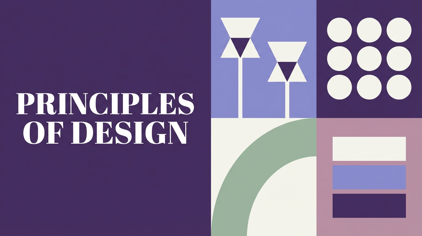
Read full article: Principles of Design
Why Alignment Matters
Alignment in graphic design does several things simultaneously. It creates order and visual structure that the eye can navigate efficiently. It groups related elements and separates unrelated ones. It communicates professionalism — misalignment reads as careless even to people who cannot articulate why. And it guides the eye through the composition in the sequence the designer intends.
Research into visual cognition consistently shows that humans process aligned compositions faster and retain their content longer than unaligned ones. Alignment is not aesthetic preference — it is cognitive efficiency.
For a broader look at tools that support structured, high-quality outputs, explore the best AI tools for designers on ImagineArt.
The 4 Types of Alignment in Design
Left Alignment
Left alignment is the most natural and most readable alignment for Western-language text because it mirrors the natural reading direction. The left edge is strong and consistent; the right edge is ragged. Left-aligned layouts feel organised, grounded, and approachable. They work for editorial design, long-form content, and any layout where readability is the primary concern.
Left alignment does not mean boring. Swiss grid-based editorial design — one of the most admired design traditions — is almost entirely left-aligned.
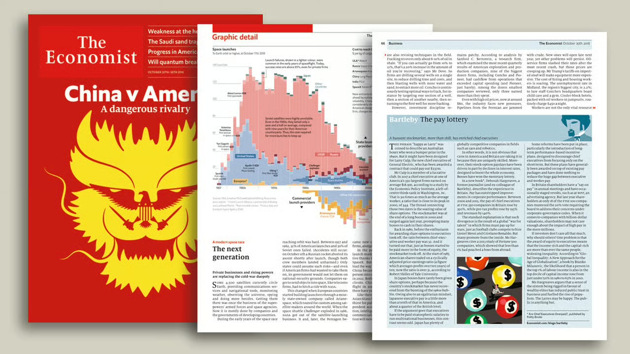 The Economist's editorial layout is one of the most disciplined examples of left alignment in publishing
Right Alignment
Right alignment creates visual tension. The ragged left edge and the consistent right edge pull against the reader's natural direction, creating a sense of elegance and contrast. It is rarely used for long text (too difficult to read at length) but works powerfully for pull quotes, captions, and elements that need to feel distinct from the main body of content.
Centre Alignment
Centre alignment is formal, symmetrical, and authoritative. It works for short text such as headlines, invitations, book covers, and packaging labels. It works best when the content is brief enough to scan without the ragged edges of a centred block becoming a readability problem. The most common amateur design mistake is centring everything by default. Centre alignment should be a deliberate choice, not a default.
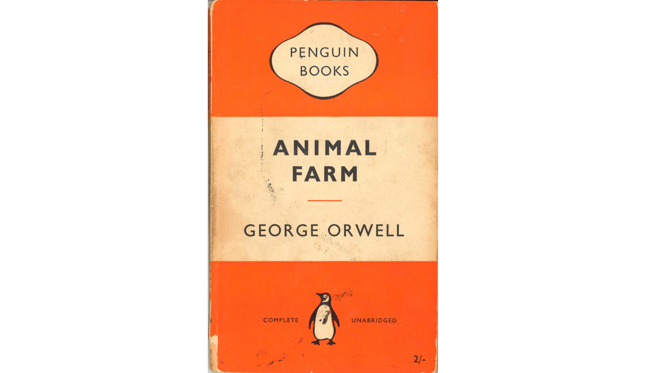 Penguin Books' classic cover designs are the definitive example of centre alignment done correctly
Edge and Object Alignment
Beyond page-edge alignment, elements are constantly aligned to each other: a caption to the left edge of an image above it; a button to the right edge of a form field; a headline to the top of an adjacent image. This object-to-object alignment is the underlying logic of every professional layout. It is invisible when correct and immediately apparent when wrong.
Alignment and the Grid System
Alignment is the output. The grid is the system that produces it consistently. A column grid divides the page into equal-width vertical columns separated by gutters. A baseline grid divides the vertical space into equal horizontal increments. Elements aligned to a grid are aligned to each other by extension — the grid does the work.
Most professional print and digital layouts use a 12-column grid because 12 is divisible by 2, 3, 4, and 6. This gives designers maximum flexibility while maintaining underlying consistency. Social media graphics typically use simpler 2 or 4-column structures.
The hallmark of a grid-based layout is that you can trace an invisible vertical line from any element's edge, and it will coincide with another element elsewhere in the composition. That invisible line is alignment made visible.
Alignment and Other Design Principles
Alignment and Proximity
Principle of proximity groups elements by closeness. Alignment orders those groups into a coherent visual structure. They are complementary: use proximity to establish what belongs together, then use alignment to make that grouping feel intentional. A group of elements that are proximate but not aligned looks accidental. A group that is both proximate and aligned looks designed.
Alignment and Visual Hierarchy
Alignment reinforces hierarchy. In a left-aligned layout, the reader's eye returns to the left edge after each line of text — a reliable anchor. When a subheading or pull quote breaks from that left alignment, the break creates emphasis. Breaking alignment is one of the most powerful tools for creating visual hierarchy. However, it only works when the underlying alignment is strong enough to notice.
Alignment in Practice — 5 Real-World Contexts
Logo and Brand Identity
Logo elements — the symbol, the wordmark, the tagline — must be aligned with precision. Off-centre wordmarks read as mistakes. Taglines misaligned to the logo body undermine the mark's authority. Most logo guidelines specify exact alignment relationships between elements precisely because these small misalignments compound visibly at large sizes.
Editorial and Print Layout
Magazine spreads, book pages, and newspaper layouts are exercises in grid-based alignment. Text columns align to each other. Headlines align to column edges. Images are cropped and positioned to align to the text grid. The richness of editorial design comes from using a rigorous grid as a foundation while occasionally — and deliberately — breaking it for visual energy.
Social Media Graphics
Social media graphics that look professional are almost always grid-aligned, even when they appear minimal or are created using AI graphic generator. The headline sits on a grid line. The image occupies a specific proportion of the frame. The logo is placed at a consistent distance from the edge. The apparent simplicity is structural.
Product Packaging
Packaging design lives in three dimensions and must align across faces, edges, and surfaces. The label hierarchy — brand name, product name, descriptor, ingredients — must be internally aligned. When a label is peeled and laid flat, its alignment should be evident. The structural order should survive the physical context.
Web and UI Design
Web layouts are governed by CSS grid and flexbox systems that encode alignment into the code. UI components — buttons, form fields, navigation items — must align precisely because even small misalignments are perceptible on high-resolution screens. Design systems codify alignment rules so every component built from the system is aligned without requiring individual decisions.
Common Alignment Mistakes and How to Fix Them
Centering Everything
The default action in most beginner design is to center everything. It feels safe and symmetrical. However, it produces weak, indecisive layouts that lack the strong visual anchors needed to guide the eye.
Fix: default to left alignment for body content. Use center alignment deliberately for headlines or short, formal text.
Aligning to the Wrong Anchor
An image caption aligned to the visual center of the page rather than the left edge of the image looks unmoored. A subheading aligned to the page margin rather than the column edge creates a visual gap.
Fix: always ask 'what should this element be aligned to?' before placing it.
Inconsistent Alignment Across a Multi-Page Document
When alignment decisions change from page to page without intention, the document feels unstable.
Fix: establish alignment rules in a grid at the document level, then apply them consistently. Exceptions should be rare and deliberate.
How to Prompt Alignment in AI-Generated Design
Alignment can be directed in AI image generation prompts, but it requires specific language. Vague aesthetic direction ('clean and professional') does not reliably produce aligned layouts. Structural language does.
Prompt Language for Alignment
- 'Left-aligned typography throughout'
- 'Swiss grid layout, two-column text'
- 'Flush-left headline and body text'
- 'Elements aligned to a strict vertical grid'
- 'Consistent left margin with ragged right text'
- 'Symmetrically centred composition'
- 'All elements aligned to the horizontal centre axis'
Best model for alignment-sensitive design: Ideogram v3 on ImagineArt handles layout structure and typographic alignment more reliably than other models.
Basic prompt · Model: Ideogram v3
"Minimalist business card design. Company name and contact details left-aligned in a clean sans-serif typeface. White background. Strong left margin. Clear visual hierarchy from name to title to contact. No decorative elements."
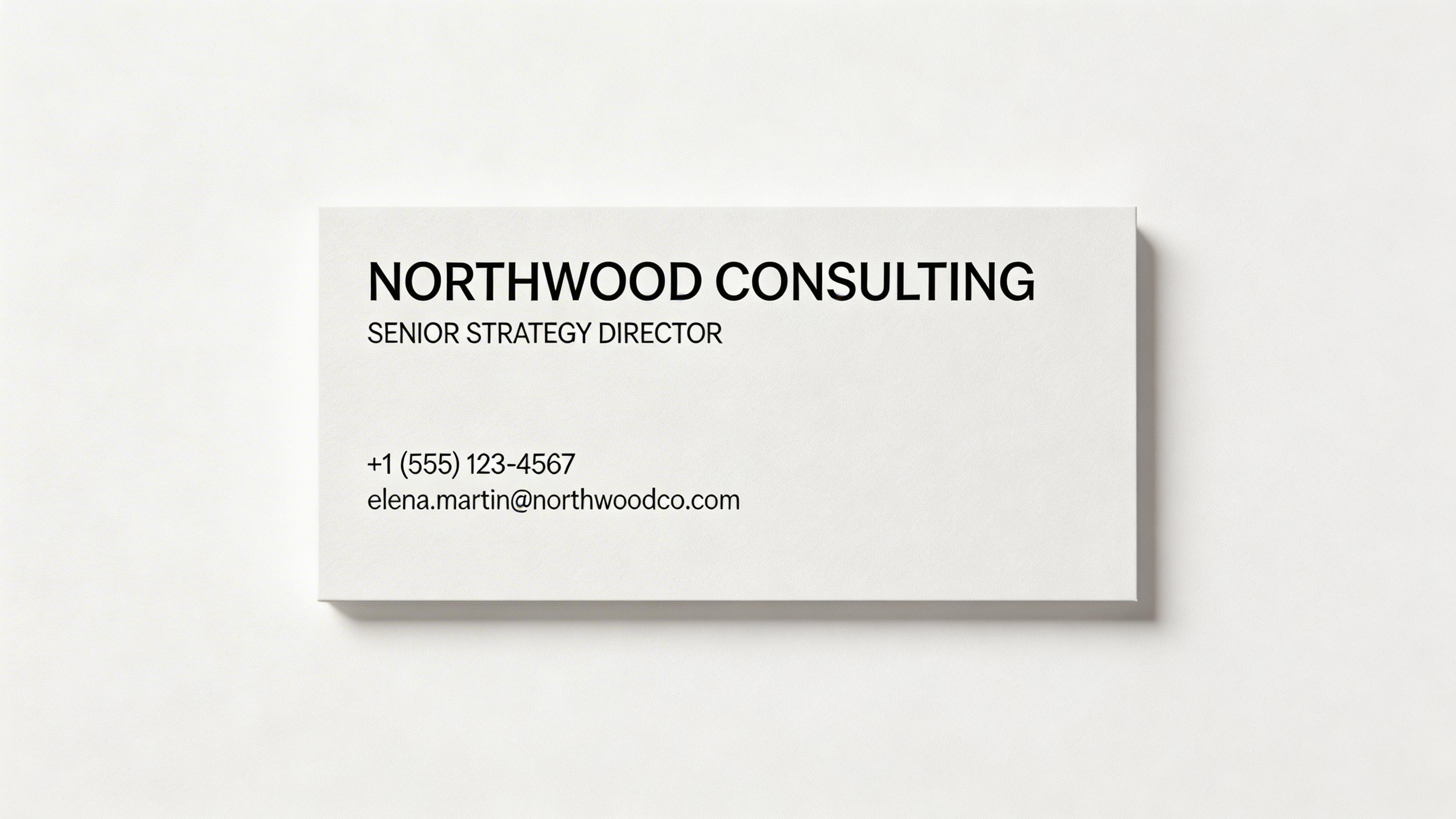 Left-aligned business card generated by ImagineArt AI Image Generator
Advanced prompt · Model: Ideogram v3
"A double-page editorial magazine spread for a luxury architecture publication. Layout: left page is a full-bleed architectural photograph. Right page: two-column text layout in a light-weight serif typeface. Headline flush left at the top of the first column. Body copy in the two-column grid. Pull quote aligned to the left edge of the second column. All elements on the right page aligned to a strict 12-column grid. Deep navy and warm white. Clean, authoritative, European editorial aesthetic."
Ready to Create Stunning Graphics with ImagineArt?
Alignment makes every design feel intentional, structured, and trustworthy. Once you start seeing alignment, you can’t unsee it. And more importantly, you can start controlling it.
You can define structure directly in your prompts, refine layouts with precision, and build consistent visual systems that hold across every asset. For growing teams and large-scale production, ImagineArt Enterprise takes this further. Instead of aligning one design at a time, you can embed alignment into workflows, templates, and brand systems—ensuring every output meets the same professional standard without starting from scratch.
Frequently Asked Questions
Alignment in graphic design is the intentional positioning of visual elements so they share a visual connection — to a grid, a page edge, or each other. It creates order, guides the eye, and communicates professionalism.
The four main types are left alignment (most readable for text), right alignment (creates tension and elegance), centre alignment (formal and symmetrical, best for short text), and edge/object alignment (elements aligned to each other rather than the page edge).
Alignment is structural — where elements are positioned relative to each other or a grid. Balance is perceptual — how heavy different elements feel to the eye. A perfectly aligned composition can be visually unbalanced, and an unaligned composition can feel visually balanced.
Alignment creates visual order that reduces cognitive load. It signals professionalism and intentionality. It guides the viewer's eye through the composition efficiently. Misalignment — even small amounts — reads as carelessness and undermines trust.
Recommended read: Graphic Design Tips for Non-Designers & Beginners
Tooba Siddiqui
Tooba Siddiqui is a content marketer with a strong focus on AI trends and product innovation. She explores generative AI with a keen eye. At ImagineArt, she develops marketing content that translates cutting-edge innovation into engaging, search-driven narratives for the right audience.