
Tooba Siddiqui
April 8, 2026 • Updated April 8, 2026
9 mins Read
The rule of thirds is the single compositional principle taught first in photography, cinematography, and graphic design because it reliably produces compelling results with minimal technical knowledge. It has been used by painters since the Renaissance, codified by cinematographers in the early 20th century, and adopted by every visual discipline since.
What Is the Rule of Thirds
The rule of thirds guides you to position your subject on the left or right third of the frame, keeping the remaining space open for balance and movement.
Rule of Thirds Grid Explained
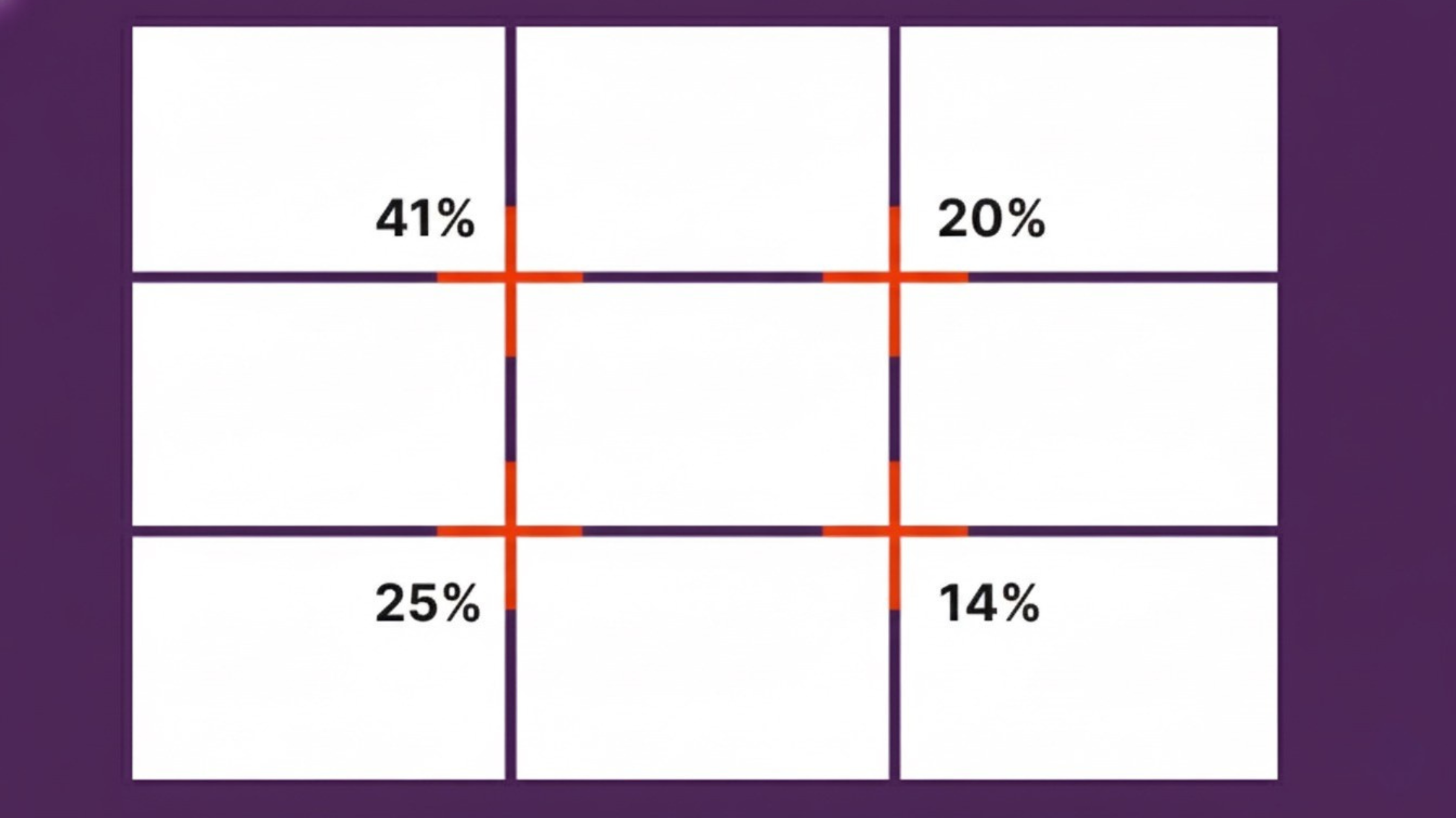
This principle of design is direct: create a rule of thirds grid (3×3), using two horizontal and two vertical lines. Draw two equidistant horizontal lines across any composition, dividing it into three equal horizontal bands. Draw two equidistant vertical lines, dividing it into three equal vertical bands. The result is a 3×3 grid of nine equal sections. The four points where these lines intersect are called the thirds points or power points.
The rule states: place the most important element of the composition at one of these four intersection points, or along one of the four lines. Specifically: place the main subject at an intersection point. Place the horizon line (in landscape photography) along one of the horizontal thirds lines — upper or lower, depending on whether the sky or the ground is more important. Place secondary elements along the remaining lines.
Read full article: Principles of Design
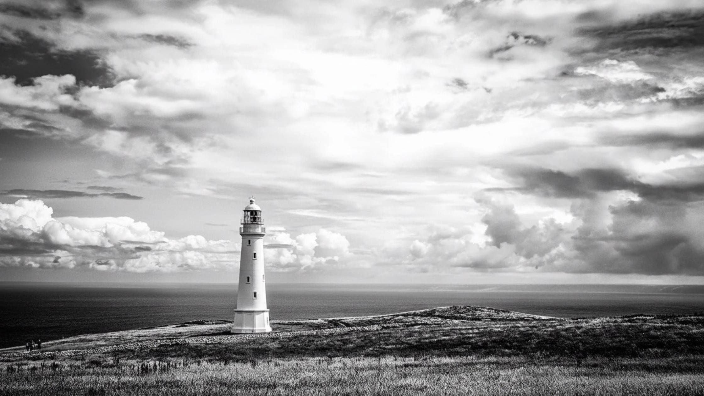
 This is how your eye scans an image according to the rule of thirds.
Why It Works — The Neuroscience
The eye does not enter a composition at the centre and then move outward. It enters at one of several natural starting points. These starting points are determined by the composition's dominant visual weight, allowing the eye to travel through the composition following contrast, size, and colour hierarchy. Centred compositions resolve immediately: the eye reaches the subject and stops. While off-centre compositions, with space on one side and subject at a thirds point, creates visual tension that keeps the eye moving through the frame.
This dynamic tension is the quality that makes images 'engaging.' It creates a visual problem (there is space beside the subject) that the eye tries to resolve by moving through the frame. The resolution is the narrative of the image.
The rule of thirds is not a rule in the sense that it must always be followed. It is a principle of design that consistently produces more dynamic and engaging compositions than centre-placement. It provides designers, artists, and photographers a reliable starting point for compositional decision-making.
Also read: Graphic Design Tips for Beginners & Non-Designers
Rule of Thirds vs Centred Composition
Centre-placed compositions are not wrong. They are appropriate in specific contexts where stability, formality, and symmetrical resolution are the communication goals:
- Formal portrait photography where the subject's direct gaze requires central placement
- Symmetrical logo marks where the radial balance requires a centred composition
- Product photography of symmetrical objects where off-centre placement would look arbitrary
- Formal invitations and certificates where symmetry communicates occasion
Rule of thirds compositions are appropriate when dynamic energy, visual interest, and narrative tension are the goals. The rule of thirds grid is mostly used in photography, editorial design, brand imagery, and social media content.
Rule of Thirds Examples — 5 Contexts
Rule of Thirds in Art
One of the most celebrated pieces by English Romantic painter J.M.W. Turner demonstrates the Rule of Thirds with remarkable subtlety. In ‘The Fighting Temeraire,’ the horizon rests along the lower horizontal line, grounding the composition, while the ships align with the first vertical line. By positioning the ships slightly off-center, Turner creates a sense of movement and anticipation, guiding the viewer’s eye naturally across the scene. This careful balance between stability and motion gives the painting its dynamic energy, contributing to its reputation as one of Turner’s most masterful works.
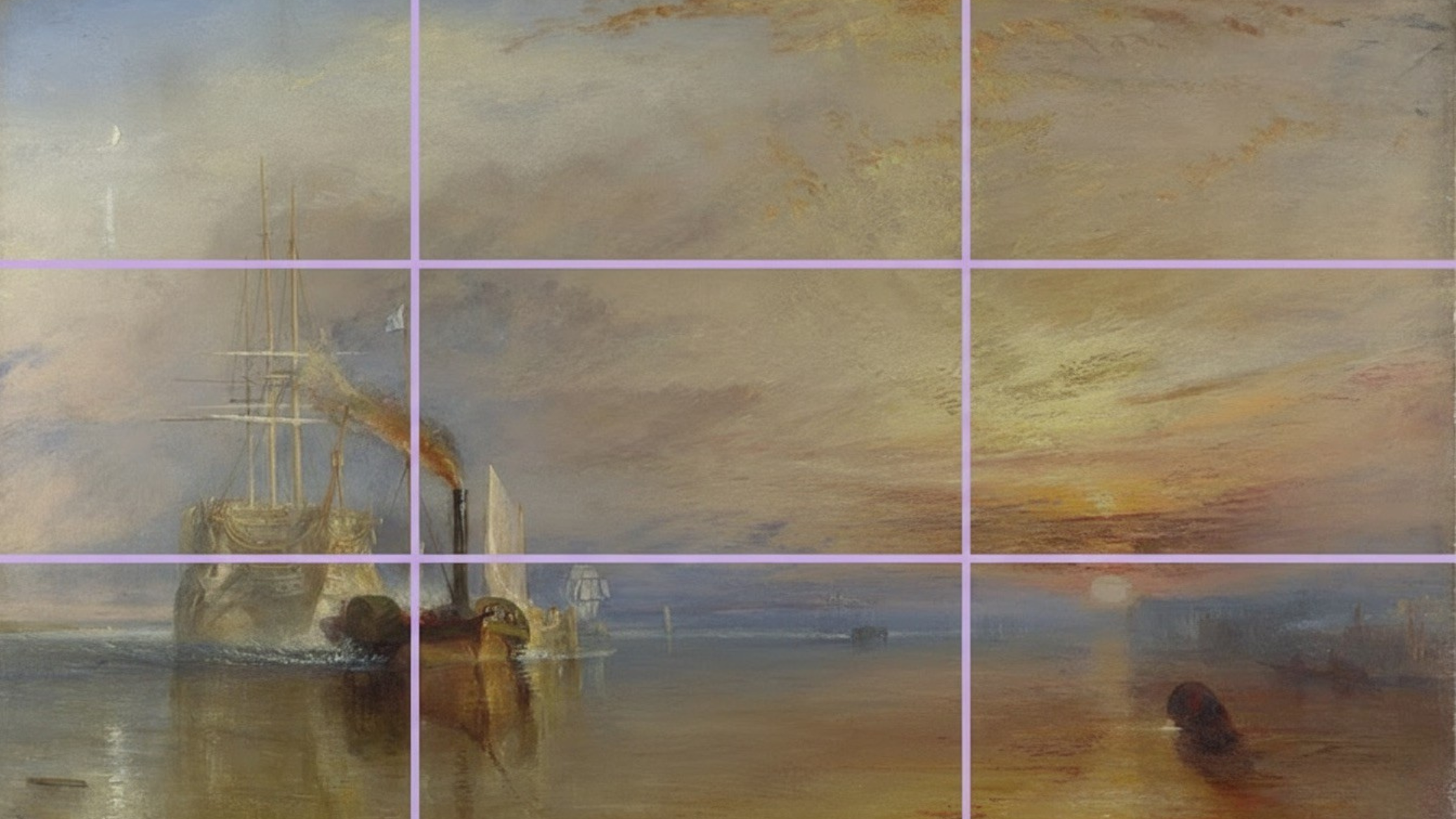 Turner’s The Fighting Temeraire using the rule of thirds, with the ship on the left and the tugboat and sun on the right, balancing emotion and contrast.
Rule of Thirds in Photography and Film
In landscape photography: place the horizon on the lower horizontal third when the sky is the more interesting element (dramatic clouds, sunset). Place it on the upper horizontal third when the ground or foreground is more interesting (reflections, texture, activity). Never place the horizon at the mathematical centre of the frame.
In portrait or product photography: place the subject's eyes at the upper horizontal third line. Give the subject 'looking space; if the subject faces right, place them in the left third of the frame, leaving space for them to look into. This creates narrative tension and a sense of the subject's world extending beyond the frame.
In film: Characters placed at thirds points in conversation shots create the visual rhythm of classic narrative filmmaking.
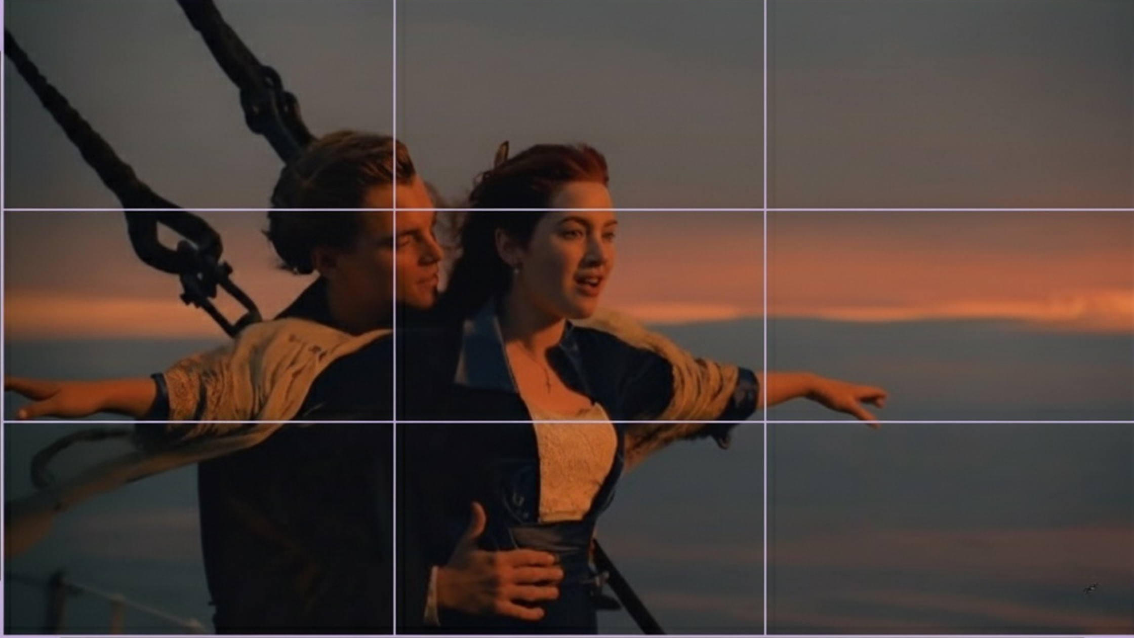 Titanic bow scene illustrating the rule of thirds, with Leonardo DiCaprio’s face at a top-left intersection and Kate Winslet’s arms aligned along the lower grid line.
Graphic Design and Print Layout
In poster design: the headline at the upper horizontal third, with visual content occupying the lower portion. Or the primary visual element at a thirds point with typography in the remaining space. The rule of thirds provides compositional anchors that prevent the 'everything floats in the middle' syndrome. Learn more about the AI tools for poster design on ImagineArt blogs.
In editorial layout: the primary image occupies two-thirds of the spread, the text occupies one third. The dominant element in the image is placed at a thirds intersection within the image itself. Hierarchy at the spread level (two-thirds/one-third) mirrors hierarchy at the image level (thirds point placement of the subject).
Social Media and Digital Content
Instagram feed posts: subjects placed at the left or right vertical third, leaving the opposite third for text overlay or breathing space.
TikTok thumbnails: face at upper-right thirds intersection, text at upper-left.
YouTube thumbnails: the face occupies the right two-thirds; large text occupies the left third.
The rule of thirds is explicitly built into most smartphone camera viewfinders as an optional overlay, and into every professional photography and video production tool. It is the compositional default of the digital image era.
Advertising Design
In advertising, the rule of thirds creates the division between the visual and the message. A two-thirds image / one-third headline split produces a composition that is visually dominant but allows the message sufficient space and prominence to be read. The product or subject placed at the intersection between the image area and the text area anchors both.
When to Break the Rule of Thirds
 Small centered subject to add emphasis while breaking the rule of thirds
Following the rule of thirds grid usually produces engaging compositions but not the most powerful compositions available. Breaking the rule, deliberately and intentionally, can produce more striking results than following the rule of thirds gird:
- Extreme isolation: placing a subject at the far edge of the frame, with the full remaining composition as empty space, creates drama beyond anything the thirds points can produce
- Radical symmetry: a portrait that places the subject's face at the exact mathematical centre of the frame, staring directly at camera, creates a confrontational directness that off-centre placement diffuses
- Deliberate imbalance: placing a heavy element at the very edge of the frame with no counterweight creates compositional tension that keeps the eye moving
- Use extreme scale: When your subject is very small, place it at or near the center to draw attention through contrast.
- Experiment with alternative flows: Try compositions like a Z-pattern to guide the viewer’s eye naturally across the frame instead of relying on thirds.
- Shoot beyond the rule: Capture multiple variations like centered, off-center, and asymmetrical, and then choose the composition that feels strongest
The rule of thirds is a starting point. Understanding why it works helps the designer break it in ways that intensify tension, visual movement, and narrative space rather than abandoning them.
How to Prompt Rule of Thirds in AI Image Generation
AI image generator responds reliably to compositional language when it is specific. 'Rule of thirds composition' in a prompt will move the generator toward off-centre placement. Specifying the thirds placement explicitly produces more precise results.
Basic prompt · Model: Nano Banana Pro
"Lifestyle portrait photography. Subject positioned at the right vertical third of frame. Generous empty space on the left — negative space for the subject to look into. Subject's eyes at the upper horizontal third. Natural light from the left. Rule of thirds composition throughout."
Advanced prompt · Model: Seedream
"Editorial product photography for a premium skincare brand. Rule of thirds composition. Product placed at the lower-left thirds intersection point. Upper-right two-thirds: soft out-of-focus background — warm neutral stone texture. Lower-right third: product's shadow and reflection on a marble surface. The product occupies approximately 25% of the frame. The remaining 75% is background, creating luxury negative space around the product. Soft natural side lighting. No text overlay. Shot from a slightly elevated angle."
 Generated by ImagineArt AI Image Generator
Recommended read: Best AI Tools for Designers
Ready to Design Stunning Graphics with ImagineArt?
The rule of thirds is a foundational tool for creating compositions that naturally guide the viewer’s eye and inject dynamic tension into your visuals. Whether you’re working in photography, film, social media, or graphic design, understanding how to balance subjects, horizons, and negative space gives your work clarity, engagement, and narrative flow.
By automating multi-step workflows, maintaining brand consistency, and producing production-ready assets at scale, you can focus on storytelling and design while ensuring every image or video follows the visual rules that captivate your audience.
Master the Rule of Thirds, combine it with smart AI workflow, and your compositions won’t just follow the rules — they’ll define them.
Frequently Asked Questions
The rule of thirds is a compositional guideline that divides a composition into a 3×3 grid using two horizontal and two vertical lines. Placing key elements at the four intersection points (thirds points) produces dynamic, engaging compositions because off-centre placement creates visual tension that keeps the eye moving through the frame.
Place the most important element of your composition at one of the four thirds points rather than at the mathematical centre. Place horizon lines at the upper or lower horizontal third. Give subjects 'looking space' by placing them opposite to their direction of gaze. In layouts, use the thirds structure to divide content into primary (two-thirds) and secondary (one-third) areas.
No. The rule of thirds consistently produces more dynamic compositions than centre-placement, but it is not universally correct. Formal portraits, symmetrical logos, and compositions where stability and resolution are the communication goals can benefit from centred placement. The rule is a starting point and a reliable default, not an absolute.
Both are compositional frameworks that produce visually harmonious results. The rule of thirds divides the frame into three equal parts (1:1:1). The golden ratio divides the frame into unequal parts at a ratio of approximately 1:1.618. The rule of thirds is faster to apply and more widely used in practice. The golden ratio produces marginally more mathematically precise harmony but is more complex to calculate.
Tooba Siddiqui
Tooba Siddiqui is a content marketer with a strong focus on AI trends and product innovation. She explores generative AI with a keen eye. At ImagineArt, she develops marketing content that translates cutting-edge innovation into engaging, search-driven narratives for the right audience.