
Umaima Shah
January 15, 2026 • Updated July 8, 2026
7 mins Read
A social media post that looks fine on Facebook ad can breaks on LinkedIn, or worse, lose clarity in ads, and crop critical content in previews. This means that social media image sizes are no longer a ‘nice-to-have’ detail, but these dimensions and aspect ratios make and break designs.
This guide covers:
- the right social media aspect ratios and image sizes according to platforms
- how to repurpose content for different placements and devices with differing aspect ratios
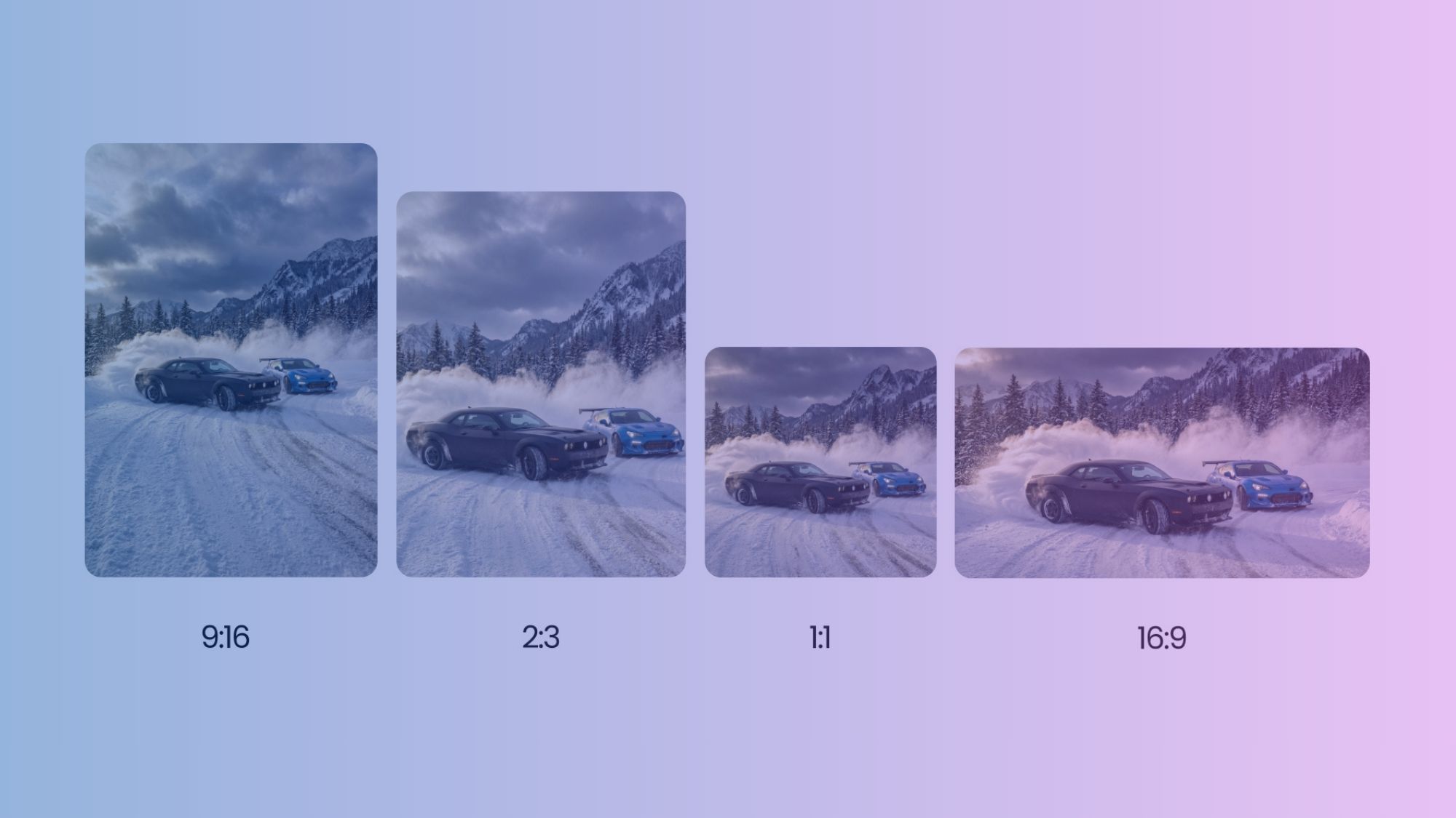
Key Concepts — Social Media Aspect Ratios and Image Dimensions
 Social Media Aspect Ratio Guide
Let’s get the fundamentals right before jumping into the details.
Image dimensions vs aspect ratios
- Image dimensions, such as 1080 × 1350 px, refer to the pixel size and determine image clarity.
- Aspect ratios describe the shape of an image, such as 1:1 or 4:5, and determine how it fits within a platform’s layout.
Both work together, but they solve different problems.
Difference between supported sizes and recommended sizes
- Supported sizes define what a platform allows you to upload.
- Recommended sizes define what displays correctly.
Uploading a supported size does not guarantee proper framing or clarity if it does not match the preferred aspect ratio.
Visual clarity across mobile-first platforms
Most social platforms prioritise mobile viewing.
- Vertical and portrait images occupy more screen space and remain clearer in scrolling feeds.
- Horizontal images often appear smaller and lose impact on mobile devices.
Avoiding unexpected crops on feed, ads, and previews
Incorrect aspect ratios trigger automatic cropping; depending on content placed in the image, automatic cropping commonly affects faces, text, logos, and CTAs. That’s why, designing in recommended ratios and sizes reduces the risk of losing key visual elements across placements.
Maintaining consistency across brands and campaigns
Consistent image sizing ensures brand visuals look uniform across platforms. It prevents layout shifts and mismatched framing when the same creative appears in different contexts. This consistency specially translates into a more aesthetically pleasing grid.
How incorrect sizing impacts reach, engagement, and credibility
Poorly sized images reduce visual clarity and disrupt presentation. Cropped visuals and compressed assets definitely lower engagement and weaken brand perception, especially if you are in a competitive business where other brands fill up feeds.
Recommended Read: AI image generators for social media
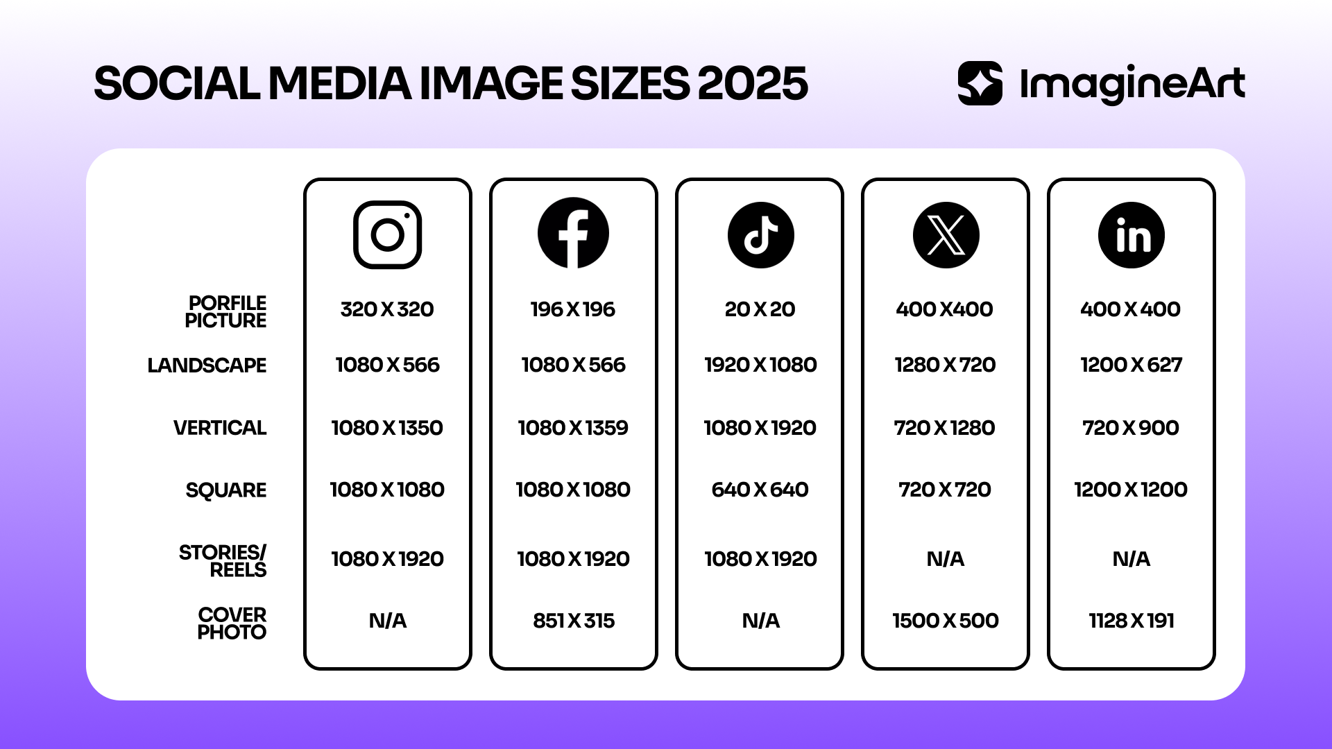
Platform-Wise Social Media Image Sizes — 2026 Edition
1. Instagram Image Sizes
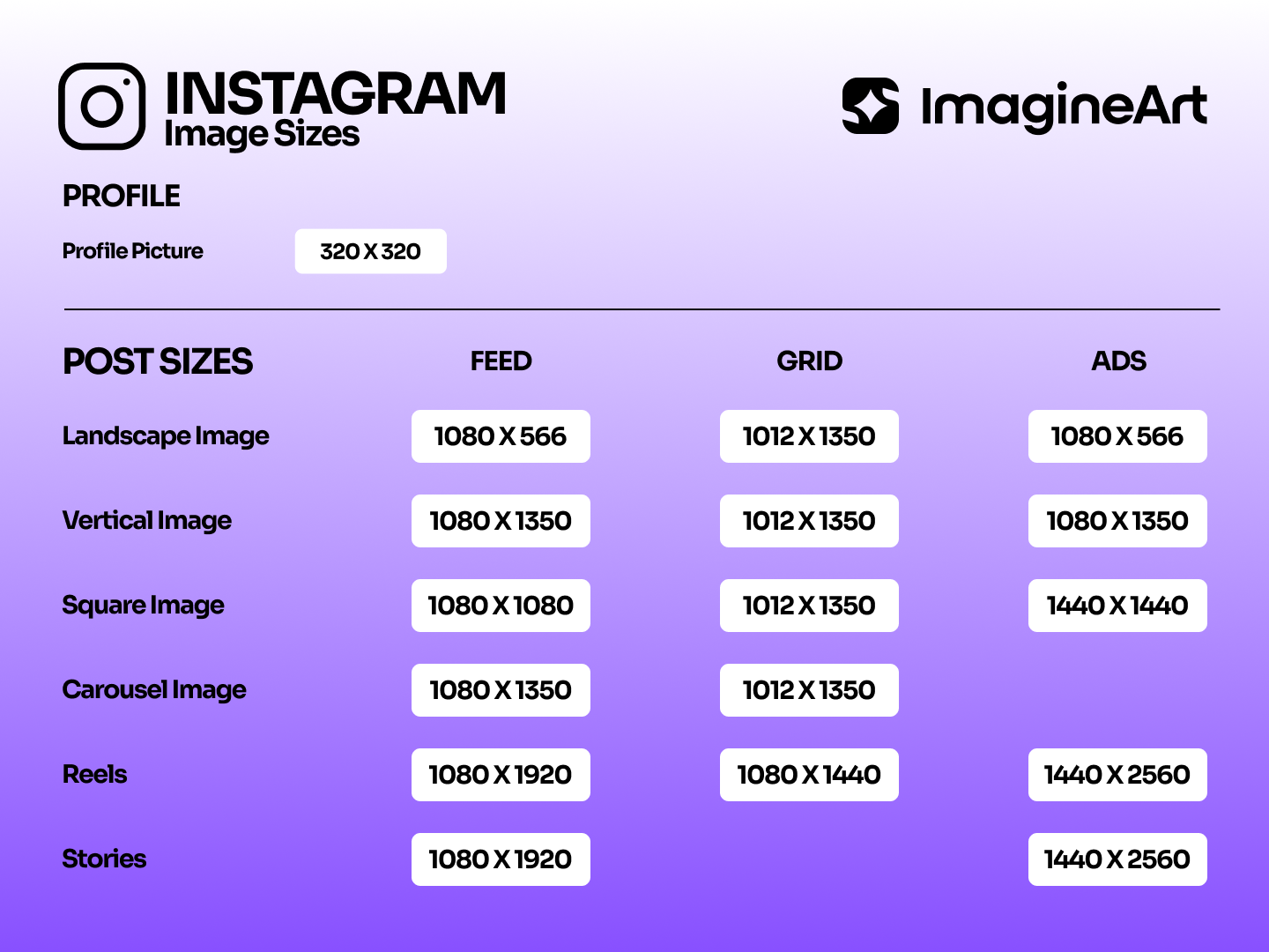 Instagram Aspect Ratio Guide
Feed Post
- Recommended: 1080 × 1080 px (1:1) or 1080 × 1350 px (4:5)
- Appears in feed and profile grid
- Common mistake: designing only for square, ignoring portrait performance
Carousel Post
- Same sizes as feed posts
- All slides must use the same ratio
- Common mistake: mixing aspect ratios in one carousel
Story
- Recommended: 1080 × 1920 px (9:16)
- Appears full screen
- Common mistake: placing text too close to top and bottom UI areas
Reel Cover
- Recommended: 1080 × 1920 px
- Cropped to 4:5 in feed preview
- Common mistake: designing only for full vertical without safe zones
2. Facebook Image Sizes
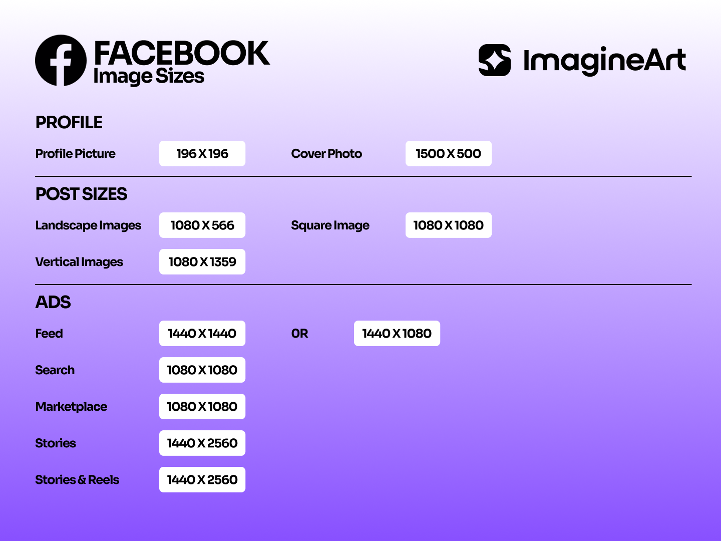 Facebook Social Media Aspect Ratio Guide
Feed Post
- Recommended: 1080 × 1080 px or 1080 × 1350 px
- Cropped differently on desktop and mobile
- Common mistake: uploading low-resolution images
Story
- Recommended: 1080 × 1920 px
- Full-screen vertical
- Common mistake: ignoring UI overlays
Cover Photo
- Recommended: 851 × 315 px
- Displays differently on mobile vs desktop
- Common mistake: centering text instead of using safe zones
Ad Placements
- Sizes vary by placement
- Common mistake: reusing organic post images for ads
3. LinkedIn Image Sizes
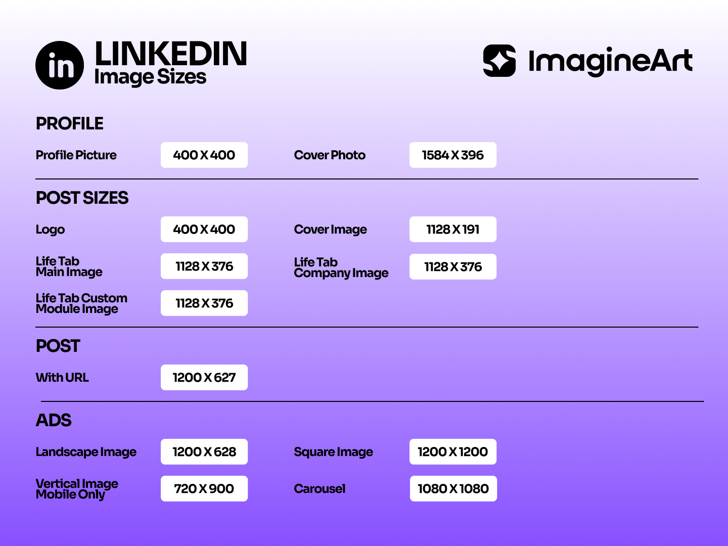 Linkedin Social Media Aspect Ratio Guide
Feed Post
- Recommended: 1200 × 627 px or 1080 × 1080 px
- Used for organic posts and shared links
- Common mistake: overly tall images that crop in preview
Carousel Document
- Recommended: 1080 × 1080 px per slide
- Ideal for presentations and storytelling
- Common mistake: using low-contrast text
Company Page Banner
- Recommended: 1128 × 191 px
- Cropped aggressively on smaller screens
- Common mistake: placing logos near edges
Sponsored Ads
- Follow LinkedIn ad-specific guidelines
- Common mistake: ignoring ad-specific aspect ratios
4. X (Twitter) Image Sizes
In-Feed Image
- Recommended: 1080 × 1080 px or 1280 × 720 px
- Cropping varies by post context
- Common mistake: using tall images that crop awkwardly
Header Image
- Recommended: 1500 × 500 px
- Appears differently across devices
- Common mistake: placing text too low
5. Pinterest Image Sizes
Standard Pins
- Recommended: 1000 × 1500 px (2:3)
- Tall pins perform better
- Common mistake: using square pins only
Idea Pins
- Vertical formats preferred
- Common mistake: horizontal layouts
6. YouTube Image Sizes
Video Thumbnail
- Recommended: 1280 × 720 px (16:9)
- Most visible entry point
- Common mistake: low-contrast designs
Community Post Image
- Recommended: 1080 × 1080 px
- Appears in feed
- Common mistake: ignoring mobile preview
Recommended Read: YouTube Shorts aspect ratio guide
7. TikTok Image Sizes
Video Cover
- Recommended: 1080 × 1920 px
- Cropped in feed preview
- Common mistake: placing text near edges
Profile and Previews
- Square formats work best
- Common mistake: using horizontal images
8. Thread Image Sizes
Feed Image
- Recommended: 1080 × 1350 px (4:5) or 1080 × 1080 px (1:1)
- Appears in the main Threads feed and profile
Best Practices for Scaling Designs Across Platforms (2026)
- Design for aspect ratio first, then resolution
- Prioritise vertical formats
- Keep text and logos inside safe zones
- Export at native platform sizes to reduce compression
- Design once, adapt smartly instead of resizing blindly
Ads vs Organic Content
Ad placements crop differently from organic posts. Stories, ads, feed ads, and carousel ads each apply different constraints. Reusing organic exports for ads often leads to performance drops due to hidden CTAs or cropped visuals.
What happens with social media images during different campaigns?
Social Media Campaigns
Campaign visuals need multiple exports before publishing. Image sizes define how a single creative is translated into platform-ready formats without unexpected cropping or layout shifts during rollout.
Product Launches
Launch assets require different image sizes for announcements, teasers, and highlights. Correct sizing keeps the product fully visible while preserving spacing for pricing, features, and labels.
Brand Awareness Content
Ongoing brand posts reuse the same visual system. Image sizes keep logos, color blocks, and typography consistently visible across repeated posts and devices.
Paid Advertising
Ad creatives must match strict placement requirements. Image sizes determine how text, imagery, and calls to action appear inside approved ad formats without rejection or truncation.
Creator and Influencer Assets
Creator visuals move across platforms with different framing rules. Image sizes adjust to maintain centering and readability of faces, products, and gestures.
Multi-Brand Social Media Management
Shared templates need platform-specific dimensions. Image sizes allow the same design system to scale across brands without rebuilding assets for each account.
Content Repurposing
High-performing visuals often move from one platform to another. Image sizes convert existing assets into new formats while preserving composition and intent.
Workflow Tips for Teams Managing Multiple Brands
- Keep a single, agreed size guide for all platforms so designers, marketers, and freelancers work from the same specs.
- Create reusable templates per platform to avoid redesigning layouts and to keep brand visuals consistent.
- Use clear file names and version tracking to prevent mix-ups between platforms, formats, and brand variants.
- Build workflows that generate correctly sized assets automatically, reducing manual resizing and production errors.
Recommended Read: ImagineArt workflows
Common Mistakes Professionals Still Make in 2026
-
One export for every platform
Reusing a single image causes cropping issues and weak performance across feeds and ad placements.
-
No mobile preview checks
Skipping mobile previews leads to hidden text, cut logos, and poor visual hierarchy on smaller screens.
-
Text placed too close to edges
Platform UI elements often cover edges, making important text unreadable or partially hidden.
-
Manual resizing instead of workflows
Manual resizing slows teams down and increases errors compared to automated, workflow-based systems.
Create Social Media Assets with ImagineArt
Design once and generate platform-specific image sizes without manual resizing. ImagineArt helps teams to start from a single visual direction and produce correctly sized assets for feeds, stories, ads, and previews across platforms.
Frequently Asked Questions
Most platforms perform best with images around 1080 px wide, adjusted by aspect ratio depending on placement, such as feed, story, or ads.
Portrait formats like 4:5 and 9:16 deliver the highest visibility on mobile-first platforms.
A 1080 × 1350 px (4:5) image works well for Instagram, Facebook, and LinkedIn feeds with minimal cropping.
Each platform applies its own layout rules, UI overlays, and feed structures, which causes automatic cropping when images don’t match preferred aspect ratios.
Uploading the above recommended sizes does not improve quality. Platforms downscale and compress images, which can reduce sharpness if the dimensions are incorrect.
Using a single size across all platforms often results in cropped visuals, hidden text, and inconsistent presentation due to differences in feed and preview behaviors.
Umaima Shah
Umaima Shah is a creative content strategist specializing in AI tools, image generation, and emerging technologies. She focuses on translating complex platforms into clear, practical insights for creators, designers, and product teams