Arooj Ishtiaq
June 5, 2026 • Updated June 6, 2026
18 mins Read
Ideogram 4.0 accepts plain text prompts but was trained exclusively on structured JSON captions. Plain text works well. JSON works better for layout, typography, and color control. This guide covers both, with 20+ ready-to-use prompts across every major use case. Generate directly through ImagineArt's AI image generator.
Ideogram 4.0 Prompt Guide
Before diving into the mechanics, here is what this guide addresses and in what order. Each section builds on the previous one, so readers new to Ideogram 4.0 will benefit from reading sequentially, while experienced users can jump to the specific capability they need.
- Plain text prompting: works out of the box, strong results for most use cases
- JSON structure: the full schema explained with field-by-field guidance
- Style description: controlling medium, lighting, and aesthetics
- Bounding box layout: placing elements exactly where you want them
- Color palette conditioning: steering the dominant color scheme via hex values
- In-image text: rendering multi-line, multi-font typography in a single generation
- Use case examples with 20+ prompts: posters, packaging, logos, social, product photography, and more
- Common mistakes: what breaks output quality and how to avoid it
For a full breakdown of what the model is and how it compares to Ideogram 3.0, the Ideogram 4.0 overview covers the architecture, capabilities, and leaderboard results.
Plain Text Prompting for Ideogram 4.0
Plain text prompts work well with Ideogram 4.0 and produce strong results across most use cases. If you are coming from Ideogram 3.0 or from other models, your existing prompts will transfer directly. You do not need to learn JSON to get useful output. For context on why text rendering in AI image generation has historically been a challenge and how Ideogram addresses it, the why AI image generators struggle with text breakdown is worth reading before diving into prompting.
Plain text works best for:
- Quick concept exploration before committing to a composition — the creative AI art prompt ideas guide covers prompt structures that work well for this stage
- Photorealistic scenes, portraits, and landscapes where exact placement is not critical
- Stylized illustrations where aesthetic direction matters more than spatial precision
- Testing a visual direction before formalizing it into a JSON caption
The difference between a weak plain text prompt and a strong one comes down to three things: the visual medium, the lighting condition, and the color direction. Specifying all three in every prompt improves output quality significantly.
Plain Text Prompt Examples
The following prompts are ready to use directly. Each one specifies medium, lighting, and color direction as the baseline for consistent output quality.
Portrait: A close-up portrait of a woman with curly red hair at a sunlit window, soft morning light from the left, shallow depth of field, warm honey tones, 85mm lens, photorealistic
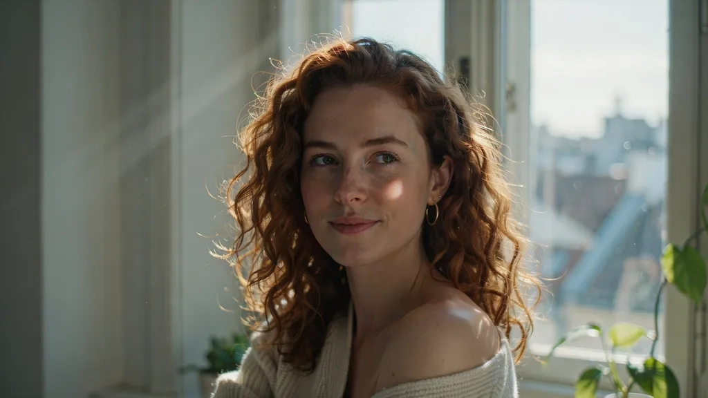 potrait by ideogram 4
Vintage travel poster: A bold vintage travel poster for Kyoto Japan, Mt. Fuji silhouette at dusk, cherry blossoms in the foreground, deep indigo sky and gold accents, large serif headline reading "KYOTO" centered at the top, screenprint style
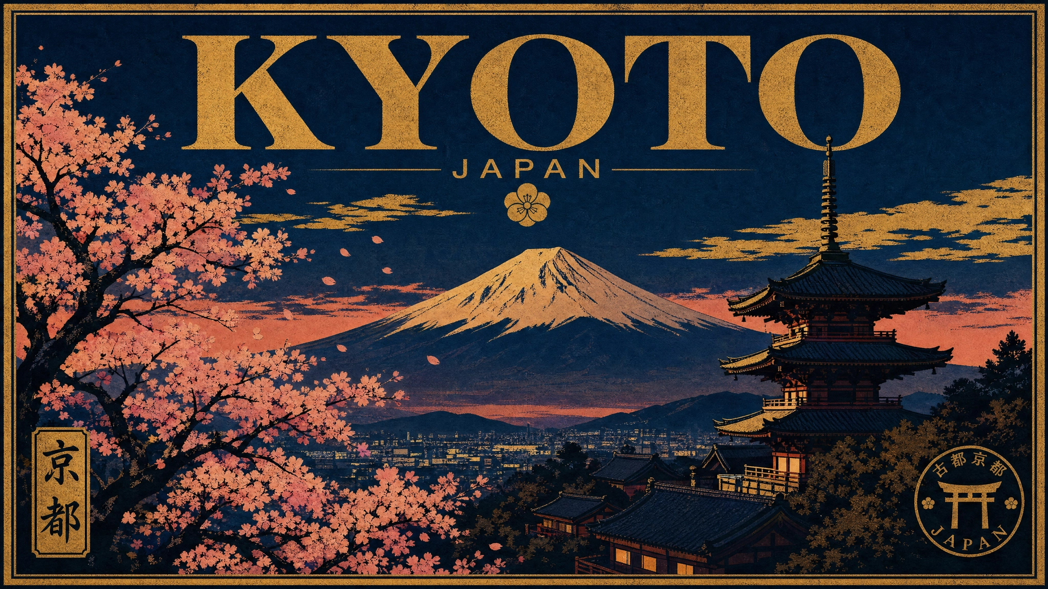 Vintage travel poster.webp
Product photography:A sleek frosted glass perfume bottle on a white marble surface, single directional side light, one soft shadow, editorial product photography, minimalist, shallow depth of field
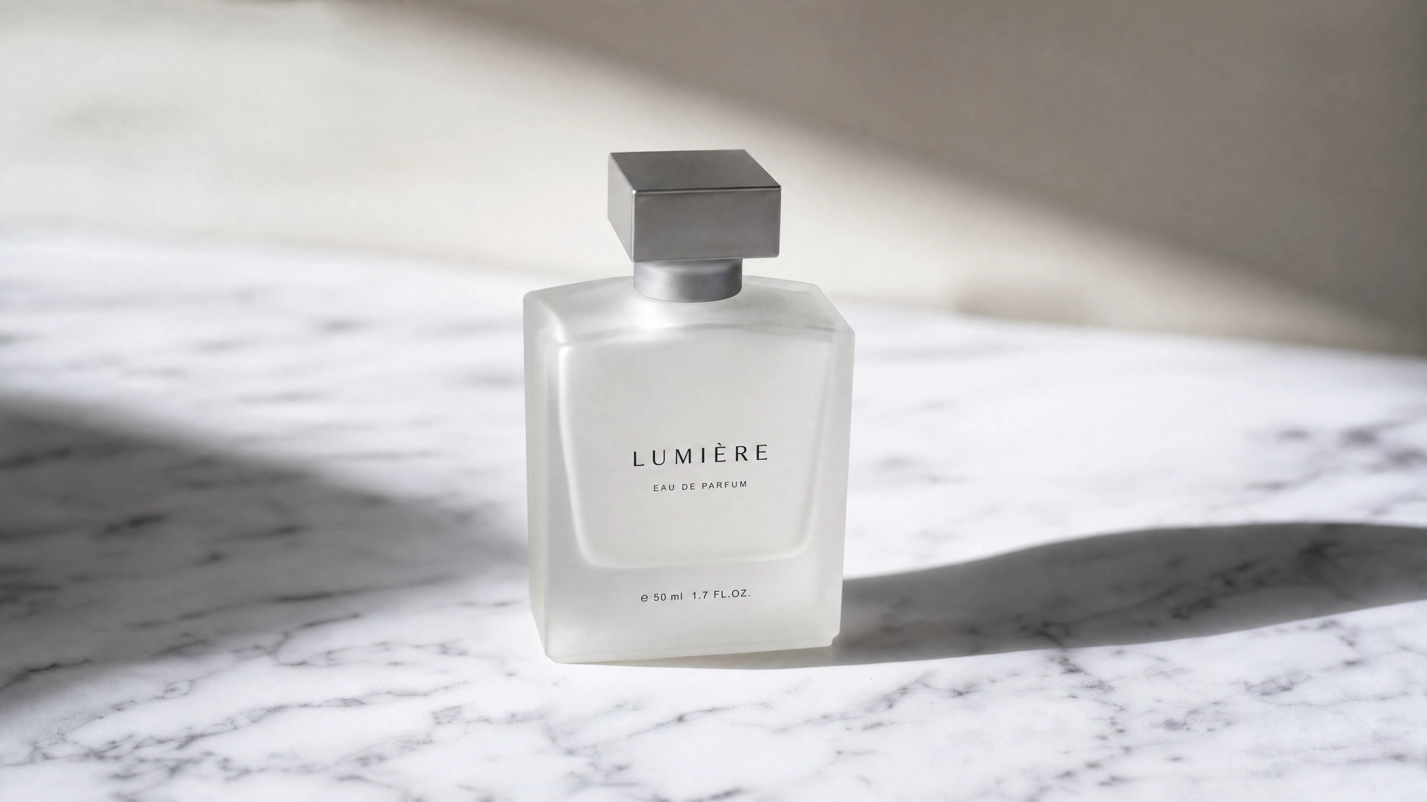 Product photography by ideogram 4
Logo concept: A clean geometric mountain logo for an outdoor equipment brand called "RIDGE", two overlapping triangles forming a peak, dark slate and white, sans-serif wordmark below the mark, flat vector style
![]() Logo concept by Ideogram 4
Logo concept by Ideogram 4
Social media post: A modern Instagram post graphic for a specialty coffee brand, warm terracotta background, overhead shot of a ceramic cup with latte art, minimal text space reserved at the bottom third, lifestyle editorial aesthetic
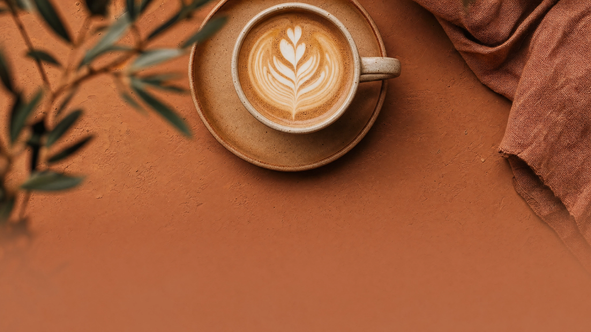 Social media post by ideogram 4
Event poster: A bold typographic music festival poster for "WAVELENGTH FEST", August 3 at Shoreline Amphitheater, dark navy and electric yellow color palette, large condensed uppercase sans-serif headline, geometric abstract shapes, minimal negative space
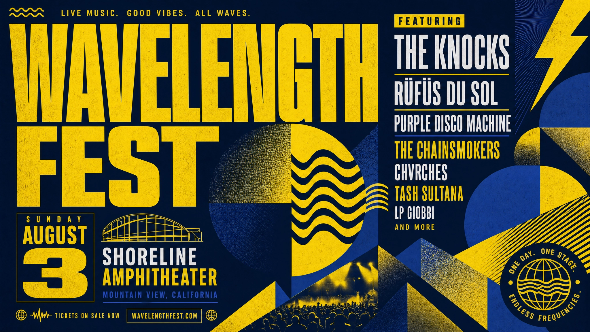 Event poster by Ideogram 4
Book cover: A literary fiction book cover for a novel called "The Weight of Salt", coastal landscape at low tide, overcast grey sky, lone figure standing at the shoreline, subdued blue-grey palette, serif title in the upper third
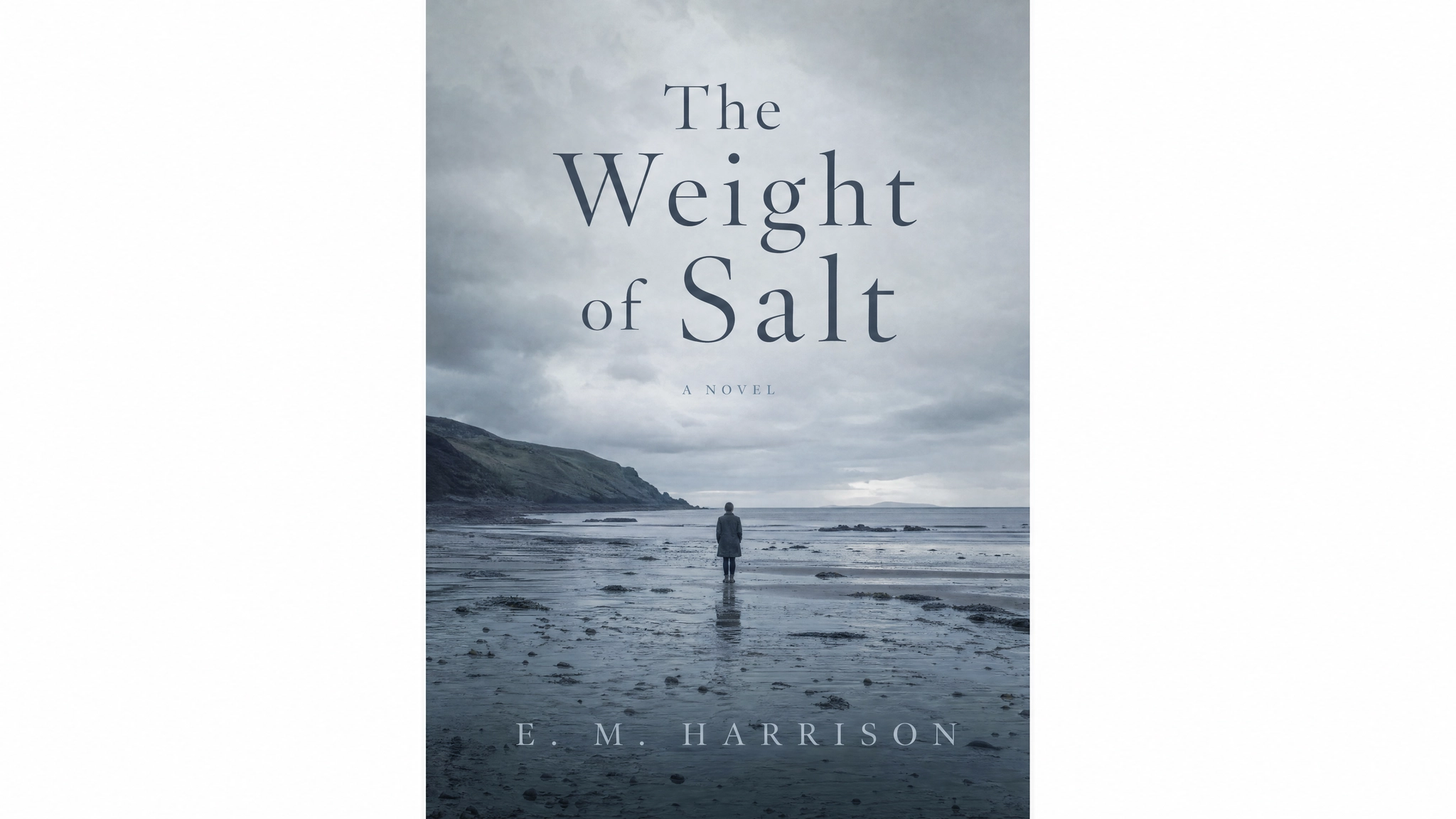 Book cover by ideogram 4
Fashion editorial: A high fashion editorial photograph of a woman in a structured red coat standing on a wet cobblestone street in Paris, overcast daylight, puddle reflections, desaturated environment with the coat as the only saturated element, 50mm lens
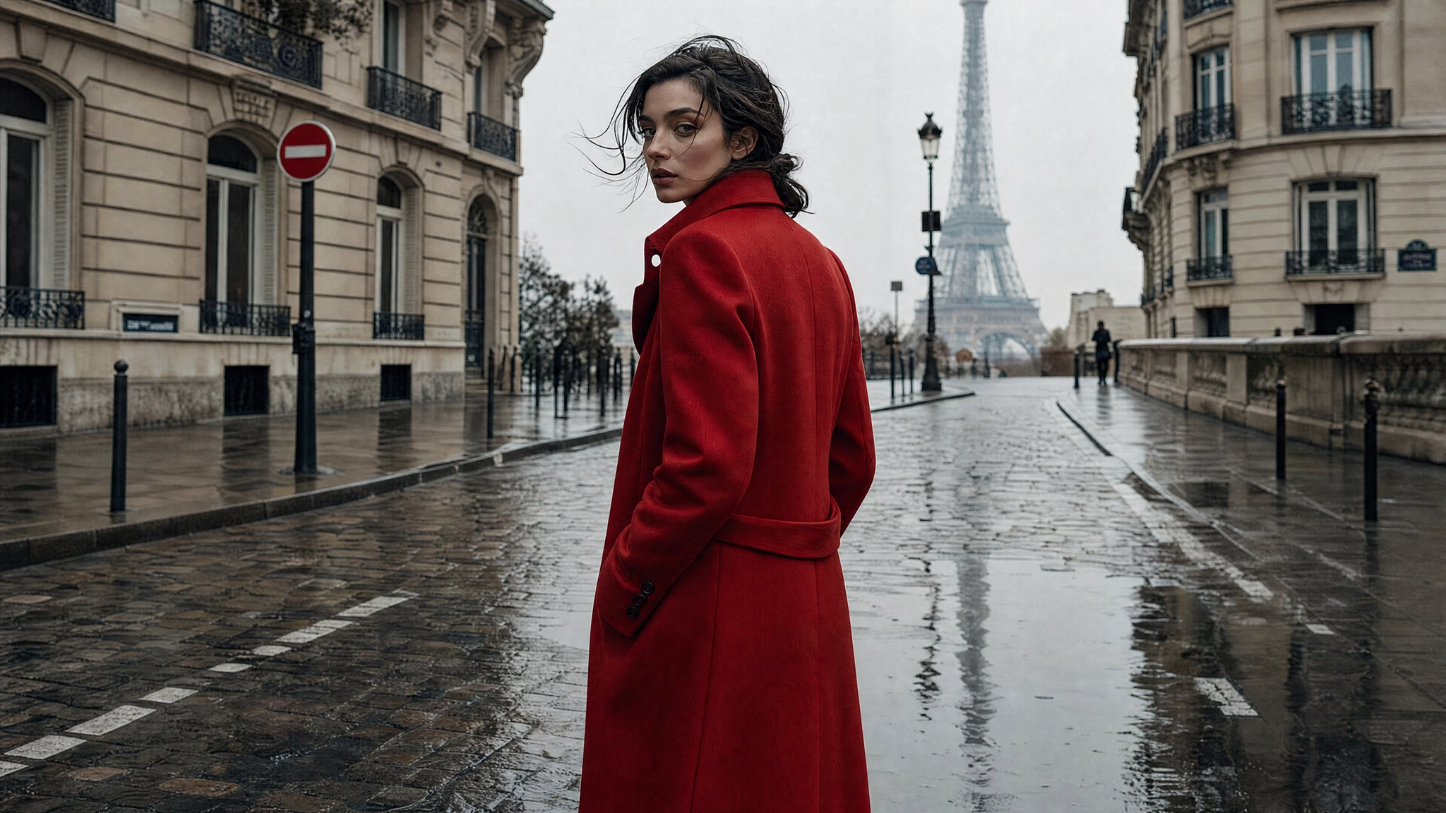 Fashion editorial by ideogram 4
Multilingual text in image: A bilingual promotional poster for a luxury skincare brand, headline in English reading "GLOW STARTS HERE" at the top in bold serif, Arabic translation below in matching weight and style, centered product bottle on a cream background, gold and ivory color palette, clean editorial layout
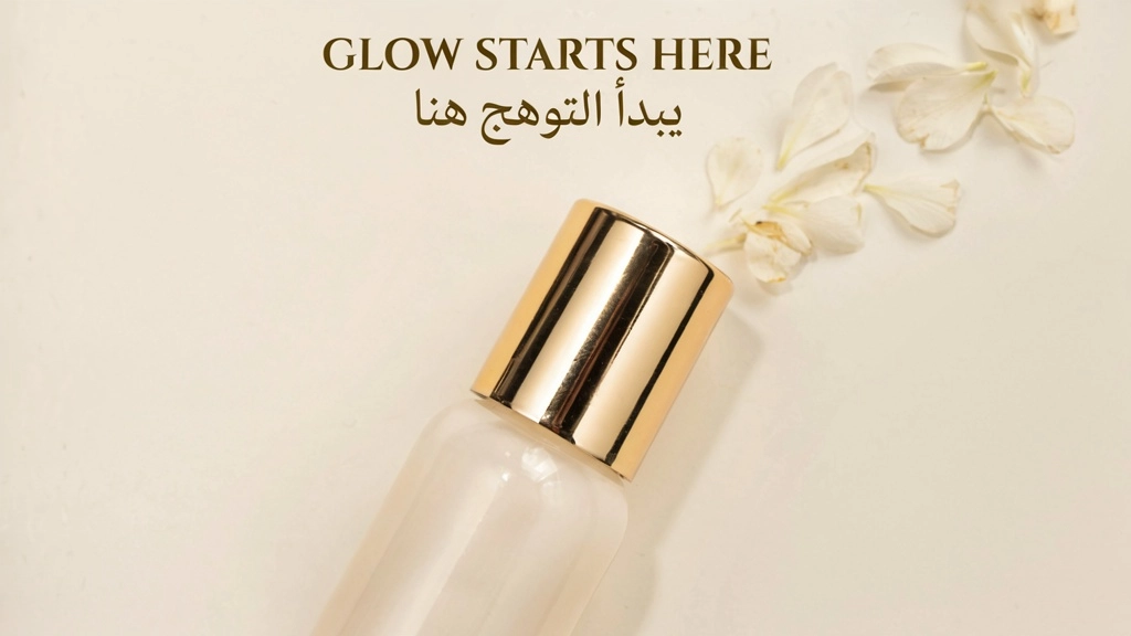 Multilingual text in image.webp
Illustration: A detailed editorial illustration of a futuristic city at dusk, floating architecture, warm amber sky, neon-lit streets below, flat color areas with fine ink-style linework, limited palette of deep teal, amber, and off-white, graphic novel aesthetic
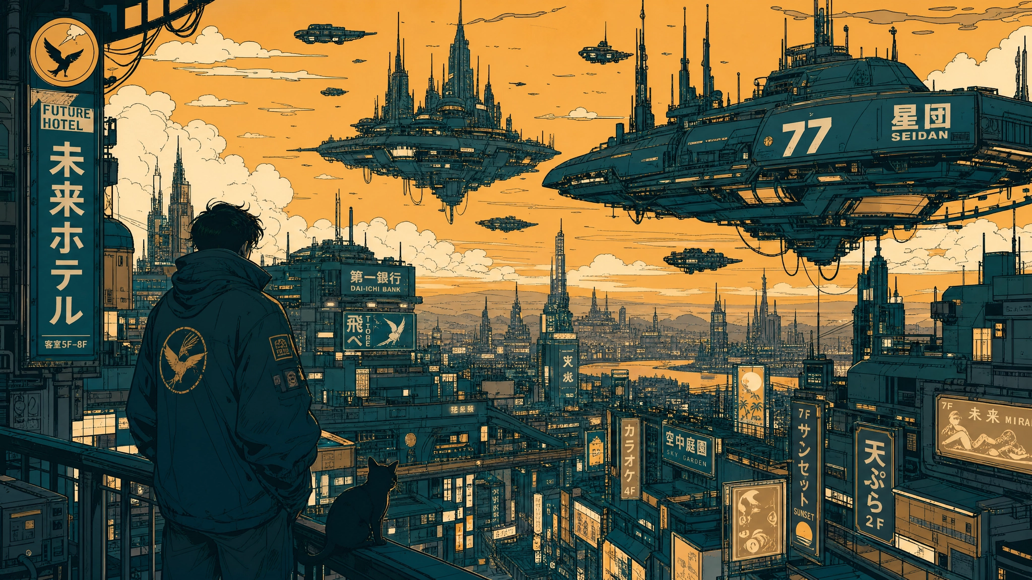 Illustration by ideogram 4
Album cover: A moody album cover for an indie artist called "LUNE", a lone figure standing in a foggy forest at night, a single shaft of moonlight breaking through the canopy, a dark blue and silver palette, title "LUNE" in delicate thin serif at the bottom center, cinematic and atmospheric
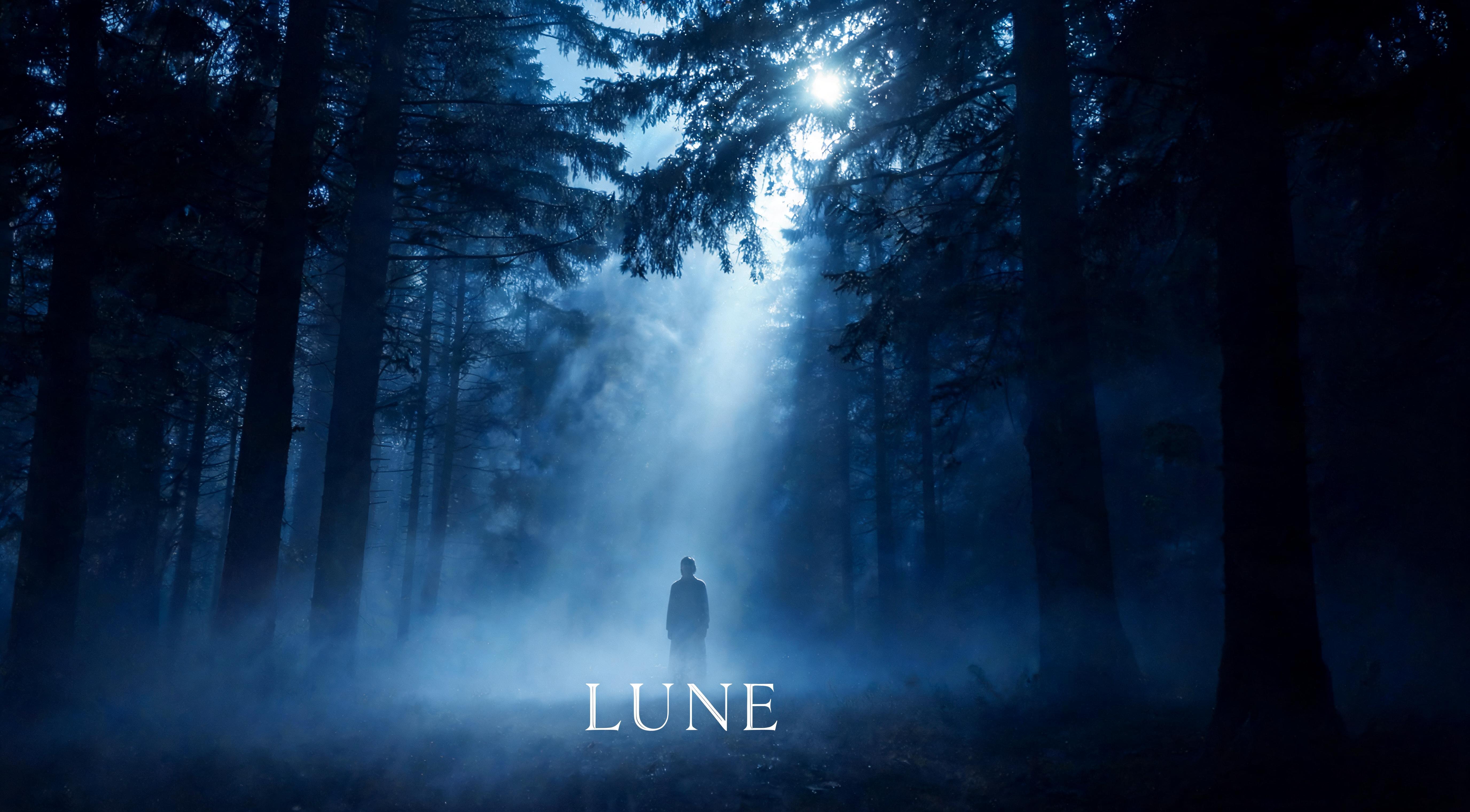 Album cover by ideogram 4
Ideogram 4.0's combination of typed text elements and bounding-box placement makes it particularly well-suited for album cover design, where the artist name, album title, and visual composition need to work together as a single cohesive layout rather than as separate design steps. The how to create an AI album cover guide on ImagineArt covers the full workflow for musicians and designers producing release-ready artwork with AI image generation.
For more details, read: Ideogram 4.0 vs Nano Banana Pro vs GPT Image 2 Guide
JSON Prompting for Ideogram 4.0
JSON prompting is where Ideogram 4.0 separates from every other image model. Because the model was trained on structured captions, providing a JSON object gives you significantly better compositional control, spatial precision, and style fidelity than plain text allows. This is especially true for design work, in-image text, and any output where exact placement matters. The full schema is documented in Ideogram's official GitHub repository and is the basis for all examples in this section.
The JSON schema has three top-level fields:
high_level_description: a one or two-sentence summary of the full image (optional but strongly recommended)style_description: controls visual style, lighting, medium, and color palette (optional)compositional_deconstruction: defines the background and all individual elements with optional bounding boxes (required)
The Full JSON Structure
Below is the complete skeleton of a valid Ideogram 4.0 JSON caption. Every example in this guide uses this structure. Copy and modify it rather than writing from scratch.
Structural rules that directly affect output quality:
backgroundmust come beforeelementsinsidecompositional_deconstruction- For photographic output, use
photo. For illustrations, useart_style. Never both at once. - Key order matters: the model was trained with a consistent key order and following it reduces generation drift
- Hex colors must be uppercase:
#FF6B35not#ff6b35or#f63 - Bounding boxes use normalized 0 to 1000 coordinates in the format
[y_min, x_min, y_max, x_max]
JSON Prompting for Style Description
The style_description field controls the aesthetic direction of the entire image. It tells the model what medium it is working in, how the scene is lit, what the visual mood is, and which colors should dominate. It is optional in the schema but strongly recommended for consistent output.
Use photo for photographic outputs paired with "medium": "photograph". Use art_style for everything else, including illustration, graphic design, and 3D rendering. These two fields are mutually exclusive.
For photographic output:
1"style\_description": {
2
3  "aesthetics": "warm, candid, golden hour",
4
5  "lighting": "soft directional sunlight from the left, long warm shadows",
6
7  "photo": "35mm, f/2.8, shallow depth of field, eye-level",
8
9  "medium": "photograph",
10
11  "color\_palette": \["\#F4A261", "\#E76F51", "\#264653", "\#2A9D8F", "\#E9C46A"\]
12
13}
For illustration or graphic design output:
1"style\_description": {
2
3  "aesthetics": "minimal, clean, geometric",
4
5  "lighting": "even diffuse light, no harsh shadows",
6
7  "medium": "graphic\_design",
8
9  "art\_style": "flat vector illustration, bold outlines, generous whitespace",
10
11  "color\_palette": \["\#FFFFFF", "\#1A1A2E", "\#0066FF", "\#00CC88"\]
12
13}
For cinematic, moody output:
1"style\_description": {
2
3  "aesthetics": "moody, cinematic, noir",
4
5  "lighting": "low-key, single practical light source, deep shadows, minimal fill",
6
7  "photo": "35mm, f/1.4, slight grain, high contrast",
8
9  "medium": "photograph",
10
11  "color\_palette": \["\#1B1B2F", "\#162447", "\#1F4068", "\#E43F5A", "\#F5F5F5"\]
12
13}JSON Prompting for Bounding Box Layout
Bounding boxes are how you specify exactly where each element appears in the frame. The coordinate system uses a normalized 1000x1000 grid with the origin at the top left corner. The format is [y_min, x_min, y_max, x_max].
Think of the frame as a 1000x1000 square. To place a headline across the top third, you want y values from around 50 to 300 and x values from 100 to 900. To place a subject in the lower center, use y values from 500 to 950 and x values from 250 to 750. Rough placement works well. The model handles small imprecision gracefully.
"bbox": [50, 100, 300, 900] places the element in the top 30% of the frame, spanning most of the horizontal width
"bbox": [500, 250, 950, 750] places the element in the bottom half, center column
Example: Jazz Festival Poster With Bounding Box Layout
This example places three distinct elements at explicit positions: a performer silhouette in the center, a headline across the top, and date and venue text at the bottom.
1{
2
3 "high\_level\_description": "A bold typographic event poster for a New Orleans jazz festival featuring a trumpet player silhouette.",
4
5 "style\_description": {
6
7 "aesthetics": "dramatic, high contrast, vintage",
8
9 "lighting": "strong stage spotlight from above, deep surrounding shadows",
10
11 "medium": "graphic\_design",
12
13 "art\_style": "screenprint aesthetic, limited color palette, bold geometric shapes",
14
15 "color\_palette": \["\#0A0A0A", "\#F5C518", "\#E63946", "\#FFFFFF"\]
16
17 },
18
19 "compositional\_deconstruction": {
20
21 "background": "Near-black background with subtle aged paper texture.",
22
23 "elements": \[
24
25 {
26
27 "type": "obj",
28
29 "bbox": \[200, 300, 850, 700\],
30
31 "desc": "A silhouette of a trumpet player mid-performance, arm raised, dramatic pose, rendered in deep gold against the dark background."
32
33 },
34
35 {
36
37 "type": "text",
38
39 "bbox": \[30, 100, 180, 900\],
40
41 "text": "NEW ORLEANS JAZZ FEST",
42
43 "desc": "Bold uppercase serif headline in bright white spanning the top of the poster."
44
45 },
46
47 {
48
49 "type": "text",
50
51 "bbox": \[870, 200, 960, 800\],
52
53 "text": "JULY 12 · ARMSTRONG PARK",
54
55 "desc": "Smaller red sans-serif text at the bottom with the date and venue."
56
57 }
58
59 \]
60
61 }
62
63}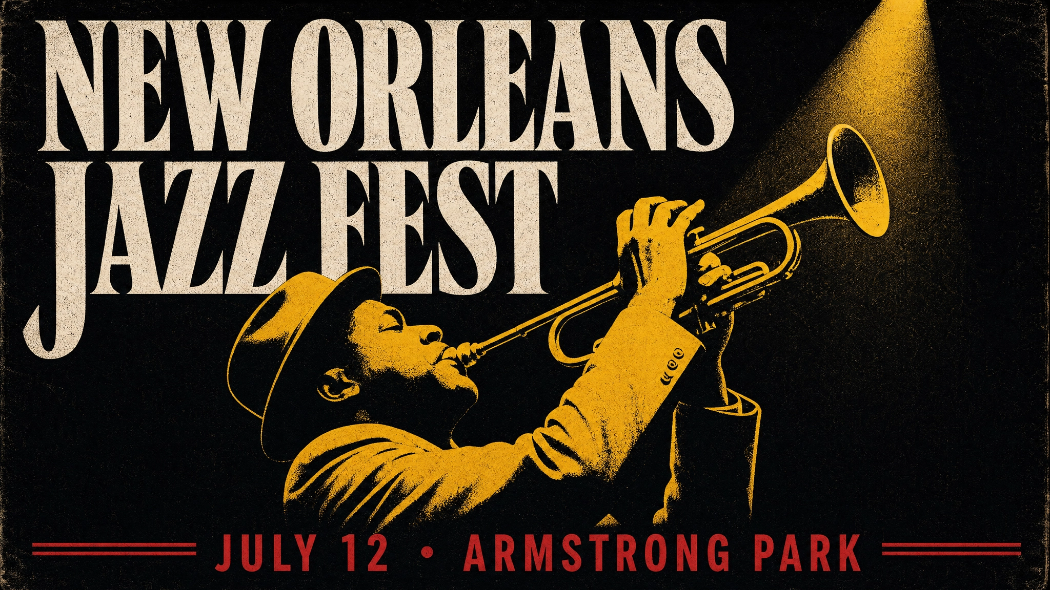 Jazz Festival Poster With Bounding Box Layout
Example: Product Detail Shot With Subject Placement
This example anchors the product in a specific position and leaves compositional space above for a headline.
1{
2
3 "high\_level\_description": "A clean editorial product shot of a matte black wireless speaker against a white background.",
4
5 "style\_description": {
6
7 "aesthetics": "clean, premium, minimal",
8
9 "lighting": "soft diffuse studio lighting, subtle shadow beneath the product",
10
11 "photo": "50mm, f/8, even exposure",
12
13 "medium": "photograph",
14
15 "color\_palette": \["\#FFFFFF", "\#F2F2F2", "\#1D1D1F", "\#CCCCCC"\]
16
17 },
18
19 "compositional\_deconstruction": {
20
21 "background": "Pure white studio background with an extremely subtle gradient to near-white at the bottom.",
22
23 "elements": \[
24
25 {
26
27 "type": "obj",
28
29 "bbox": \[280, 280, 820, 720\],
30
31 "desc": "A matte black cylindrical wireless speaker, centered, with minimal branding. Subtle soft shadow beneath it on the white surface."
32
33 }
34
35 \]
36
37 }
38
39}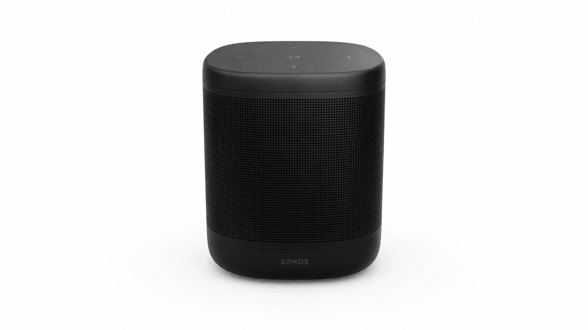 Product Detail Shot With Subject Placement
JSON Prompting for Color Palette Conditioning
Color palette conditioning is one of Ideogram 4.0's most distinctive features. Providing hex values in color_palette steers the dominant colors of the generated image directly, rather than relying on imprecise descriptive language like "deep navy" or "warm amber."
Up to 16 hex colors can be specified at the image level in style_description.color_palette. Up to 5 hex colors can be specified per individual element. All values must be uppercase #RRGGBB format. Include both highlight and shadow colors for controlled lighting, and always include the intended background color explicitly if you want a specific background tone.
Example: Warm Sunset Palette
This example from the official Ideogram documentation shows how the palette directly steers a seascape toward orange and pink tones without relying on language alone.
1{
2
3 "high\_level\_description": "A lone sailboat on calm water at sunset.",
4
5 "style\_description": {
6
7 "aesthetics": "serene, warm, golden hour",
8
9 "lighting": "golden hour backlighting, warm atmospheric haze",
10
11 "photo": "wide angle, f/8",
12
13 "medium": "photograph",
14
15 "color\_palette": \["\#FF6B35", "\#F7C59F", "\#004E89", "\#1A659E", "\#2B2D42"\]
16
17 },
18
19 "compositional\_deconstruction": {
20
21 "background": "A calm ocean stretching to a low horizon, sky washed in orange and pink with thin wisps of cloud.",
22
23 "elements": \[
24
25 {
26
27 "type": "obj",
28
29 "desc": "A single sailboat with a white triangular sail, silhouetted against the setting sun."
30
31 }
32
33 \]
34
35 }
36
37}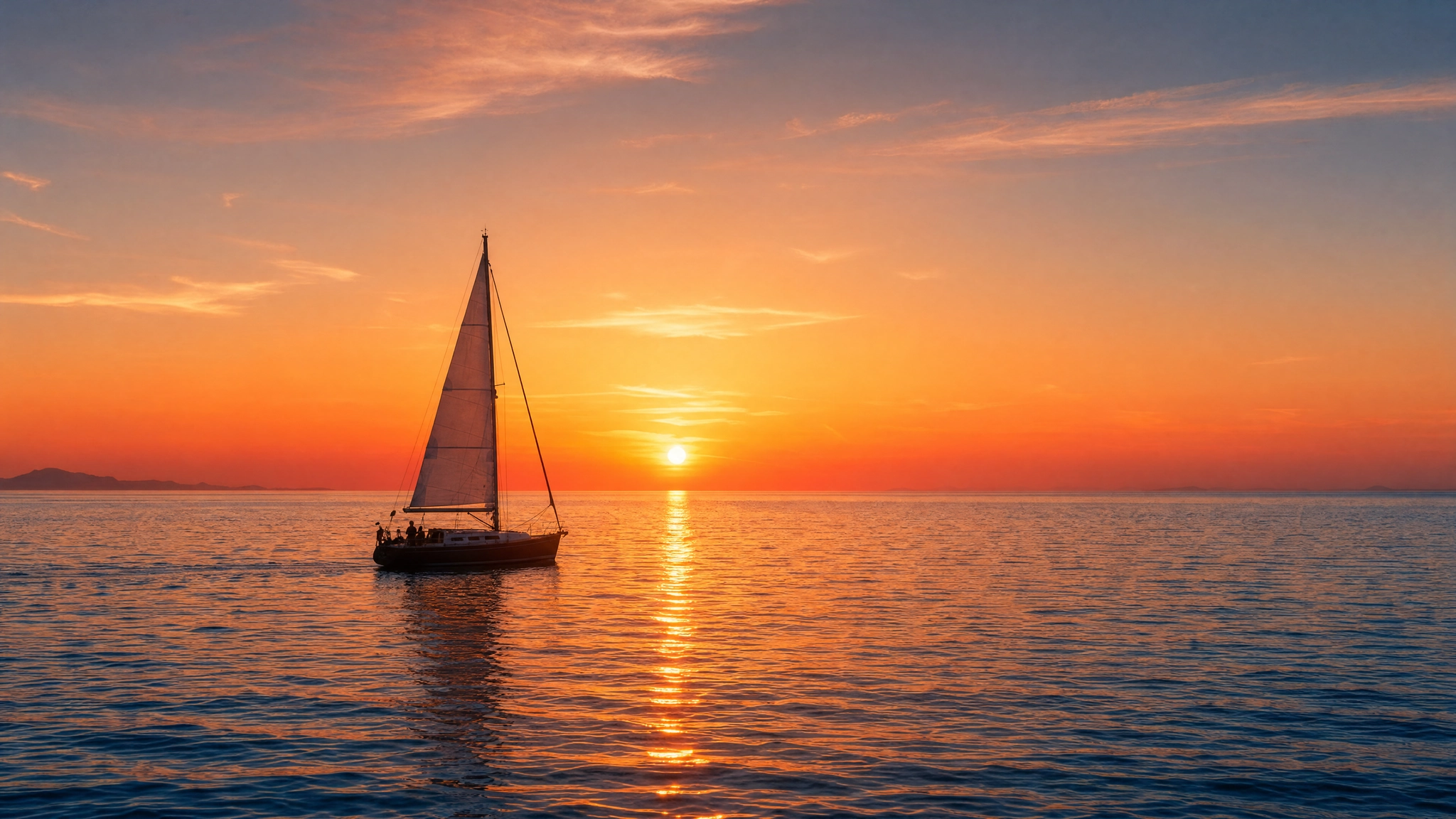 Warm Sunset Palette
Example: Corporate Brand Palette
This example shows how to enforce a brand color system on a business card layout by specifying exact brand hex values.
1{
2
3 "high\_level\_description": "A clean modern business card layout for a tech company.",
4
5 "style\_description": {
6
7 "aesthetics": "minimal, professional, geometric",
8
9 "lighting": "even diffuse studio lighting",
10
11 "medium": "graphic\_design",
12
13 "art\_style": "flat vector design, generous whitespace, sans-serif typography",
14
15 "color\_palette": \["\#FFFFFF", "\#F0F0F0", "\#333333", "\#0066FF", "\#00CC88"\]
16
17 },
18
19 "compositional\_deconstruction": {
20
21 "background": "A solid off-white card surface with subtle paper texture.",
22
23 "elements": \[
24
25 {
26
27 "type": "text",
28
29 "text": "NOVA TECH",
30
31 "desc": "Bold dark grey sans-serif company name across the upper third of the card."
32
33 },
34
35 {
36
37 "type": "text",
38
39 "text": "hello@novatech.io",
40
41 "desc": "Small blue sans-serif contact email near the bottom of the card."
42
43 }
44
45 \]
46
47 }
48
49}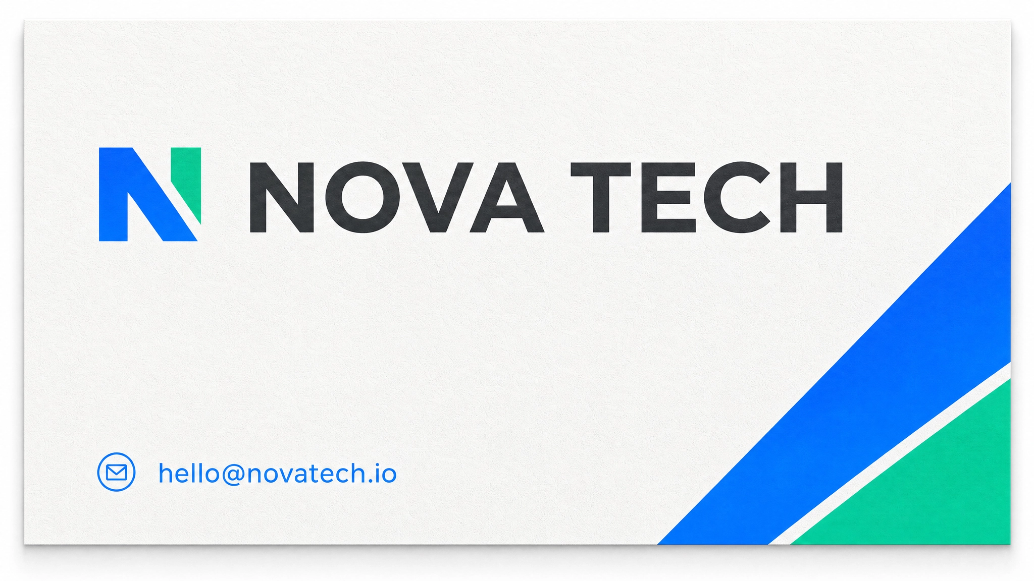 Corporate Brand Palette
JSON Prompting for In-Image Text
In-image text rendering is Ideogram 4.0's most significant advantage over other open-weight models. The "text" element type carries the literal string to render and a separate visual description for how it should look. This separation is what allows multi-line, multi-font, multi-weight typography across a single generation without the spelling errors and glyph confusion that affect other models.
Each text element uses this field order: type, bbox (optional but recommended), text (the exact string), desc (visual styling description), color_palette (optional, up to 5 hex values). The text field is separate from desc because one is what the model renders, and the other is how it should look.
Example: Product Launch Poster With Multi-Text Layout
This example places a headline, subtext, and availability date as three separate text elements, each in its own bounding box zone.
1{
2
3 "high\_level\_description": "A minimal product launch poster for a premium wireless speaker with a dark aesthetic.",
4
5 "style\_description": {
6
7 "aesthetics": "clean, high-end tech, premium",
8
9 "lighting": "soft studio lighting, no harsh shadows",
10
11 "medium": "graphic\_design",
12
13 "art\_style": "flat design, generous whitespace, premium minimal aesthetic",
14
15 "color\_palette": \["\#0A0A0A", "\#1A1A1A", "\#FFFFFF", "\#0071E3", "\#888888"\]
16
17 },
18
19 "compositional\_deconstruction": {
20
21 "background": "Deep near-black background with very subtle surface texture.",
22
23 "elements": \[
24
25 {
26
27 "type": "obj",
28
29 "bbox": \[200, 300, 720, 700\],
30
31 "desc": "A sleek matte black wireless speaker, centered, minimal industrial design, subtle specular highlight on the top edge."
32
33 },
34
35 {
36
37 "type": "text",
38
39 "bbox": \[60, 100, 170, 900\],
40
41 "text": "SOUND. REDEFINED.",
42
43 "desc": "Bold white sans-serif headline in large uppercase letters spanning the upper section."
44
45 },
46
47 {
48
49 "type": "text",
50
51 "bbox": \[750, 300, 820, 700\],
52
53 "text": "Available from June 15",
54
55 "desc": "Small blue sans-serif subtext centered below the product."
56
57 }
58
59 \]
60
61 }
62
63}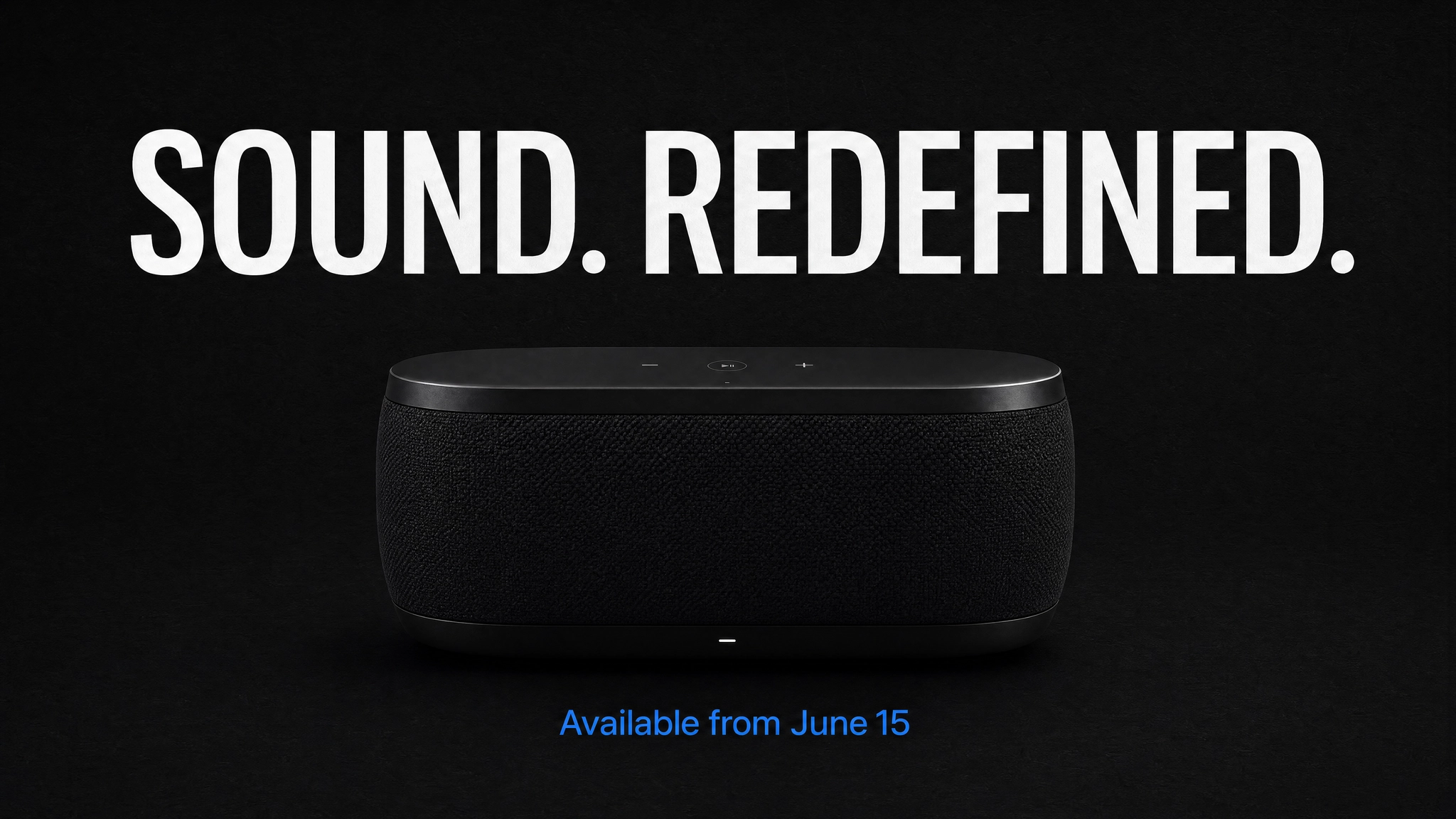 Product Launch Poster With Multi-Text Layout
Example: Vintage Coffee Shop Sign With Layered Typography
This example demonstrates three layers of type at different weights, sizes, and vertical positions on a textured background.
1{
2
3 "high\_level\_description": "A vintage hand-lettered coffee shop sign on aged dark walnut wood.",
4
5 "style\_description": {
6
7 "aesthetics": "warm, artisanal, nostalgic",
8
9 "lighting": "warm tungsten interior light, soft directional glow",
10
11 "medium": "graphic\_design",
12
13 "art\_style": "hand-lettered sign painting style, vintage illustration, aged wood texture",
14
15 "color\_palette": \["\#3E2723", "\#5D4037", "\#F5F0E8", "\#D4A017", "\#8D6E63"\]
16
17 },
18
19 "compositional\_deconstruction": {
20
21 "background": "Aged dark walnut wood planks with visible grain and slight weathering.",
22
23 "elements": \[
24
25 {
26
27 "type": "text",
28
29 "bbox": \[80, 100, 280, 900\],
30
31 "text": "MORNING RITUAL",
32
33 "desc": "Large bold hand-lettered serif text in cream, slightly arched, dominant across the upper section."
34
35 },
36
37 {
38
39 "type": "text",
40
41 "bbox": \[300, 200, 420, 800\],
42
43 "text": "COFFEE & ESPRESSO",
44
45 "desc": "Medium weight sans-serif in warm gold, centered below the main headline."
46
47 },
48
49 {
50
51 "type": "text",
52
53 "bbox": \[450, 350, 550, 650\],
54
55 "text": "EST. 2019",
56
57 "desc": "Small spaced-out caps in muted cream, centered below the subtitle."
58
59 }
60
61 \]
62
63 }
64
65}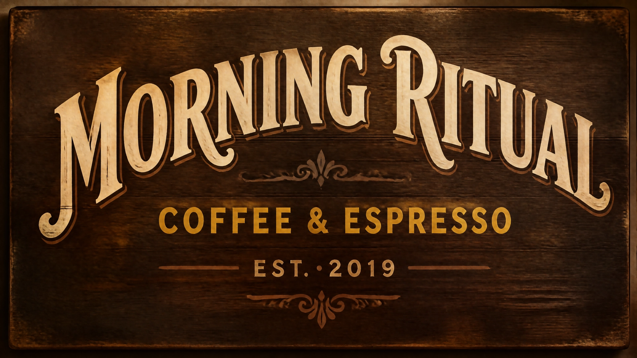 Vintage Coffee Shop Sign With Layered Typography
Magic Prompt for Automatic JSON Expansion
Writing JSON from scratch adds time to the generation process. Ideogram's Magic Prompt feature solves this by using a language model to expand a plain-text description into a full structured JSON caption automatically, giving you the quality benefits of a JSON prompt without writing the structure yourself.
On Ideogram, Magic Prompt is enabled by default. For local inference, the package ships three configurations: Ideogram's hosted service (free with an API key), Claude Opus via OpenRouter, and Claude Sonnet via OpenRouter. The default configuration runs server-side and is free.
On ImagineArt's AI image generator, the Enhance toggle in the generation interface performs a similar function, automatically optimizing your prompt before the model runs.
Prompting for Specific Use Cases
The sections below cover the most common Ideogram 4.0 use cases with both plain text and JSON approach notes. Each use case reflects scenarios where Ideogram's text rendering and layout control create a genuine advantage over other models.
For a broader comparison of how Ideogram handles these tasks relative to other models, the Ideogram vs Midjourney vs ImagineArt guide provides useful context.
Posters and Event Graphics
Posters benefit most from JSON because multiple text elements need to land at specific positions. Use "medium": "graphic_design" with "art_style" describing the visual style. Assign each text block its own bounding box, and define the color palette in hex values to enforce brand or event identity.
Plain text prompt: A bold screenprint-style festival poster for "SALT FLATS MUSIC FESTIVAL", late September in Utah, deep rust red and pale sand color scheme, abstract mountain range silhouette, condensed sans-serif headline across the top third, minimal geometric layout.
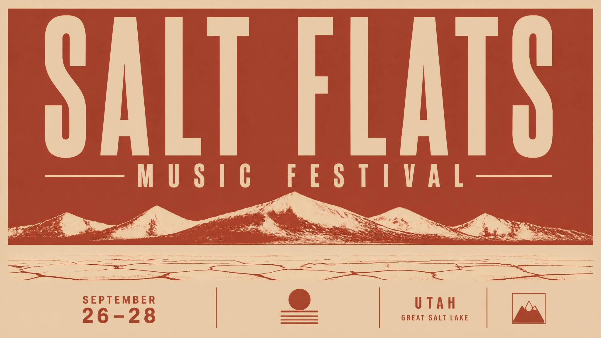 Plain text prompt.webp
Alternative: A retro art deco movie premiere poster for a film called "THE LAST MERIDIAN", gold and deep black color palette, geometric sunburst motif behind the title, serif typeface, classic Hollywood glamour aesthetic, vertical format.
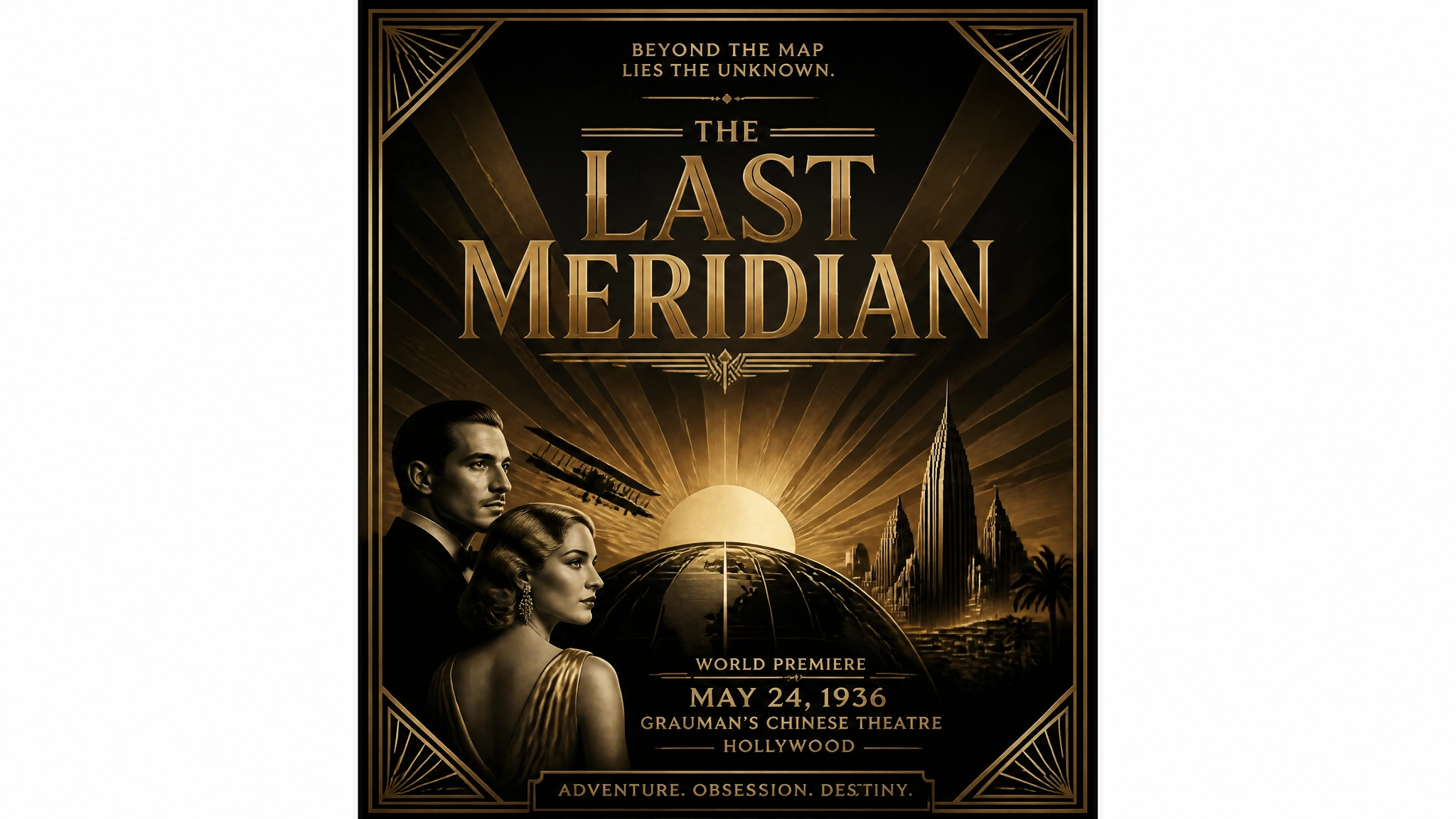 ideogram 4
Product Packaging Mockups
Specify the surface material in the background description (matte, glossy, kraft paper, frosted glass) since the material texture affects how the label reads. Place brand name and product descriptor as separate text elements. Include brand hex values at the element level for precise color application to the label.
Plain text prompt: A product label mockup for an artisan hot sauce called "EMBER", bold condensed uppercase wordmark, hand-drawn chili pepper illustration, aged kraft paper texture, dark burgundy and charcoal color scheme, artisan food packaging aesthetic
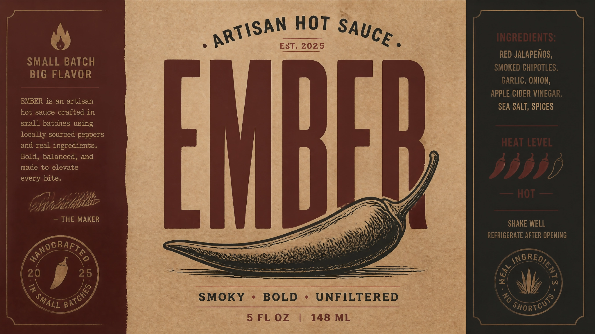 Product Packaging Mockups.webp
Alternative: A premium skincare serum box packaging mockup for a brand called "LUMÉ", frosted white cardboard with subtle embossed texture, gold foil wordmark on the front panel, minimalist layout, one thin botanical line illustration
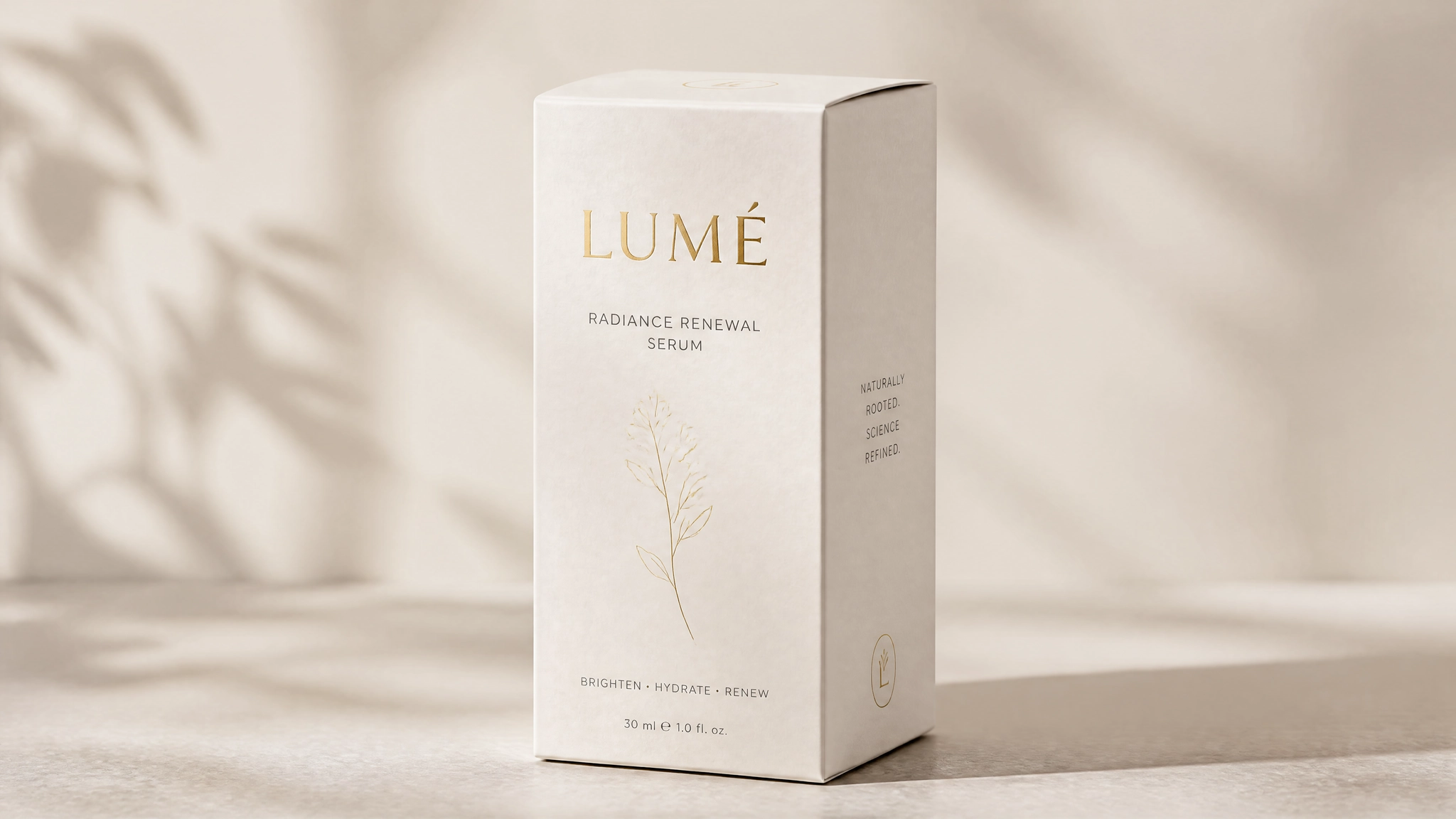 Product Packaging Mockups by ideogram 4
Brand Identity and Logos
Use "medium": "graphic_design" with "art_style": "flat vector". Describe the mark as an obj element and each text component as a separate text element. Keep the palette to three to four values maximum for clean vector output.
Plain text prompt: A minimal geometric logo mark for a sustainable architecture studio called "FORM", two overlapping triangles forming a roof silhouette, dark forest green and off-white, clean sans-serif wordmark below, professional and environmental aesthetic
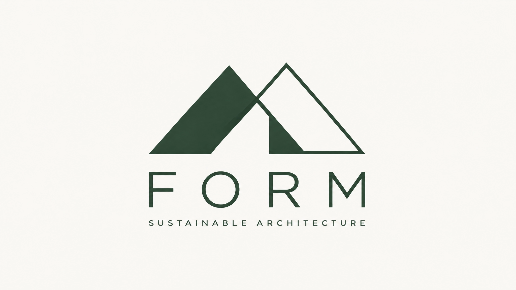 Brand Identity and Logos
Alternative: A bold monogram logo for a premium barber brand called "CUTLER CO", thick slab serif letterforms, black and aged gold, circular badge format with a straight razor illustration, masculine and heritage aesthetic
 Brand Identity and Logos by ideogram 4
Social Media Graphics
For consistent social templates, use bounding boxes to reserve the text zone at a fixed position across multiple generations. Use the Ideogram AI features overview as a reference for how text handling has evolved across versions when planning social content at scale.
Plain text prompt: A clean Instagram carousel slide for a wellness brand, dusty sage green background, centered overhead shot of a ceramic bowl with herbs and flowers, minimal text space at the bottom quarter, warm neutral tones, editorial lifestyle aesthetic
Alternative: A bold YouTube thumbnail background for a personal finance channel, dark charcoal background, neon green accent color, large bold text area on the right third, minimal geometric shapes, high contrast for small-screen visibility
 Social Media Graphics
Product Photography
Native background transparency in Ideogram 4.0 makes product photography a natural use case. The generated subject arrives with a clean alpha channel ready for placement on any campaign background. Specify the surface, lighting direction, and shadow behavior explicitly for the most realistic output.
Plain text prompt: A studio product photograph of a matte olive green water bottle on a concrete surface, soft diffused light from above, long subtle shadow to the right, brand logo visible on the front, minimalist outdoor lifestyle aesthetic
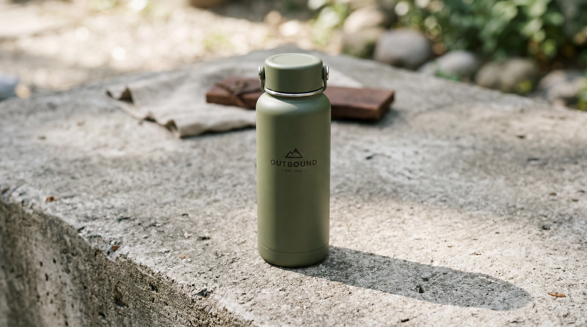 Product Photography by ideogram 4
Alternative: A lifestyle flat lay photograph of skincare products arranged on white linen, a glass dropper bottle, a small jade roller, and a ceramic tray, morning window light from the left, soft warm shadows, clean and aspirational aesthetic
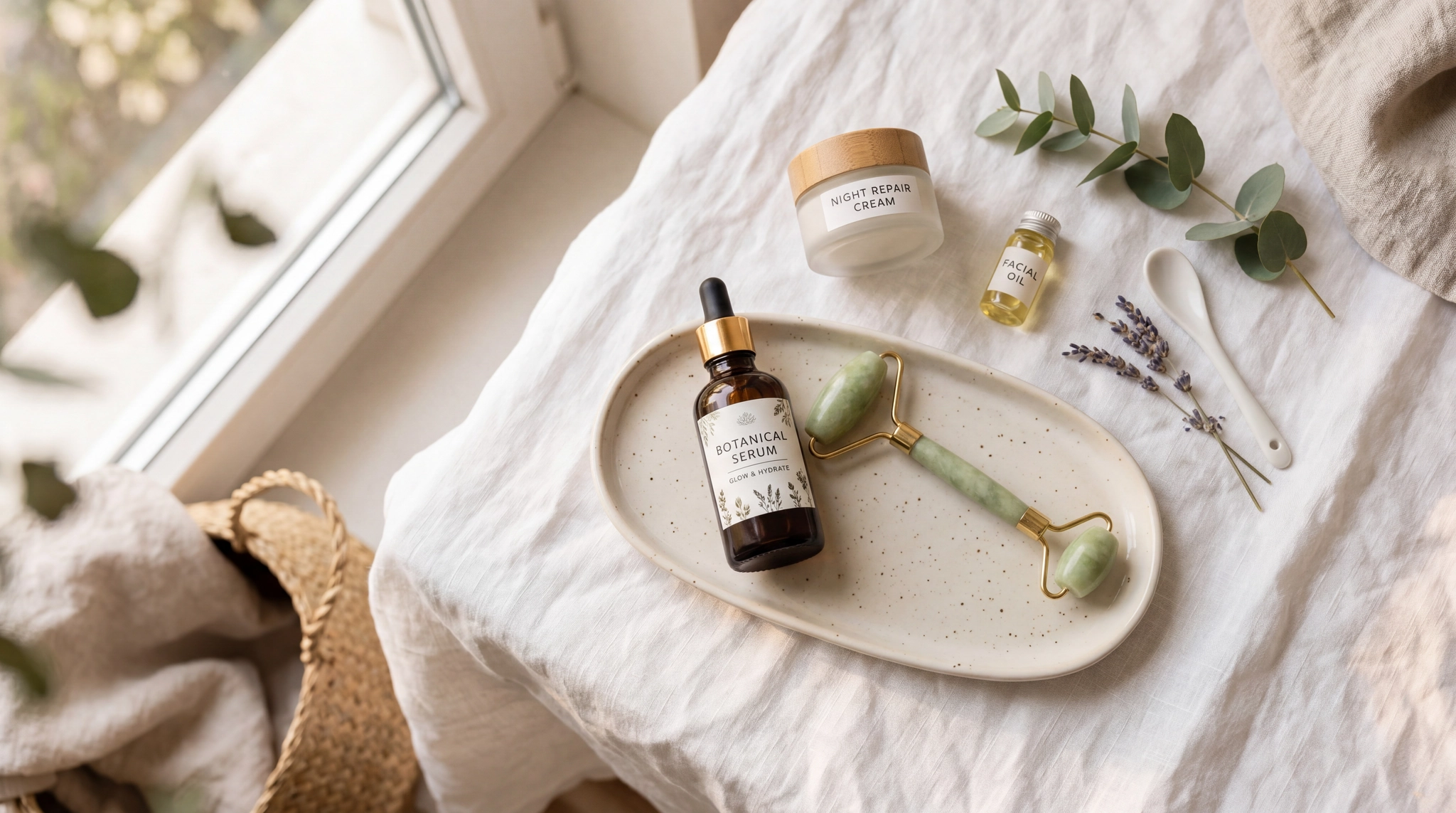 Product Photography by ideogram 4
Infographics and Data Visuals
Multiple text elements with distinct bounding boxes allow precise placement of headers, labels, and data points. This is where JSON's spatial precision produces results that plain text cannot reliably achieve.
Plain text prompt: A clean data visualization infographic showing global smartphone adoption from 2015 to 2025, line chart format, soft blue and teal color palette, clear axis labels, modern sans-serif typography, white background, editorial style
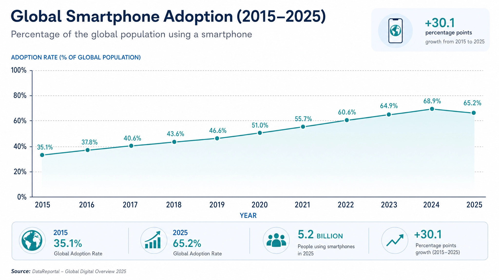 Infographics and Data Visuals
Common Prompting Mistakes
These are the most common issues that reduce output quality on Ideogram 4.0, drawn from the official schema documentation and observed generation behavior.
- Describing color in language instead of hex. "Deep navy blue" is ambiguous.
"#162447"is exact. Use hex values incolor_palettewhenever color accuracy matters. - Omitting the medium. Without
"medium": "photograph"or"medium": "graphic_design", The model infers the format. Being explicit removes that ambiguity and produces more consistent results. - Overlapping text bounding boxes. If two text elements share overlapping bounding box coordinates, both will render poorly. Give each text element its own non-overlapping zone.
- Wrong hex format. Colors must be uppercase
#RRGGBB. Shorthand (#fff) and lowercase (#1b1b2f) both trigger schema warnings that reduce output quality. - Putting multi-line copy in a single text element. For multi-line text, use separate elements for each distinct line or block. The model handles individual lines more accurately than long strings with line breaks inside a single text field.
- Using
photoandart_styletogether. These are mutually exclusive. Choosing one based on your intended output format is required. - Burying important elements at the end of a long prompt. The model processes prompts from the beginning. For plain text, put the most important subject and action first.
Conclusion
Plain text works. JSON works better for layout and typography. Either way, Ideogram 4.0 is the strongest open-weight model for design-focused work available right now.
Generate it directly through ImagineArt's AI image generator alongside the full model stack, no separate account needed.
Frequently Asked Questions
Do I have to use JSON to get good results from Ideogram 4.0?
No. Plain text produces strong results for most use cases. JSON is worth the effort when compositional precision, specific color values, or accurate multi-element text placement are requirements.
How many colors can I include in the palette?
Up to 16 in style_description.color_palette for the overall image. Up to 5 per element in compositional_deconstruction.elements. All must be uppercase #RRGGBB format.
How precise do bounding boxes need to be?
Reasonably precise but not pixel-perfect. The 0 to 1000 coordinate grid means rough placement in hundreds works well. The model handles small positional imprecision without breaking output quality.
What is Magic Prompt and should I use it?
Magic Prompt automatically expands a plain text description into a full JSON caption. It is free with an Ideogram API key and enabled by default on Ideogram. Use it when you want JSON quality from a casual prompt without writing the structure manually.
How does Ideogram 4.0 text rendering compare to 3.0?
Ideogram 4.0 improves multi-line handling, multilingual support, and dense typography accuracy, including logos and signage. Creators who used Ideogram 3.0 specifically for text will find 4.0 is a direct and meaningful upgrade on every text-related capability. The best AI image generators for artistic visuals guide how Ideogram's text handling benchmarks against other leading models.
Can I use Ideogram 4.0 for character consistency across a series?
For dedicated character consistency, Ideogram Character on ImagineArt is the right tool. Ideogram 4.0 is optimized for compositional control, typography, and design output rather than multi-image character series.
Arooj Ishtiaq
Arooj is a SaaS content writer specializing in AI models and applied technology. At ImagineArt, she creates sharp, product-focused content that helps creators and businesses understand, adopt, and get real value from AI tools.