
Tooba Siddiqui
Thu May 14 2026 • Updated Thu May 14 2026
14 mins Read
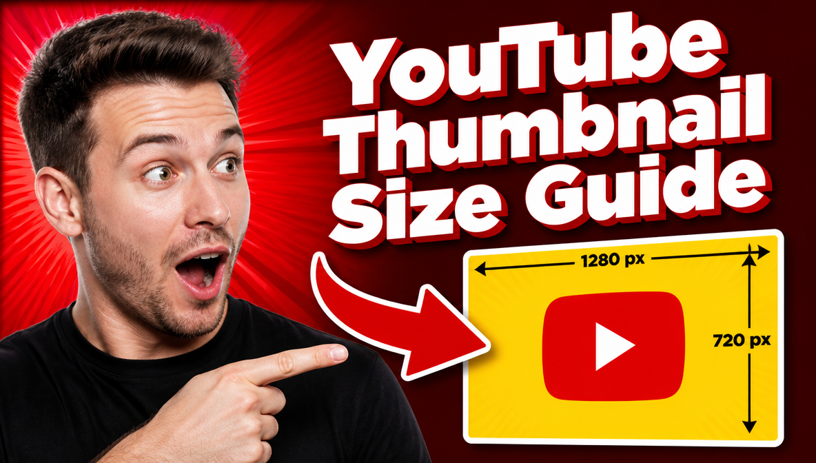
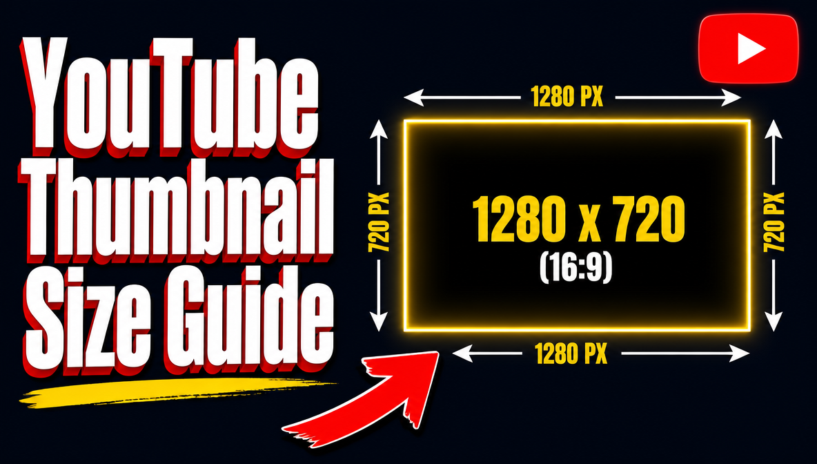
The recommended YouTube thumbnail size is 1280×720 pixels at a 16:9 aspect ratio, with a maximum file size of 2MB. YouTube accepts JPG, PNG, GIF, and BMP formats — PNG is recommended for designs with sharp text and high-contrast visuals.
Getting the dimensions right is the starting point, not the finish line. A thumbnail at the correct size still fails if it is not designed for how YouTube actually displays it — heavily compressed, rendered small, and competing with dozens of other thumbnails in a search feed. This guide covers the exact thumbnail size for YouTube, where and how your thumbnail appears across every surface, and how to design one that earns the click.
For a full overview of image dimensions across other social media platforms, see social media image sizes.
YouTube Thumbnail Size — Full Specifications
| Spec | Value |
|---|---|
| Recommended YouTube thumbnail size | 1280×720 px |
| Minimum width | 640 px |
| Aspect ratio | 16:9 |
| Max file size | 2MB |
| Accepted formats | JPG, PNG, GIF, BMP |
| Display on homepage/search | ~246×138 px |
| Display on watch page (desktop) | ~480×270 px |
| Requirement | Verified YouTube account |
All YouTube thumbnail size specifications based on YouTube's official thumbnail guidelines.
Why 1280×720 px — The 16:9 Aspect Ratio Explained
The correct thumbnail size for YouTube is 1280×720 px because 16:9 is YouTube's native video aspect ratio. Thumbnails that match this ratio sit flush in every display context — search results, the homepage feed, the watch page — without letterboxing or cropping.
Upload a thumbnail at the wrong aspect ratio and YouTube adds black bars to fill the 16:9 frame. This immediately signals an unpolished channel in a feed full of properly formatted thumbnails.
Why 1280×720 over the 640px minimum: YouTube compresses every thumbnail before displaying it. A file uploaded at 640px minimum starts at low resolution and degrades further after compression. A file uploaded at 1280×720 retains noticeably better quality at the same compressed display size. Always upload at the full recommended resolution.
The compression reality most creators miss: your 1280×720 thumbnail is rendered at approximately 246×138 pixels in YouTube search results and the homepage feed. That is the actual size competing for a viewer's attention. Design decisions that look fine on a large canvas — detailed backgrounds, small text, subtle colour differences — frequently disappear entirely at 246×138 px.
The practical implication: design for the smallest display surface, not the canvas. Large text, bold contrast, and a single dominant visual element are not stylistic choices — they are functional requirements for a thumbnail that works at the sizes YouTube actually shows it.
Where YouTube Displays Your Thumbnail
YouTube Homepage & Search Results
Rendered at approximately 246×138 px — the most important surface and the smallest display size.
This is where clicks are decided. A viewer scrolling through search results sees your thumbnail at roughly the size of a playing card held at arm's length. Small text is unreadable. Busy backgrounds collapse into visual noise. Weak contrast disappears against adjacent thumbnails.
The test: shrink your thumbnail design to 246×138 px before publishing. If the main text is still readable and the focal point is still clear at that size, it will work in search. If it is not — redesign before uploading.
Watch Page (Desktop)
Displayed at approximately 480×270 px before the video plays.
This is the largest standard display surface outside of TV. More detail becomes legible here — facial expressions, secondary text, background elements. Viewers who arrive at the watch page directly (from a link or subscription) spend more time looking at the thumbnail before pressing play. It still needs to be compelling, but you have more visual information working for you.
Mobile
Smaller than desktop search results, displayed in a single-column or two-column feed depending on the app layout.
Most of your viewers are on mobile. YouTube's own data consistently shows mobile as the dominant viewing platform. Text needs to be larger than feels intuitive at design size, contrast needs to be stronger, and faces need to be closer and more expressive. A thumbnail that reads well on desktop but feels cluttered on mobile is a mobile problem — and mobile is where most of your audience lives.
Suggested Videos Sidebar
Rendered small in a vertical list alongside thumbnails from competing channels.
The challenge on the sidebar is visual differentiation — your thumbnail appears next to others in the same topic area. A distinctive colour palette, a strong single focal point, and high contrast give your thumbnail the best chance of standing out in a sidebar that is designed to pull attention away.
YouTube Thumbnail Design Best Practices
What Makes a High-Click Thumbnail
- Single clear focal point — one face, one object, one visual moment. Thumbnails that try to show the whole story show nothing clearly.
- Bold, legible text — two to three words maximum, large enough to read at 246px wide. If you need more words, the title below the thumbnail does that job.
- High contrast — light subject against a dark background or vice versa. Mid-tones against mid-tones are invisible at small sizes.
- Emotional expression — faces with strong visible emotion (surprise, excitement, concern, disbelief) consistently outperform object-only thumbnails across most content categories. Expressions register before text does.
- Colour that stands out in context — open a YouTube search for your topic and look at the existing thumbnails. Then design yours to contrast with that specific visual environment, not just to look good in isolation.
Text on Thumbnails
Keep thumbnail text to three words or fewer. The video title already appears directly below the thumbnail — your thumbnail text should add a hook, an emotion, or a number that the title does not already convey. Repeating the title word for word wastes the space.
Font weight matters more than font choice. Thin, elegant typefaces that look refined in a design tool become invisible at 246px. Use the boldest weight available. If text sits over a complex background, add a drop shadow or a solid colour block behind the letters — anything that separates the text from the background and keeps it readable at compressed sizes.
Branding Consistency
A consistent thumbnail style turns individual videos into a recognisable channel. Viewers who see your thumbnail in a sidebar or recommended feed should recognise it as yours before they read the title.
Practically: pick a colour palette and stick to it across every thumbnail. Use the same font family. Position your channel name or logo in the same corner of every thumbnail. These small consistencies compound over time — a channel with 50 thumbnails that all look related feels established. A channel where every thumbnail looks different feels disjointed regardless of content quality.
Match your thumbnail style to your YouTube banner — viewers who click through to your channel page see both together. A cohesive visual identity across banner and thumbnails signals a channel worth subscribing to.
For building a consistent visual identity across all your channel assets, see how to build a brand kit with AI.
YouTube Thumbnail Examples — What High-Performing Thumbnails Have in Common
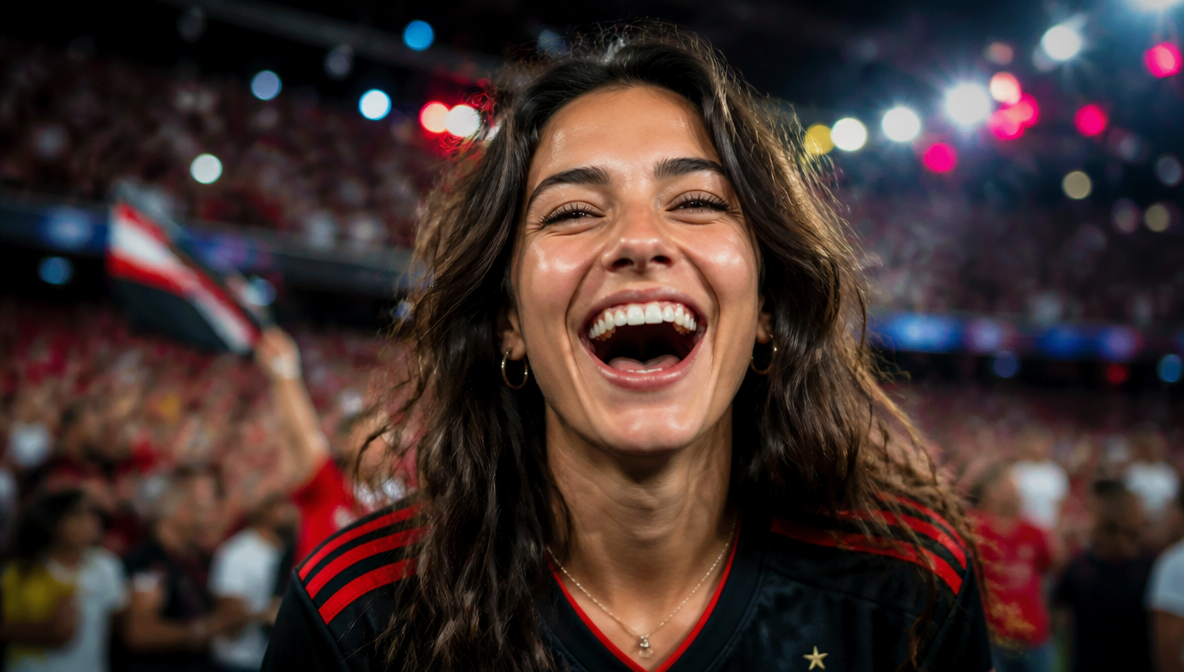
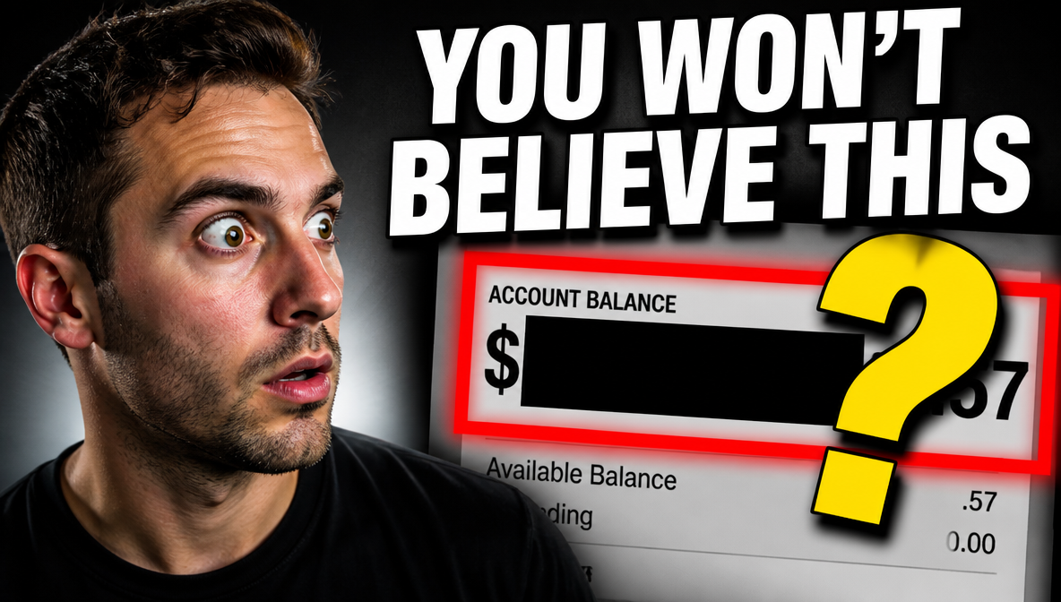
The Face-Forward Thumbnail
 Generated by ImagineArt AI image generator
A tight crop on a face with a strong, visible expression — surprise, disbelief, excitement, concern. No complex background, no competing elements. Just an expression that makes the viewer want to know what caused it.
This format works across almost every niche because human faces register faster than text or objects at small sizes. The expression does the emotional work; the title does the explanatory work. The two together give the viewer everything they need to decide whether to click.
For maximum impact: crop close enough that the expression fills the frame. A face that is too small in the thumbnail loses the emotional signal entirely.
The Text-Dominant Thumbnail
 Generated by ImagineArt AI image generator
Minimal visual, one bold statement in large text. Works for opinion pieces, commentary, educational content, and anything where the idea itself is the hook.
The risk with text-dominant thumbnails is legibility — at 246×138 px, even large text can become unreadable if contrast is not extreme. White or yellow text on a dark background is the safest starting point. Test at actual display size before committing.
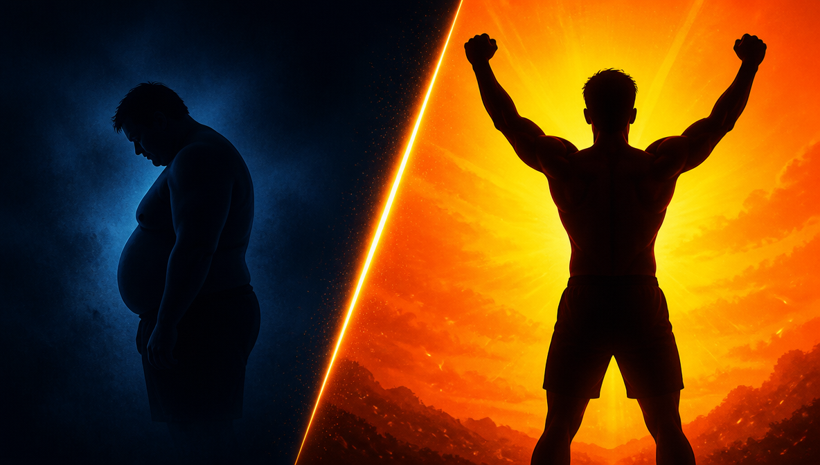
The Before/After Thumbnail
 Generated by ImagineArt AI image generator
A two-panel split showing a transformation — a space redesigned, a skill acquired, a result achieved. The value proposition of the video is communicated instantly, without reading the title.
Works best when the contrast between panels is dramatic and clearly visible at small sizes. A subtle transformation that is only noticeable at full resolution does not work as a thumbnail concept — the difference needs to register immediately.
The Curiosity Gap Thumbnail
 Generated by ImagineArt AI image generator
Shows a reaction to something off-screen, a partially revealed result, or a question that the thumbnail raises but does not answer. The viewer has to click to close the gap.
This format performs strongly when the curiosity is genuine — when the gap between what the thumbnail shows and what the video reveals is real and worth the click. It loses trust quickly when the reveal does not match the setup. Use it honestly and it builds click-through rate. Use it as pure clickbait and it drives up bounce rates and damages long-term channel performance.
How to Make a YouTube Thumbnail with ImagineArt
Along with an AI image generator, ImagineArt has a dedicated AI Thumbnail Maker built specifically for YouTube — a tool designed around YouTube's performance requirements from the ground up. Unlike general design tools where you start from a blank canvas or a generic template, ImagineArt generates thumbnail variants built for how YouTube actually displays them: compressed, small, competing in a crowded feed.
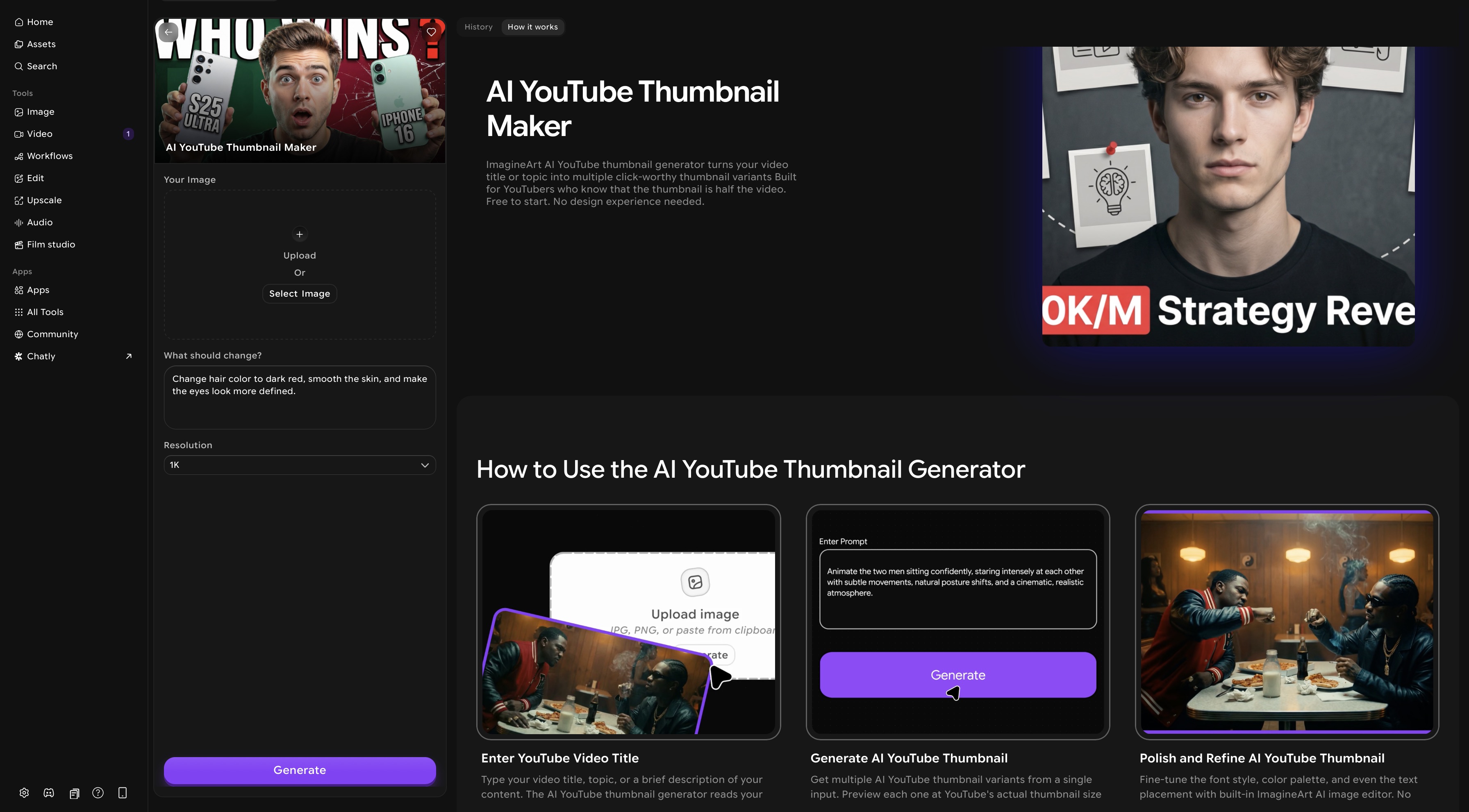 ImagineArt AI YouTube thumbnail generator dashboard
Step 1: Open ImagineArt AI Thumbnail Maker
Go to ImagineArt AI Thumbnail Maker. No design experience or external software required — the entire workflow from generation to download happens inside the tool.
Step 2: Upload Your Image
Upload the image you want to use as the base for your thumbnail — a product photo, a screenshot, a portrait, a scene. This is the visual foundation the AI works from. For best results, use a high-resolution image with a clear subject. If your image has a cluttered background, the tool can isolate the subject and build the thumbnail composition around it.
Step 3: Enter Your Video Title or Describe the Edits You Want
Type your video title or describe what you want the thumbnail to communicate — the topic, the emotion, the hook. Be specific: "frustrated person looking at laptop, text saying I wasted 3 years" will produce more targeted output than "tech video thumbnail." The more context you give the AI about the video's angle and intended emotion, the closer the first generation will be to what you actually need.
Step 4: Generate Multiple Thumbnail Variants
The AI generates several distinct thumbnail options from your input — each one applying YouTube-specific design principles: bold legible text, high contrast between subject and background, a strong single focal point, and a colour palette that stands out in a search feed. You get multiple directions to choose from rather than committing to a single output. This is particularly useful early in a channel's life when you are still discovering which thumbnail style resonates with your audience.
Step 5: Preview at Actual YouTube Display Size
Before selecting a variant, preview it at the size YouTube actually renders it — approximately 246×138 px in search results. This is the step most design tools skip. A thumbnail that looks polished on a large canvas can have unreadable text or a cluttered composition at real display size. ImagineArt shows you exactly what viewers will see in search before you download anything. If a variant reads clearly at that size, it will work. If it does not, generate another.
Step 6: Fine-Tune in the Built-In Editor
Once you have a variant you want to develop, refine it using the built-in AI image editor. Adjust font style and weight, shift the colour palette to better match your channel's branding, reposition text to sit more clearly within the composition, or swap background elements. You are not locked into the AI's first output — the editor gives you full control over the final result without needing to move to a separate design tool.
Step 7: Generate Additional Variants for A/B Testing
If you want to test which thumbnail drives higher click-through rate, generate two or three distinct variants of the same concept — different text wording, different colour palette, different composition. YouTube allows you to swap thumbnails after publishing, making it straightforward to run informal A/B tests across your audience. Thumbnails that look slightly different can produce meaningfully different click-through rates on the same video.
Step 8: Download and Upload
Download your final thumbnail at 1280×720 px in JPG or PNG — the correct dimensions and format, ready to upload directly to YouTube Studio. No resizing, no format conversion, no additional steps.
How to Upload a YouTube Thumbnail
For an existing video:
- Go to YouTube Studio
- Select Content from the left-hand menu
- Click the video you want to update
- Under Thumbnail, select Upload thumbnail
- Choose your 1280×720 px file (JPG or PNG, under 2MB)
- Click Save
For a video you are currently uploading:
The thumbnail option appears on the Details step of the upload flow. Select Custom thumbnail and upload your file before publishing the video.
Note: Custom thumbnail upload requires a verified YouTube account. If the option is not visible in YouTube Studio, verify your account at youtube.com/verify — verification takes approximately 24 hours.
Common YouTube Thumbnail Size Mistakes
- Uploading at the 640px minimum. YouTube compresses thumbnails before displaying them. A file starting at 640px degrades noticeably after compression. Always upload at 1280×720 for the best display quality at any rendered size.
- Wrong aspect ratio. Non-16:9 thumbnails receive automatic black bars from YouTube. This looks unfinished in search results and on the watch page. Always confirm your canvas is set to 16:9 before designing.
- Text too small to read at search size. The most common design mistake. Text that reads clearly on a 1280×720 canvas can be completely illegible at the 246×138 px size YouTube renders in search. Always test your thumbnail at actual display size before uploading.
- Too many elements. A thumbnail trying to show three faces, a title, a logo, and a background scene communicates nothing clearly at small sizes. One dominant element. Everything else is noise.
- Exceeding 2MB. YouTube rejects the upload. Export PNG files at standard compression or switch to high-quality JPG for photographic thumbnails to keep file size under the limit.
- Inconsistent style across videos. Each thumbnail looks unique but the channel looks unplanned. Viewers cannot recognise the channel at a glance. Consistent colour, font, and composition across thumbnails builds the visual identity that turns casual viewers into subscribers.
- Using the auto-generated YouTube thumbnail. YouTube's automatic frame capture from video content is almost always a blurry mid-motion still that does not represent the video well. Custom thumbnails consistently outperform auto-generated ones on click-through rate. Always upload a custom thumbnail.
Ready to Create YouTube Thumbnail with ImagineArt?
Every video you publish needs a thumbnail that earns the click. Now you know the exact size, the compression reality, and the design principles that separate thumbnails that get scrolled past from ones that get clicked.
Stop leaving click-through rate on the table with auto-generated frames. Use ImagineArt AI Thumbnail Maker to generate multiple custom variants, preview them at actual YouTube display size, and upload thumbnails that work — starting with your next video.
Frequently Asked Questions About YouTube Thumbnail Size
The correct YouTube thumbnail size is 1280×720 pixels at a 16:9 aspect ratio. The maximum file size is 2MB. Accepted formats are JPG, PNG, GIF, and BMP.
YouTube thumbnails should be 16:9 — the same aspect ratio as YouTube's video player. Thumbnails uploaded in a different aspect ratio will have black bars added automatically by YouTube to fill the 16:9 frame.
The maximum file size for a YouTube thumbnail is 2MB. Uploads exceeding this limit will be rejected. For thumbnail images with text and graphic elements, export as PNG at standard compression. For photographic thumbnails, high-quality JPG typically stays well under 2MB.
The most common cause is uploading below the recommended 1280×720 px resolution. YouTube compresses thumbnails before displaying them — a file starting at low resolution degrades further after compression. Always upload at 1280×720 for the sharpest result. Heavy JPEG compression on designs with text or sharp edges also causes visible softening.
Yes. PNG is the recommended format for thumbnails with text, logos, or geometric elements because it preserves sharp edges that JPEG compression softens. Use JPEG only for purely photographic thumbnails where file size is a concern.
Yes. YouTube requires account verification to enable the custom thumbnail feature. Verify your account at youtube.com/verify. Verification typically takes up to 24 hours.
On mobile, YouTube displays thumbnails smaller than on desktop — approximately the same size or smaller than the ~246×138 px rendered in desktop search results, depending on the feed layout. Design for maximum legibility at small sizes: large bold text, high contrast, and a single clear focal point.
You can create a YouTube thumbnail for free using ImagineArt AI Thumbnail Maker. Enter your video title, generate multiple variants, preview at actual YouTube display size, and download at the correct 1280×720 px dimensions — no design experience or paid software required.
Setting up your full YouTube channel? See YouTube profile picture size, YouTube banner size, and how to start a YouTube channel for business.
For channel content ideas and best tools, see faceless YouTube channel ideas and best AI video generators for YouTube.
Tooba Siddiqui
Tooba Siddiqui is a content marketer with a strong focus on AI trends and product innovation. She explores generative AI with a keen eye. At ImagineArt, she develops marketing content that translates cutting-edge innovation into engaging, search-driven narratives for the right audience.