A historic first — and a deceptively complex brief
Every December, Pantone makes an announcement that ripples across the global creative industry within hours. Mood boards shift. Packaging briefs get revised. Creative directors forward the announcement to their teams with a common question: how does this affect the palette?
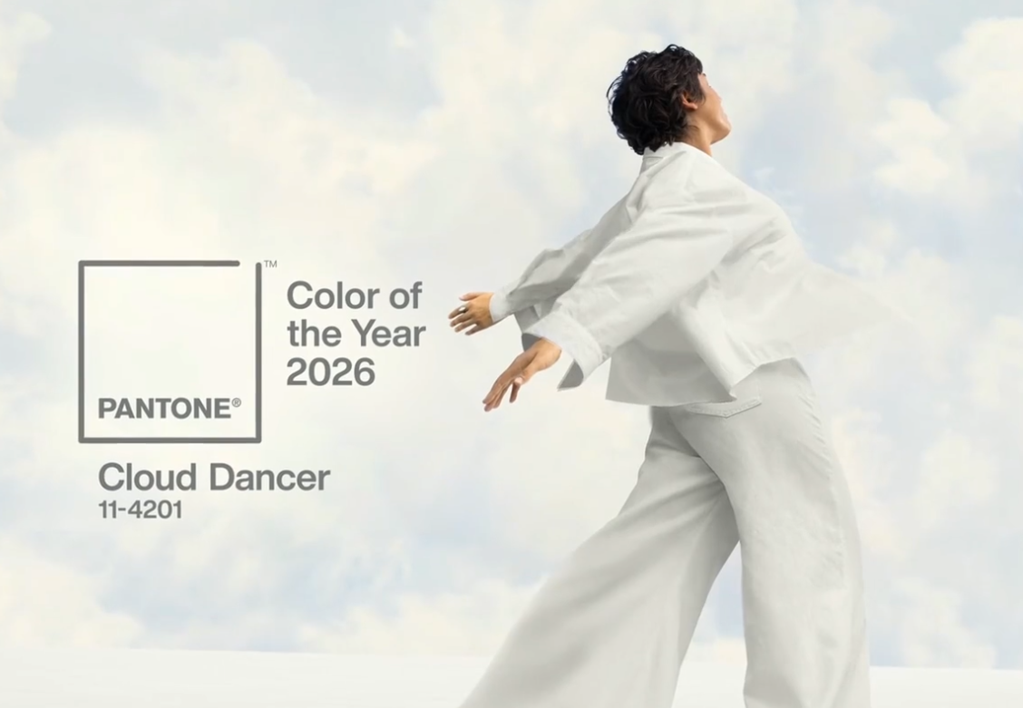
In December 2025, Pantone named PANTONE 11-4201 Cloud Dancer as its 2026 Color of the Year, which is, a softly balanced, luminous off-white that sits between bright white and light cream. It was the first time in the programme's 26-year history that a shade of white had been chosen. The choice was deliberate and culturally grounded.
"Cloud Dancer is a quieting whisper in a noisy world."
— Leatrice Eiseman, Executive Director, Pantone Color Institute
Pantone framed Cloud Dancer as a response to collective overstimulation: years of bold color collisions, constant scrolling, AI-accelerated content saturation, and geopolitical turbulence. The color will provide breathing room, a visual reset that signals calm, clarity, and intentional simplicity.
- For lifestyle journalists and trend forecasters, that framing is compelling.
- For enterprise brand and creative operations teams, it raises an immediate practical question that rarely gets coverage
“ What does incorporating a near-white into global creative production actually involve, and what does it cost?”
But standing in April 2026, Cloud Dancer doesn’t look difficult to add to palette. Look at the digital presence of IBM, Ordinary, Claude, Notion already heavily utilized shades of white and ash and beige.
Is Cloud Dancer harder than it looks — at scale?
Cloud Dancer is not simply white. It carries a faint grey undertone that maintains equal balance between warm and cool, deliberately avoiding the clinical sharpness of pure white and the domestic warmth of cream. Pantone's hex equivalent sits around #F0EEE9, with a high Light Reflectance Value (LRV) that makes it highly reflective yet visually soft.
That balance makes it technically demanding to reproduce consistently across the range of surfaces a global brand operates on. Consider what 'incorporating Cloud Dancer' actually means for a major brand:
- Packaging updates across SKUs that may run into the thousands, printed across multiple regional suppliers using different substrate types
- Digital asset libraries, product photography, campaign imagery, social templates: regenerated or adapted to the new background tone
- Retail point-of-sale materials produced across dozens of markets with different print standards
- E-commerce product listings, where background consistency directly affects platform compliance and conversion rate
- Internal and external brand communications refreshed for the year
White is notoriously unforgiving in print and photography. Small inconsistencies in lighting, paper stock, ink calibration, or monitor calibration produce visible tonal drift. A product image shot against pure white will read differently from one shot against Cloud Dancer's warmer off-white — and both will look different again on an OLED screen versus a matte display.
Cloud Dancer demands more controlled execution than a saturated color. There is nowhere to hide. The shade's subtlety exposes inconsistency across touchpoints in a way that Pantone's Mocha Mousse (2025) or Peach Fuzz (2024) simply did not.
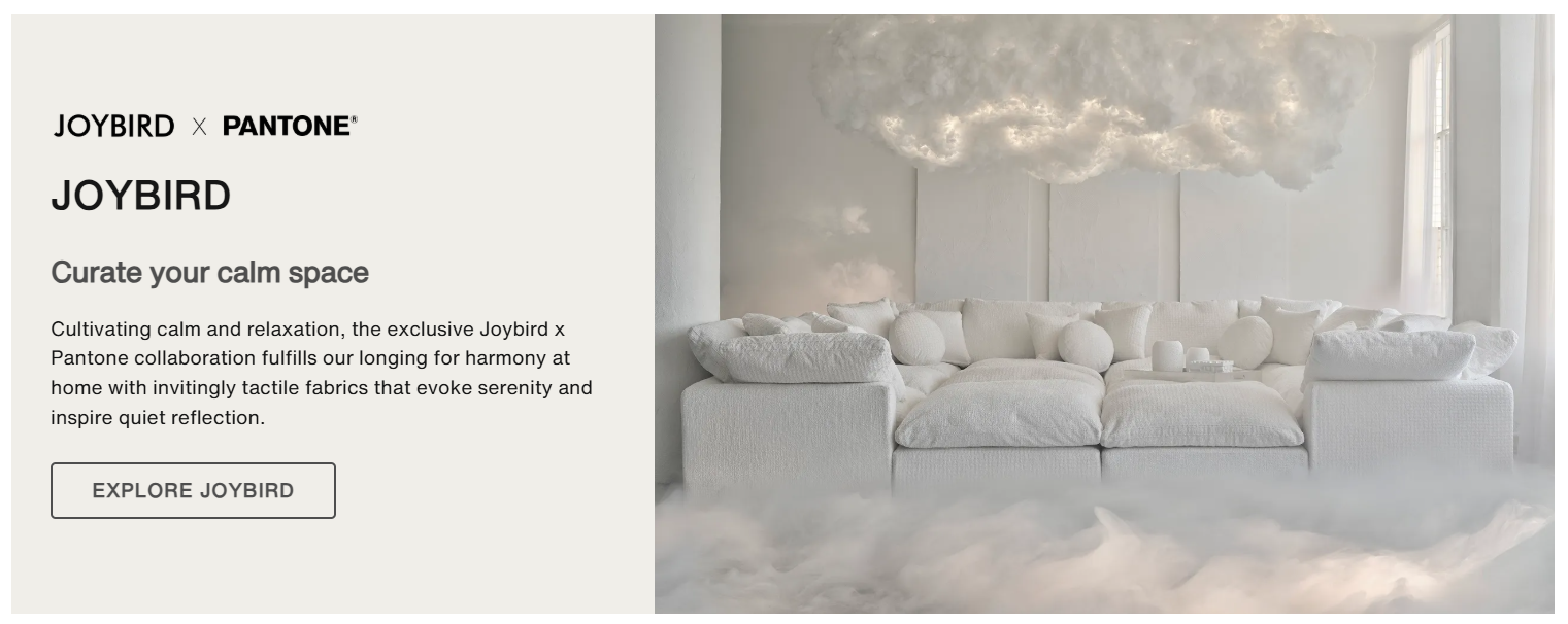
What the world's largest brands are already doing with Cloud Dancer
Pantone lined up a cross-industry partner roster for Cloud Dancer that reveals exactly how commercial briefs were seriously considering the color. Each partnership is instructive for enterprise teams thinking about their own activation.
 Source: pantone.com
Motorola: product design and physical execution
Motorola reimagined the edge 70 smartphone in Cloud Dancer with a quilted vegan leather finish and Swarovski crystal detailing.
The physical execution required new production workflows for a color that reads differently across matte textile, glass, and metal. The challenge was achieving Cloud Dancer's warmth across materials with fundamentally different surface properties, a manufacturing coordination problem as much as a design one.
Spotify: extending color into sound
Spotify built a Cloud Dancer playlist.. This is notable not for its technical complexity but for its strategic intelligence: Spotify treated the color as a brief to interpret, not replicate. For brands without a physical product, this cross-sensory translation approach is highly replicable.
Mandarin Oriental: spatial and experiential
Ten properties across the Mandarin Oriental group integrated Cloud Dancer into spa treatments, seasonal décor, and themed guest experiences.
The challenge here was consistency across ten distinct physical environments with different ambient lighting, materials, and staff. Achieving the right 'feeling' of Cloud Dancer — calm, airy, intentional — without mechanical color matching requires detailed creative direction at the property level.
Monotype: typography as colour response
Pantone partnered with Monotype to create the program's first typographic response to a Color of the Year, pairing Cloud Dancer with the Jensen Arabique typeface. The creative logic is precise: a colour that communicates through restraint and space needs typography that does the same. For global brands refreshing visual communications, this pairing is immediately applicable to editorial, digital, and packaging contexts.
The common thread across these partnerships is that Cloud Dancer requires interpretation, not just application. Unlike a specific Pantone red or blue, which can be matched numerically and applied with relative confidence across materials, Cloud Dancer's power lies in the atmosphere it creates. That atmosphere is harder to brief, harder to quality-control, and harder to reproduce at scale — especially across markets and supply chains.
The cultural debate amongst brands
Within days of the announcement, Cloud Dancer sparked an unusually contentious global conversation that enterprise brand teams need to understand before briefing any regional creative work.
The criticism was sharpest in India, where white carries specific cultural associations with mourning and loss that have no counterpart in Western colour psychology. Indian creative and marketing professionals pointed out that Pantone's framing — calm, clarity, fresh start — assumes a cultural context rooted in Western wellness aesthetics. A global brand that applies Cloud Dancer uniformly without regional sensitivity risks creating campaigns that land very differently in EMEA than they do in London or New York.
"2026 will not be defined by a single global shade, but by the conversation it sparks."
— Exchange4Media, December 2025
This isn't a new issue — every Pantone Color of the Year carries cultural context that requires regional translation. But Cloud Dancer makes the stakes more visible, precisely because white is not culturally neutral. Across different markets, white signals purity, grief, luxury, sterility, or absence depending on context. In MENA markets, white is broadly positive; in parts of East Asia, it carries specific ceremonial connotations; in parts of South Asia, it demands careful contextualization.
The practical implication for global brands is clear: a Cloud Dancer-led visual direction needs regionally adapted executions, not a single global rollout. That means more versions of every asset, more localization work, and more production volume, which brings the conversation back to how that production is resourced.
The production economics of a color of the year shift
Most coverage of Pantone's annual announcement focuses on what to create. Almost none focuses on what it costs to create it. For enterprise creative operations teams, that cost question is the most important one.
A mid-sized global brand updating its visual identity to incorporate Cloud Dancer across core channels — not a full rebrand, just a meaningful integration — will typically need to address:
- E-commerce product photography: background updates across the active catalogue
- Campaign imagery: hero shots, lifestyle photography, social assets for each market
- Packaging design: refreshed for seasonal or permanent updates
- Digital templates: web, email, social, paid advertising
- Retail and OOH materials: adapted per region and format
In a traditional production model, each of these requires separate shoots, separate briefing cycles, separate rounds of approval. A brand operating across ten markets with a 500-SKU active catalogue and seasonal campaign refresh may be looking at hundreds of individual production decisions — each carrying its own cost, timeline, and coordination overhead.
The compounding cost of a color shift is often invisible in planning because it's distributed across multiple budgets and teams. The packaging team updates their assets. The e-commerce team updates theirs. The regional marketing teams each handle their own. Nobody is tallying the total production spend triggered by a single color decision made at the brand level.
The Cloud Dancer Brief and AI Design Workflows
Cloud Dancer creates a production opportunity that design AI for enterprises, with dependent workflows, like image to product videos, is particularly well-suited to address — and it works in both directions. Now this works for all by products and outputs: social media graphics, product photography, carousels etc.
First off, Cloud Dancer's soft off-white is an ideal background tone for product photography. It is:
- clean enough to read as premium,
- warm enough to avoid clinical sterility,
- and versatile enough to work across almost any product category.
These are exactly the qualities that make it a natural default for e-commerce product image backgrounds in 2026 — which means brands will be generating enormous numbers of product images against Cloud Dancer backdrops.
In a traditional workflow, updating a product catalogue's photography to a new background requires re-shooting or re-compositing every image. A normal background removal and replacement doesn’t work for premium brands.
For a marketplace with 5,000 active SKUs, that is a significant undertaking. For a fashion brand launching a seasonal collection with multiple colorways per style, multiply that by the number of variants.
AI design workflows change the economics of this completely. With a well-configured generation workflow:
- Existing product images can have backgrounds removed and replaced with accurately rendered Cloud Dancer environments — maintaining shadow, reflection, and depth consistency across the catalogue
- Lifestyle imagery can be generated with Cloud Dancer as the ambient backdrop, placing products in contextually appropriate settings without a physical shoot
- Campaign asset variants — different formats, different markets, different compositional emphases — can be produced from a single product reference image at a fraction of the cost and time of traditional production
- Regional variations that account for cultural context can be produced in parallel, rather than as a sequential localization afterthought
The second opportunity is more strategic. Cloud Dancer's defining characteristic — restraint, space, clarity — actually plays to AI ad generation's strengths. Complex, saturated imagery with multiple elements and deep color palettes requires careful prompt engineering to get right. A Cloud Dancer-led composition, with its emphasis on negative space, soft light, and limited tonal range, is highly controllable. The brief is inherently clean.
For enterprise teams thinking about how to implement a Cloud Dancer visual direction at scale, this is the moment to evaluate whether AI-generated imagery can carry the load that traditional production cannot sustain economically.
A practical framework for enterprise brand teams
Given the production complexity outlined above, here is how enterprise creative and brand operations teams should approach a Cloud Dancer integration strategy for 2026.
1. Audit before you brief
Before any creative production begins, map every channel and touchpoint where Cloud Dancer will appear and estimate the asset volume required per channel. This inventory exercise almost always reveals that the production task is larger than initially scoped — and it is better to know this before briefing than after.
2. Separate the cultural translation brief from the production brief
Determine which markets require adapted executions — not just translated copy, but visually different approaches that account for local cultural context. This should be a strategic decision made before production begins, not an afterthought handled by regional offices at the end of the process.
3. Define what 'Cloud Dancer' means in your brand context
Cloud Dancer is an off-white, but your brand's version of Cloud Dancer needs to be precisely defined:
- specific hex values for digital,
- specific CMYK and Pantone values for print,
- specific lighting and shadow standards for photography.
Without a brand-specific specification, production quality will drift across teams and suppliers.
4. Identify which asset categories are candidates for AI design
Not every asset type is equally well-suited to AI-assisted production.
E-commerce product backgrounds, lifestyle context imagery, and social template variants are strong candidates. Hero brand campaign imagery and print materials with strict reproduction requirements may still need traditional production.
5. Build the production infrastructure before the creative brief
If an AI creative suite is going to play a role in your Cloud Dancer execution, the technical infrastructure — model access, API integration with your asset management system, quality review workflows, approval processes — should be in place before the creative brief goes out.
6. Plan for iteration, not perfection on first pass
Cloud Dancer's subtlety means that small errors in tone, temperature, or surface rendering are visible. Factor iteration time into your production timeline. The review and approval cycle for a near-white background is typically longer than for saturated colours, because human perception of subtle tonal differences is acute.
Where is enterprise visual communication going with Cloud Dancer?
Pantone's choice of Cloud Dancer as the first-ever white Color of the Year is a cultural signal as much as an aesthetic one. The program has spent 26 years tracking the emotional pulse of the global population through color. Choosing a near-neutral in 2026 reflects something specific about where that pulse currently sits.
The framing, calm, clarity, reset, breathing room, is a direct response to information overload, AI-accelerated content production, and the fatigue of constant visual stimulation. There is a genuine tension here that enterprise brand teams should register: at the same moment that AI tools are enabling brands to produce more content faster than ever before, the cultural mood is shifting toward wanting less, slower, and more intentional communication.
Cloud Dancer is not an instruction to produce fewer assets. It is an instruction to make each one more deliberate. That deliberateness is actually easier to achieve when production workflows are efficient — when teams are not spending their creative energy managing volume, they can invest it in quality and intention.
Cloud Dancer's restraint is a creative directive, not a production constraint. The brands that will execute it well are those that solve the production problem first.
The brands that activated Cloud Dancer most successfully in early 2026, Motorola's textured device finish, Mandarin Oriental's experiential integration, Monotype's typographic pairing — all share a common approach: they treated the color as a brief to interpret intelligently, not a trend to replicate quickly.
For enterprise teams assessing their position as 2026 unfolds, the strategic question is not 'are we using Cloud Dancer?' It is 'do we have the production infrastructure to execute Cloud Dancer with the quality and intentionality the color demands, across every market, every channel, and every asset category where it appears?'
That is a production question. And in 2026, it is a question that AI design is increasingly well-positioned to answer.
Ready to put this into practice?