
Syed Anas Hussain
Tue Mar 17 2026 • Updated Wed Mar 18 2026
14 mins Read
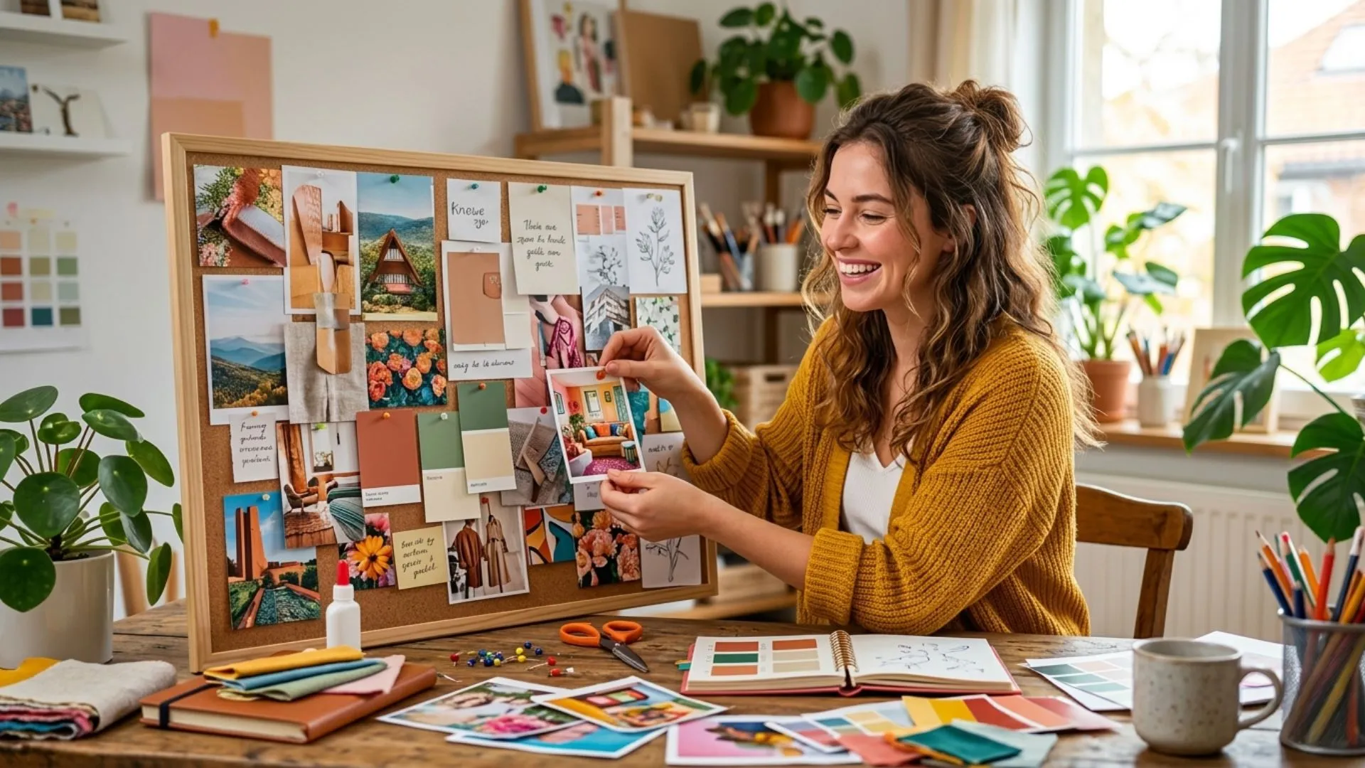
I didn't understand moodboards at first. Then I started using them, and I never skipped one again. Whether you're planning a fashion shoot, redesigning a room, or building a brand from scratch, a moodboard gives your idea a shape before you spend a single dollar or hour on execution.
This guide covers everything. What a moodboard is, why it works, the best moodboard examples by category, and a full step-by-step walkthrough to build one yourself. By the end, you'll have a moodboard ready and a clear creative direction locked in.
Let's get into it.
What Is a Moodboard?
A moodboard is a curated visual collection that captures the feeling of a project. It's not a finished design. It's not a mockup. It's the emotion, the palette, the texture, the why behind the work.
Think of it as a visual brief. It shows what the project should feel like before anyone decides what it should look like.
Designers, photographers, art directors, interior designers, and brand teams all use moodboards. The format hasn't changed much. But the tools for building them have evolved dramatically, especially with AI image generator now making it possible to create original visuals that don't exist anywhere yet.
Why a Moodboard Actually Matters
Most creative projects that go sideways never had a moodboard. The reasons are always the same. Here's what a moodboard actually fixes:
- It stops creative drift. Without one, people interpret the brief differently. Feedback loops multiply. Revisions pile up before a single good thing gets made.
- It aligns the whole team upfront. The client, the photographer, the designer, the art director - everyone reads from the same visual page before work starts.
- It saves real money. Catching a wrong creative direction on a moodboard costs nothing. Catching it after a shoot, a render, or a launch costs a lot.
- It unlocks unexpected connections. A texture from architecture inspires a fashion direction. A color story from nature reshapes a brand palette. You don't find those connections in a written brief.
- It builds your own clarity. Before you can brief anyone else, you have to know what you want. Building a moodboard forces that clarity on yourself first.
Types of Moodboards [With Real Examples]
Not every moodboard looks the same. The format changes based on what you're creating. Here are the most common types, with real moodboard examples for each.
Fashion Moodboards
A fashion moodboard sets the visual direction for a collection or shoot. It pulls together editorial references, fabric textures, color palettes, silhouettes, and seasonal tone.
A summer fashion moodboard might include open linen fabrics, warm sand tones, Mediterranean light, and minimal accessories. A dark winter fashion moodboard goes the opposite direction, deep jewel tones, layered textures, moodier editorial lighting.
The best fashion moodboards go beyond clothes. They pull from architecture, nature, film stills, and lifestyle imagery. The goal is to create a world, not just an outfit.
Interior Design Moodboard
An interior design moodboard maps out a space before anything is purchased. It brings together furniture references, wall colors, flooring textures, lighting styles, and decorative details.
A Japandi bedroom moodboard would show clean platform beds, warm wood tones, shoji screen textures, muted linen fabrics, and soft indirect lighting. A maximalist moodboard would go bolder, patterned rugs, jewel-toned walls, layered art, and rich brass finishes.
Interior design moodboards prevent expensive mistakes. You make every decision visually, before you make it financially.
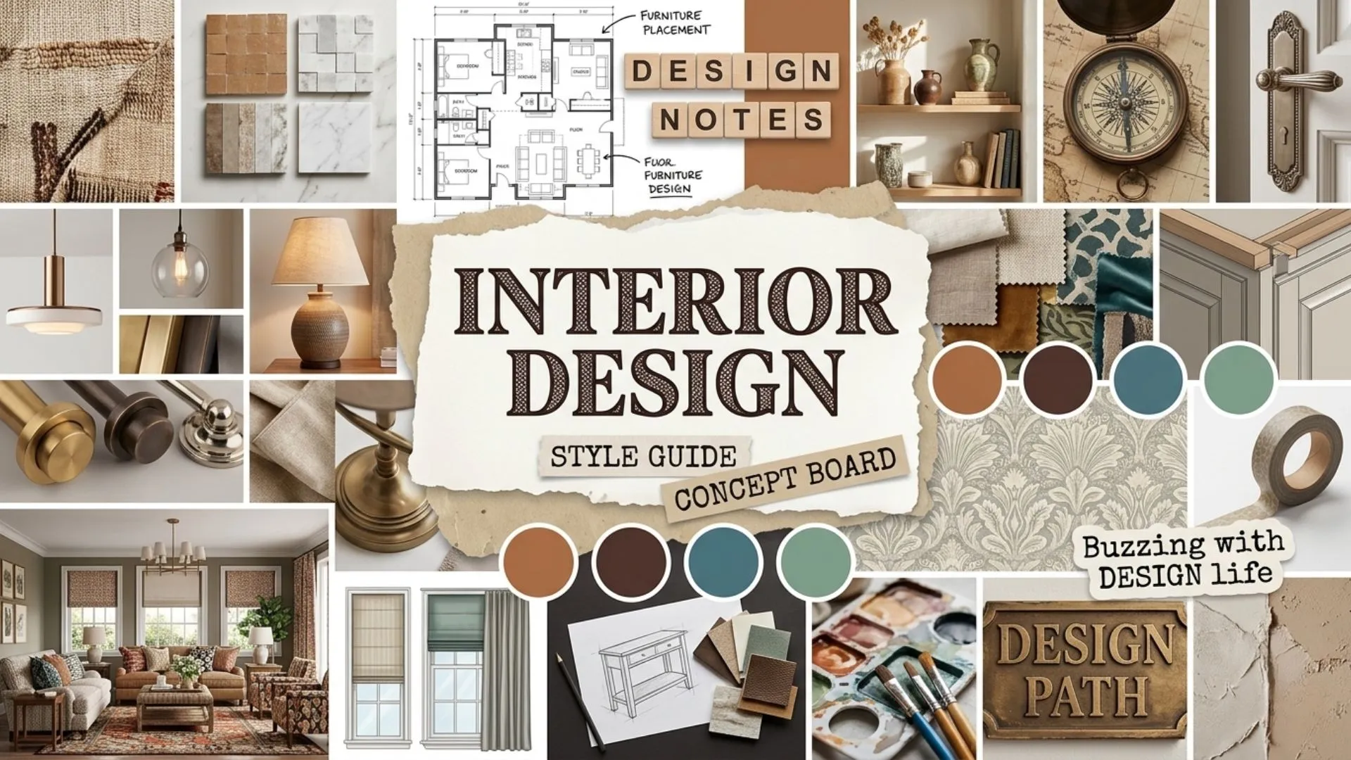 Interior Design Moodboard.webp
Brand Moodboard
A brand moodboard captures the visual identity of a business. It defines tone, colors, typography style, and imagery language across every brand touchpoint.
Startups use them during identity development. Established brands use them when repositioning or refreshing. A strong brand moodboard keeps designers, marketers, and content teams producing work that feels cohesive, even when they're working independently.
Product Photography Moodboard
Before any shoot, the photographer, stylist, and art director need to agree on lighting, backgrounds, props, and styling direction. A product photography moodboard defines all of that upfront.
It references existing product shoots in a similar aesthetic, lighting setup details, surface textures, and color stories. Everyone arrives on set knowing exactly what they're building toward.
10 Moodboard Ideas to Spark Your Next Board
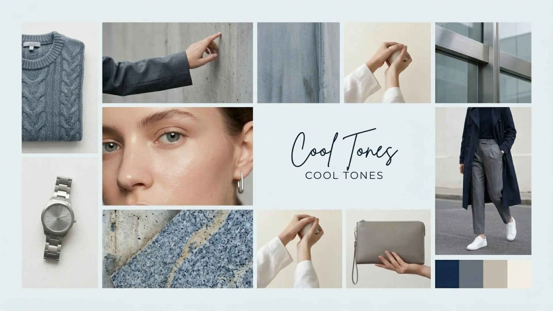
1. Color-story moodboards — Build entirely around one palette. All terracotta tones. All soft dusty blues. All warm neutrals. The discipline of a single color story creates very powerful, intentional boards.
2. Era-inspired moodboards — Pull from a specific decade. 70s earth tones and macramé. 90s grunge textures and saturated primaries. Y2K chrome and low-rise everything. These are especially strong for fashion moodboard projects.
3. Texture-driven moodboards — No dominant color story. Just raw material texture — concrete, linen, leather, water, moss, dried botanicals. These work beautifully as interior design moodboard foundations.
4. Emotion-led moodboards — Gather images that evoke a single feeling. Nostalgia. Quiet. Power. Warmth. Label the emotion at the top and let every visual below it answer that one word.
5. Seasonal moodboards — Late summer golden hour. The first crisp week of autumn. Deep winter stillness. Seasons are an underrated framework for any creative direction.
6. Material-contrast moodboards — Pair opposing textures intentionally. Rough concrete against soft silk. Cold steel against warm wood. The tension between materials creates visual energy that drives bold creative directions.
7. Location-inspired moodboards — Build around a place. The light and architecture of a specific city. The landscape textures of a particular region. Location moodboards work especially well for travel brands, editorial shoots, and hospitality design.
8. Movement and energy moodboards — Focus entirely on implied motion. Running water. Wind in fabric. Crowd energy. Blurred light trails. These are powerful for sports, performance, and lifestyle brands that need to communicate dynamism.
9. Typography-led moodboards — Start with typefaces instead of images. Choose two or three fonts that match the brand personality. Build the visual references around the feeling those fonts create. Works especially well for brand identity and editorial design projects.
10. Monochrome moodboards — Restrict the entire board to variations of a single color, from its lightest tint to its darkest shade. This creates moodboards with extraordinary visual depth and sophistication. Particularly effective for luxury, beauty, and high-end interior design directions.
How to Make a Moodboard Step by Step with AI
Here’s a five step guide to make your moodboard.
Step 1: Define Your Creative Objective
Before you gather a single image, write down three things.
- What is this moodboard for? (a shoot, a room, a brand, a campaign)
- What emotion should it communicate?
- What's the one word that describes the feeling you're going for?
That one word becomes your filter. Every image you add should pass the test: does this belong in a "serene" board? A "bold" board? An "editorial" board? If it doesn't pass, leave it out.
Step 2: Open The AI Image Generator
For original visuals that don't exist yet anywhere online, use an AI image generator to create them from a text description. Type in exactly what you're imagining, the lighting, the texture, the mood, and generate it. This is especially useful for product shoot moodboards where you need to visualize custom setups before committing to a studio booking.
You can also collect images. Pull from editorial photography, architecture, fashion, nature, interiors, food, texture close-ups, whatever fits your direction.
Don't over-curate at this stage. Collect broadly first, then edit down later. Aim for 20 to 30 images before you start filtering.
Step 3: Edit Down to Your Best 8 to 12 Images
This is the most important part of the process. More images do not make a better moodboard. They make a cluttered one.
Go back through everything you collected. Keep only the images that clearly, strongly communicate your direction. Ask: if someone who knew nothing about this project looked at this image, would they understand the mood?
If it's interesting but off-direction, save it in a separate folder for a different project. Ruthless editing is what makes a moodboard powerful. You can use an AI image editor to get things done efficiently.
Step 4: Build the Layout
Arrange your images with intention. Place your hero image, the one that best captures the overall mood, front and center or in the dominant position of your layout.
Follow a few layout principles:
- Mix wide shots, medium shots, and close-up texture shots
- Use odd numbers in groupings (3, 5, 7)
- Leave breathing room, white space is not wasted space
- Keep a consistent color palette across all images
Once your layout is set, use an AI image editor to adjust any images that don't quite match. You can color-grade individual references to sit closer to the overall palette, clean up backgrounds, or remove distracting elements.
Step 5: Add Color Swatches, Typography, and Labels
A great moodboard does more than show images. It documents the details.
Add a color palette strip beneath your images. Include hex codes if this is for a design or brand project. Add a typography reference, show the font style and weight that fits the mood. Label the board with the project name, date, and a one-sentence creative direction summary.
These details transform a visual collage into a working creative document. It's the difference between a pretty inspiration board and an actual project brief.
Step 6: Share and Collaborate
Once the moodboard is complete, share it with your team or client before any production begins. This is the moment to get alignment.
Invite feedback specifically on mood and feeling, not on individual images. Ask: "Does this feel right for the direction we discussed?" rather than "Do you like this photo?"
Save the final approved version as a reference document. Everything that gets created for this project should refer back to it.
How Businesses Use Moodboards
Moodboards aren't just for individual creatives. Some of the most effective applications happen inside business teams, where visual alignment across multiple stakeholders is genuinely hard to achieve.
Here's how different types of businesses use them in practice.
Marketing teams use moodboards at the start of every campaign. Before a brief goes to a designer, photographer, or video team, the marketing lead builds a moodboard that defines the campaign's visual world — color palette, imagery style, typography tone, and emotional register. It replaces pages of written direction that everyone interprets differently.
E-commerce brands build product photography moodboards before every shoot. The moodboard travels to the studio as a one-page visual brief. Photographer, stylist, and art director all work from the same reference. The result is a consistent content library — not a mixed bag of styles from different shoot days.
Interior design firms share moodboards with clients as part of the proposal process. Instead of describing a concept in writing, they show it. Clients respond faster, approve more confidently, and raise fewer late-stage objections when they've seen the direction before the work begins.
Fashion brands use seasonal moodboards as the master reference document for an entire collection. Designers, pattern-makers, buyers, and campaign teams all work from the same visual source. The moodboard keeps a 30-piece collection feeling cohesive from first sketch to final campaign image.
Agencies and studios present moodboards at the start of client engagements as a creative alignment checkpoint. Before any design, copy, or production work begins, both sides agree on the visual direction. That single step eliminates the most common source of costly revisions — discovering mid-project that client and agency had different things in their heads.
The throughline in all of these? A moodboard replaces assumption with evidence. It turns a subjective, hard-to-communicate creative direction into something everyone in the room can see, react to, and agree on.
How to Make a Fashion Moodboard
Let's walk through a real example. The brief: a late autumn fashion collection. Vibe, dark romance. Velvet textures. Deep burgundy and forest green tones. Candlelight warmth.
Start with your objective word: Romantic.
Collect references for:
- Fabric textures (velvet, lace, dark silk)
- Editorial portraits (candlelit, cinematic shadow, jewel-toned wardrobe)
- Color palette (burgundy, forest green, deep amber, dark gold)
- Setting references (candlelit rooms, autumn forests, stone interiors)
- Accessory details (leather gloves, antique jewelry, lace trim)
For visuals that don't exist in stock libraries, like a custom velvet fabric texture in exactly the right shade of burgundy, use an AI image generator to generate it from a description.
Build the layout with the richest portrait shot as the hero. Surround it with texture references and color swatches. Apply a consistent warm-dark color grade across all images using an AI image editor.
Label it: Autumn Collection '25, Dark Romance, Jewel Tones, Velvet & Lace.
That's your fashion moodboard. Done in an afternoon. Ready to brief your photographer, stylist, and art director with zero ambiguity.
 Fashion Moodboard.webp
How to Make an Interior Design Moodboard (Specific Example)
The brief: a modern Japandi bedroom. Japanese minimalism meets Scandinavian warmth.
Objective word: Serene.
Collect references for:
- Furniture (low platform bed, natural wood frame, minimal nightstand)
- Textures (shoji screen paper, woven linen, matte plaster wall)
- Lighting (soft indirect, natural morning light, single ceramic lamp)
- Color palette (white, warm grey, pale wood, sand, sage)
- Detail shots (dried botanicals, simple ceramics, linen bedding close-up)
Arrange with the full bedroom shot as the anchor. Group textures in the top right. Place the palette strip along the bottom. Add a typography reference in a clean sans-serif, something that matches the quiet minimalism of the direction.
The result is a complete interior design moodboard that a contractor, furniture buyer, or interior photographer can immediately understand and work from.
05 Common Moodboard Mistakes to Avoid
I've made all of these. Here's what to watch out for.
Too many images. A moodboard with 30 images communicates nothing clearly. Edit down to your strongest 8 to 12. Less is always more powerful.
Inconsistent color temperature. If half your images are warm and half are cool, the board feels scattered. Run everything through an AI image editor to bring them into the same tonal range.
No texture variety. A board made entirely of wide-shot editorial photos misses depth. Include close-up texture references. They add richness and tactile feeling to the direction.
Skipping the labels. An unlabeled moodboard is an inspiration board. A labeled one is a working document. Always include the project name, direction summary, and color codes.
Adding images you like instead of images that serve the direction. This is the most common one. Just because an image is beautiful doesn't mean it belongs on this board. Every image should pass the direction test, not the beauty test.
How to Use AI-Generated Images in Your Moodboard
Most moodboards rely entirely on images that already exist, stock photography, editorial tearsheets, Pinterest screenshots. That limits you to what other people have already shot.
AI image generation removes that ceiling entirely.
Instead of scrolling for 45 minutes looking for exactly the right texture reference, describe it. Type the lighting, the material, the angle, and the mood. The AI image generator produces it from scratch. No compromising on "close enough."
This is especially powerful for product photography moodboards. You might need a specific surface, a slate grey concrete texture with a particular warm overhead light. That exact combination may not exist in any stock library. But it does exist as a text description. Generate it. Drop it into your moodboard.
For fashion moodboard projects, the same principle applies to fabric textures. A specific silk weave in a shade between rust and terracotta, photographed at a 45-degree angle with diffused natural light. That's a description. It's also a prompt. Within minutes, that image exists.
Moodboard Color Theory: How to get the palette right
Color is the most powerful element of any moodboard. It communicates mood faster than any image. It's also the most common thing people get wrong.
Here's a simple framework that works every time.
Pick one dominant color. This is the color that takes up the most visual real estate on the board. It sets the emotional foundation. Warm dominant colors (terracotta, amber, cream) create welcoming, approachable moods. Cool dominant colors (slate, deep teal, grey-blue) create calm, sophisticated, or serious tones.
Add one accent color. This is the contrast. It creates visual interest and stops the board from feeling flat. The accent should be distinct but complementary, not competing, just punctuating.
Use one neutral to balance. White, off-white, natural linen, warm grey. Neutrals give the eye a place to rest between the dominant and accent colors.
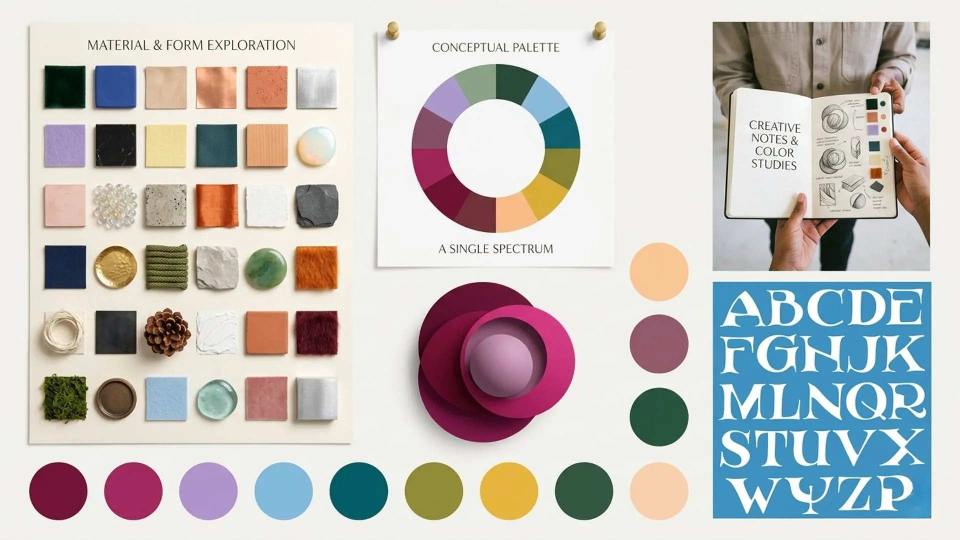 Color Theory.webp
Three colors. That's the structure. Everything on your moodboard should live within those three.
Once you've chosen the palette, use an AI image editor to bring all your reference images into the same tonal range. Even subtle color temperature differences between images can make a moodboard feel inconsistent. Unified color grading is the invisible detail that separates a professional moodboard from a rushed one.
Digital vs Physical Moodboards: Which One to Use
Physical moodboards, cut-out magazine images, fabric swatches, paint chips, pinned to a foam board, have a tangible quality that digital boards can't fully replicate. You can feel the textures. You can hold the paint chip up to natural light. There's something irreplaceable about that for interior design and fashion work.
But digital moodboards win on almost every other front.
- They're shareable. Send a link instead of shipping a physical board to a client in another city.
- They're editable. Swap one image in 30 seconds instead of cutting, reprinting, and repasting.
- They're scalable. Generate 20 versions of the same moodboard with different color directions and compare them side by side.
For most professional use cases, client presentations, team alignment, remote collaboration, digital is the right choice. For personal creative exploration and tactile research phases, physical still has value.
The best workflow often combines both. Do your initial exploration physically, cut, pin, feel. Then build the final shareable version digitally with original visuals generated through an AI image generator.
Ready to create your moodboard with ImagineArt?
Every project I've started with a moodboard has gone more smoothly. Every project I've skipped it on has had more friction, more revisions, and more creative drift.
A moodboard takes a few hours at most. It saves days of rework. And it gives everyone working on the project, including you, a clear, confident direction to build from.
Start with your objective word. Gather broadly. Edit ruthlessly. Build with intention. Share early.
That's how you make a moodboard that actually works.
Need original visuals for your moodboard that don't exist in any stock library? Generate them with an AI image generator or refine existing references with an AI image editor.
Syed Anas Hussain
Syed Anas Hussain is a computer scientist blending technical knowledge with marketing expertise and a growing passion for AI innovation. Curious by nature, he dives into new AI sciences and emerging trends to produce thoughtful, research-led content. At ImagineArt, he helps audiences make sense of AI and unlock its value through clear, practical storytelling.