
Saba Sohail
Sat Jun 14 2025 • Updated Wed Mar 25 2026
12 mins Read
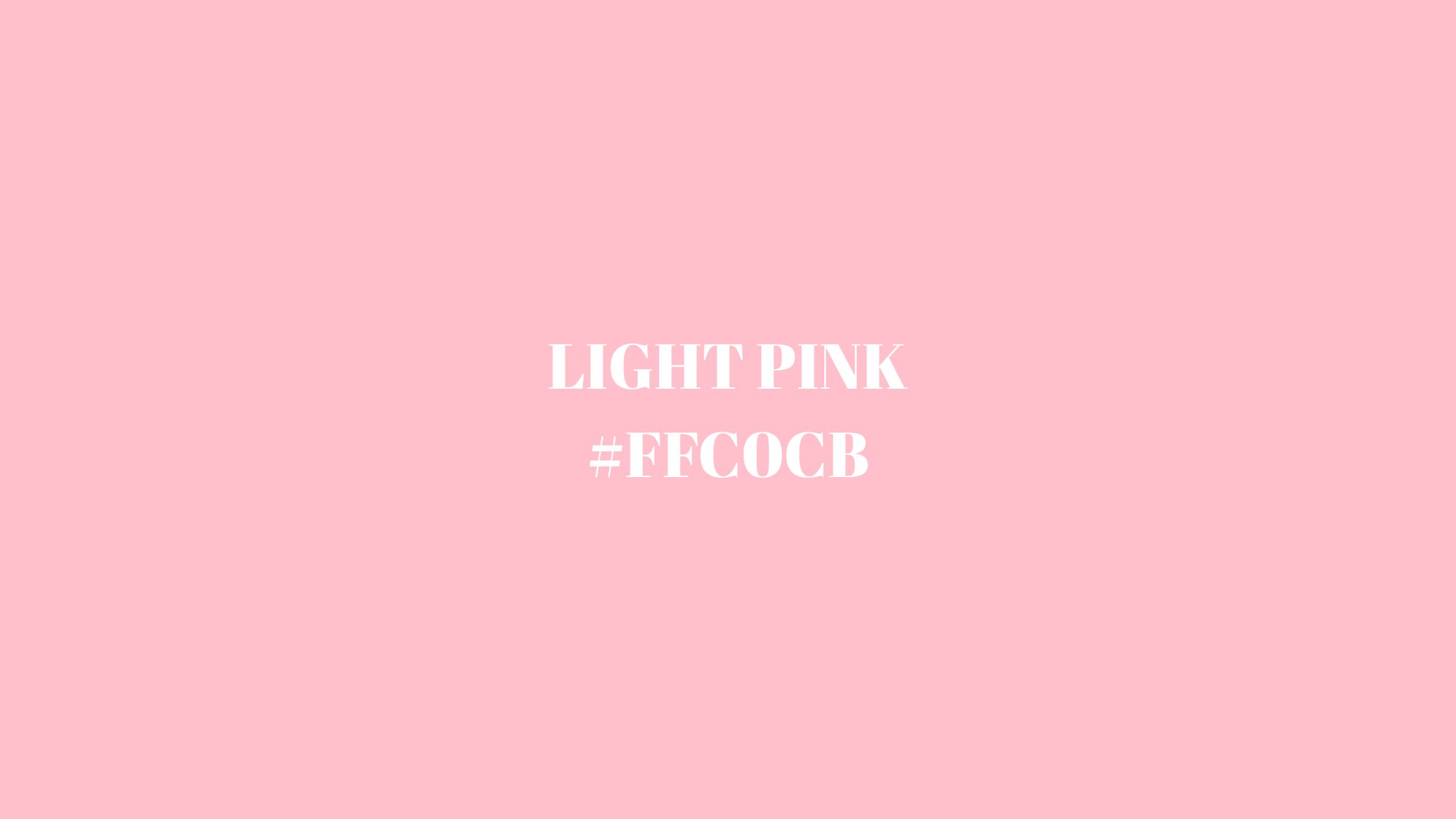
Light pink sits softly in the red family — delicate, warm, and emotionally expressive. The most widely used hex code for light pink is: #FFC0CB
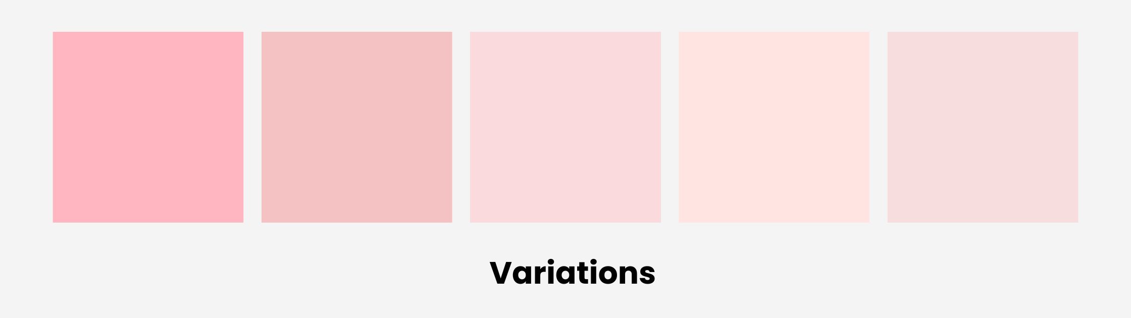
But this shade doesn’t live alone. Light pink branches into a whole range of tints and tones, from romantic blushes to bubblegum vibes and subtle rose hues.
Light Pink Hex Code (#FFC0CB) and Color Variations
The hex code of light pink is ##FFC0CB.
In RGB, that’s (255, 192, 203), and in HSL, it reads as 350° hue, 100% saturation, and 88% lightness. It's a bright, slightly warm pink with just enough white blended in to give it that soft pastel glow.
Here are some of its closest variations:
- Cotton Candy Pink – #FFB6C1
- Baby Pink –
#F4C2C2 - Blush –
#FADADD - Pale Rose –
#FFE4E1 - Champagne Pink –
#F7DDDD
 Light Pink Color Variations
Let’s say you’re designing a brand palette — light pink plays well in many directions. Here's how:
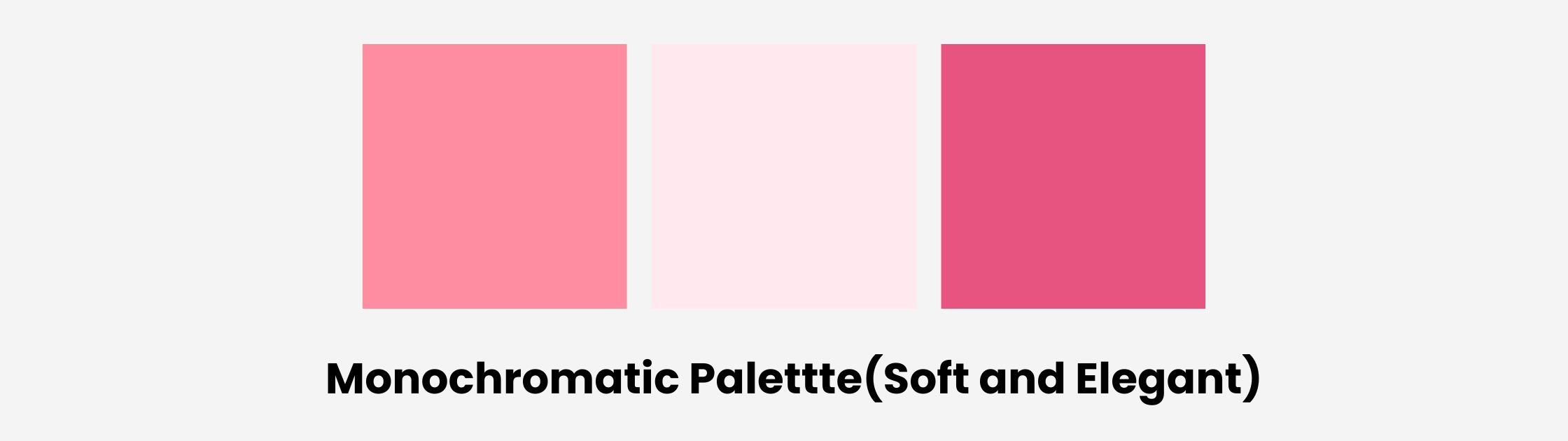
Monochromatic Palette
Build with lighter and darker versions of the same hue. Try pairing light pink #FFC0CB with:
- Medium Pink
#FF8DA1 - Pale Pink
#FFE9EE - Deep Rose
#E75480
 light pink mono
This kind of palette is perfect for fashion brands, editorial-style graphics, or romantic packaging that wants to feel cohesive and light.
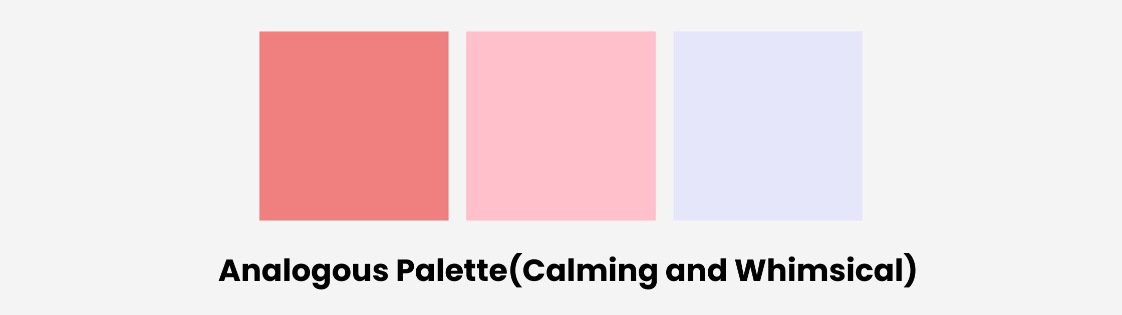
Analogous Palette
Analogous colors sit next to pink on the color wheel — think peach and lavender tones:
- Light Coral
#F08080 - Light Pink
#FFC0CB - Lavender
#E6E6FA
 light pink analogous palette
Great for creating pastel illustrations, children’s book art, or dreamy moodboards.
Triadic Palette
A triadic scheme uses three evenly spaced colors on the wheel. Try this combo:
- Light Pink
#FFC0CB - Powder Blue
#B0E0E6 - Pale Lemon Yellow
#FFFACD
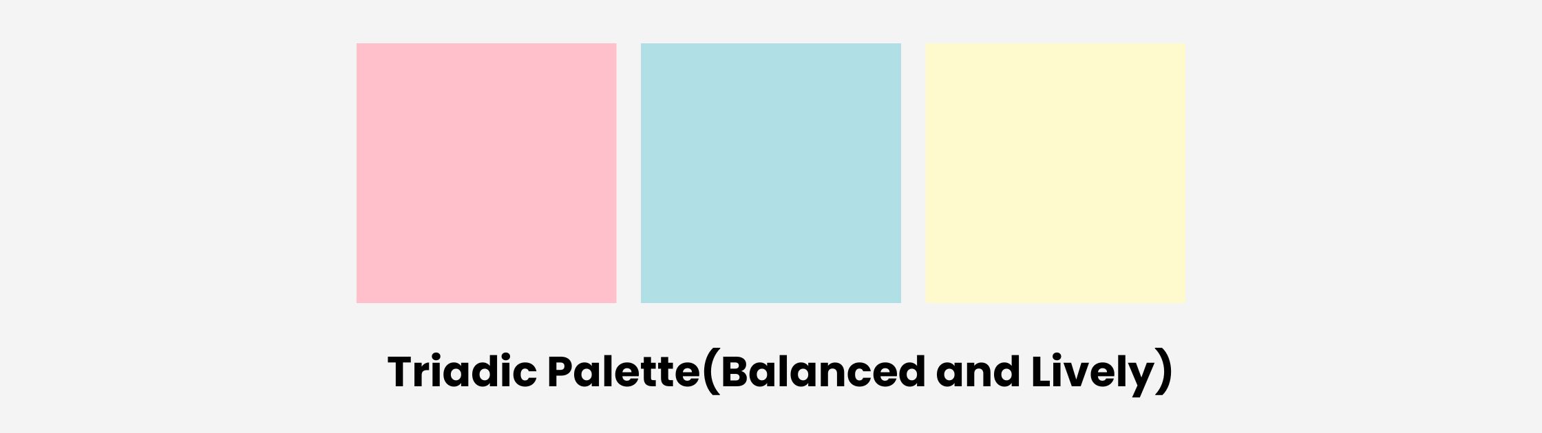 Light pink triadic palette
This one's perfect for playful logos, cheerful product packaging, or even YouTube thumbnails where color contrast needs to be energetic but not loud.
Complementary Palette
Opposite colors create visual interest. Light pink’s complement is a muted green or mint:
- Light Pink
#FFC0CB - Mint Green
#98FF98
 Colors that complement light pink
This duo is wildly popular in pastel design trends — it feels fresh, clean, and uplifting, and works wonders in UI cards, pastel logo systems, and soft branding kits.
What Does Light Pink Represent?
Light pink may look soft, but it carries a surprising amount of emotional and cultural weight. It’s a color that soothes, uplifts, and evolves with the times — and that makes it a powerhouse in both visual storytelling and brand identity.
Light Pink Symbolism and Emotional Meaning
When people see light pink, a few feelings instantly come to mind: comfort, sweetness, affection. It’s a color long associated with softness, nurturing, and emotional healing.
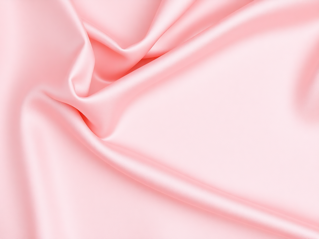 Light Pink Silk
- It radiates gentleness — perfect for wellness brands, journals, or mental health apps.
- It signals romantic innocence — often used in wedding visuals, love notes, or dreamy moodboards.
- It conveys calmness and trust, making it surprisingly effective for modern UI design and finance apps looking to soften their edge.
Historically, light pink leaned heavily feminine. Think: baby girl clothes, dolls, or Valentine's Day cards. But in recent years, that’s changed.
We’re seeing it used for:
- Gender-neutral fashion
- Luxury skincare packaging
- Soothing tech and productivity brands
Why? Because it’s emotionally disarming without being boring. It’s soft, but it has presence.
Light Pink in History and Culture
Back in the 18th century, pink was worn by European aristocrats — including men. It was considered a sign of youth, class, and fashion-forward confidence.
By the 20th century, however, marketers had turned pink into a symbol of femininity, especially in the West. Baby boom ads, Barbie dolls, and cosmetics solidified its role in "girls only" territory.
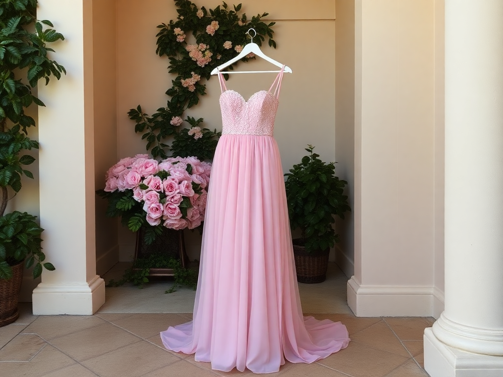 Light Pink Prom Dress
But fast-forward to now: pastel pink is everywhere — from minimalist tech startups to streetwear drops and even high fashion. It’s also a major player in K-beauty and Japanese packaging, often tied to themes of freshness, nature, and purity.
Light Pink in Color Psychology
If you’ve ever felt instantly relaxed when looking at soft pinks, there’s a reason. Light pink doesn’t just look gentle — it actually triggers psychological responses tied to care, trust, and emotional openness.
It’s one of the most calming and non-threatening hues in the color wheel, which is why it’s such a popular choice in spaces where comfort and vulnerability matter.
How It Affects Mood and Behavior
Light pink is often described as:
- Nurturing and supportive — it’s the emotional equivalent of a soft blanket or a gentle hug.
- Warm and emotionally open — it invites connection, reflection, and trust.
- Gentle and non-aggressive — perfect for diffusing tension.
This is why light pink is commonly used in:
- Healthcare design, like therapy rooms, pediatric spaces, or hospital branding.
- Mental wellness apps, journals, and meditation platforms.
- Community-based or nonprofit campaigns, where approachability and empathy matter.
There’s even something called the “Baker-Miller Pink” effect, where a specific pink shade was tested in prisons and psychiatric hospitals to reduce aggression. While the long-term effects were debated, the short-term calming impact was undeniable.
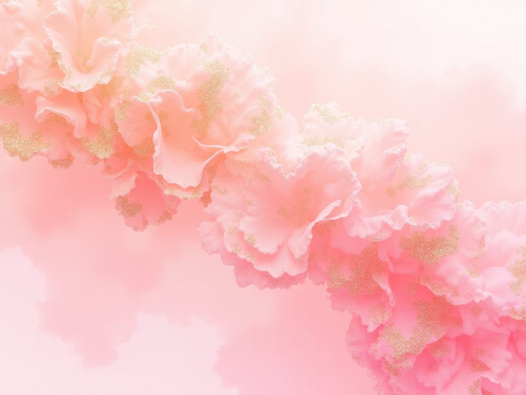 Created with ImagineArt
It’s also interesting to contrast light pink with stronger, bolder pinks like magenta or fuchsia. While those tones scream boldness and confidence, light pink whispers. It creates a pause — space for breath, softness, or contemplation. Used intentionally, it can make an environment or visual piece feel human, grounded, and emotionally safe.
In short? Light pink doesn’t demand attention — it invites emotion. And that’s what makes it so powerful.
In many Eastern cultures, pink connects to cherry blossoms, renewal, and seasonal cycles. It feels alive — not static.
So while it may look light and airy, pink is one of the most versatile colors in culture. From rebellion to tenderness, it can do both — and do them beautifully. Want to see how to use it next? Let’s get into real-world design applications.
How to Use Light Pink in Design
Light pink is incredibly versatile. It softens harsh lines, adds warmth to minimalist spaces, and creates an emotional connection that few colors can match. Whether you’re working on a logo, product label, or mobile app, light pink can bring a sense of calm and care that immediately stands out — quietly.
Product Packaging and Branding
Light pink is a top-tier choice for brands that want to feel soft, approachable, and caring — especially in wellness, beauty, and lifestyle industries. Think:
- Skincare and makeup brands that want to communicate softness and sensitivity.
- Soft drink and tea companies targeting a younger, lifestyle-driven audience.
- Mental health apps and wellness planners that focus on self-care.
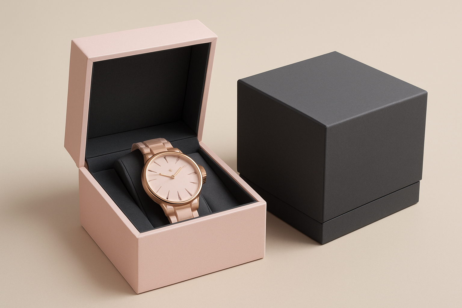 Light Pink Product Packaging
The emotional branding power of light pink is strongest when you want to evoke comfort, gentleness, or emotional healing. It’s also increasingly used to suggest premium calm — quiet luxury without the loud price tag.
UI and Web Design
Light pink works beautifully as a background color or as a gentle accent in user interfaces.
When used in digital platforms, light pink:
- Makes digital spaces feel more welcoming and user-friendly.
- Pairs well with serif fonts for elegance or rounded sans-serifs for softness.
- Can be used for call-to-action buttons, banners, and input fields without feeling aggressive.
But here is a quick accessibility tip if you want to use light pink in your website’s user interface: Always check contrast ratios when using light pink with white or pale text.
Consider pairing it with charcoal, dark brown, or muted purples for better readability.
See this one created with ImagineArt
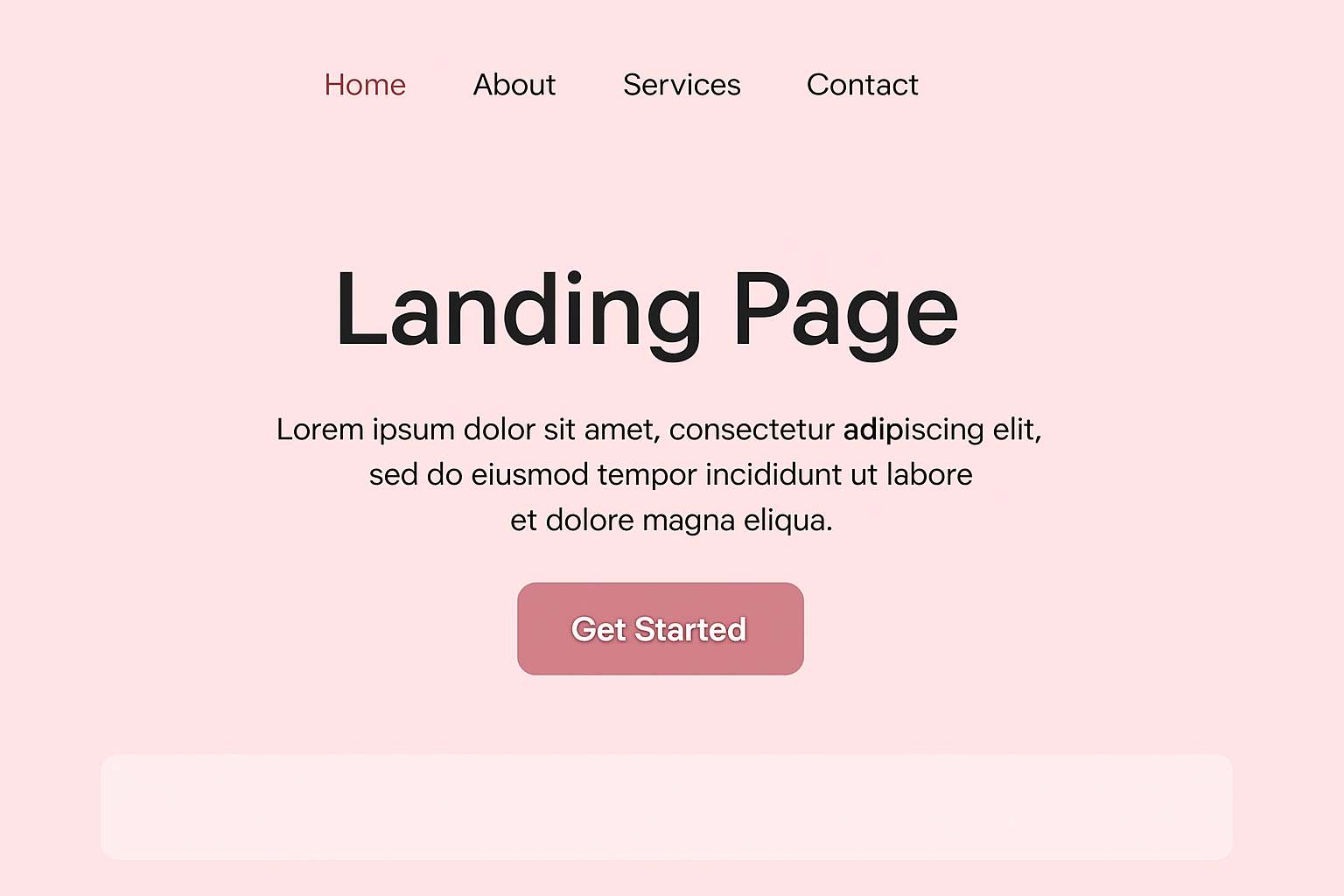 Light Pink Website Landing Page Concept
Light Pink in Fashion, Apparel and Lifestyle
In fashion, light pink has made the shift from “girlish” to gender-neutral and minimal luxe.
You’ll see pink symbolizing feminine, but you'll increasingly find it in:
- Monochrome fashion outfits and minimalist streetwear
- Scandinavian-inspired interior design and pastel office decor
- Stationery, planners, and lifestyle products meant to soothe and inspire
It’s no longer niche — it’s a neutral.
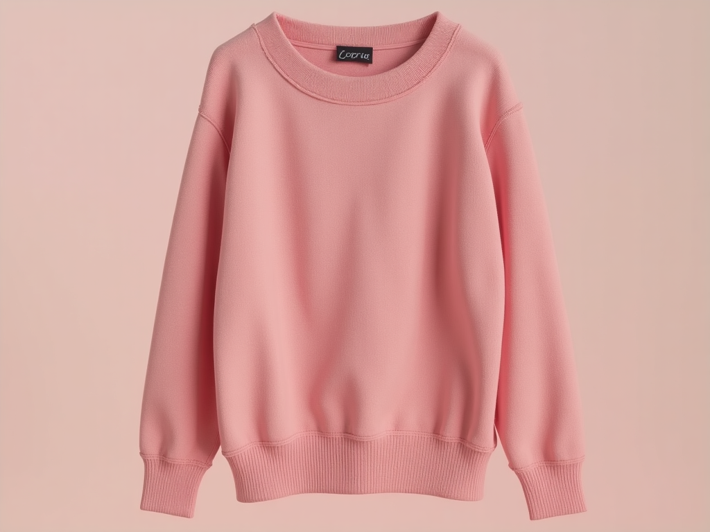 Light Pink Sweater
Light pink dominates virtual fashion spaces — from soft streetwear concepts to pastel-infused high fashion mockups.
In AI-generated fashion sketches or digital lookbooks, this color signifies freshness, elegance, and body-positive softness.
Use ImagineArt’s Text-to-Image feature to create runway poses, fabric textures, and outfit designs built around pink tones. This is ideal for creators developing apparel mockups, moodboards, or digital fashion portfolios.
 Light Pink Product Mockups
Light Pink Logos
A light pink logo isn’t always about sweetness — or say, anymore.
It can signal authenticity, nurture, or even bold softness depending on how it’s used.
Brands in beauty, mental health, parenthood, or lifestyle coaching all turn to light pink for a reason — it makes you feel safe.
![]() Light Pink Logo
Light Pink Logo
Try pairing it with:
- Gold or beige for a soft-luxury look
- Navy or forest green for contrast and grounding
- Coral or warm oranges for playful energy
It’s the color of trust, with a whisper of elegance.
AI Logo Generation
Light pink is making waves in AI logo generation, especially for brands in beauty, wellness, and lifestyle niches. It communicates elegance and care — so it’s suitable for businesses targeting calm, emotionally aware branding.
Whether used as a background or accent color, it pairs well with gold, beige, or charcoal. ImagineArt’s AI Logo Generator helps you create light pink logos using minimal shapes, serif or script fonts, and balanced palettes.
The result? Stylish yet modern logos that stand out in soft product lines like skincare, wellness services, or boutique shops.
![]() Boutique Logo
Boutique Logo
Using Light Pink in AI Image Generation
Light pink isn’t just a color — it’s a mood. And when you’re generating visuals with AI, especially using tools like ImagineArt’s Image Studio, light pink becomes your shortcut to creating soft, emotionally resonant, and highly shareable art.
Light Pink in Wall Art and Wallpapers
From digital art prints to phone and desktop wallpapers, light pink remains a timeless choice. Its soft hue creates peaceful atmospheres in bedrooms, workspaces, and creative zones.
With ImagineArt’s AI wallpaper generator, you can generate abstract art, floral illustrations, or celestial scenes in light pink tones using just a few prompt tweaks.
These AI-generated artworks can be printed or sold on platforms like Etsy, Society6, or Redbubble. For a unique touch, combine light pink with golden ink textures or line art to create minimal yet powerful visual statements for any wall.
 Light Pink Wallpaper
Light Pink in Vision Boards
Light pink is the go-to color for vision boards centered on self-love, healing, or relationship goals. This gentle shade provides a calming foundation for affirmations, goal statements, and inspirational visuals.
Whether you're building a dream life collage or a business growth roadmap, pink backgrounds help center your intentions around emotional well-being.
Check ImagineArt’s Text to Image tool that helps you to generate dreamy collage-style visuals, vision board templates, and moodboard assets with light pink as the primary color. Add script overlays, polaroid frames, and sparkle accents to complete the soft aesthetic.
 Light Pink Vision Board
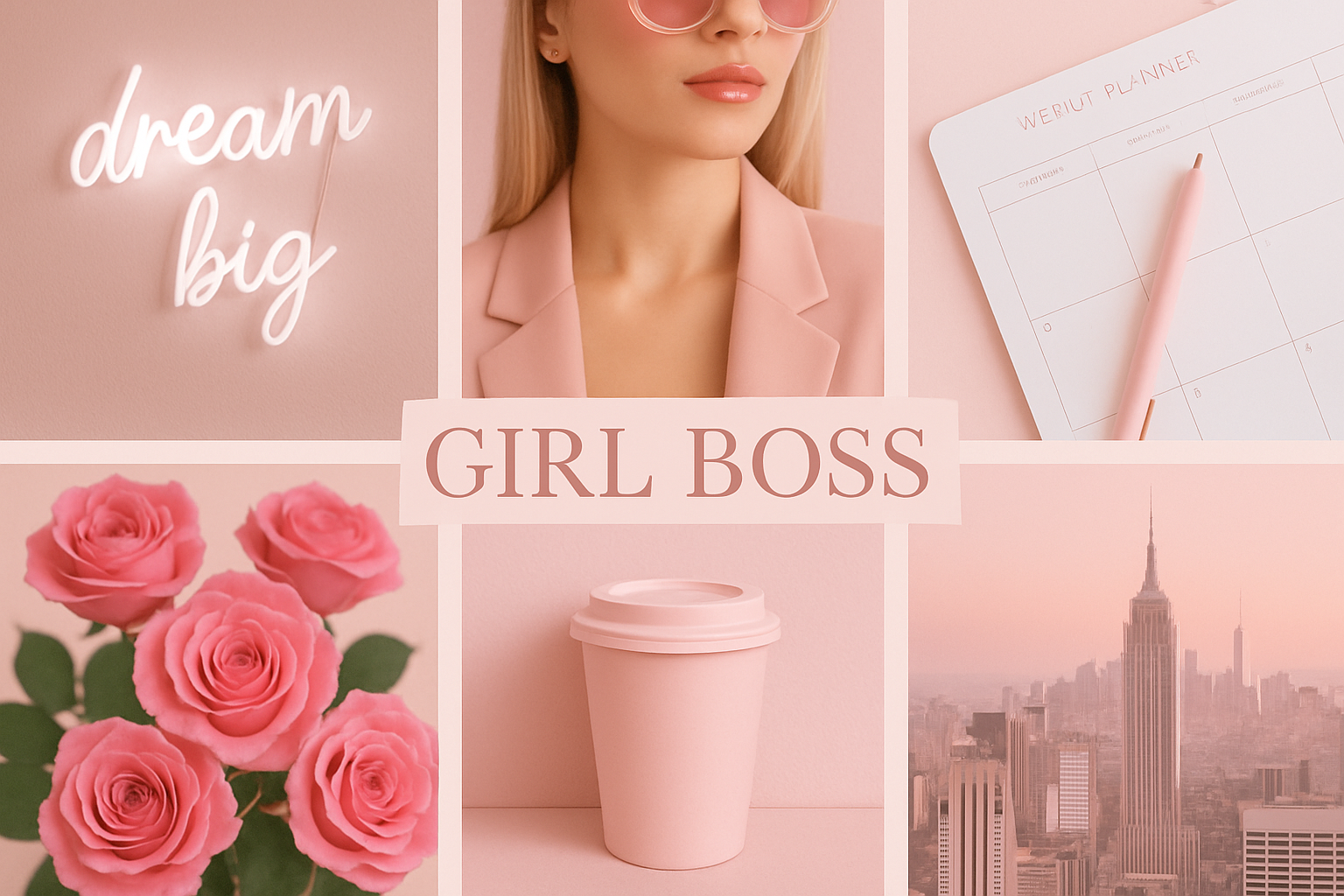
When Should You Use Light Pink in Images?
Use light pink when your visual goal is to evoke:
- Comfort or care (think self-care products or mental health awareness)
- Minimalist elegance (great for skincare, luxury stationery, journals)
- Cuteness or charm (ideal for kawaii themes, planners, and character art)
This shade is a staple in:
- Pinterest graphics for lifestyle blogs
- Product mockups for gentle branding
- Flat lay compositions for Instagram posts
- Aesthetic printable art (think affirmations, baby shower invites, etc.)
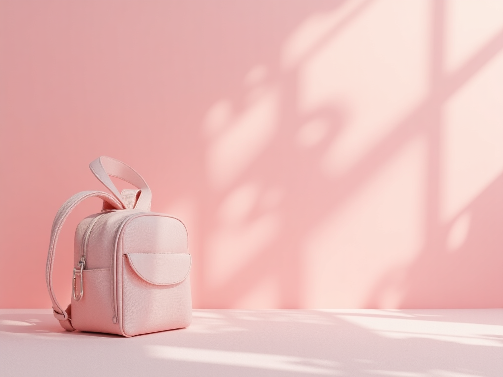 Light Pink Products
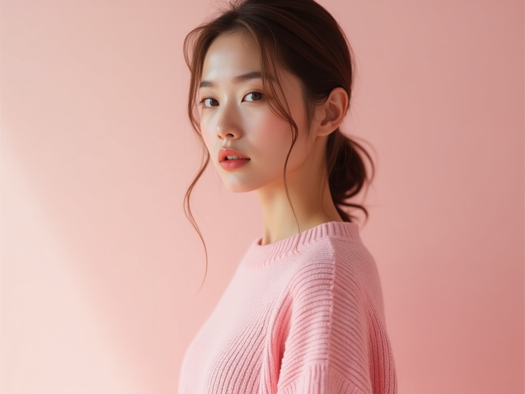
Light Pink in AI Headshots
Light pink backgrounds are trending.
Fashionistas to creatives are using AI headshot generator like ImagineArt to redo their personal and professional branding.
This soft shade evokes warmth, approachability, and a subtle glow that flatters most skin tones. Whether you're creating corporate-friendly portraits or more casual social media headshots, light pink adds a modern, aesthetic touch without overpowering the subject.
In ImagineArt’s Face Portrait tool, you can customize the lighting and background color to include soft pink gradients or flat blush tones — perfect for LinkedIn, personal websites, or brand kits that need a feminine or friendly vibe.
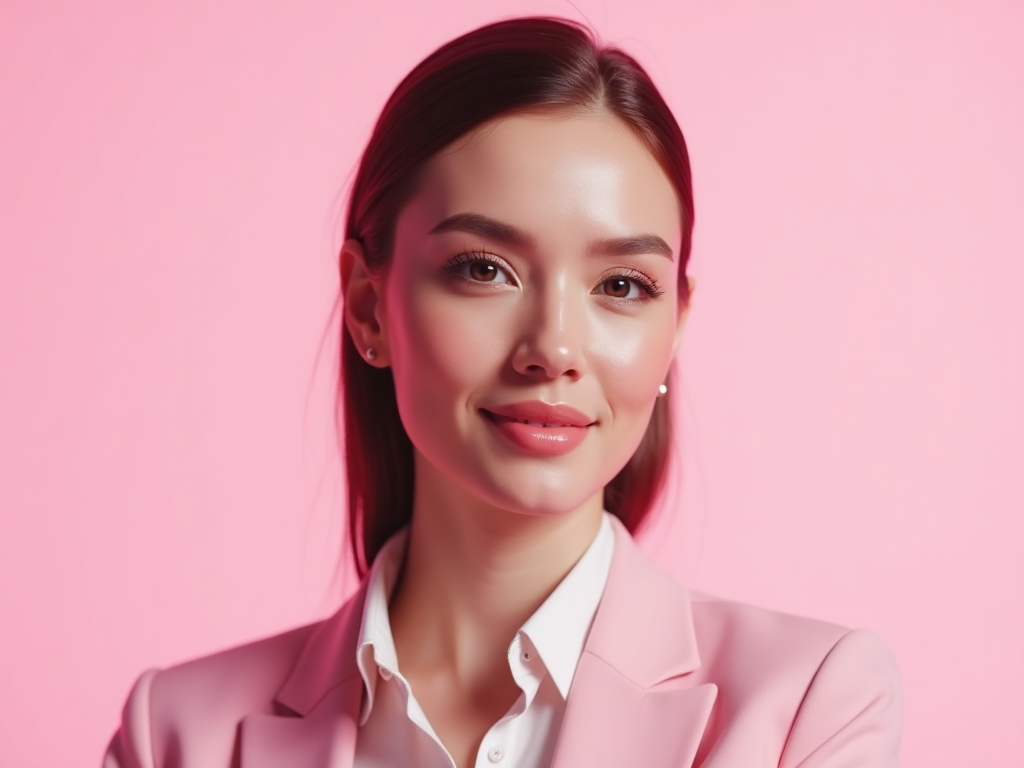 Light Pink Headshot
More AI Image Use Cases with Light Pink
Here are a few types of visuals where #FFC0CB works beautifully:
- Brand illustrations (line art with light pink accents)
- Digital planners and journals (soft backgrounds, motivational quotes)
- Character design for wellness apps, educational content, or social stories
- Kawaii-style drawings, food stickers, or seasonal art collections
 Light Pink Aesthetics
Example Prompts to Try in ImagineArt
You can type these directly into Image Studio (Text-to-Image tool) with studio lighting, portrait aspect ratio, and line art or soft illustration styles.
- “Flat lay of a minimalist skincare bottle on a light pink marble surface with dried flowers”
- “Digital illustration of a serene girl journaling, light pink background, calming mood”
- “Kawaii boba tea with smiling face, surrounded by pastel stars, light pink background”
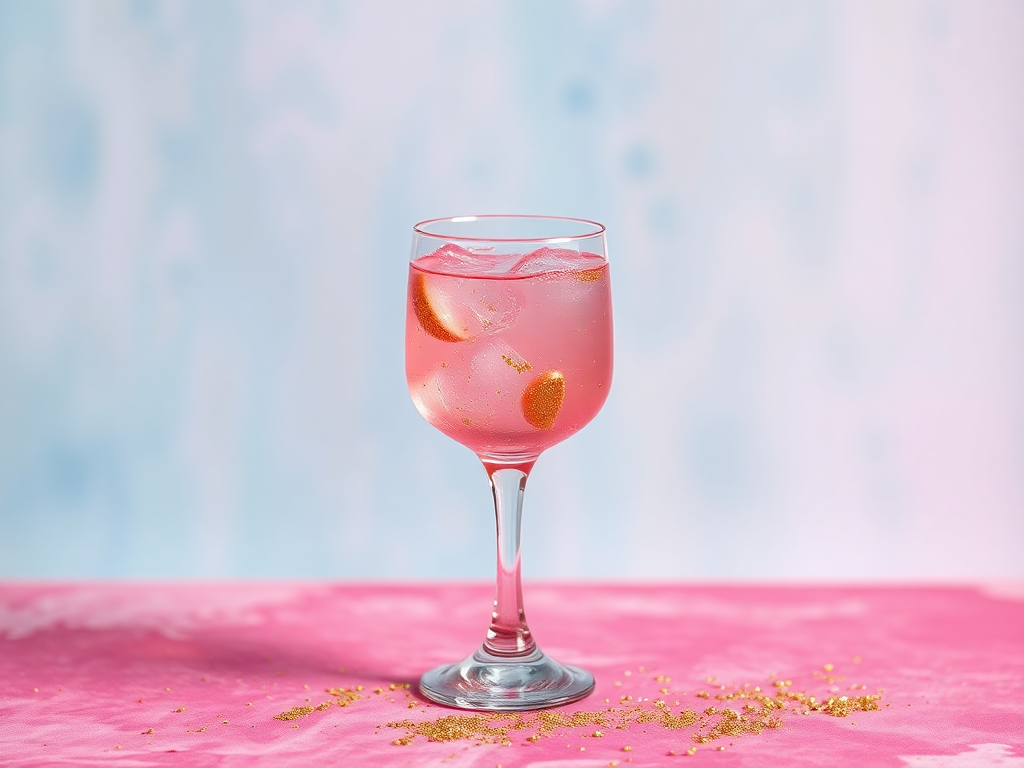
AI Video Generation with Light Pink Palette
Using light pink in AI video generation can create soft, calming, and visually appealing content that resonates with a wide audience.
ImagineArt’s AI video generator brings this palette to life in dynamic videos for social media, brand storytelling, and more. Here's how you can leverage the delicate touch of light pink in your AI-generated videos:
When to Use Light Pink in Video Content
Light pink adds a sense of calm and softness to videos, making it perfect for projects that aim to evoke warmth, serenity, and positivity. It works especially well in videos related to beauty, wellness, fashion, and lifestyle. When used strategically, light pink can provide a subtle yet impactful visual presence that encourages relaxation, trust, and a sense of nurturing.
Some ideal video use cases include:
- Beauty and skincare tutorials
- Fashion showcases
- Product promotions for wellness brands
- Character-driven animation or explainer videos
- baby videos
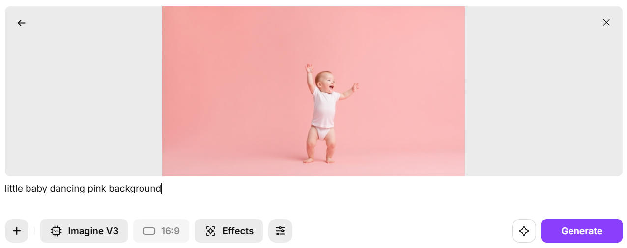 Baby Dancing Video
Sample AI Video Prompts Using Light Pink
To get the best results in AI-generated video content using the light pink palette, you’ll want to include specific references in your prompts. Below are a few examples that would yield visually appealing video content.
- "beauty tutorial with a soft pastel light pink background, showcasing skincare products, with text overlays and a calm voiceover."
- "a fashion showcase video with a soft pink background, highlighting a minimalist spring collection with smooth transitions between shots."
- "lifestyle video using a light pink backdrop to promote a wellness brand. The video should have calming music and text overlays describing the benefits of the products."
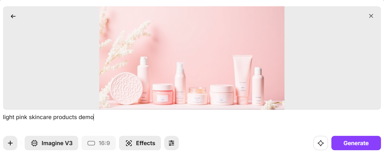 Product demo videos
Each of these video types can be further enhanced with ImagineArt Video Recolor app, making it simple to apply, refine, and maintain consistent light pink tones across your entire project for maximum visual impact.
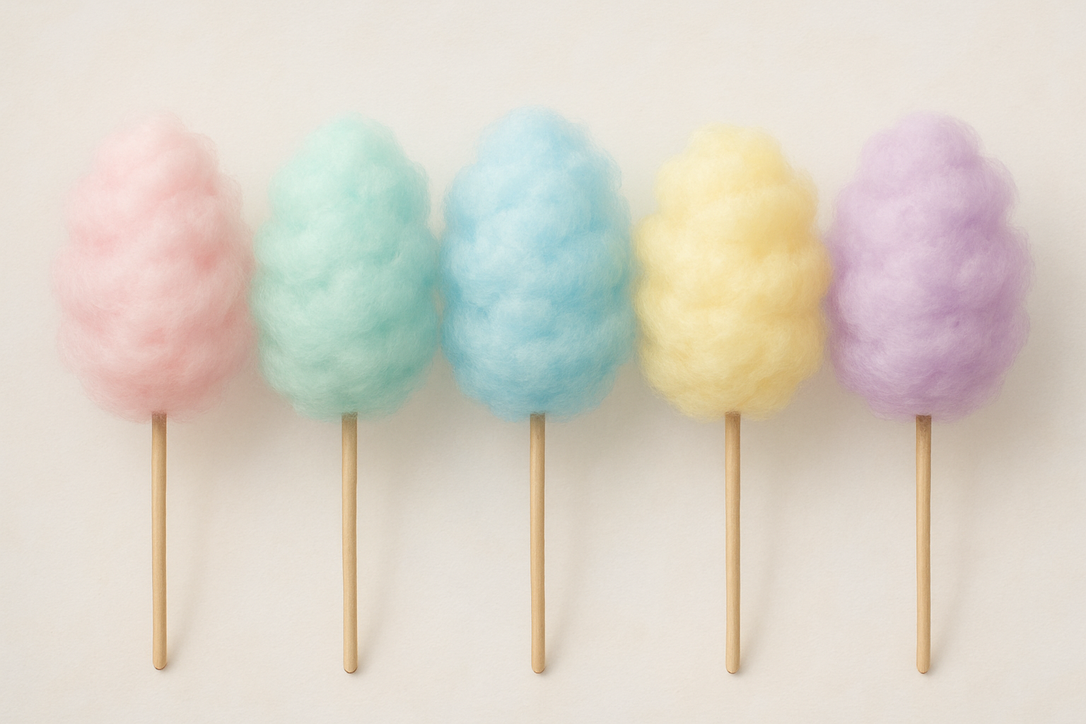
Light Pink Palettes
Here are top 4 light pink palettes that work well for branding, visuals, videos and literally everything design!
 Created with ImgineArt
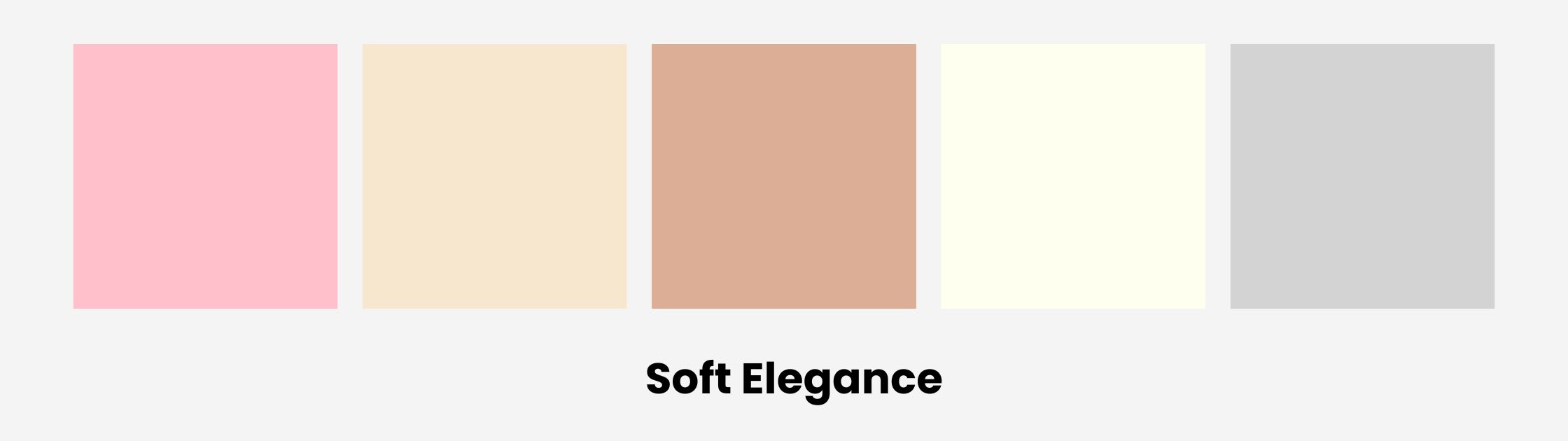
🩷 1. Soft Elegance
- Light Pink:
#FFC0CB - Champagne:
#F7E7CE - Dusty Rose:
#DCAE96 - Ivory:
#FFFFF0 - Soft Gray:
#D3D3D3
 Light Pink Palette 1
🌸 2. Spring Pastels
- Light Pink:
#FFC0CB - Mint Green:
#98FF98 - Lavender:
#E6E6FA - Baby Blue:
#BFEFFF - Lemon Chiffon:
#FFFACD
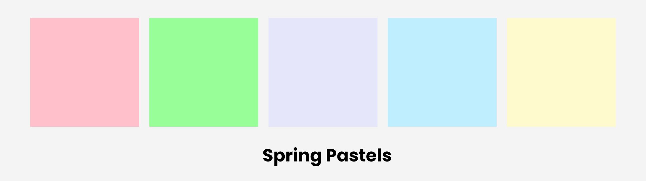 Light Pink Palette 2
🌷 3. Romantic Sunset
- Light Pink:
#FFC0CB - Coral:
#FF6F61 - Peach:
#FFDAB9 - Apricot:
#FBCEB1 - Warm Sand:
#ECD9C6
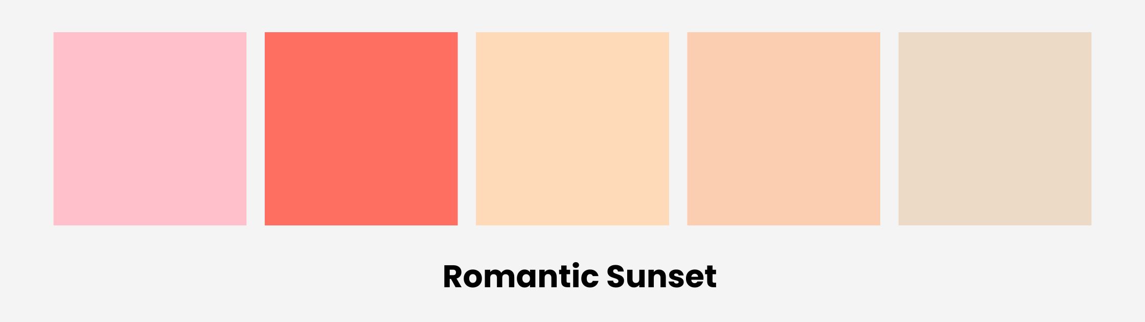 Light Pink Palette 3
💗 4. Modern Blush
- Light Pink:
#FFC0CB - Charcoal Gray:
#4A4A4A - Rosewood:
#65000B - Dusty Mauve:
#B48E9D - White Smoke:
#F5F5F5
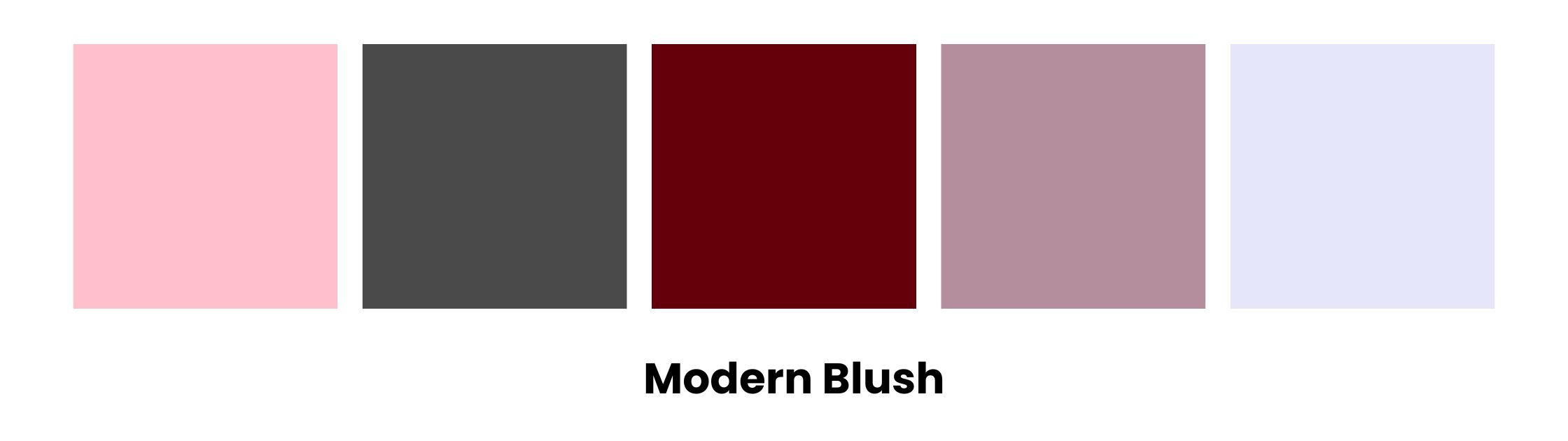 Light Pink Palette 4
🦢 5. Dreamy Neutrals
- Light Pink:
#FFC0CB - Taupe:
#B38B6D - Cream:
#FFFDD0 - Warm Beige:
#F5DEB3 - Pale Plum:
#DDA0DD
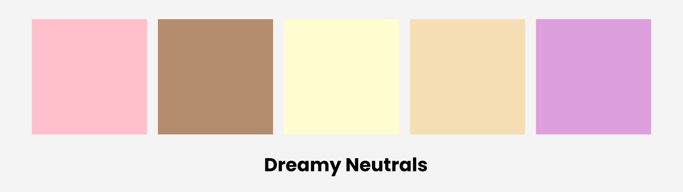 Light Pink Palette 5
Want more color profiles? Emerald Green | Cobalt Blue | Sage Green | Burgundy
Ready to create light pink visuals?
Saba Sohail
Saba Sohail is a Generative Engine Optimization and SaaS marketing specialist working in automation, product research and user acquisition. She strongly focuses on AI-powered speed, scale and structure for B2C and B2B teams. At ImagineArt, she develops use cases of AI Creative Suite for creative agencies and product marketing teams.