
Saba Sohail
Fri Jun 13 2025
13 mins Read
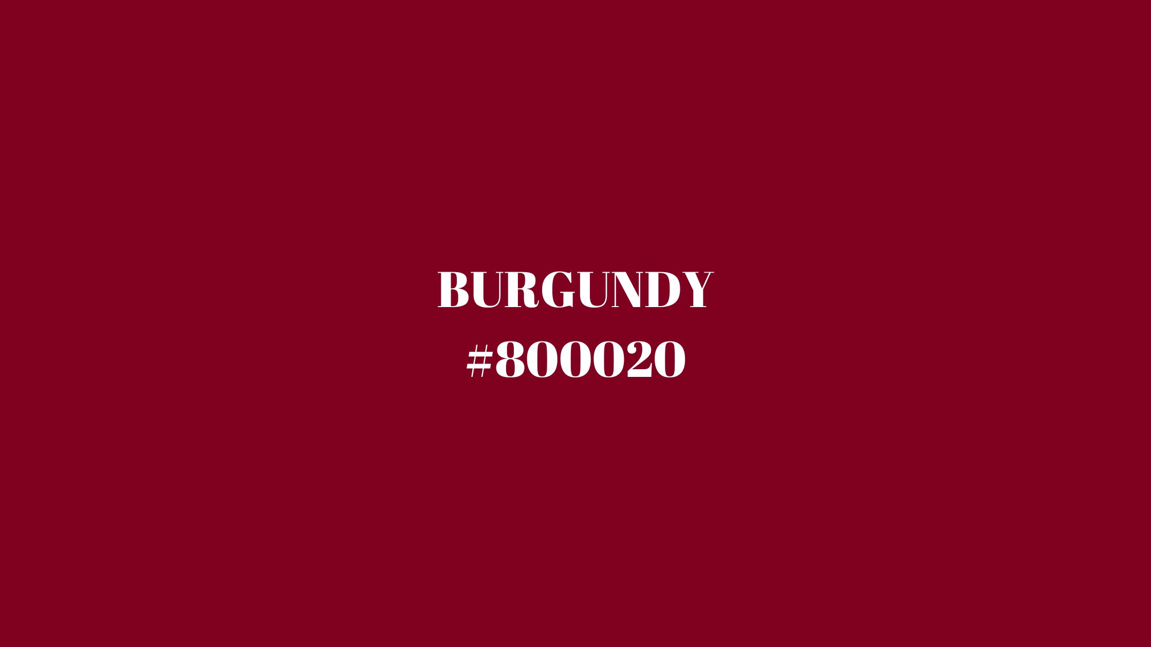
Burgundy color is a rich, deep shade of red with subtle undertones of purple and brown.
It evokes feelings of sophistication, warmth, and timeless elegance. This color derives its name from the Burgundy wine region in France, known for producing deep red wines that share the same luxurious hue.
Burgundy’s hex code is #800020, a classic choice that balances boldness with maturity.
Though fashion and design trends continually evolve, burgundy remains a steadfast favorite across many industries—from high-end fashion and interior design to branding and digital media. Its versatility allows it to convey passion and power as well as restraint and refinement.
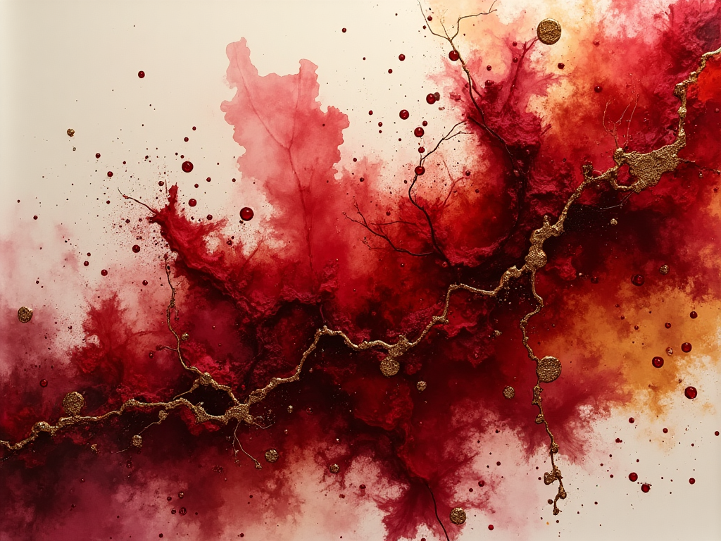 Burgundy Alcoholic Ink
This comprehensive guide will delve into burgundy color cultural significance, psychological impact, and practical uses in print and digital design.
You’ll find everything about burgundy color: use of palettes, hex codes, accessibility tips, and insights on integrating burgundy into AI-powered image and video generation workflows.
Burgundy Color Hex Code and Color Variations
The standard hex code for burgundy, recognized by design industry leaders #800020
This rich shade combines the depth of red with subtle brown and purple undertones, producing a warm yet commanding color.
To build dynamic palettes around burgundy, consider these complementary and analogous variations:
- Complementary colors: Sage Green (#9DC183), Soft Mustard (#D4B04B)
- Analogous colors: Deep Red (#7B0000), Plum (#8E4585)
- Triadic colors: Slate Blue (#6A5ACD), Olive Green (#708238)
- Monochromatic shades: Light Burgundy (#A05260), Dark Burgundy (#4B0000)
These variations provide designers with a rich toolkit to create moods ranging from romantic and passionate to grounded and earthy. Complementary colors like sage green create striking contrast, while monochromatic schemes emphasize unity and elegance.
You can directly use these color codes within ImagineArt's AI image generator to craft visuals that leverage burgundy’s powerful aesthetic.
🍷 Burgundy vs. Maroon: What’s the Difference?
Though often confused, burgundy and maroon are two distinct deep red hues — each with its own identity.
-
Burgundy (#800020) has a purplish undertone, giving it a richer, more elegant look. It’s often associated with luxury, wine, and sophistication — making it a favorite in fashion and branding for upscale, moody vibes.
-
Maroon (#800000), on the other hand, has brown undertones. It feels earthier and more grounded. You’ll often see maroon used in sports uniforms, academic robes, and classic autumn designs.
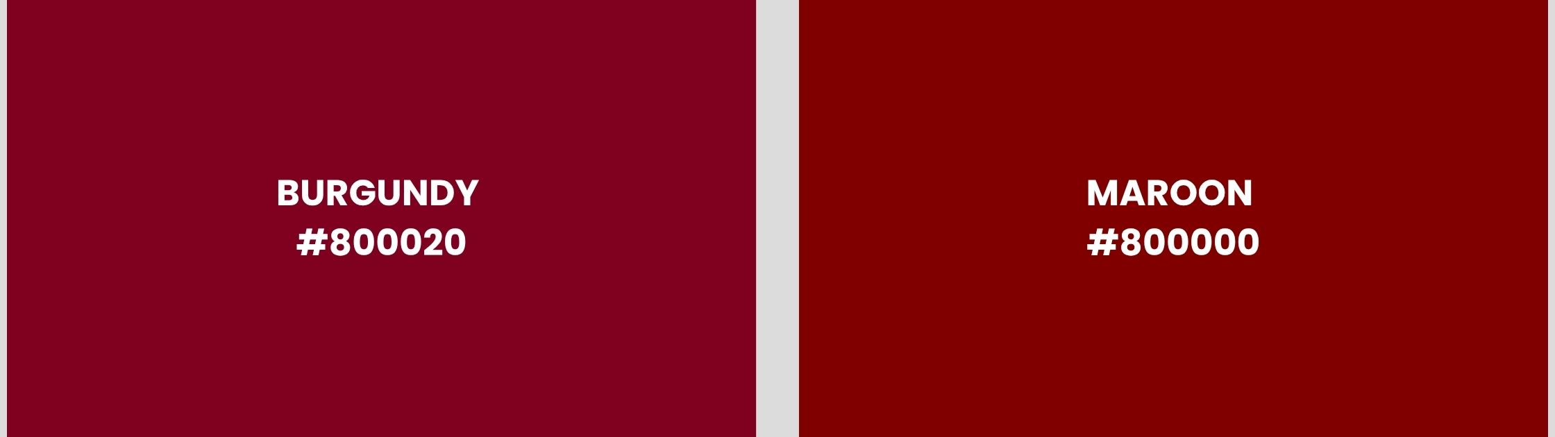 Burgundy vs Maroon
Quick Visual Cue:
- If it leans slightly purple — it’s burgundy.
- If it looks more brown — it’s maroon.
While both colors evoke strength, confidence, and warmth, burgundy is more refined and mature, whereas maroon gives a bolder, more classic statement. Choose burgundy for elegance and emotion; choose maroon for tradition and resilience.
Want to see the difference in action?
Try designing with both in ImagineArt’s AI image generator to feel how each one shifts the tone of your project.
Burgundy Color Meaning and Symbolism
Burgundy is named after the famous wine region in France known for its rich red wines.
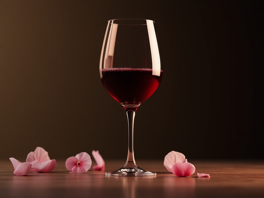 Burgundy Wine Glass
This deep red color, mixed with hints of brown or purple, has long been connected with elegance, strength, and classic style.
In history, burgundy was worn by royalty, religious leaders, and nobles. It symbolized power and dignity without being too flashy. Its deep, muted shade represented refined taste and sophistication—qualities that are still valued today.
Culturally, burgundy stands for ambition, wealth, and luxury. It attracts attention in a calm and confident way, unlike bright reds that can feel bold or loud. Because of this, designers use burgundy in luxury brands, high-end fashion, and financial services to show trust, tradition, and exclusivity.
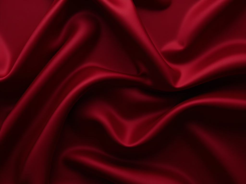 Burgundy Textures in Silk Fabric
From a psychological perspective, burgundy mixes the passion of red with the stability of brown and the mystery of purple. This combination creates feelings of seriousness, confidence, and emotional depth. Burgundy is perfect for projects that want to convey heritage, wisdom, and strength.
In Eastern cultures, burgundy is often used in ceremonies and spiritual practices. It represents respect, devotion, and connection to family history. The darker color reflects honor for tradition and cultural roots.
Today, burgundy bridges the gap between old and new. It fits well in classic designs, modern luxury branding, and even AI-generated images that want to show deep meaning.
Whether in fashion, branding, or digital storytelling, burgundy brings a sense of richness, legacy, and quiet confidence, inviting people to experience something both timeless and meaningful.
Burgundy Color Psychology
Burgundy’s psychological appeal lies in its rich duality: it fuses the intensity of red with the maturity and restraint of brown or purple undertones. This makes it a powerful color that communicates depth, ambition, and sophistication—ideal for brands or visuals seeking emotional weight and authority.
Emotional Associations with Burgundy Color
- Luxury and Prestige
Burgundy is closely linked to wealth and refined taste. Unlike bright reds that evoke urgency, burgundy speaks to long-term value and cultivated elegance. It's often found in luxury branding, upscale packaging, and premium hospitality design.
 Burgundy Color in Product Packaging
- Stability and Strength
Its dark hue gives a sense of grounded power. Burgundy appeals to those looking for reliability and leadership, making it suitable for legal firms, financial services, or political branding.
- Sensuality and Romance
While less overt than vibrant red, burgundy carries a subdued sensuality. It hints at emotional depth, mystery, and intimacy—qualities used in perfumes, cosmetics, and fashion campaigns.
Cognitive and Behavioral Impact
- Encourages Reflection
Burgundy invites introspection. Its richness is often associated with serious thinking, making it appropriate for academic brands, cultural institutions, or meditation/wellness environments.
 Burgundy in Luxury Fashion
- Improves Focus
When used in moderation, burgundy can foster concentration. Its muted tone minimizes distraction while maintaining visual interest—useful in UI design, workspaces, or educational content.
- Reduces Overstimulation
Unlike bright red, burgundy doesn’t trigger immediate alertness. Instead, it offers a sense of calm strength—useful for soothing interfaces or promotional materials meant to build long-term trust.
How Burgundy Color Looks on Different Screens
The visual perception of burgundy can shift depending on screen technology and ambient lighting, impacting how your design is experienced.
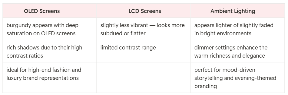 How Burgundy Looks on Different Screens
Burgundy Color Contrasts and Pairing
Well-paired palettes maximize burgundy’s power and elegance. Consider these combinations:
- Neutrals: Ivory, gray, taupe — bring softness and balance
- Gold & Bronze: Add opulence and luxury
- Pastels: Blush pink, dusty lavender — soften burgundy for romantic or feminine tones
- Earth tones: Rust, olive, ochre — evoke grounded, rustic energy
Use Cases of Burgundy Color in Design
Burgundy increases perceptions of quality and trustworthiness.
- Consumers associate it with products that are well-crafted, mature, and reliable.
- It's often used in industries that want to project sophistication without being flashy—such as winemaking, interior design, high-end apparel, and consultancy firms.
- In UX/UI, burgundy works well for calls to action that feel confident but not aggressive—for example, subscribe buttons, sign-up prompts, or feature highlights.
By strategically applying burgundy in your design or brand, you tap into an emotional spectrum that ranges from elegance to authority to intimacy—all without overwhelming the viewer.
Use of Burgundy Color in Print Media
Burgundy brings a sense of opulence and gravitas to print. Achieving consistent vibrancy requires careful selection of paper, ink, and finish.
- Paper choices: Matte paper softens burgundy’s intensity, while glossy finishes enhance its richness and shine.
- Printing methods: Spot color printing using Pantone 19-1617 TCX preserves depth and saturation.
- Applications: Business cards, luxury packaging, wine labels, and brochures often feature burgundy for premium appeal.
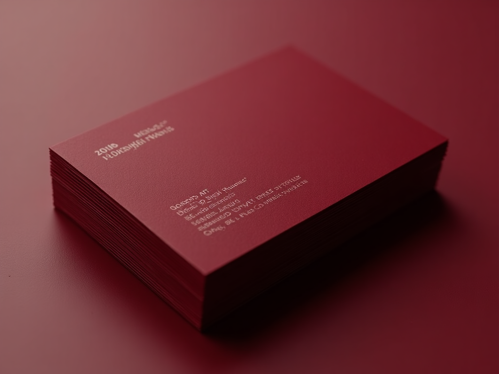 Burgundy Business Cards
Pairing burgundy with metallic foils, embossing, or textured stocks elevates tactile and visual luxury, making it popular in hospitality, cosmetics, and wine industries.
When designing with ImagineArt, you can use provided Pantone and CMYK values in the Canvas to ensure expected outcomes.
Use of Burgundy Color in Digital Media
On screens, burgundy conveys warmth, seriousness, and sophistication.
- AI-Generated Images: Burgundy works well as a rich background or accent, evoking luxury, romance, or intensity. ImagineArt’s AI image generator can produce compositions featuring burgundy garments, interiors, or abstract textures.
- Web Design: Burgundy is often used for buttons, headers, or icons in brands that want to appear established and trustworthy without aggressive brightness.
- Video Content: Burgundy enriches cinematic color grading, adding warmth and emotional depth, perfect for storytelling or brand videos.
Its compatibility with dark mode interfaces and ability to pair with soft neutrals or jewel tones enhances modern UI design.
Burgundy accents also improve user engagement by evoking feelings of comfort and confidence, encouraging longer interactions.
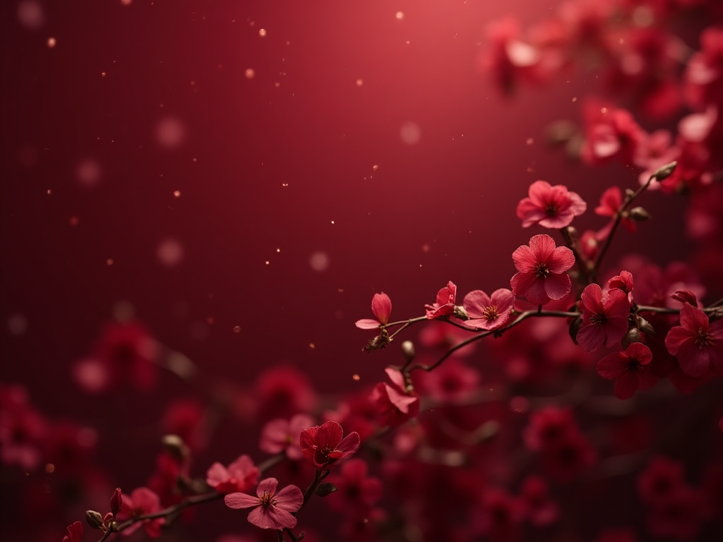
AI Image Generation with Burgundy Color
In AI-driven design tools like ImagineArt, burgundy can be used as a thematic anchor for compositions that aim to project emotion, elegance, or dramatic contrast. Burgundy works particularly well in the following AI-generated scenarios:
- Luxury Branding Visuals: Generate stylized imagery for boutique labels, high-end cosmetics, or classic fashion with burgundy backdrops, textiles, and lighting.
- Portraiture and Fashion: Train AI models to use burgundy in clothing, accessories, or environments to evoke prestige or depth.
- Romantic or Introspective Scenes: Use prompt guidance to include burgundy tones in soft lighting, velvet textures, or candlelit settings.
 Generated with ImagineArt
Suggested prompts:
"A royal room with burgundy velvet drapes,"
"Elegant woman in burgundy gown under moonlight,"
"Burgundy abstract gradient background with gold accents."
AI Video Generation with Burgundy Color
Burgundy adds depth and emotional richness to AI-generated video content. Its warm, refined tone works well for themes like luxury, tradition, and passion.
In AI videos, it’s often used in:
- Backgrounds for elegance and warmth
- Lighting accents to set a dramatic mood
- Wardrobe elements to convey prestige or intimacy
Common use cases include luxury product showcases, historical visuals, and romantic or premium brand storytelling. Ready to create stunning videos with burgundy color in ImagineArt's AI video generator?
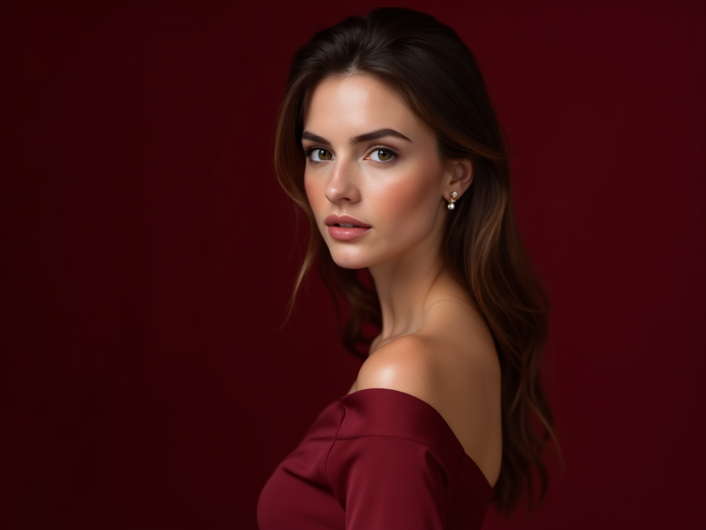
Use of Burgundy Color in Headshots
Burgundy adds an instant sense of sophistication and warmth to headshots—making it a strategic choice for personal branding, corporate profiles, and creative portfolios. Its deep, refined tone enhances skin tones across a wide range of complexions and subtly communicates confidence, maturity, and depth.
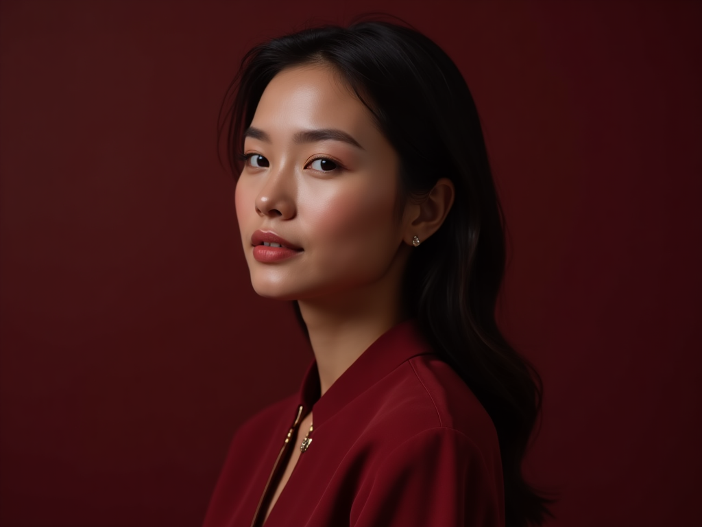 Burgundy Headshot
Why It Works
- Skin Tone Enhancement
Burgundy complements both warm and cool undertones, reducing redness in skin and creating contrast that flatters facial features.
- Emotional Appeal
The color lends headshots a serious yet approachable vibe—ideal for professionals in law, academia, the arts, or luxury services.
- Visual Consistency
When used in wardrobe or background, burgundy helps unify the visual story without overpowering the subject.
Application Tips
- Wardrobe
A burgundy blazer, blouse, or accessory creates a focal point while conveying taste and authority.
- Backgrounds
Soft burgundy backdrops with subtle texture or gradients can make headshots feel more editorial and refined.
- Lighting
Burgundy reflects well under warm lighting setups, enhancing the richness of the scene without introducing noise or harsh contrast.
AI-Enhanced Headshots
With ImagineArt’s AI headshot generator, you can generate or retouch headshots with burgundy-themed enhancements:
- Simulate wardrobe options in burgundy to test aesthetics.
- Apply background swaps that introduce burgundy gradients or interiors.
- Use tonal filters to shift ambiance toward romantic, vintage, or executive vibes.
Use of Burgundy Color in AI Logo Generation
In AI logo design, burgundy is a preferred color for institutions and firms aiming to convey prestige, stability, and intellectual depth. AI logo generators like ImagineArt have models that adhere to burgundy-centric prompts strongly. Burgundy, in fact, is an intentional choice for professional and academic identities.
![]() Event Management Logo
Event Management Logo
- Université Paris Cité
The university’s logo incorporates a refined burgundy tone, reinforcing its academic authority, cultural heritage, and intellectual legacy. It’s a strong example of how educational institutions use burgundy to build trust and seriousness.
- Hevins Law Firm
This legal brand utilizes burgundy in its logo to project sophistication, reliability, and a high level of professional decorum—attributes that align with the expectations of clients in the legal field.
- Why it works
Burgundy’s associations with tradition, wisdom, and confidence make it a powerful tool for logos generated with AI platforms—especially in sectors like law, academia, and consulting.
- Design insight
When using AI tools, pairing burgundy with serif fonts or gold accents can help reinforce an authoritative, upscale visual identity.
Use Cases in Brand Identity
Burgundy is widely employed in brand identities that seek to convey sophistication, heritage, and trust. Its deep, rich tone provides a visual cue of exclusivity and refined taste, making it ideal for industries such as luxury goods, legal services, and high-end hospitality.
![]() Burgundy Asset Management Logo
Burgundy Asset Management Logo
Burgundy Asset Management, a financial firm, uses the color prominently in their logo and website design to communicate stability, seriousness, and professionalism. The color choice reinforces client trust and signals the company’s long-term commitment and expertise.
In this context, burgundy conveys:
- Trust and Reliability: Deep red tones minimize flashiness and elevate perceptions of solid financial stewardship.
- Heritage and Gravitas: The color reinforces a legacy mindset, signaling experience and thoughtful judgment.
- Visual Consistency: Burgundy’s appearance across digital and print mediums enhances brand recognition and reinforces its values.
Burgundy Color Accessibility and Conversion
Burgundy, being a dark, rich color (#800020), generally offers good contrast against light backgrounds, but text and UI elements need to be tested for readability—especially for users with color vision deficiencies such as deuteranopia or protanopia.
Contrast and Readability
For optimal accessibility, burgundy pairs best with white (#FFFFFF) or soft neutrals like beige (#F5F5DC). The Web Content Accessibility Guidelines (WCAG) recommend a contrast ratio of at least 4.5:1 for normal text, which burgundy usually satisfies when paired with light text or backgrounds. However, pairing burgundy with other dark or saturated colors (like deep plum or maroon) can reduce readability and should be avoided or carefully checked.
Color Spaces and Print Conversion
Designers must be aware of how burgundy translates across color models:
- RGB (digital): Burgundy’s vibrant display on screens is defined by #800020, combining strong red with subtle brown undertones.
- CMYK (print): In print, burgundy often appears deeper and less saturated. A typical CMYK approximation is C:0, M:100, Y:61, K:50, which retains its warm and grounded feel but may look slightly muted compared to digital.
- Pantone: PMS 7421 C is a close Pantone equivalent often used for high-quality print reproduction of burgundy.
Using color management tools and consistent color profiles across devices ensures that burgundy maintains its intended richness and emotional impact, whether on digital displays or printed materials.
Fun Facts and History of Burgundy Color
Burgundy’s name originates from the historic Burgundy region in France, famed worldwide for its exceptional red wines. The color itself is deeply tied to this heritage, symbolizing richness, sophistication, and a legacy of craftsmanship.
Historical Roots
The Burgundy region has been producing wine since Roman times, and the color took on cultural significance as the deep red hue of these prized wines. Over centuries, burgundy became associated not only with wine but also with aristocratic fashion, royal robes, and ecclesiastical garments, symbolizing power and prestige.
Royal Connections
In medieval Europe, burgundy was favored by nobility and clergy alike. The rich, dark shade was a marker of high status, worn in ceremonial clothing and heraldic banners. This association helped cement burgundy as a color representing influence and dignity.
Cultural Impact
Beyond Europe, burgundy has made its mark globally in design, art, and fashion. Its versatility allows it to convey both warmth and authority, which is why it remains a popular choice for formalwear, interior decor, and luxury branding.
Interesting Fact
Burgundy was historically difficult to reproduce in dyes, making it a rare and expensive color during the Middle Ages.
This rarity contributed to its association with wealth and exclusivity.
From its roots in winemaking to its royal and artistic heritage, burgundy carries a story of depth, luxury, and timeless appeal that continues to inspire creators and designers worldwide.
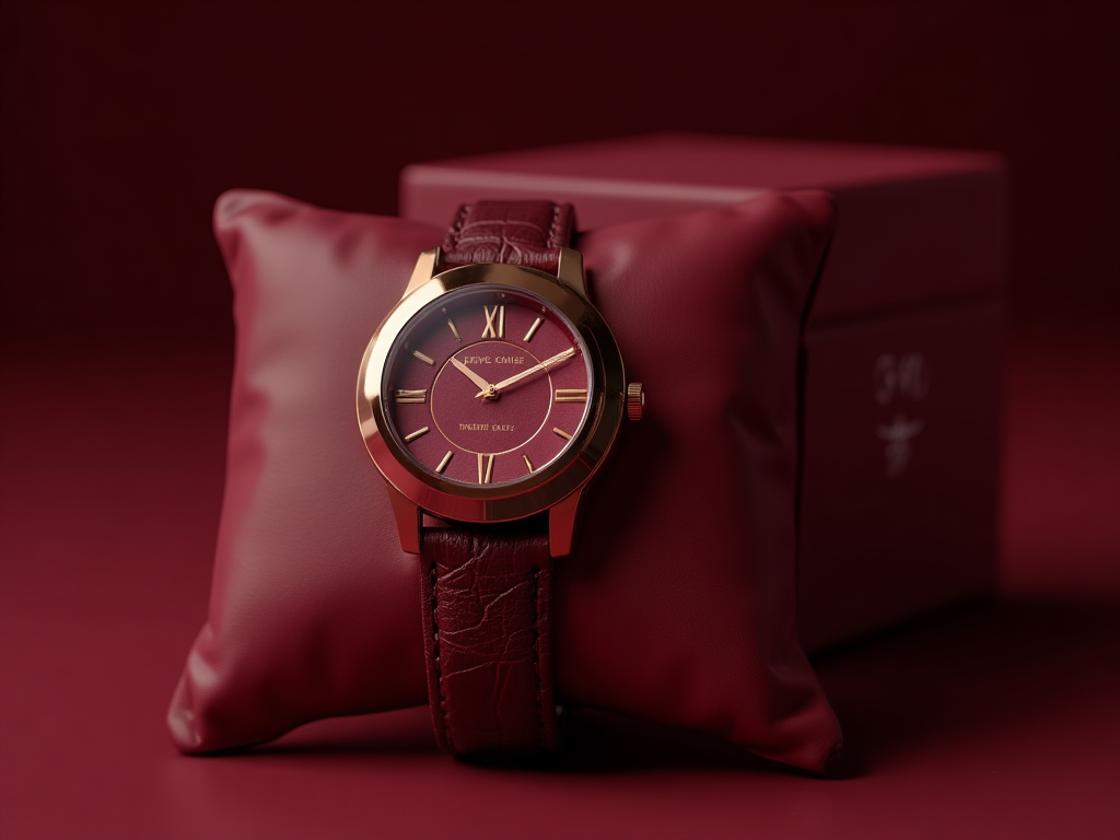
Famous Brands Using Burgundy Color
Burgundy’s rich, sophisticated tone has made it a favored choice for many renowned brands aiming to communicate luxury, heritage, and reliability. Its deep red hues evoke trust, warmth, and timeless elegance—qualities that resonate strongly in brand identity.
Berlinger Haus
This premium cookware brand highlights burgundy in its Metallic Line Burgundy Edition, using the color to signal luxury and modern kitchen aesthetics.
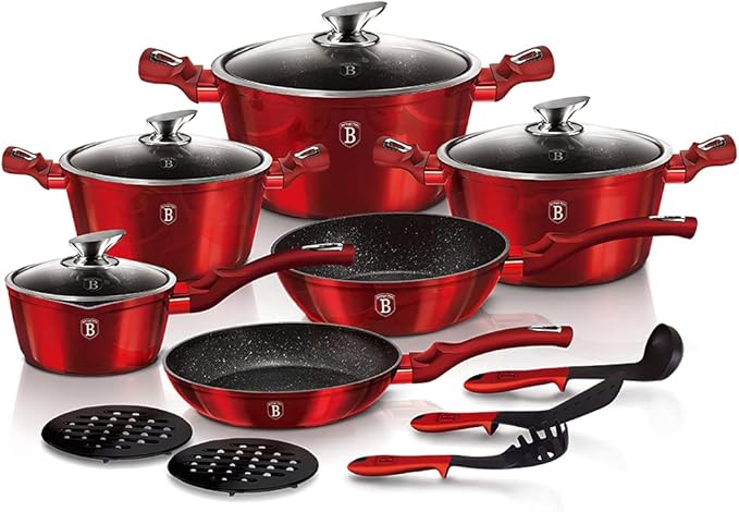 Burgundy in product design
Gucci
Gucci features burgundy-like tones in accessories like GG Marmont bags and footwear, reflecting vintage glamour and timeless elegance.
Recommended Read: Emerald Green and Cobalt Blue
Popular Burgundy Palettes
1. Luxury & Drama
- Burgundy: #800020
- Gold: #D4AF37
- Black: #000000
- Cream: #FAF3E0
- Deep Plum: #4B0033
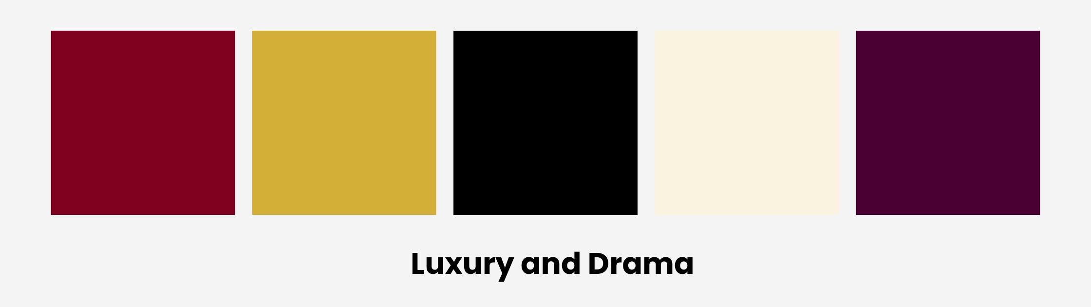 Burgundy Color Palette 1
2. Rustic Romance
- Burgundy: #800020
- Terracotta: #E2725B
- Olive Green: #808000
- Sand Beige: #E6D5B8
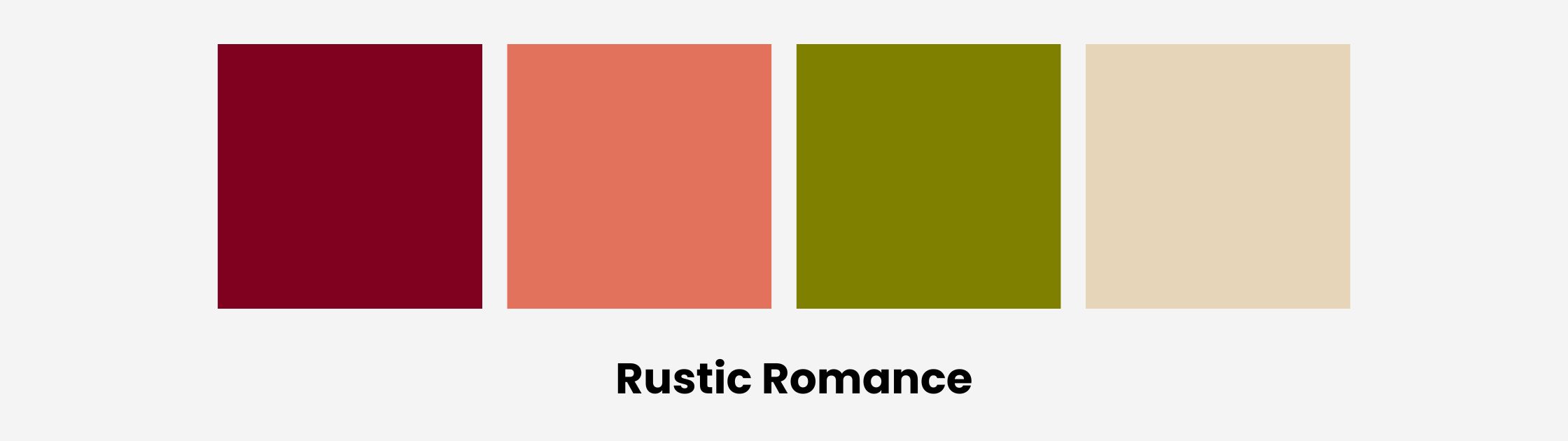 Burgundy Color Palette 2
3. Modern Minimal
- Burgundy: #800020
- Pale Gray: #DCDCDC
- White: #FFFFFF
- Slate: #708090
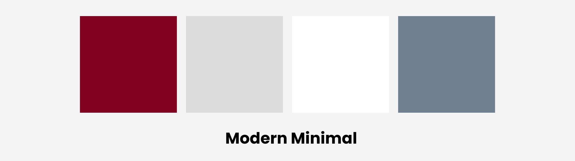 Burgundy Color Palette 3
4. Edgy Contrast
- Burgundy: #800020
- Teal: #008080
- Mustard Yellow: #FFD700
- Charcoal: #2E2E2E
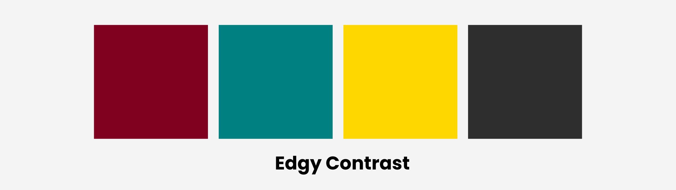 Burgundy Color Palette 4
5. Soft & Feminine
- Burgundy: #800020
- Blush Pink: #F4C2C2
- Dusty Rose: #DCAE96
- Pearl White: #FDF6EC
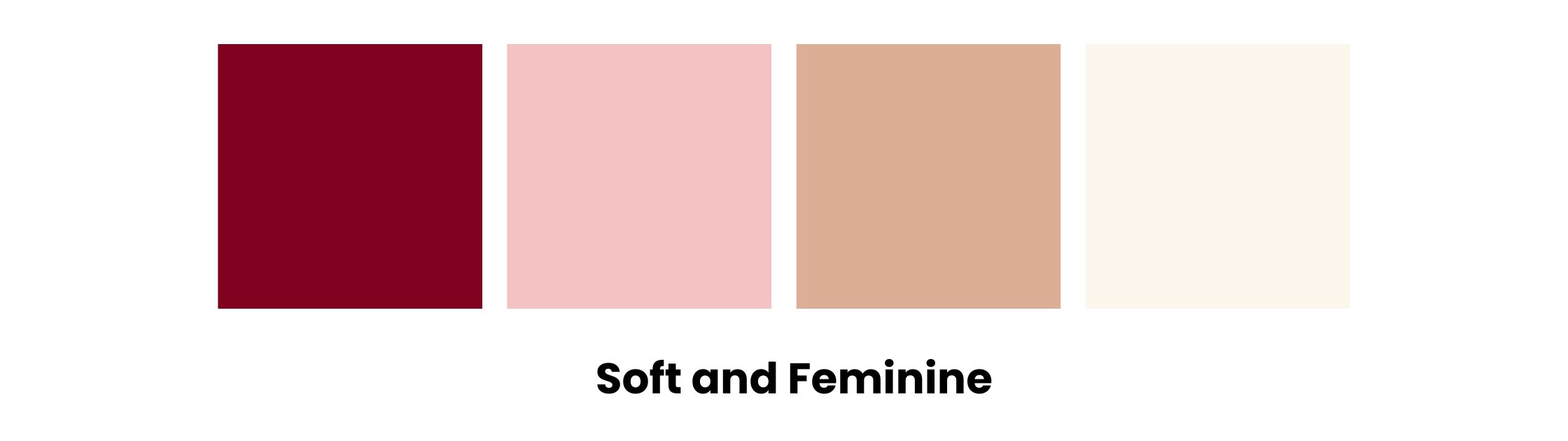 Burgundy Color Palette 5
Ready to use these palettes in ImagineArt’s AI tools to create mood boards, packaging visuals, or digital illustrations that radiate emotional resonance?
Saba Sohail
Saba Sohail is a content marketing strategist specializing in automation, product research and user acquisition. She strongly focuses on Gen-AI-led speed and scale for creators, professionals and businesses. At ImagineArt, she develops use cases of AI Creative Suite.